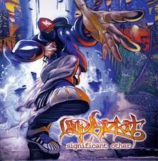
Significant other is in the style of… and was released in 1999. The colour scheme is gloomy with hints of warm colour in some areas, particularly around the band name. The effect of this is that the name is glowing and highlights areas closer to it, which enhances the effect of a zoomed perspective.
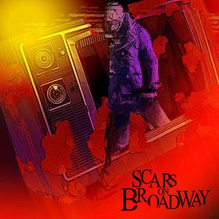
The red that consumes the bottom right of the art looks as though it has a burn effect while the yellow at the top left has a glow effect. Combining purple, yellow and red means the colour scheme is very warm and the saturation ensures the cover is eye-catching.
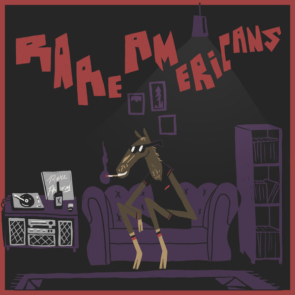
Rare Americans use certain characters in every bit of art used to promote their music, so the characters work effectively to catch the attention of fans. The simplicity is very different to a lot of other bands’ styles and the font is very distinct and interesting.
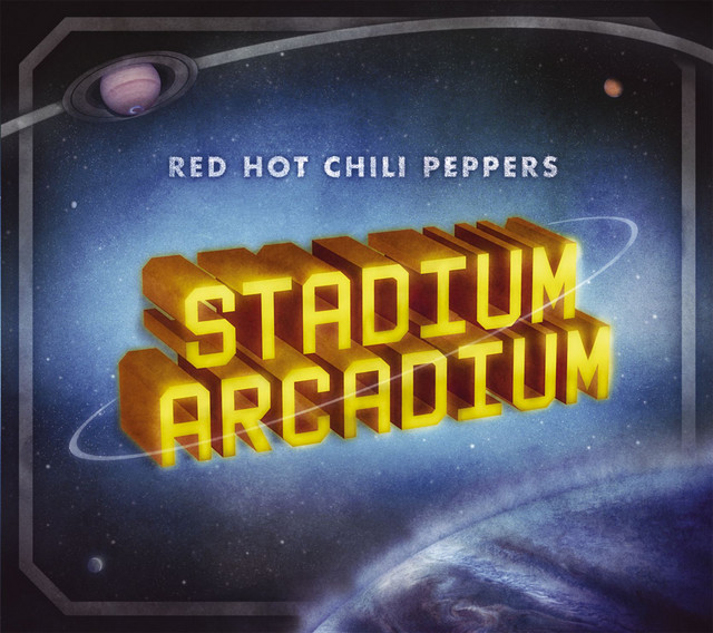
RHCP’s Stadium Arcadium art is very unique and differs greatly to their other art. It features a sci-fi style background using contrasting colours against the album name. The genre the album follows is a large mixture of different things, but could be described as funk rock. Developed throughout 2004 to 2005, … could have influenced the art (look at other funk rock albums from a few years before + trends in sci fi movie release)
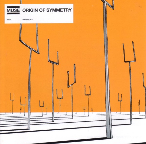
Muse’s use of a warm orange against grey, black and white looks appealing due to colour association to emotion. The focus isn’t defined clearly because of the perspective and repetition of the same shape at different angles and distances. Choosing to place the album name above the orange makes it obvious enough to be shown as important.