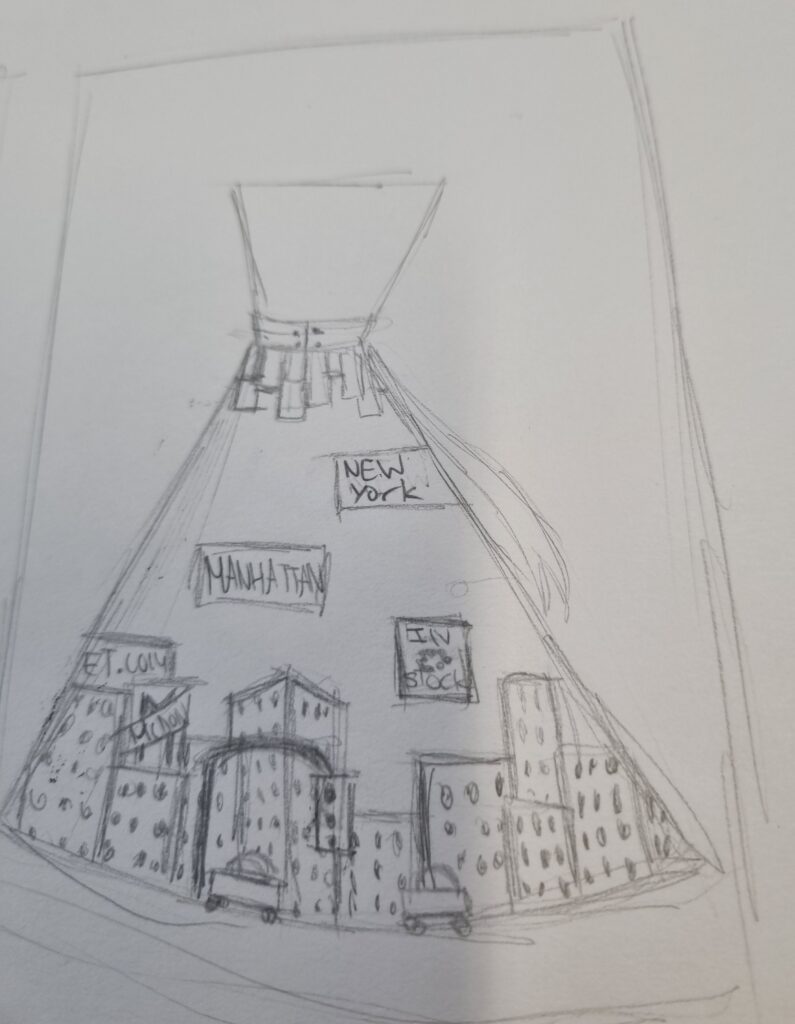
Here is where I began drawing what I wanted to do for my final piece. I didn’t have time for a full-on dress so I opted for a skirt instead and drew 3 designs with Clare Caulfield and Maddie Hill in mind thinking about how to implement their art into my sketch.
I also found a lot of information about why I chose a maxi dress as they were in fashion in New York with this link:
BigApple, H. (2020) NYC fashion of the 1960s (gallery), Medium. Available at: https://medium.com/@info_28452/nyc-fashion-of-the-1960s-gallery-15265e105f67 (Accessed: 31 January 2024).
Sketching
For my first design, I designed Manhattan buildings on the trim and signs everywhere. I even added taxis, lamposts and stoplights. Even though I said I wasn’t going to implement Maddie Hills art but more of her idea, I decided to try sketching out a design near the bow where it’s an abstract skyline. I even added a bow for a nice touch and the top half was just an add on. I didn’t really have any ideas frankly for this skirt however I did a skirt due to how in Manhattan it was trendy whether it be a maxi or a mini skirt. I have also provided research of that above. I thought since skirts are trendy I would do a maxi kind of skirt. I even added signs floating everywhere. What I liked about this design was how I implemented Clare Caulfield’s work for the trimming and how I added signs around the skirt. The reason I did that was because of how theres so many billboards in New York so it made it feel more like the city. I also like the top part of where the bow is as it just makes it feel more full and gives more of a building touch to it as it is a unique shape. I also love the bow. What I didn’t like was how I made it too busy with Maddie Hill’s design under the bow. I didn’t think it was necessary but I wanted to try putting a touch of her in the design itself.
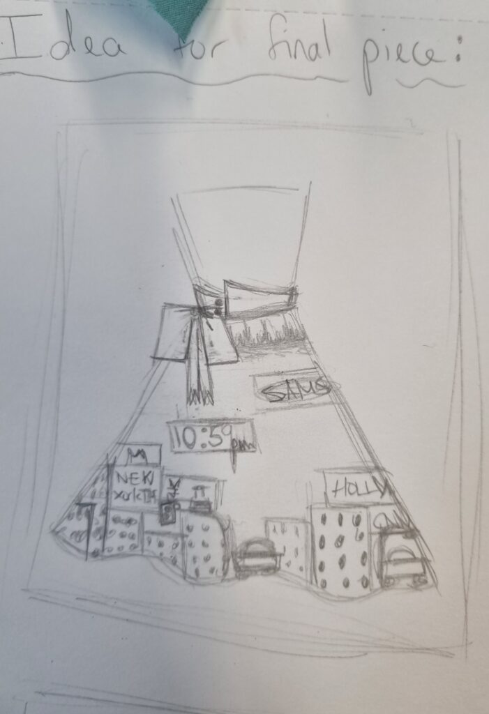
For the second design, I kept the top half the same however switched the buttons on the bigger side. I tried keeping this more plain and simple but it didn’t give a Manhattan vibe as Manhattan is a busy bustling city so it made more sense to just cram everything in. Here I tried implementing Maddie hill’s and Clare Caulfield’s style and combining it together. I didn’t like this design as I was doing too much with both artists’ style and it was too plain and just overall boring in my opinion.
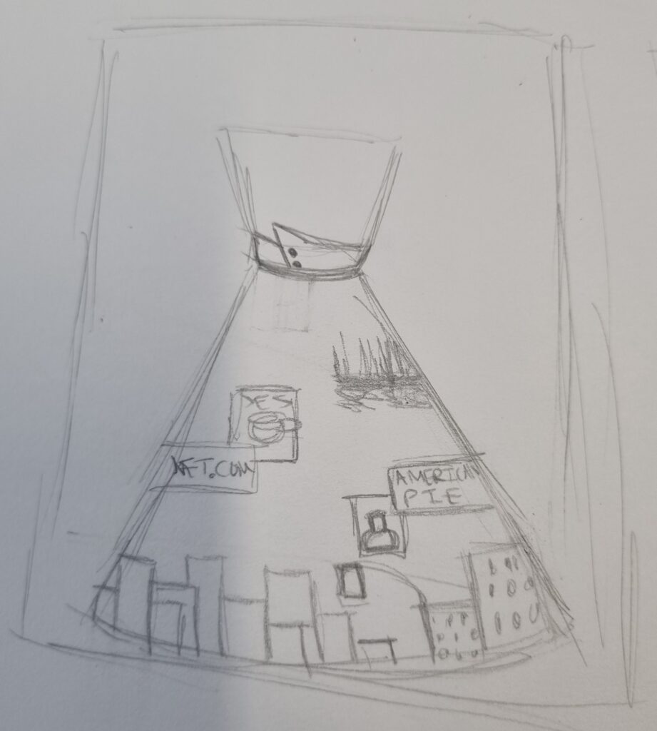
For the last design, the trimming was my favourite here as I decided to add 3D buildings with the 2D buildings and even kept the billboard idea. I even added Maddie Hill’s other type of building she’s done but instead put it upside down as if it’s reflecting the top half of the design even though it’s got no design like the bottom part I just liked how Maddie Hill did her reflections. In the end, I didn’t really like implementing Maddie Hill’s designs into any of my artwork so I didn’t do that but rather just kept her idea of buildings around the trimming. I liked this design’s trimming idea and kept this but decided to expand further on the design as the sketch is too plain. I decided to also do the first designs bow idea and the billboard idea as I liked that more and tried doing this designs billboard idea too. I did not like my 2nd design and didn’t use any ideas from that at all. If I had more time I would have done more sketches of my final design than rushing it and doing only 3.
Finding the right colour
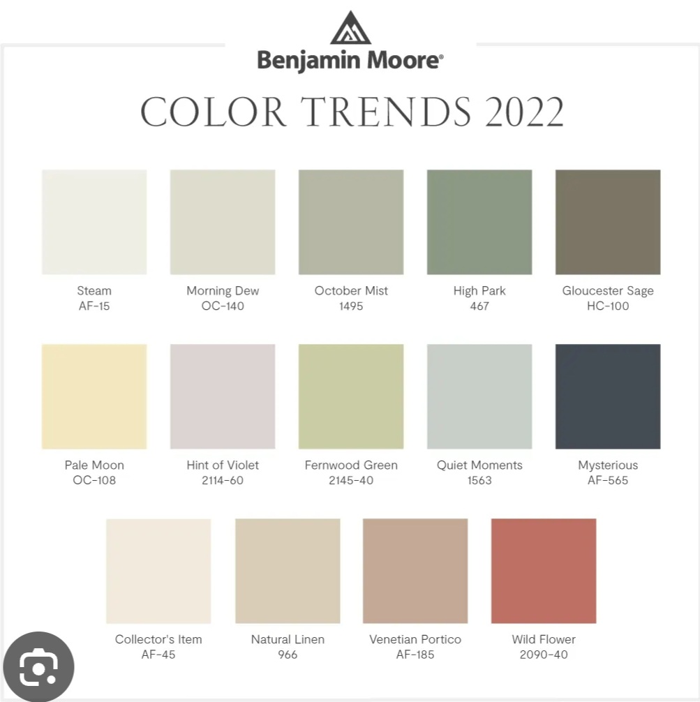
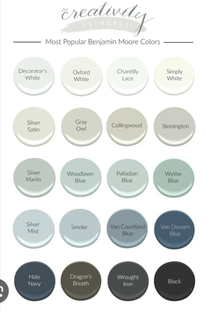
I searched up trendy colours and these monotone colours came up. As I went to go buy fabric, I saw an off-white kind of colour and I chose that one because I didn’t know if having a darker colour or a colour that isn’t white would affect the sublimation printing so I decided to choose an off-white colour to play it safe. If I had more time beforehand I could have gone and bought the fabric that is a different colour and tested it out on that.
Cutting the skirt
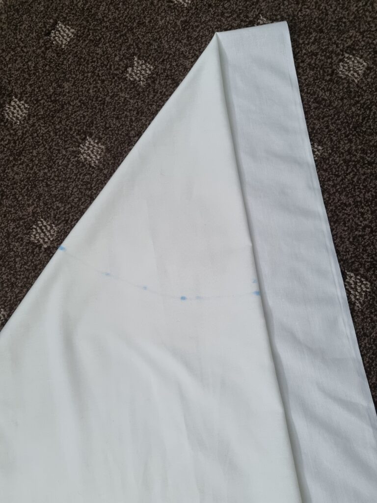
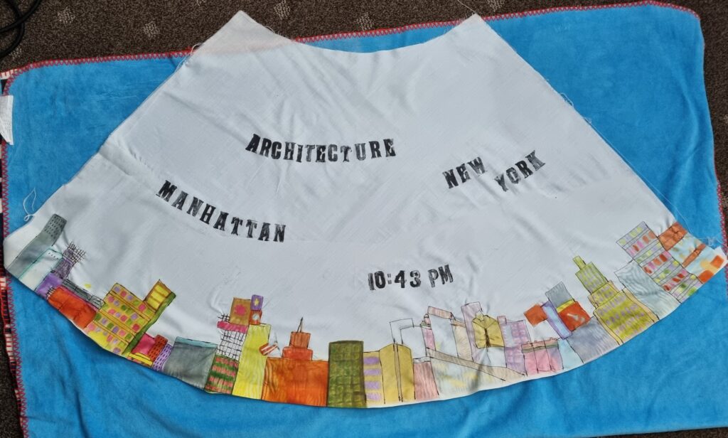
Here is where I began measuring the skirt and cutting it. I was making an umbrella skirt so I had to fold it across and then double it so it was 2 times thick. After I did that I had to use a measuring tape and start from the point of the skirt in the image below and do a curve making sure to mark it as I go along. This was going to be the waistband area. I measured about 7.5cm to make sure the torso area would fit a mannequin so I measured my other skirt whose waistband was about 7.5cm so I followed it off of that. After finding the cm for the waist, we had to cut it in a curved way because it was an umbrella skirt so it had to be a circle initially. After I cut the top part, I had to measure the bottom part and make sure to measure it and curve it too to make a circle.
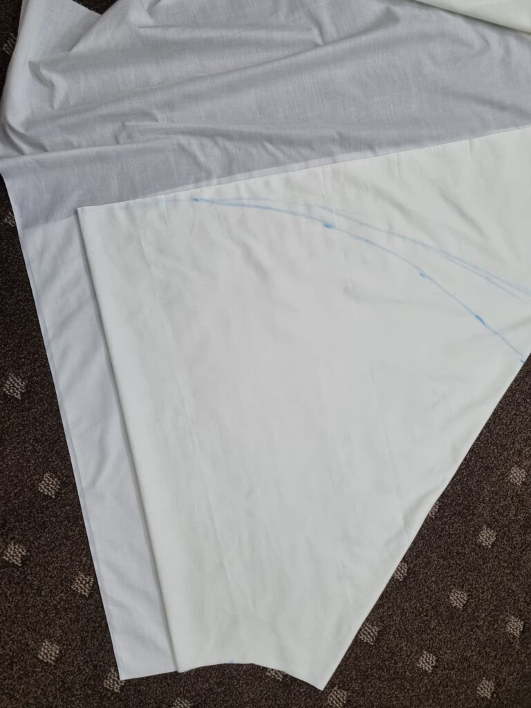
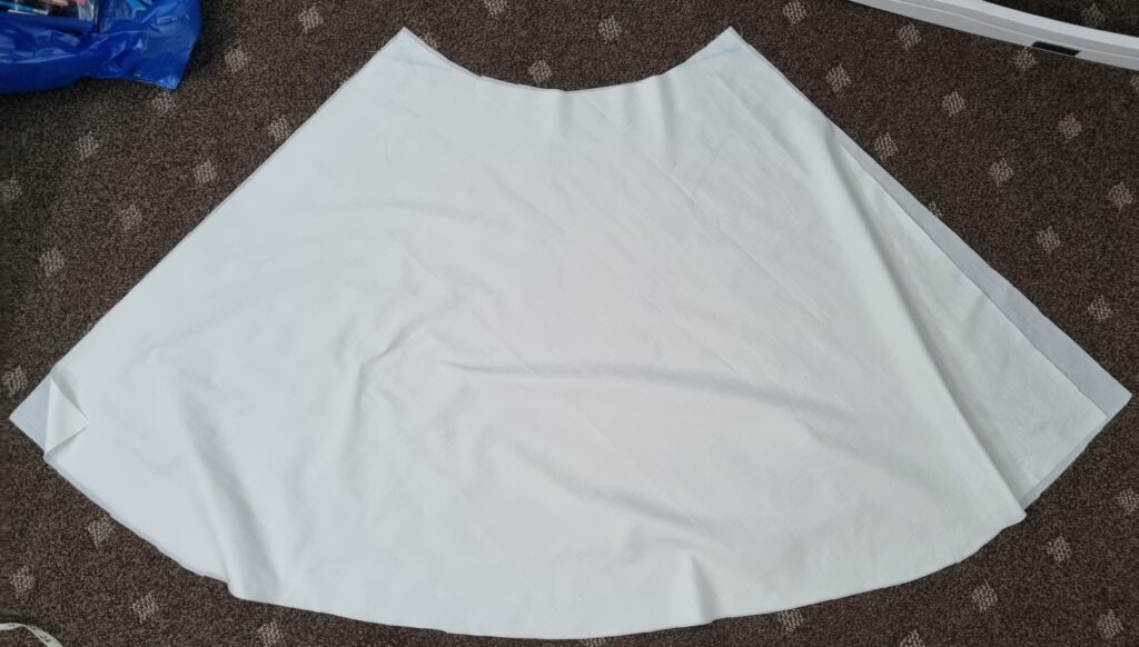
I opened the skirt up and made sure there were 2 parts of the same skirt so I could sew it together later. This is how it turned out when opened.
Fabric Paint
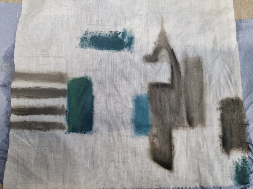
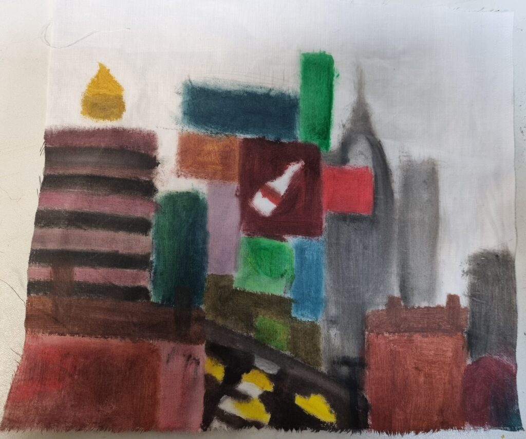
Before I finalised my option of choosing sublimation printing for my final piece, I tested out fabric paints first as I had some at home. The fabric paints had to be manually mixed if I wanted to get the right colour and sometimes it would come out light in some areas and then dark in the other areas. The reason I didn’t choose fabric paint was because it looked really rough and felt rough when it dried up. Also because it wasn’t a nice medium to work with and I wasn’t very much experienced with it so I didn’t really know how to apply it and may have applied it on wrong. In the end, the way it looked and felt was rough and I didn’t want that as I wanted it to look smooth and more light like Clare Caulfield’s art style. Next time I’ll have to learn how to use it and experiment more with it than a last-minute experimental option.
Sublimation testing
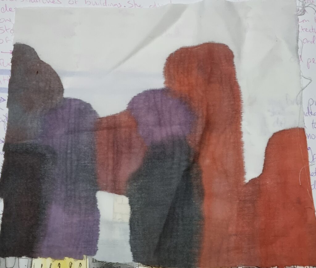
At first, when doing sublimation printing I had forgotten that I was meant to apply the ink on the paper then the machine would transfer it to the fabric so here I instead accidentally applied the ink onto the fabric and realised later why it was so splotchy and how come it wasn’t neat like I remembered. It was a failed attempt but sometimes we forget and we learn and we improve. I then finally began the right process of sublimation printing.
Here is where I began testing it out on the fabric I had bought seeing if the colours would come out correctly. At first, it didn’t print out ok on the fabric as it left wet marks but then I realised I had to wait for it to dry and then put it under the machine. After that, the inks were transferred successfully onto the fabric. The colours came out nicely and vibrant and I then started inking buildings to see if that would come out nicely I even used different inks this time too which were yellow, green, black and pink. As I didn’t have much experience with sublimation printing I made a few mistakes however I overcame them by testing and seeing what the inks work best with and in the end, after the testing, the result came out nicely.
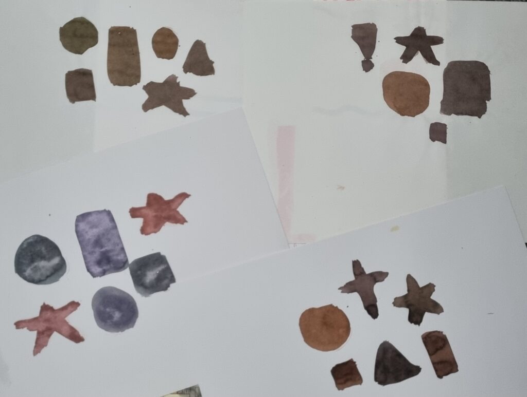
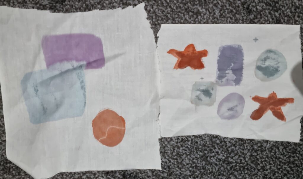
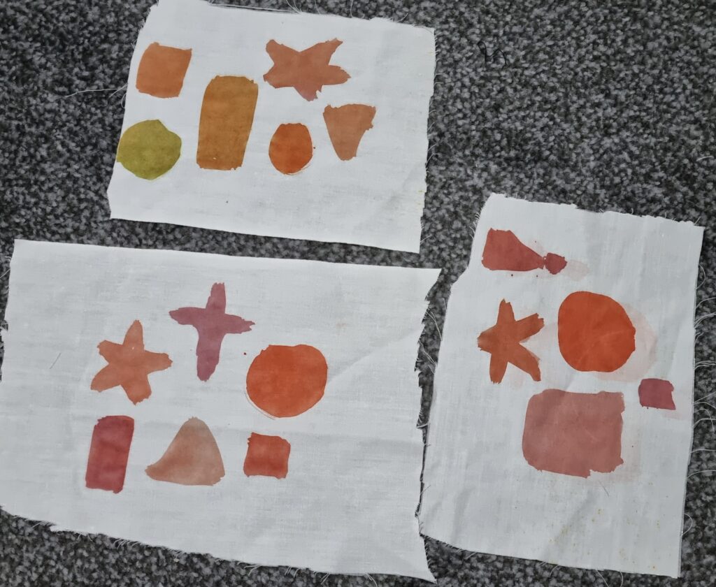
This was where I began testing the sublimation printing with different inks and actually trying to replicate buildings and billboards to see if they would come out nicely.
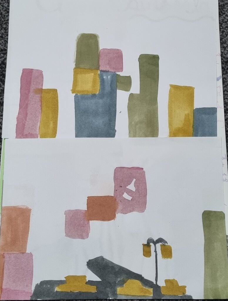
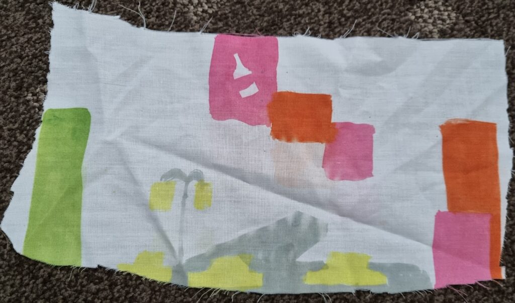
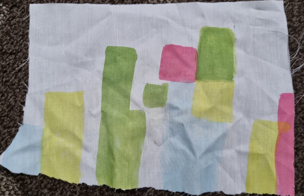
In the end, they came out nicely and the colours were vibrant. This finalised my idea of doing sublimation for my final piece and I began sketching out my actual designs to then ink.
Sketching my final designs
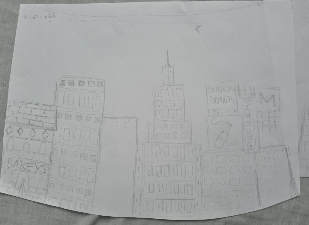
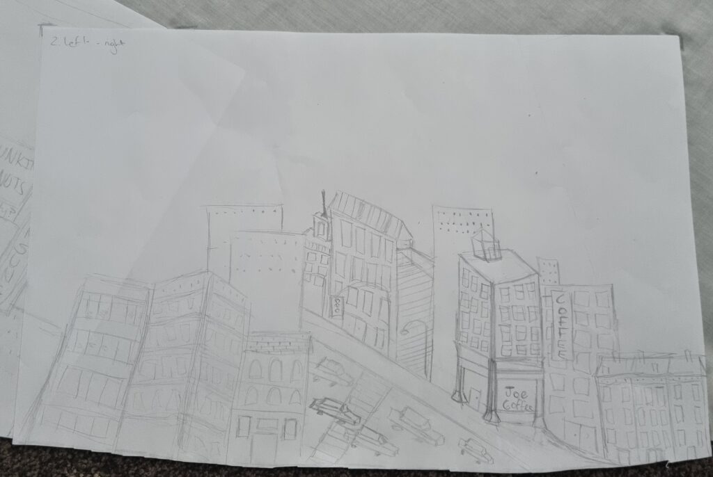
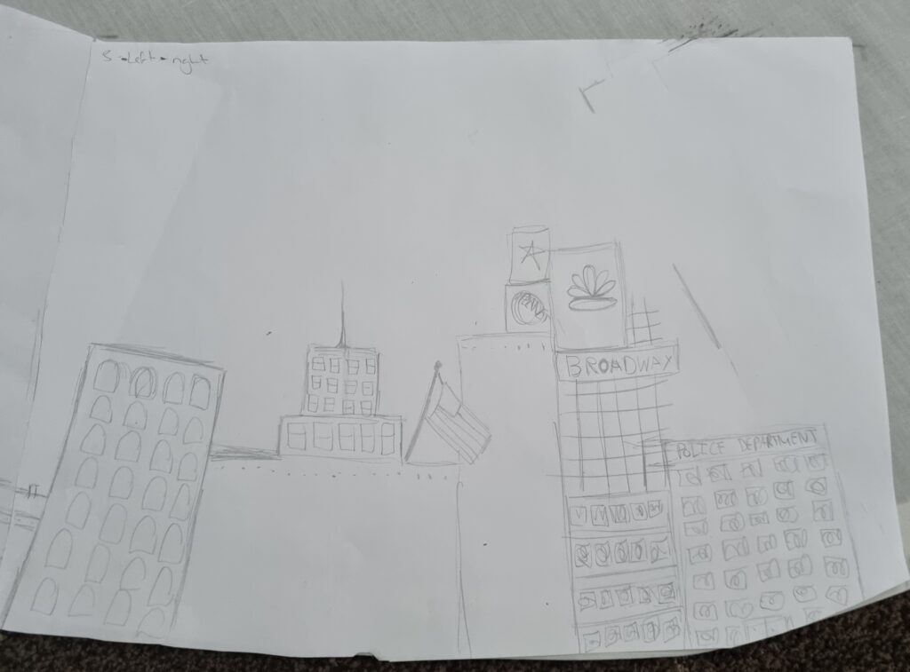
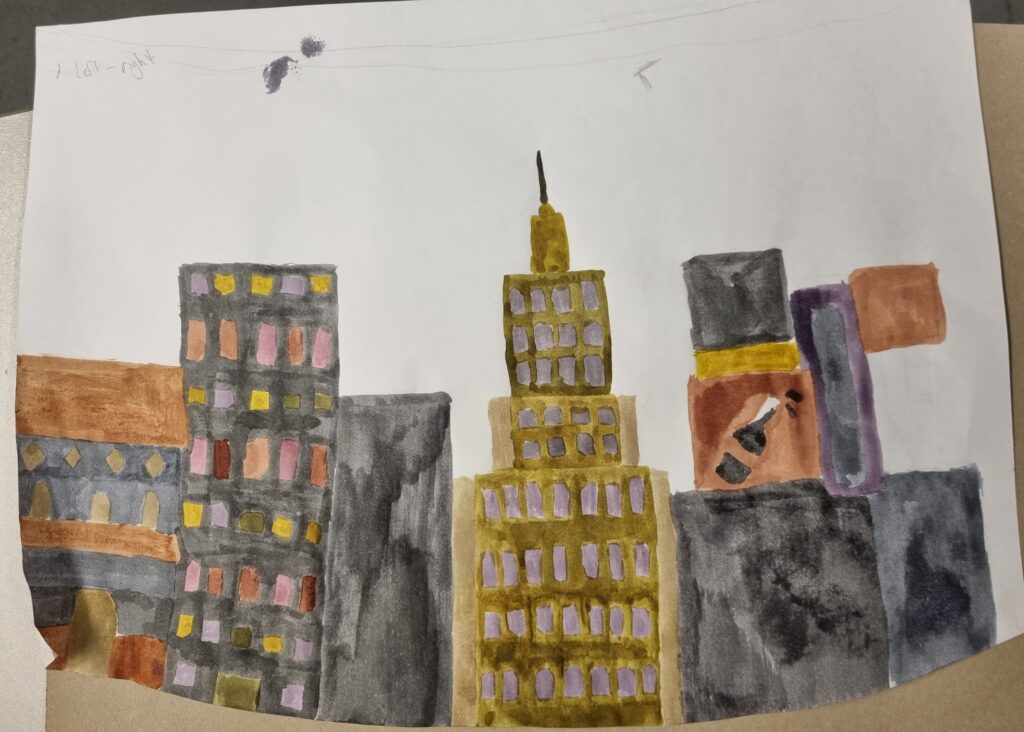
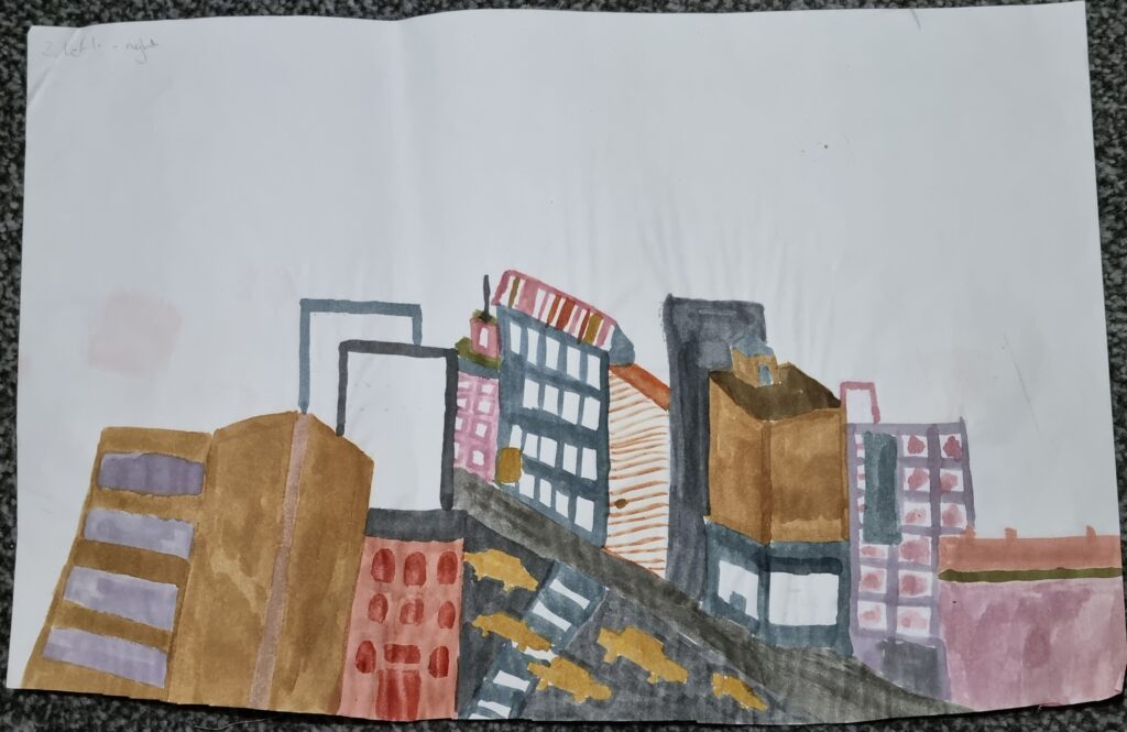
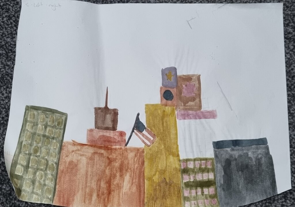
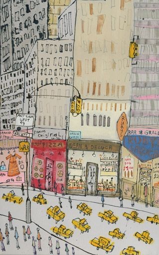
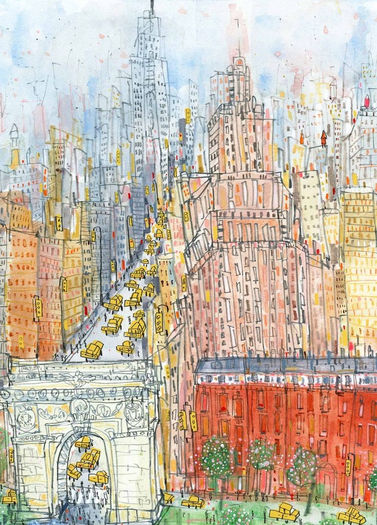
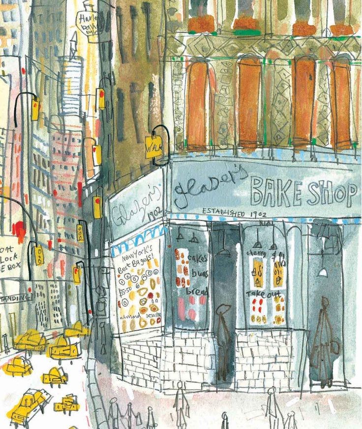
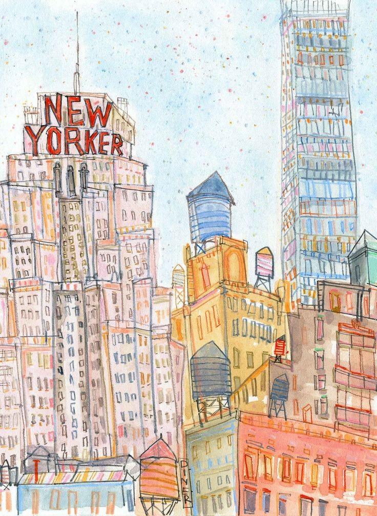
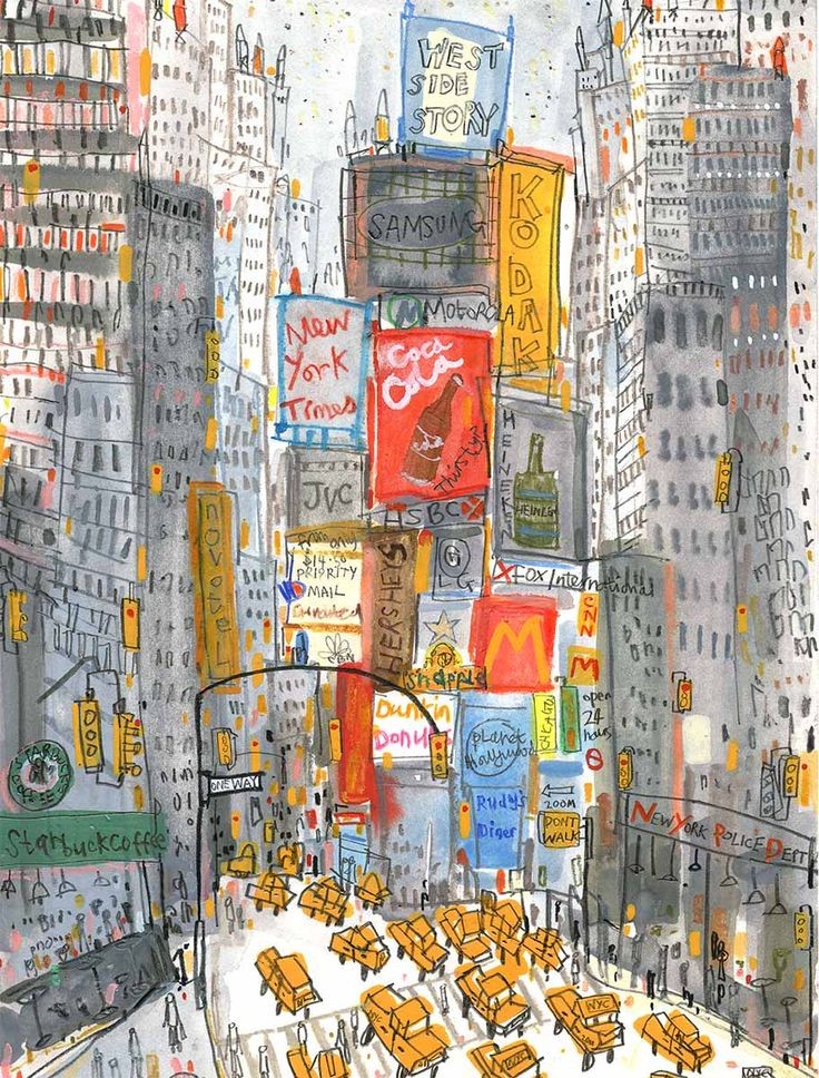
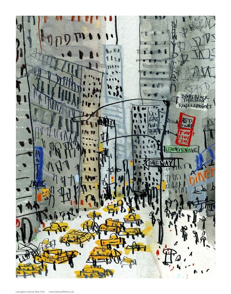
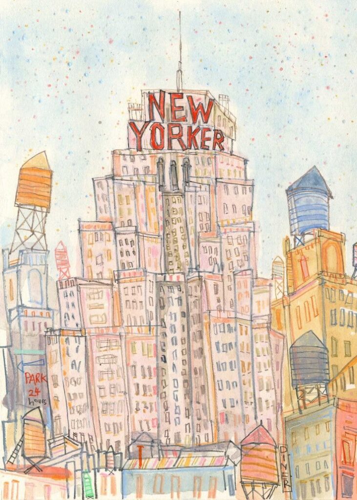
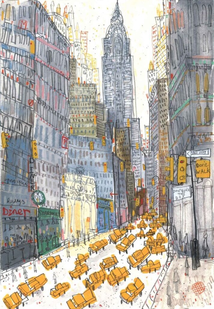
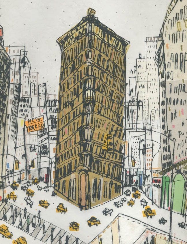
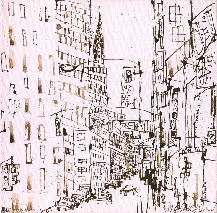
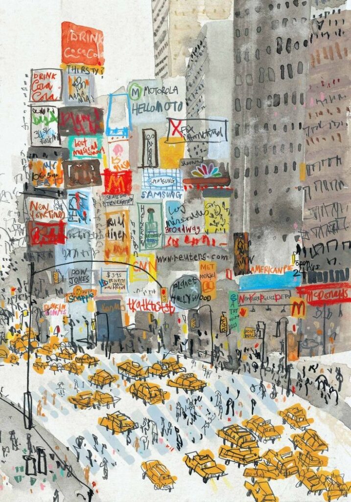
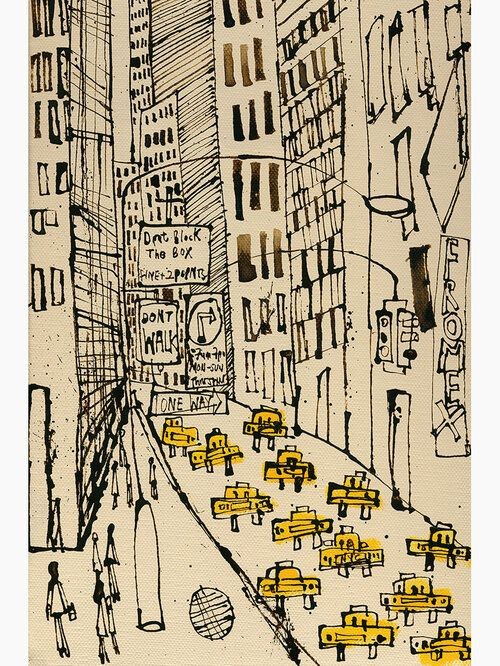
I used loads of references from Clare Caulfield’s work and from Pinterest to sketch out these designs. I also had to line the papers up with the skirt’s design so I had to curve it and then mark down where the paper would sit for when I need to put it in the sublimation machine. I then began sketching out my designs. I numbered them from 1-4 and will use the same designs for the front and back of the skirt.
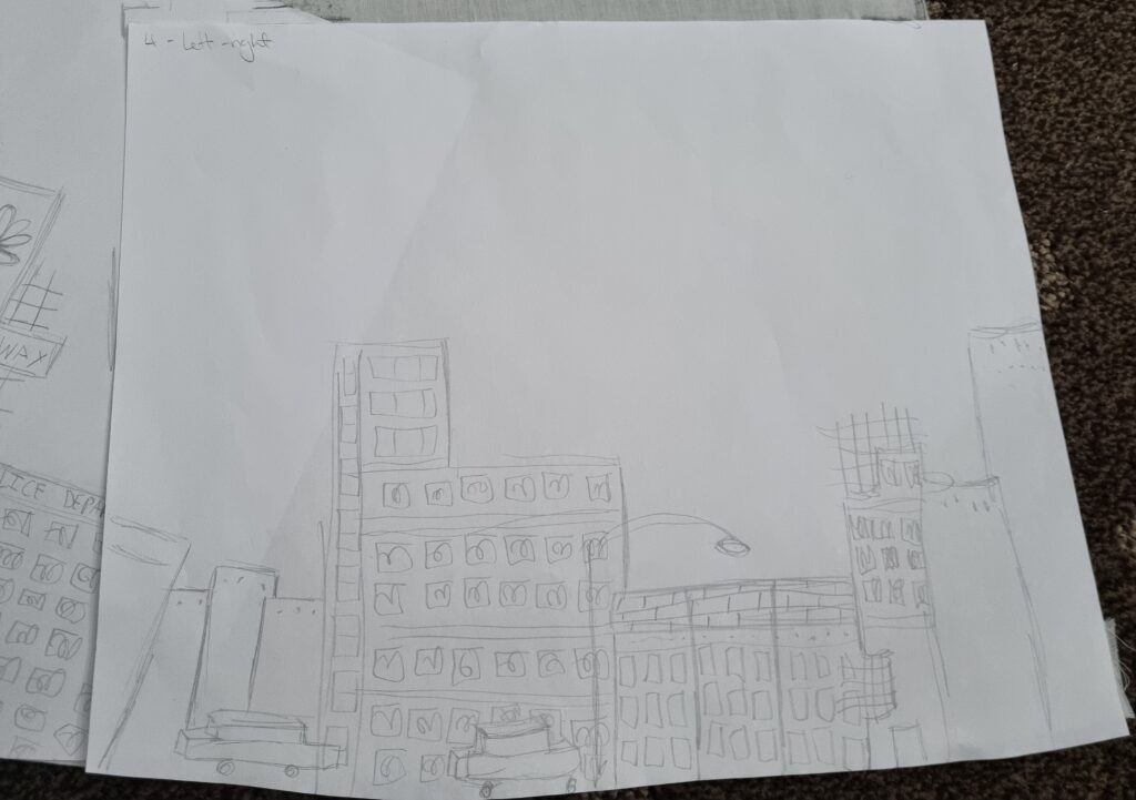
Inking the sketch
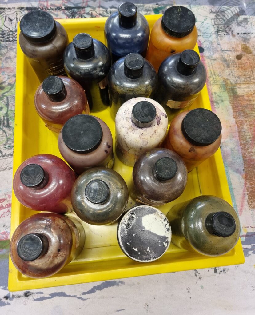
Here is where I began inking the sketch. The colours I used were black, pink, dysperse mid yellow, turqoise, dysperse violet, scarlet and dyserpse brown. I also mixed some colours up too and created different hues. I liked this process and liked how the colours came out on paper. I, unfortunately, lost my 4th sheet of paper after I used it for my skirt however you will see the design on the skirt and I still have the sketch of it. After the inking, it was time to use the machine and print the design onto the skirt. I liked how the colours came out more dark on the paper which made me believe that when it’s transferred onto fabric the colours will come out nice and light.
References
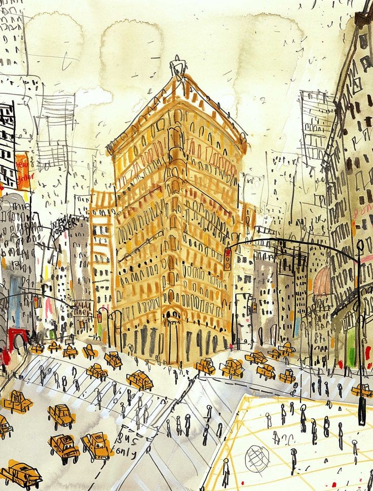
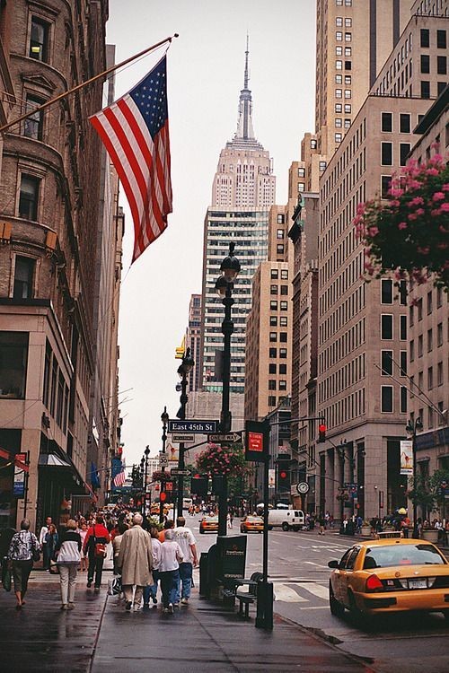
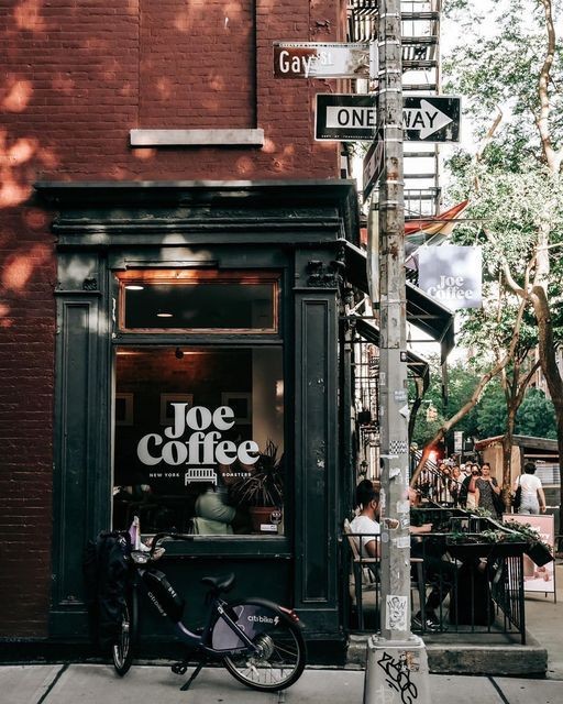
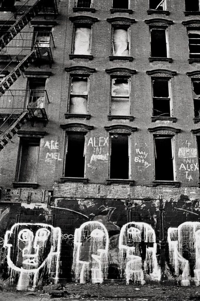
These are all the images I used for the sketching process. These are all Clare Caulfield’s work and the ones that aren’t drawings are from Pinterest.
Sublimation Process
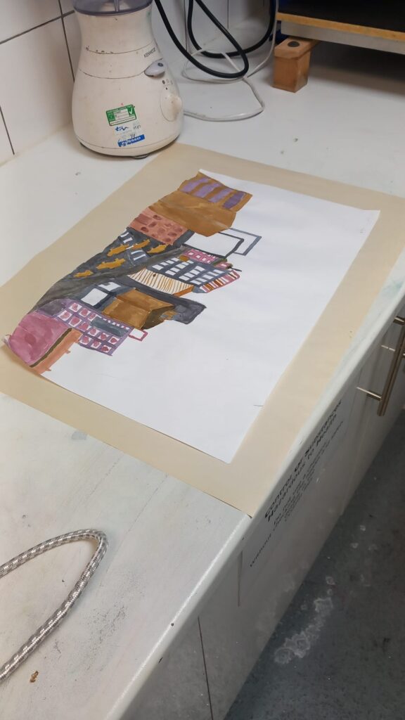
Here is where I began setting up my ink designs ready for the sublimation machine. I had one of my classmates help me out with the process as it was tedious and the fabric was large and I needed another hand to help me place it in the machine. This was one of my designs and I put it on top of this big sheet of paper. I did this because the heat was too much and could possibly burn the paper and the fabric itself so we had to sandwich it between 2 big sheets of paper. At first, I got scrap paper and decided to test the design out on that.
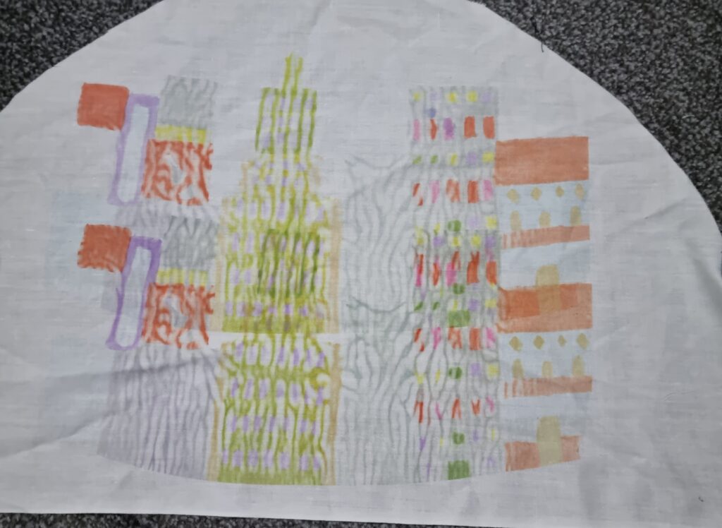
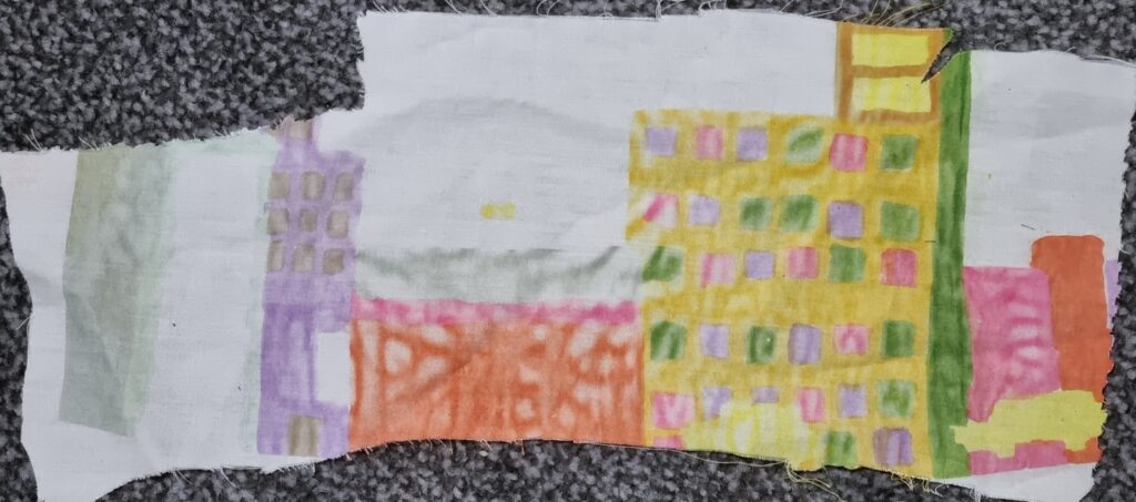
Here are the 2 scrap fabrics that I tested out my design on. Unfortunately, it didn’t turn out like how my previous testing did. There were these random lines that interfered with the process and the colours weren’t as vibrant, especially with the first design. It was more washed out and had very visible lines. I didn’t know what was the cause of this but later found out it was the big sheets of paper that caused the lines and maybe possibly the machine settings needed to be higher for the colour to become darker. In the end, I thought that even if the colours were lighter, it still linked in with how Clare Caulfield uses watercolours and how the sublimation replicates that look. For the lines, however, I tried swapping it out for a different sheet of paper which made the lines less visible but it was still a hindrance to the process. However, after testing it I didn’t know how to resolve this problem and continued to just do it on my final piece. In the end, even if there were lines in the sublimation printing I didn’t think it looked too bad and thought it was just a learning curb to solve for next time.
Here is where I finally began using the sublimation machine for my skirt. The settings for this machine were on about 120 degrees and had a 30-second countdown for when I needed to take the fabric out. I had my classmate help put it under the machine as the fabric was big and kept sliding everywhere. I aligned my design underneath the fabric and then put the big sheet on top. I then moved it towards the machine and we checked just in case the design moved out of place. I then closed the top part of the machine down and we waited 30 seconds for it to work. Once I pushed the top part back up, I saw that the design was too light and decided to let it sit under the machine again twice. After that, I took the design out and saw that the design came out better and more stronger with the colours and decided for all the other designs I would let it sit in the machine twice so the colour came out vibrant. I wasn’t 100% sure it would work but I’m glad it did and I’m glad I tested that out. For health and safety reasons use something like tweezers to take your artwork out as it is extremely hot and you could burn yourself.
Here is the process and how the design came out.
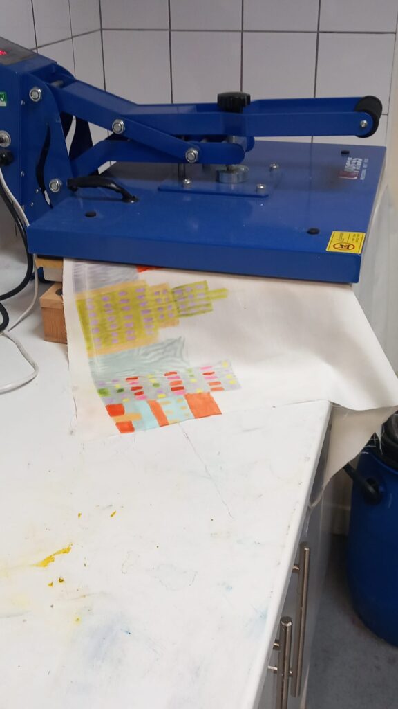
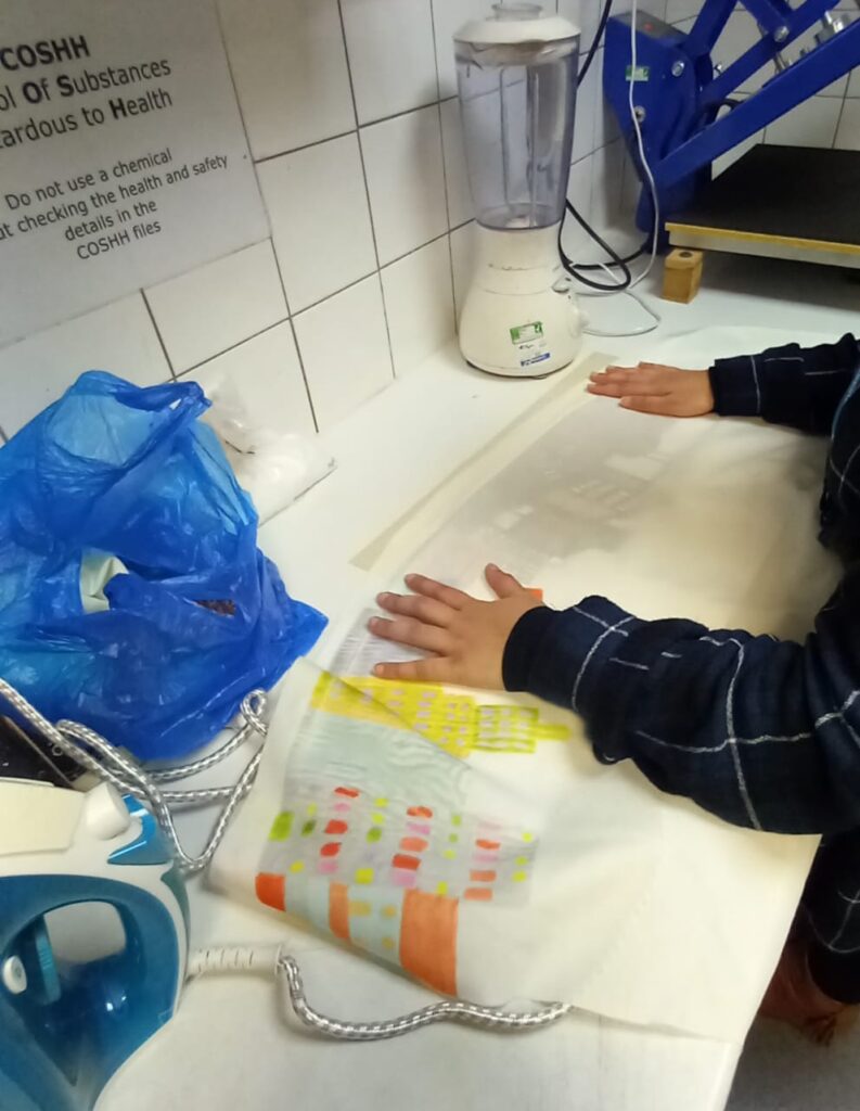
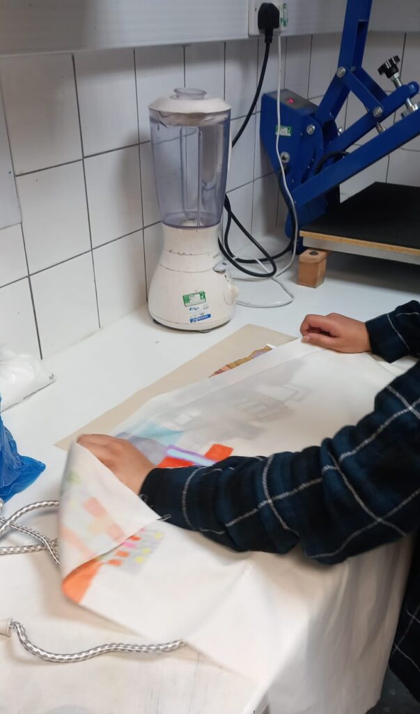
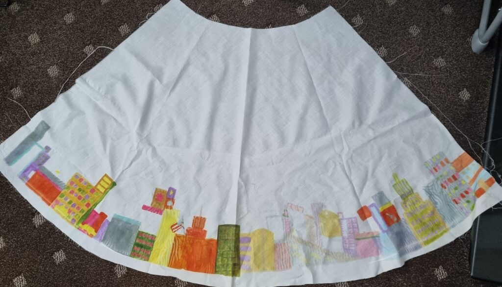
This is the final product of how the design came out. I had forgotten to take a picture of the other skirt design however it is the same as this one. In the end, I’m glad that I put the fabric under the sublimation machine twice as the colours came out more vibrant. The lines however are still in most of the print but I couldn’t do anything about it and I am still happy with the progress especially as everything can’t turn out the way you want it to.
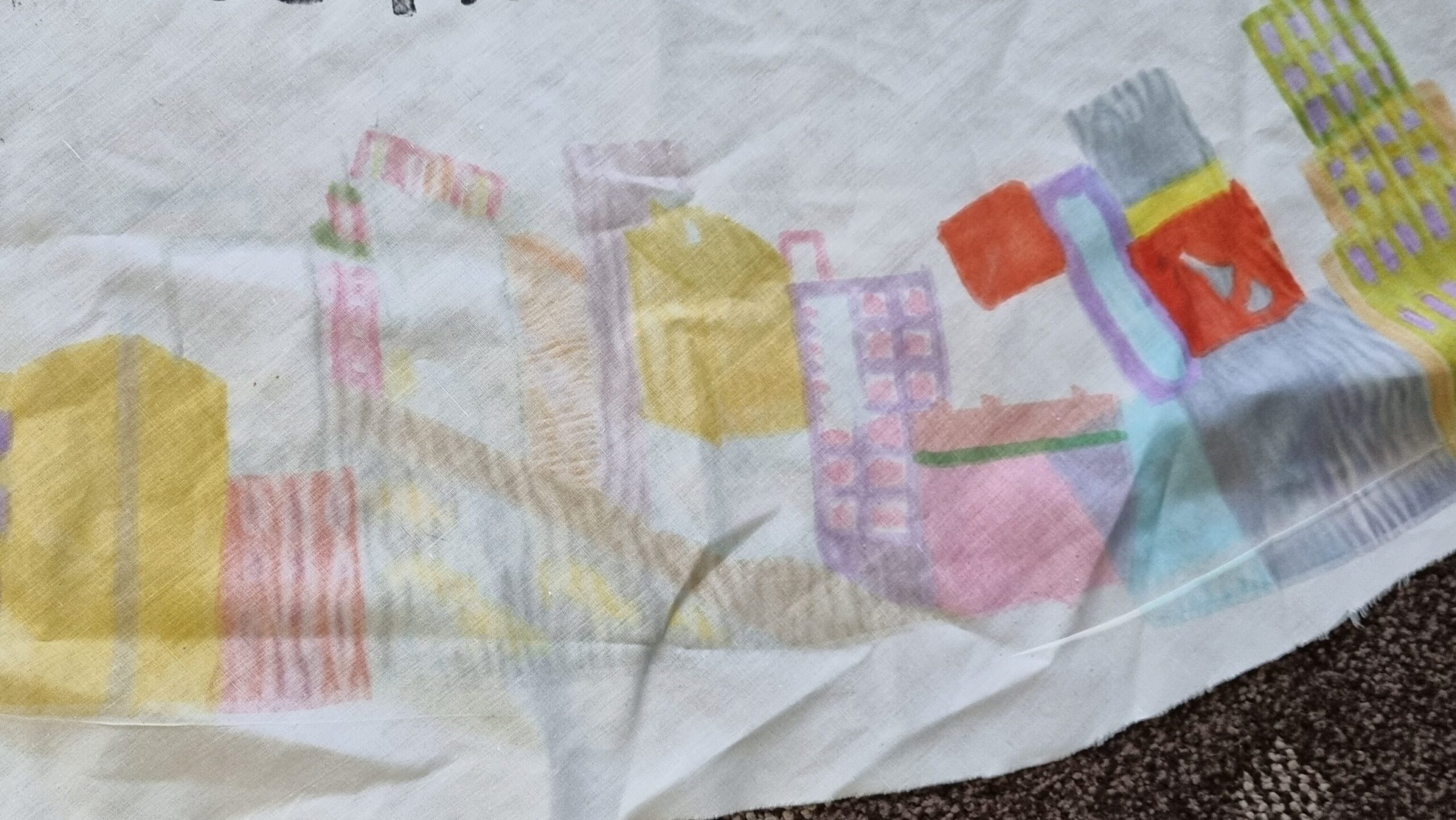
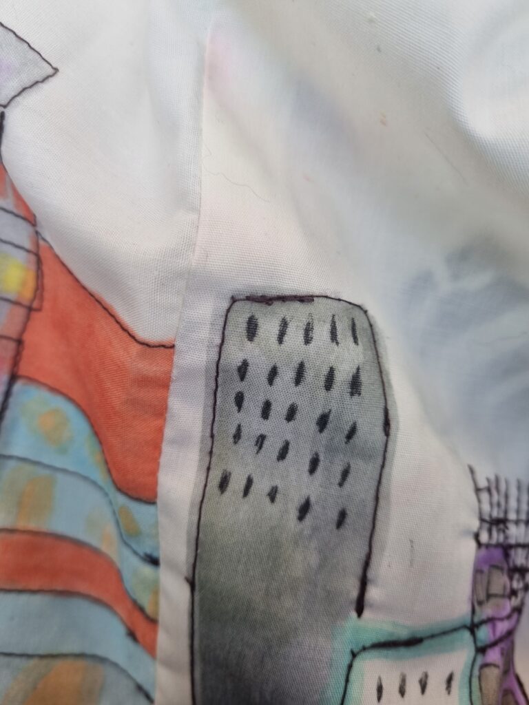
I zoomed in closely to this print because I had made a mistake and printed the design backwards. Some mistakes were made in the process of making the skirt but I found ways around it. Due to how I was going to be sewing over the design anyway with a darker colour, I didn’t think too much of it and decided to leave it as it wouldn’t be too noticeable. I’m glad I did the design twice because if I had done it once it wouldn’t have shown up on the other side of the fabric. Next time I’ll make sure to check which side I’ll be printing on so I don’t come across this issue again however I am satisfied with the end result.
Sewing
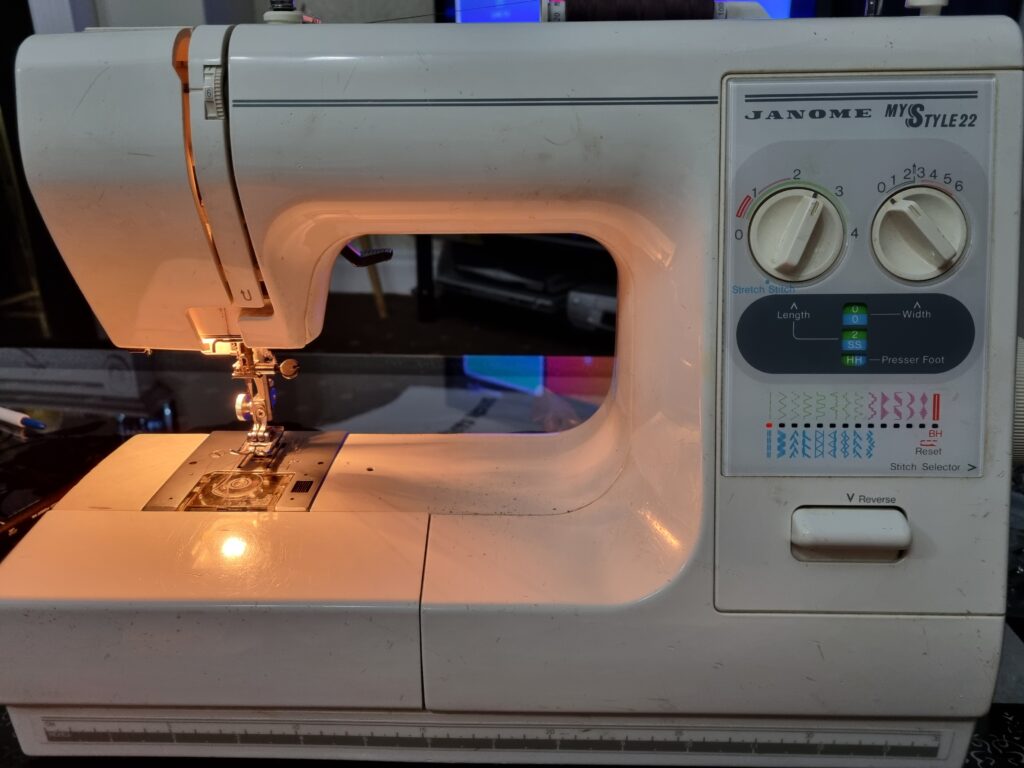
Here is where I began sewing the outlining of the buildings. It took some time as sometimes the thread would gather in one place by accident or how it would get stuck but I successfully have sewn all the buildings. I worked from my own home sewing machine to get this done so then at college I could focus on assembling the pieces together.
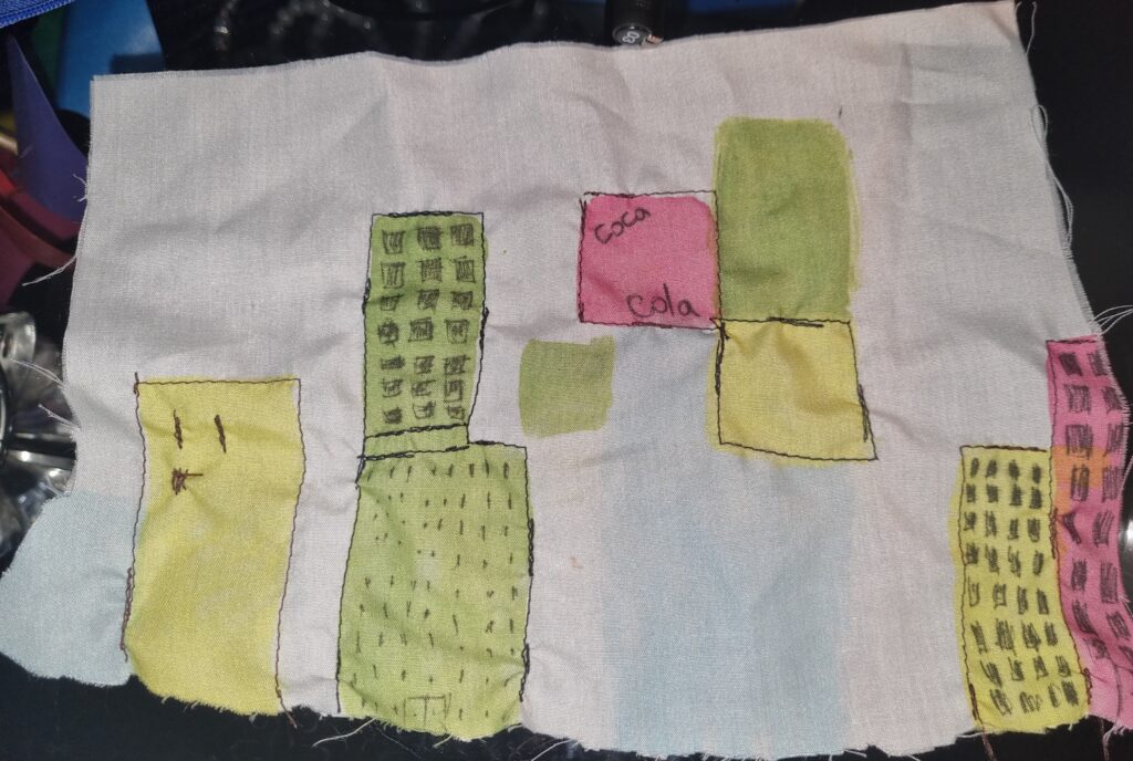
Here is the test that I did to see what thread looked better. I tried using a dark brown or a black one to relate to how Clare Caulfield uses black or brown to outline her artwork. I thought that black was too dark and decided to stick with dark brown. I then also tried sewing in the windows to see if they would look ok however it was a tedious task and very time-consuming so I decided to use a black pigmented fine liner pen to do the job to make the windows and it worked perfectly. What I like about Clare Caulfield’s work is that it is messy and sewing creates that effect so I used that to my advantage.
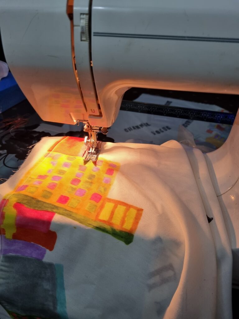
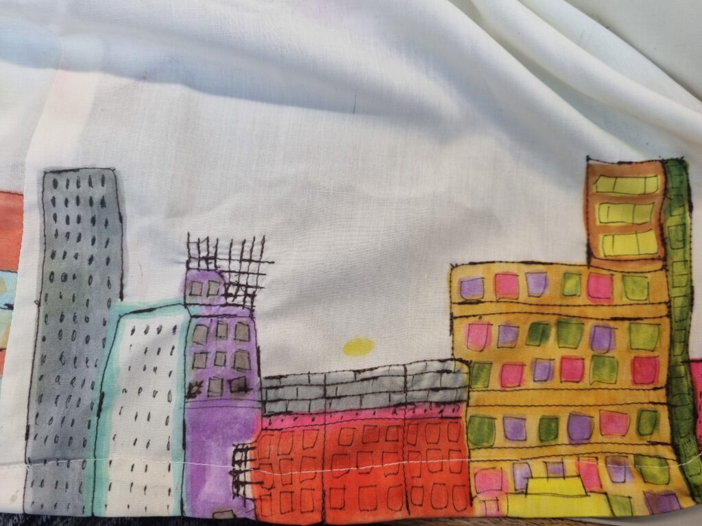
Here is where I took an image of the sewing I had done. I wanted a close-up picture to look into the details. I used a pen to outline the windows and had sewn the outlines. I even decided to sew the wires that are coming out of the building as it shows construction and a journey through Manhattan being built.
Typography
I wasn’t going to do typography but more just using sublimation for it however, one of my tutors gave me the idea of doing typography and how the words would come out better so I decided last minute I’d do that. I researched a few artists who do typography and I came across Craig Ward. I used his work to inspire mine and did the typography for the words I wanted to use for the billboard design.
This was a practice test I had done. I accidentally did the words backwards thinking I had to do it like that however it was fine the way it was and I had to just make sure I had the lettering the right way. Although I had done it backwards, what I liked about typography was how it gave the feeling I wanted to convey which is messy but the feeling of it being worn out. Since I’m doing a journey about how Manhattan is being built, this made it seem like one of the old buildings in Manhattan had been worn out and new construction was being made. I liked the texture and I liked how it reminded me of a newspaper headline. In the end, I stuck with typography and used different words to express Manhattan and fashion onto my skirt.

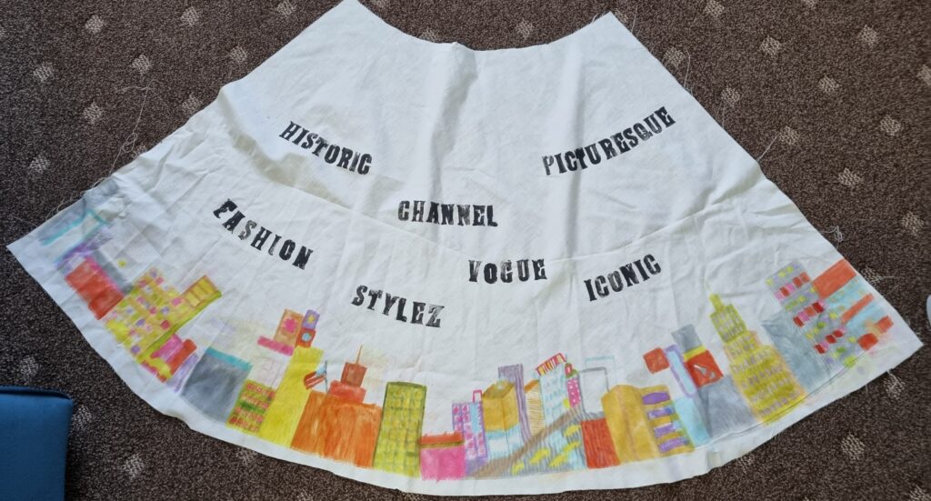
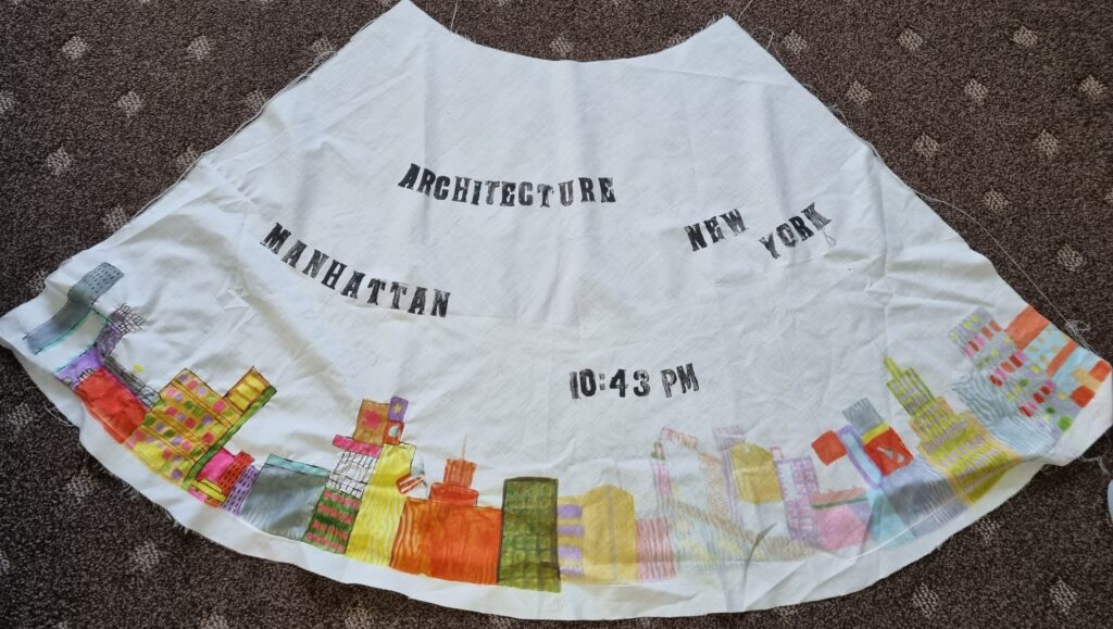
Craig Ward- Artist Research
Craig Ward is a typographer and art director whose work mostly revolves around the juxtaposition of clean, classic type with various organic or uncontrolled processes. He likes to take inspiration from not necessarily the artist’s work but the process and how there might be accidents, misprinted posters, peeling, faded, broken signs or any other mishaps that could happen to someone’s art or to anything in general. He also looks at the fashion and art worlds for material inspiration. He likes to have more free roam with his work without limitations to express his ideas too. His favourite designs are ones that are simple and minimal so he doesn’t overthink his artwork and it still conveys the message he wants. He has also been fascinated by generative processes that are human-based and code-based which got him thinking what if he combined both and created a font with that. He then began using NFTypeface to generate code-based typography instead and he has experimented loads with that and now creates modern-based typography with more of using a computer than traditional typography.
This is the NFType he used to make typography with and he’s created art with it.

Some more of his work.


This is the type of font I used for my typography. What I liked about this particular one was how the letter D seemed like an ink splatter. It gave off this cool effect that I really liked. Unfortunately, I didn’t do the same as Craig Ward did with the ink splatter but more of just simple lettering. Next time what I could do is experiment more and do some of his typography art instead of just normal typography. What I liked about his art was how he used his computer to generate Typography or he did traditional typography. Next time I’ll make sure to further experiment with his typography work and gain more of an insight into his work and how he does it.
I decided to message him on Instagram at Mrcraigward to ask for more of an insight into his work. He replied and told me how he gains his inspiration for his work and how now he focuses on promotional works and creating typography for brands. This gives me more of an idea on what he does and how he does it.

Craig Ward (2019) The Type Directors Club. Available at: https://www.tdc.org/profiles/craig-ward/ (Accessed: 31 January 2024).
Carter, W.B.D. (2023) Craig Ward has revolutionised the creation of custom fonts with NFTy.pe, Creative Boom. Available at: https://www.creativeboom.com/news/nftype/ (Accessed: 31 January 2024).
Assembling the bow
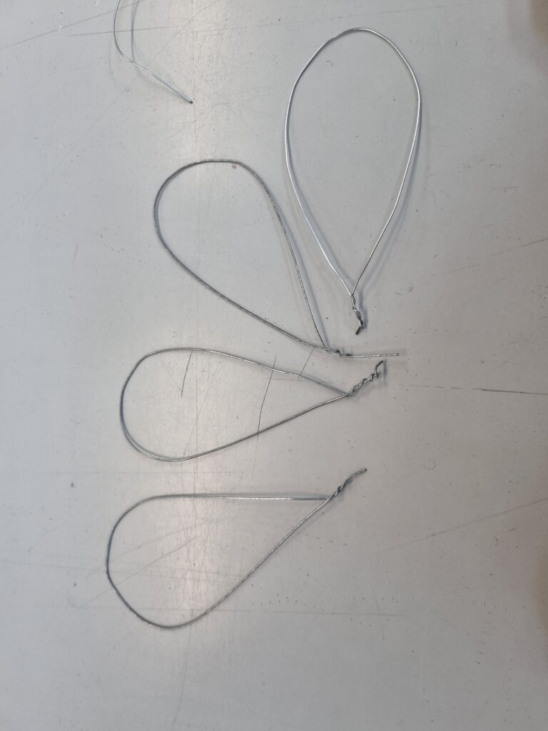
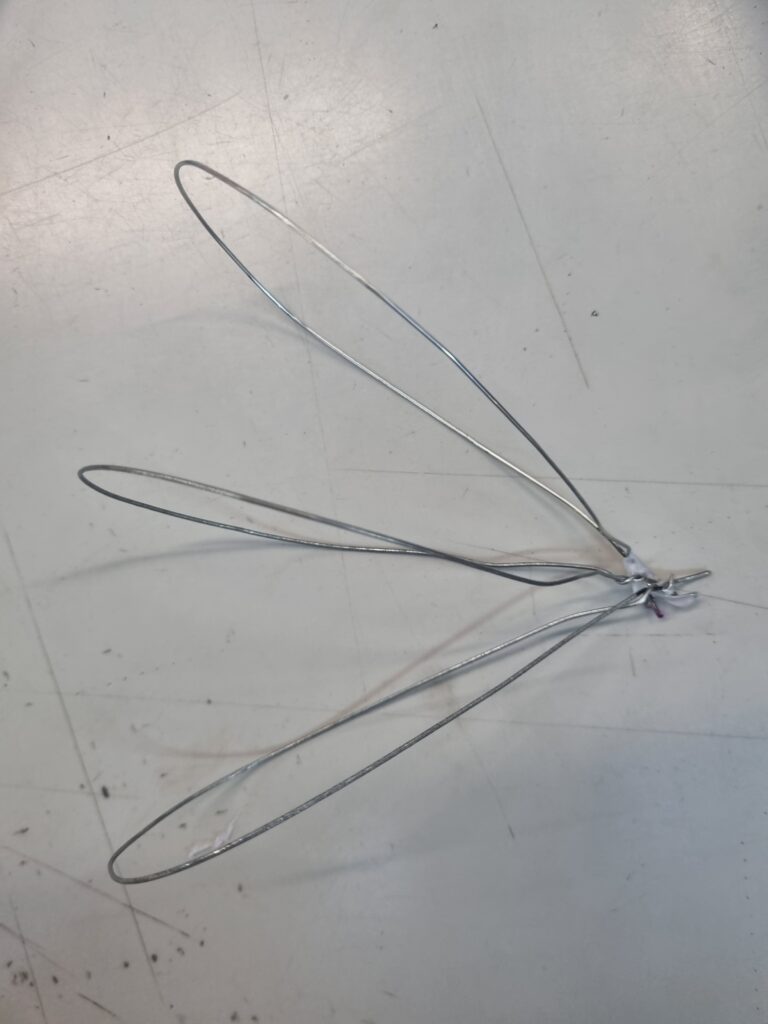
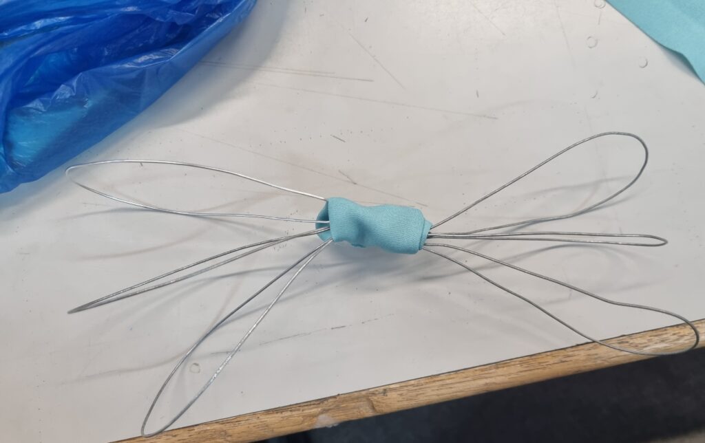
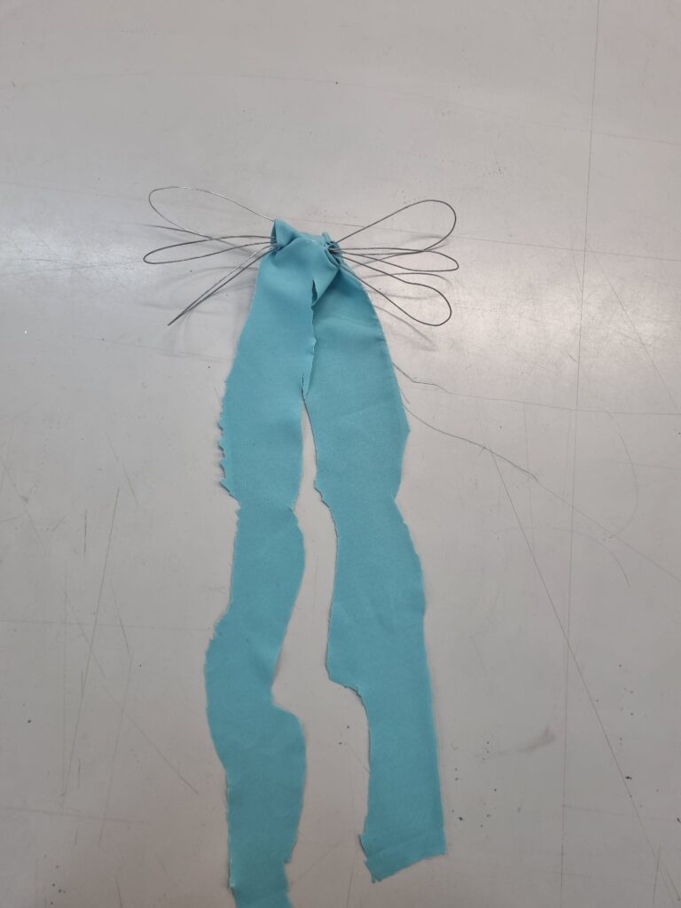
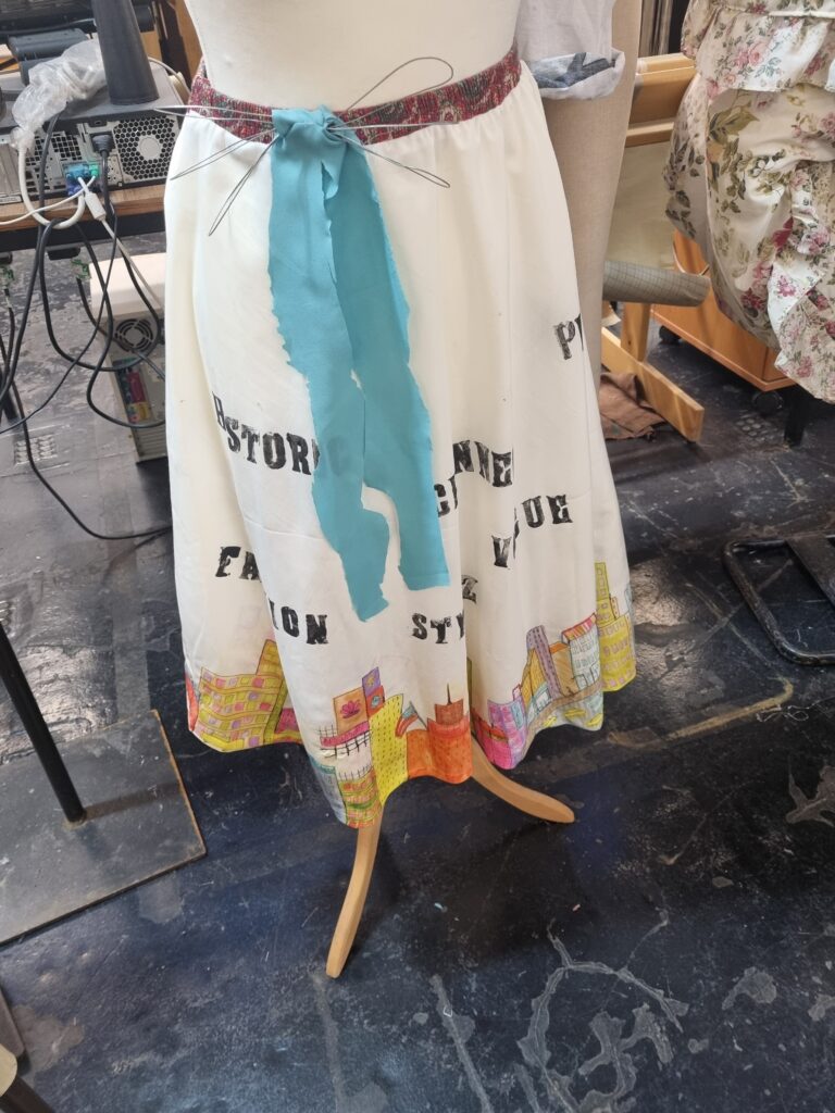
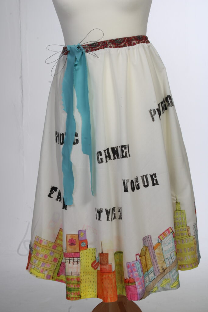
For the bow, I wanted it to replicate that it’s still being constructed due to how my journey is about Manhattan being made. I decided to make the bow out of wires and create circles with it. I then tried using a hot glue gun to attach it together however it wasn’t a rough surface so the hot glue gun wouldn’t stay on properly. To tackle this problem, I decided to get the blue fabric I was using and wrap it around the middle of it to secure the attachment. What I like about this bow is how it’s supposed to give a messy and uneven look as it’s still being assembled and attached together. To avoid the bow from not working out, I could have experimented more with the bow and should have seen what equipment I could use to hold it together for example using tape or binding the wires together in the middle. After I had done, it was time to add the fabric hanging from the bow. I decided, since this bow is still being constructed, I would make the ends messy. I cut it in a messy manner and it came out looking how I wanted it to. After assembling the pieces together for the bow, I then hot glue gunned it down to the dress. I like how the bow came out in the end however the bow isn’t very much visible due to the wire being thin. Next time I could improve the design of the bow and experiment more with how I could have made the bow turn out.
The final parts
After I finally had done the typography, the sublimation printing and the sewing, it was time to assemble the final pieces of my work.
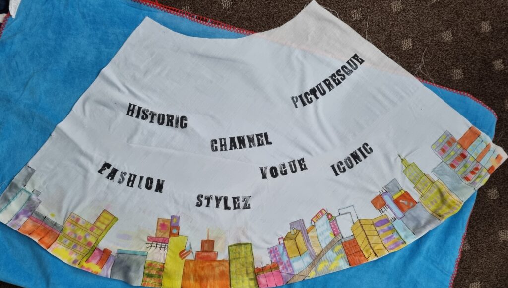
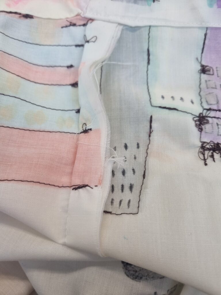
Here is where I have sewn the 2 pieces of skirt together and I took a picture to show the results of that and how I have sewn it. I sewed it from the inside out as you would normally do and I even did the trimming so it looked more neat and kept and so no threads come out. I didn’t take a picture but I also found old fabric from my pants with an elastic inside and even though the pattern did not match my theme, I thought it connected to it in a way and how it was different and tied the Manhattan look together. I then sewed the elastic to the top of the skirt and it turned out so well as it now could fit the mannequin perfectly.
Final outcome
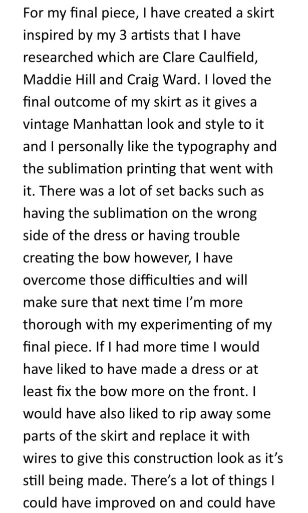
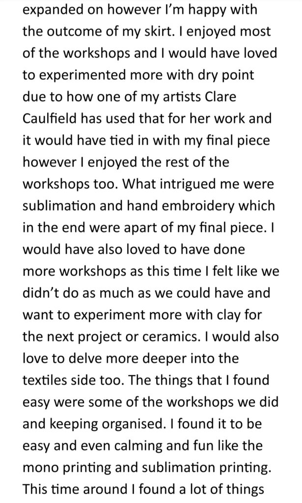
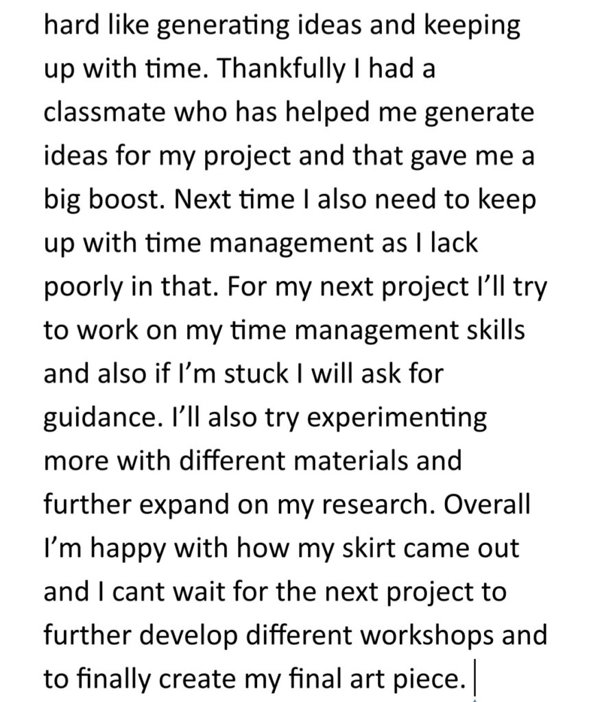
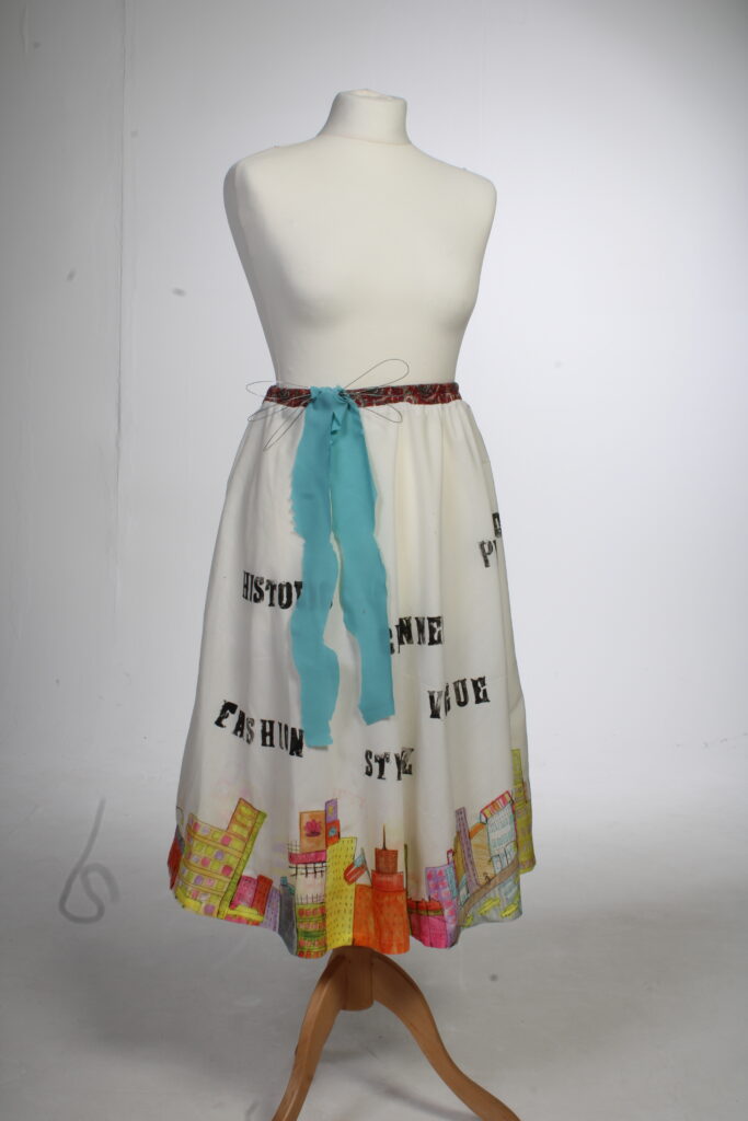
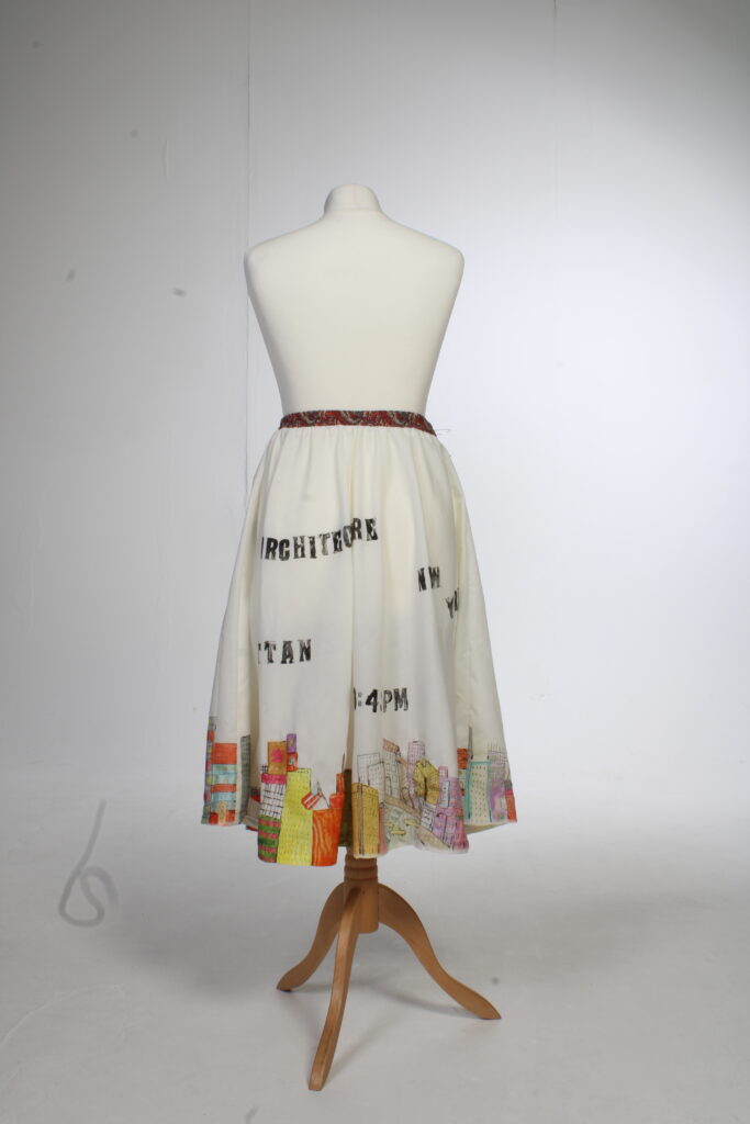
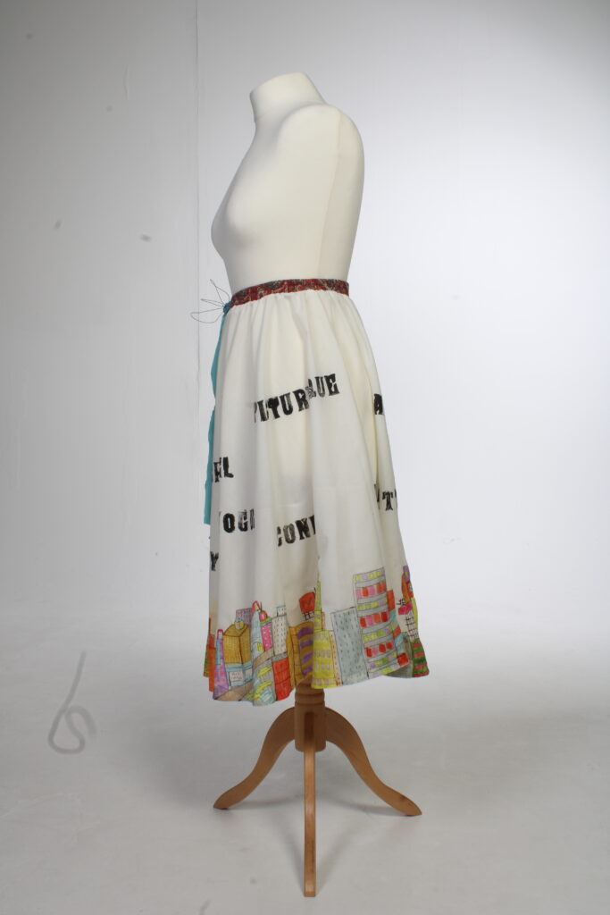
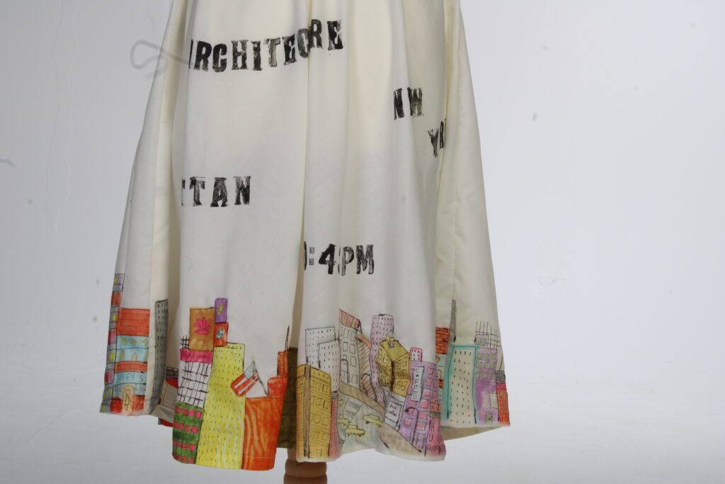
I am so happy with how my skirt came out and although there were a lot of problems to face while making it, in the end, everything tied we’ll together. I took some photos of the skirt in the photography studio and the pictures came out really well. I’m proud of this piece especially as I’ve had to do things I’ve never done before and I enjoyed the process. If I were to do this again maybe I could make the skirt into a dress or if I want to present it more better I could add words at the top from my typography work and stick them around it or even have bows or pieces of fabric tied around the mannequin.
Library Exhibition
At first, I didn’t know what I was going to be making. I had an idea of a hat that had buildings on top or a garment. In the end, I didn’t take as many pictures of the library spaces as I hoped to due to not knowing what I would make.
There were a few spaces to exhibit in the library. I thought maybe I could put my work near the pillars, windows or even in a corner. I thought about exhibiting a hat or a garment and hadn’t decided which one I would choose however in the end I chose a garment. The mannequin is quite big so it would have to be in a space where there isn’t much around and you can still get past. I thought about what I couldn’t do for this exhibition like create something offensive as it could affect people’s beliefs or something that shows nudity. At the end of the day this visit has changed my viewpoint on how small the library actually is and how there’s not much space to put a mannequin if I was to make a garment.
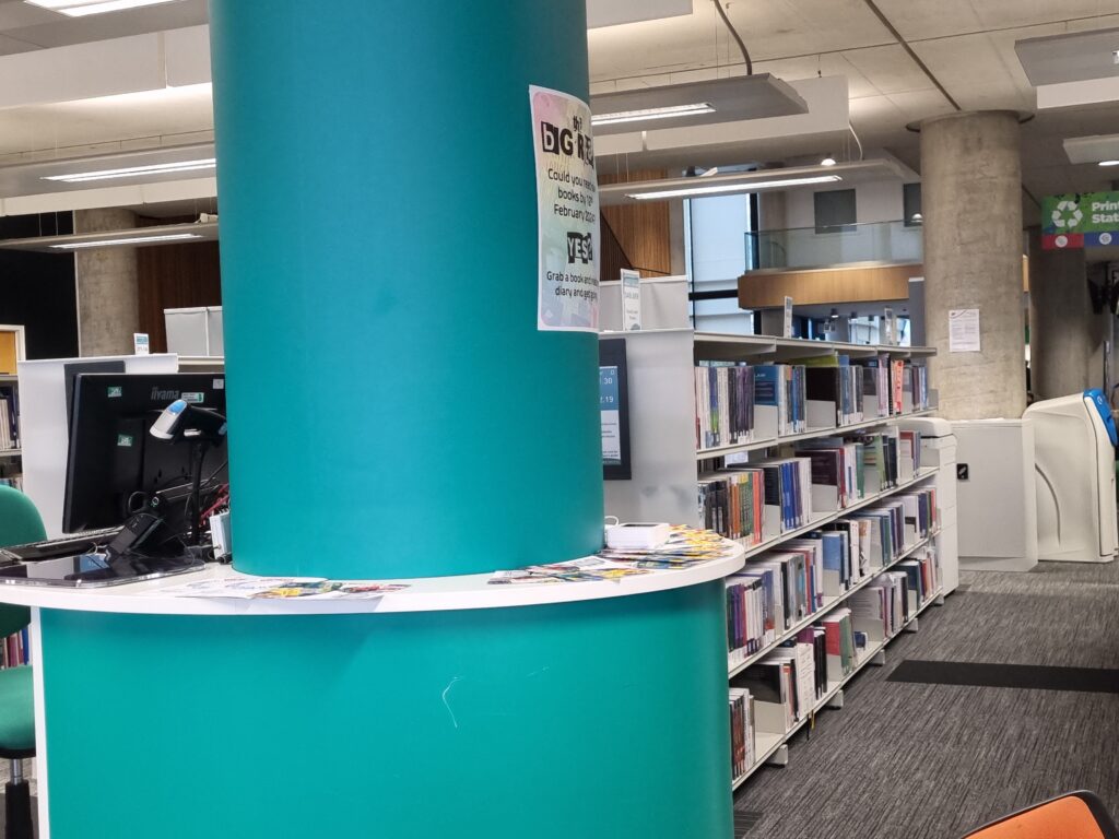
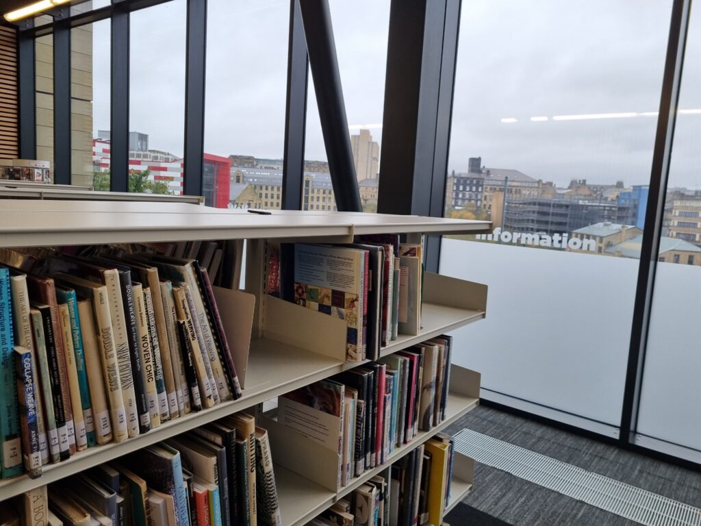
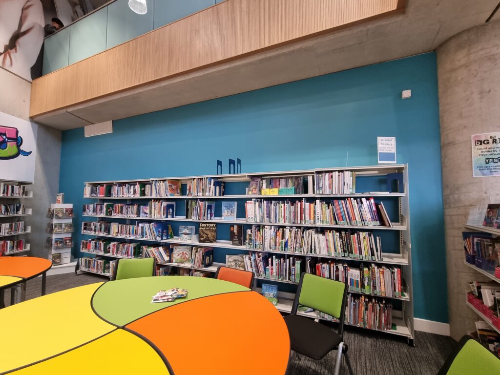
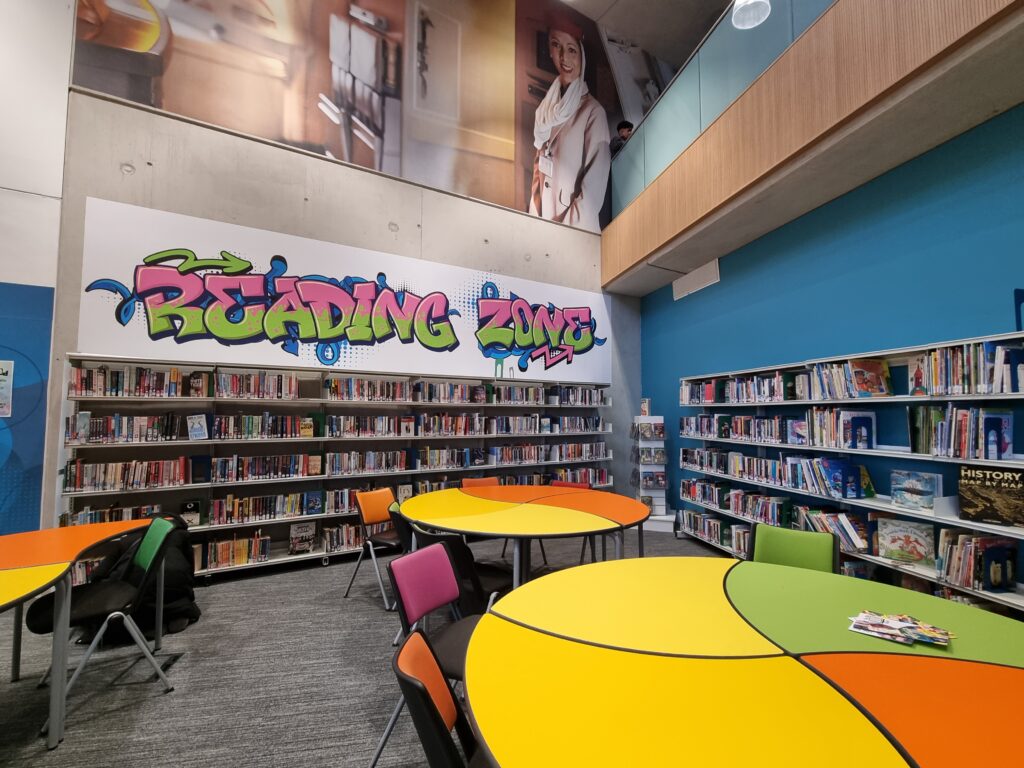
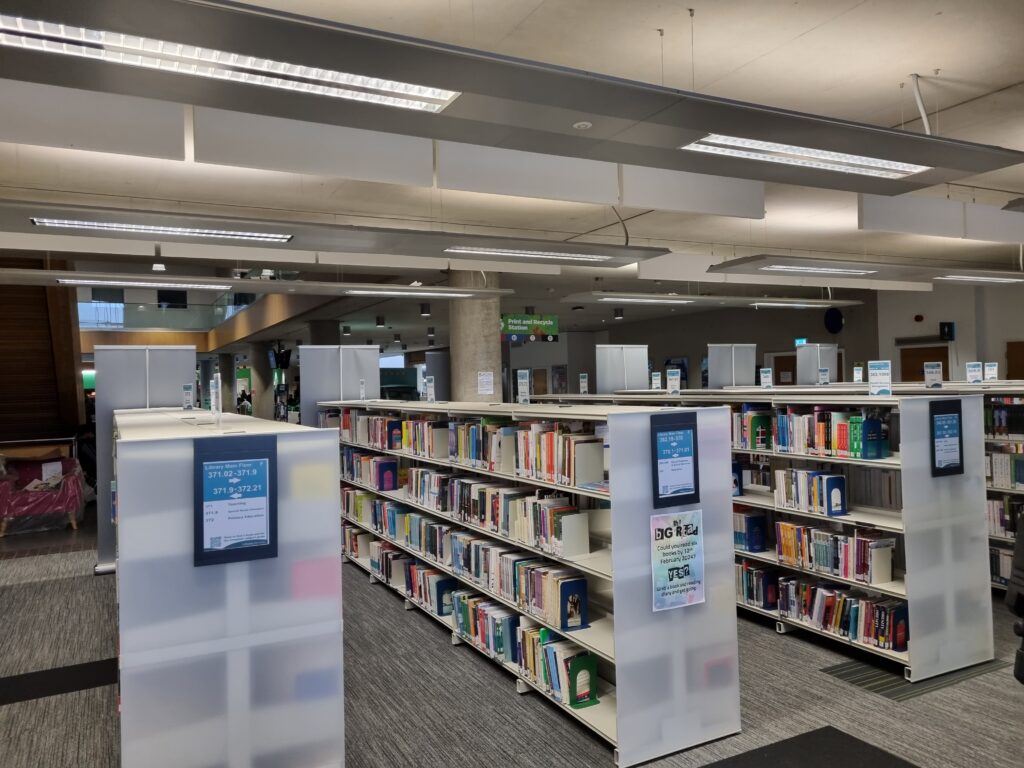
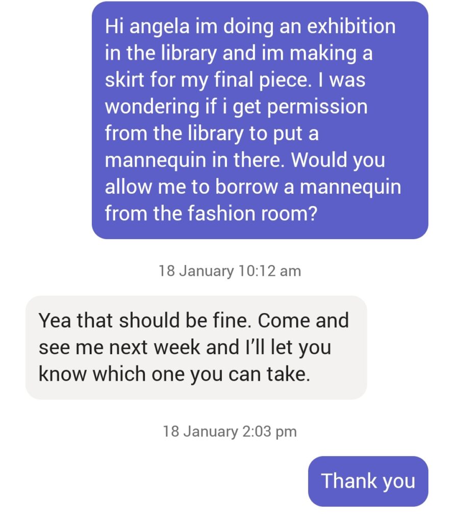
I decided to ask the library for permission if I could put a mannequin in the library and they agreed to do so and I also even asked the head of fashion which is Angela Loftus if I could borrow a mannequin and she allowed me as well. In the end, if I were to put my garment anywhere it would be in the library space next to the desk to check out to the right where it’s out of the way but still visible to be seen.
Evaluation
