Maddie Hill
I went to James Owen Thomas’ exhibition and found her artwork to be in one of the little rooms and I am glad I took pictures of her work. She creates paintings of different buildings as she states below she wants to be an architect. I visited her Instagram page maddiehill_art and saw she did cityscapes and other various paintings that included some abstract form of buildings. I couldn’t find much information about her online as she was a small artist however her Instagram made me realise how different and unique her work is and how her contemporary art has different qualities about it.
Below is the information she provided for herself with various artworks of hers in the gallery.
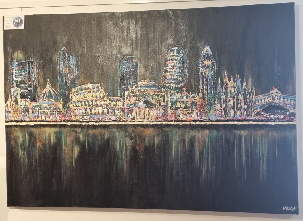
These were the 2 art pieces that caught my attention and I’m glad I took pictures as it relates to my concept now. The first artwork of hers is in more detail than the second one. What I like about it is how detailed it is but in reality, she didn’t actually focus on the details but rather the bigger picture by scraping big blobs of paint as windows and creating shadows. I noticed for the background, even though it’s black, she used white to contrast with it as if it’s a ghostly shadow for the cityscape. She has also mixed different colours together and due to it having some little 3D elements it makes me believe that she used a spatula for the shadows and details. I like how the shadows she created initially make the light and texture of the building. It just shows if you don’t focus on the details too much you could still create a different type of detail. I don’t know what inspired her to do this painting and I don’t know what reference she took for this but it seems to me that she’s created different types of landmarks combined in one. For example, I think she’s made Big Ben on the right-hand side next to the Leaning Tower of Pizza. Even having the Colosseum next to which I presume is a museum. She has combined famous landmarks together is what I take from this. I like the different use of colours and I also like how she’s created a ghostly reflection in the water. Her artwork inspires me with how I want to do my final piece about buildings. I don’t think I’ll be using her artstyle for my final piece as I want to do something textiles-based however her work has influenced my idea further. I went from wanting to do a skyline to now creating a series of buildings. I’m also going to do her technique of less is more. I won’t add too much detail however I will add details to make it look complete but not too busy with the look. After testing sublimation printing, I think it could help me pull off that look Maddie Hill conveys with her artwork and sew in the bigger details.
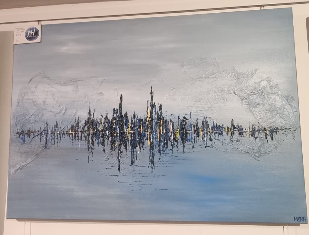
This is the second artwork I took a picture of. This one is a lot different from the one above as it’s more abstract and not visible to the eye on what it could be. It could be interpreted in many ways. I like how simple yet detailed it is. She shrowded the background in mist and has created a waterline where you can see the reflection of the city below in the water. For the background shes also molded something into the painting. Maybe tissue paper or something else however it creates such a cool and 3d effect. what I like is how she’s also stuck to 3 simple colours. Blue, yellow and white. The values mostly being in different shades however it contrasts so well by having the colours vibrant in the foreground and in the background more muted. This artwork kind of links in with my skyline concept as it’s just the outline of the buildings no details whatsoever. It’s almost enticing yet mysterious. What I like about this is the simplicity. In the end, I don’t think I’ll be using her artwork to inspire my final piece (like I’ve stated before) but rather her ideas to inspire mine with the skyline and the buildings.
Messaging
I tried messaging her on Instagram but she never reached back to me however at least I tried and have primary research to prove I tried gathering information from the artist herself.

These are more cityscape artwork of hers.


Clare Caulfield
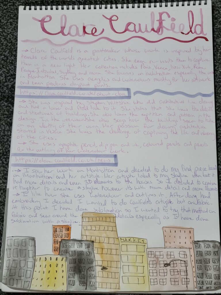
I wrote stuff about Clare Caulfield and how I will be using her artwork for my final piece. I talked about my idea too about how I could swap out watercolour with sublimation and outline the work with sewing than a pen. I chose Clare Caulfield as an artist due to how her work follows up with Maddie Hills but I can manipulate it and make it more textiled based by still using her style. Also because on her Instagram page, I had seen her go to Manhattan and drawn a lot of what she saw and had a lot of drawings from Manhattan which helped me with my research and will help me with my final piece. I decided I would do a garment and imprint this design onto the garment.
Harvard referencing:
About (no date) Clare Caulfield – UK Artist and Printmaker. Available at: https://clarecaulfield.co.uk/about-clare (Accessed: 30 January 2024).
News / exhibitions (no date) Clare Caulfield – UK Artist and Printmaker. Available at: https://clarecaulfield.co.uk/news (Accessed: 30 January 2024).
Messaging
I tried to message her on Instagram at Clare Caulfield but she never responded. This is another primary research I have done even if the artist hasn’t replied. Although she didn’t reply I still gathered information about what materials she uses and her thought process throughout her workings.

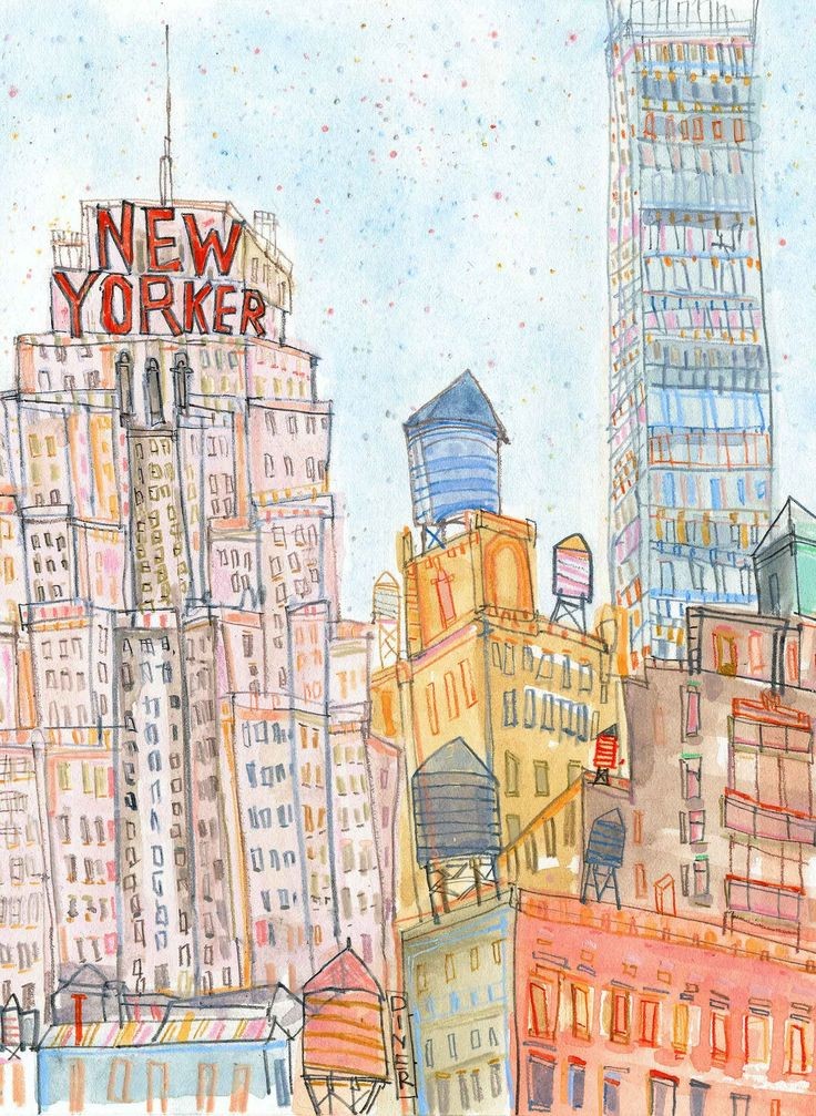
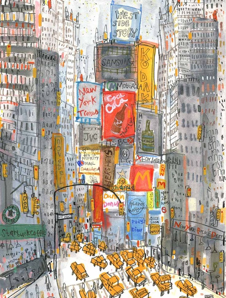
I have a lot of images from her art however I chose to just evaluate these 2 art pieces instead. The first drawing has a lot of messy lines. it’s not set in place and has more monotone colours for the buildings but for the build boards it has vibrant colours to contrast which makes me believe she wanted the viewers to focus on the middle of the artwork and become drawn to it. What I also like is the different ways of her making the windows. Some were thinner than others while some were simple scribbles. The taxis also weren’t intricately detailed just like how Maddie Hill does her work. She doesn’t add too many details however I think the difference between her and Clare Caulfield is that Clare likes to add little intricate designs but it doesn’t take away from the art piece it just makes it more full and busy kind of contrasting with how new york is so busy itself and how the streets are always bustling with noise. I like how it’s not neat and tidy but messy but I also like the way it looks busy. I’m definitely using Clare Caulfield’s art style for my final piece as it is unique and she even has a lot of artworks about Manhattan which makes it easier for me to take reference from.
For this artwork, however, she uses more vibrant colours instead and more lighter colours. It looks like she used watercolour for this art piece which is why it gives a light but watery texture. It’s also more 3D here having 3D buildings instead of just 2D. As I’ve used sublimation and want to interpret it into my final piece, I realise that sublimation kind of resembles the light kind of effect as 1 of my artworks turned out to come out lighter than expected which resembles Clare Caulfield’s art. I’ll be experimenting more with sublimation in Clare Caulfield’s art style and seeing how well it works together.
