Dry Point
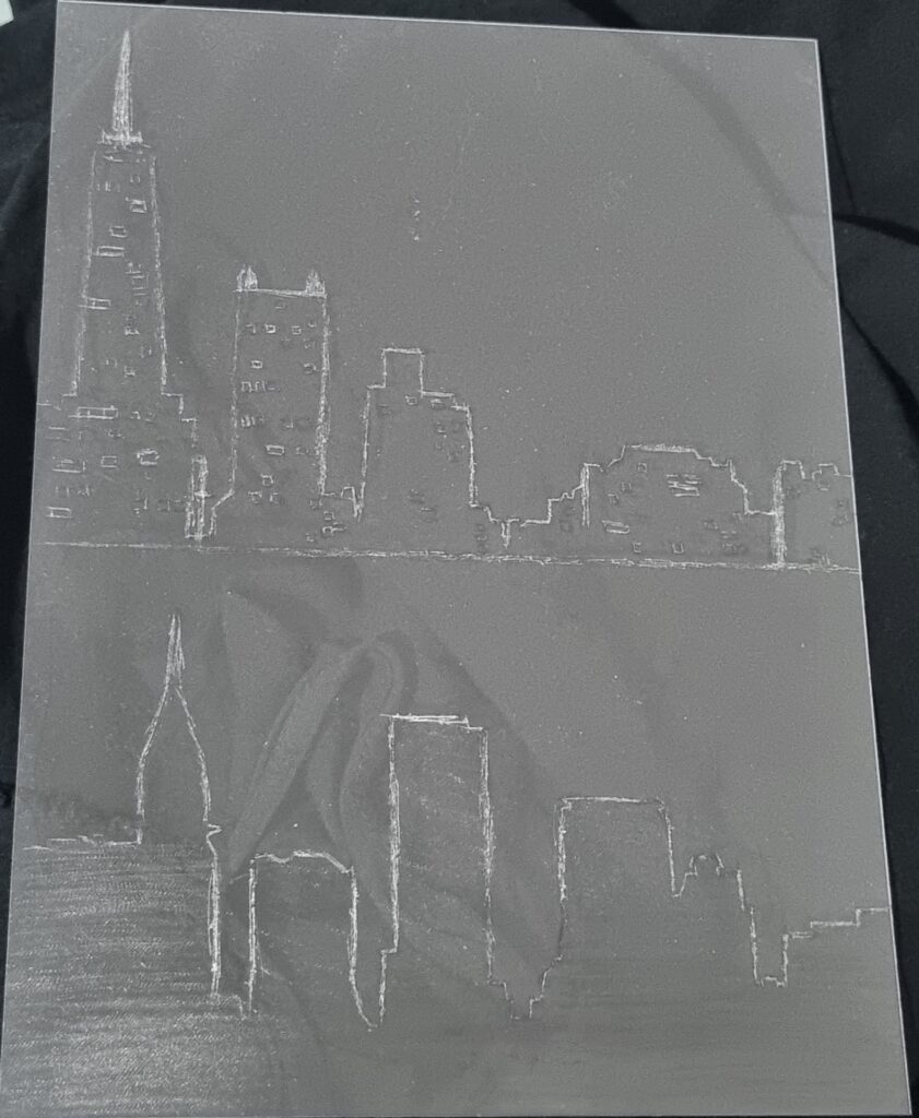
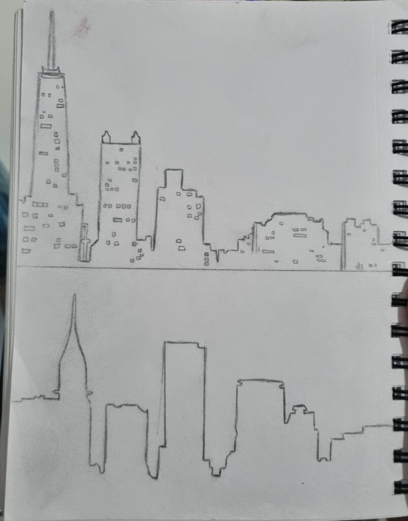
This was my sketch for the dry point. I found pictures of the skyline on Pinterest which inspired me to make the dry point about it. I have already done idea-generating about buildings, so I still wanted to follow that theme. Coming across the skyline images helped me further develop my idea of what I’m doing for my final piece. I decided to do 2 drawings so I could experiment more with it.

Inspiration
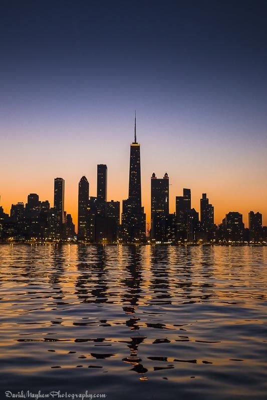
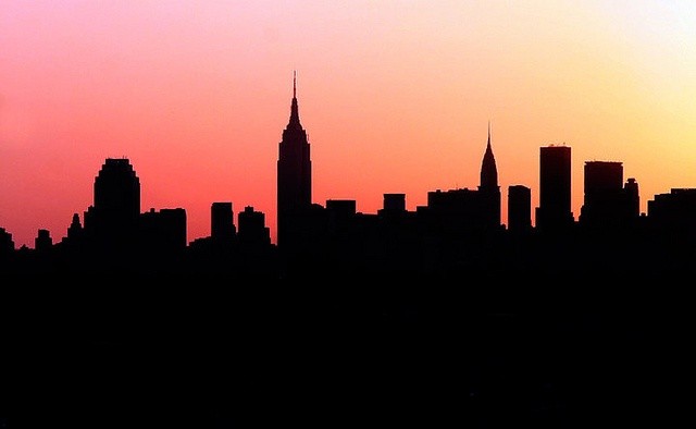
Here are the images I replicated to use for the dry point.
Process
For this process, we had a thin piece of transparent plastic which we scratched our design into using a specific type of needle. I scratched the outline for the top one but for the bottom one I added texture to the plastic. We used a more roll needle type of tool for this one where it didn’t leave an indent but rather tiny textures. I enjoyed doing this as scratching into the plastic was fun and how I could use different texture tools to create more depth to my artwork. However, due to not being able to be here for the other lessons to do this, I do not have the final product of this where we had to put it under a machine where it would push the ink that we put on the plastic onto paper. Next time I should finish this to really see the final outcome and to see if it had worked. Due to my artist Clare Caulfield who uses dry point for most of her work, if I was able to finish it, I could have used dry point to influence my final piece to really link it to my artist.
Mono Printing
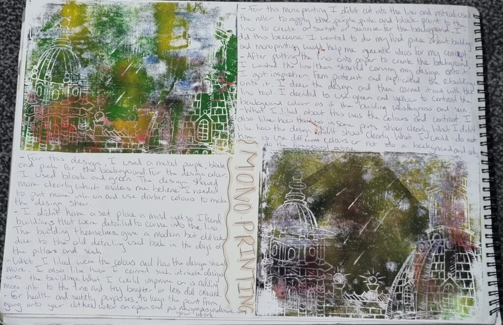
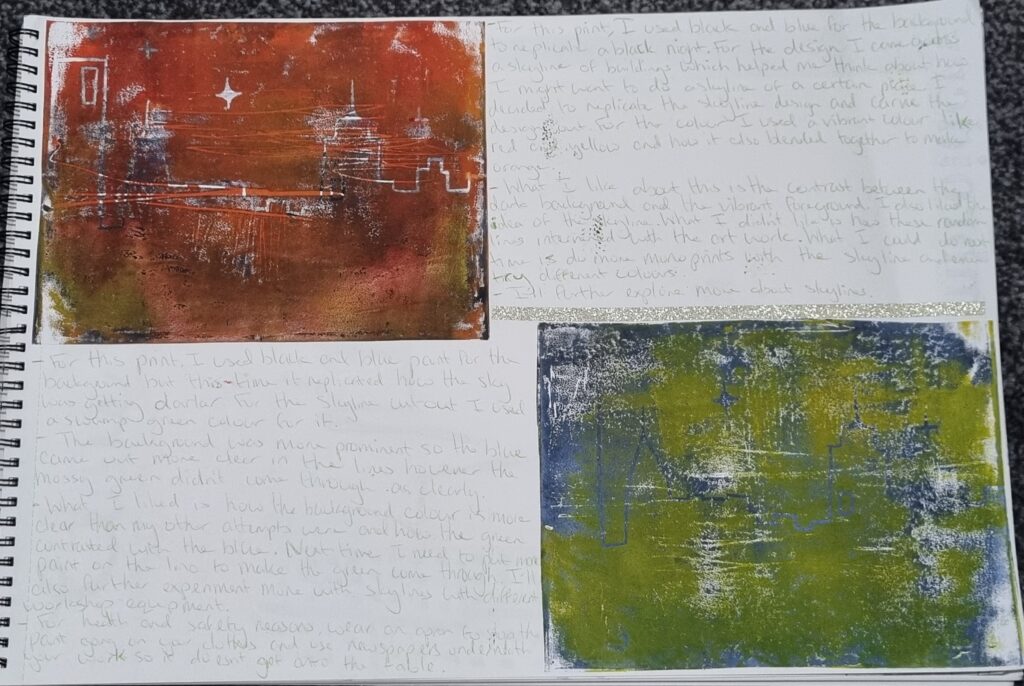
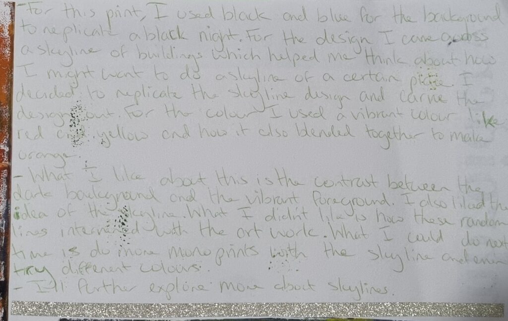
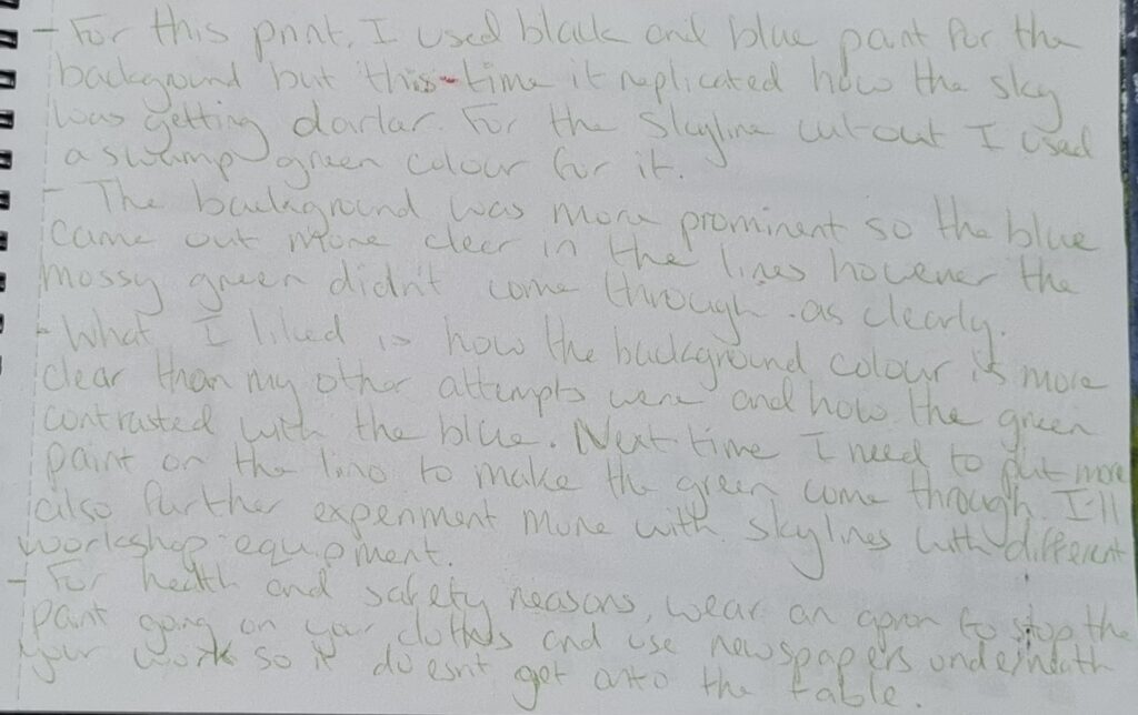
I’ve already mostly explained everything here however I’ll further link it to my other workshops I have done later on.
Process
Here is the process of me sketching my design out using 2 reference photos. I then began carving out the design for it.
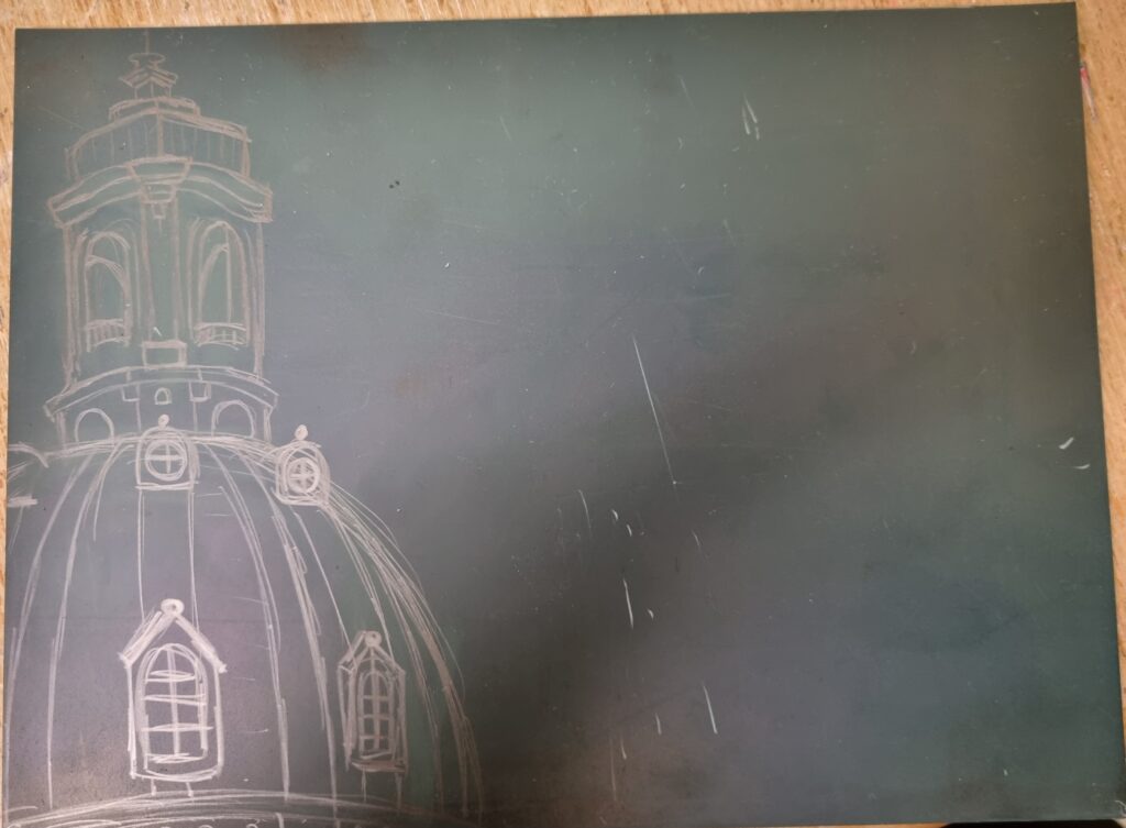
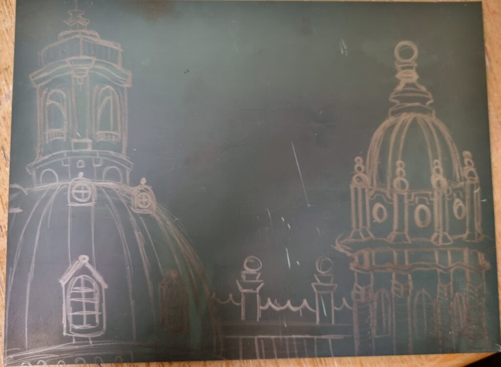
Here is when I began adding little details like shadows and lines to indicate the light is beaming from the lamp.
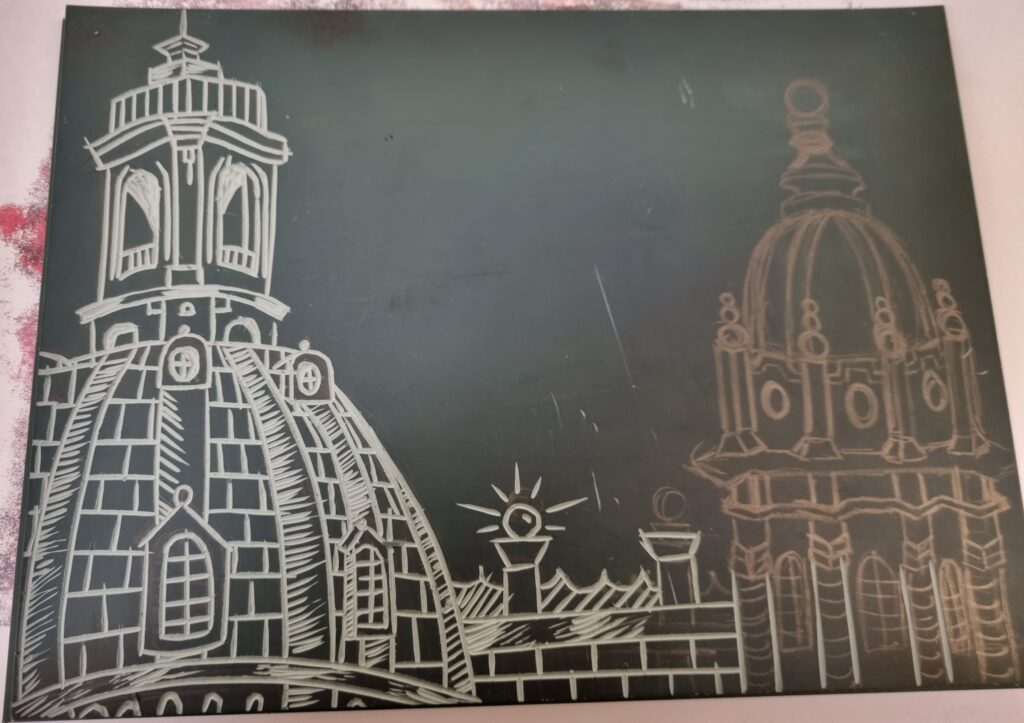
I added little stars shooting from the sky.
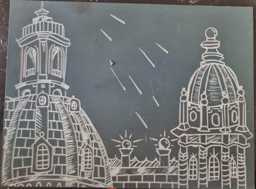
This is my second Lino cut-out. I used the same reference photo as I did for dry point to carry out to see if I wanted to do a skyline for my final piece and if it was the best choice.
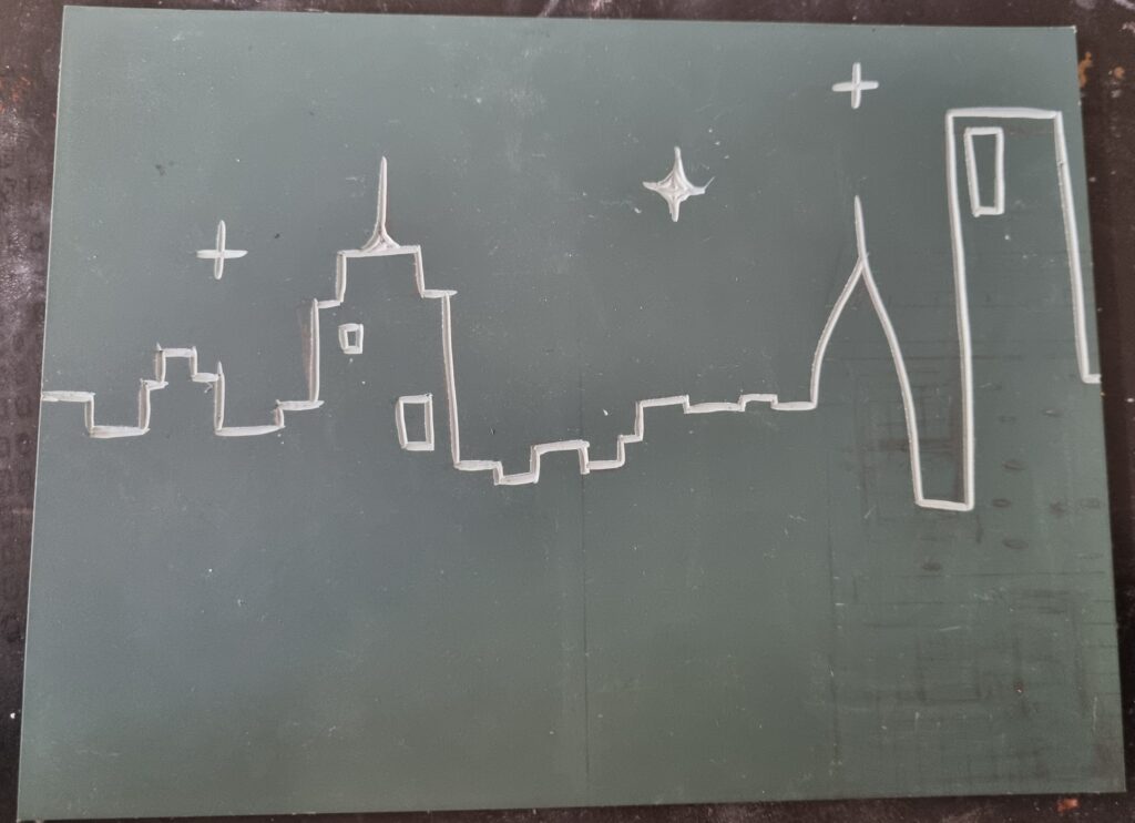
Reference
These 2 photos are references for what I carved out onto the lino.
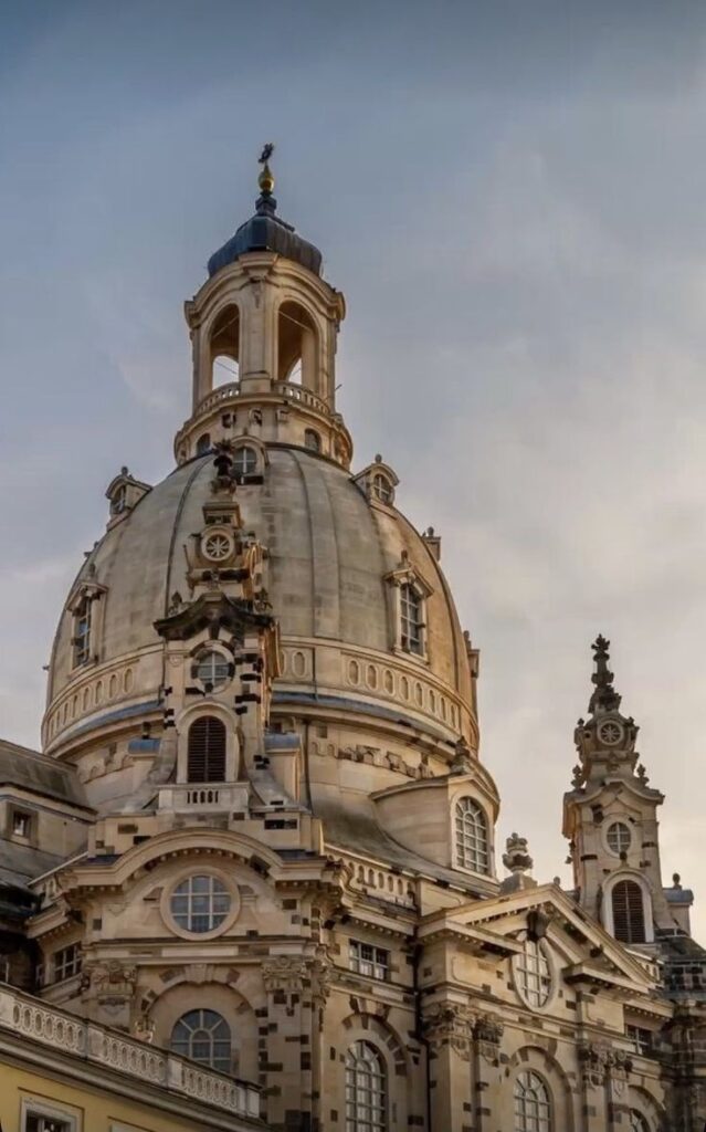
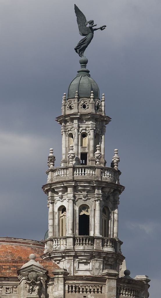
This is the same reference photo I used for Dry Point. I carried the same concept over to mono printing.

Backgrounds
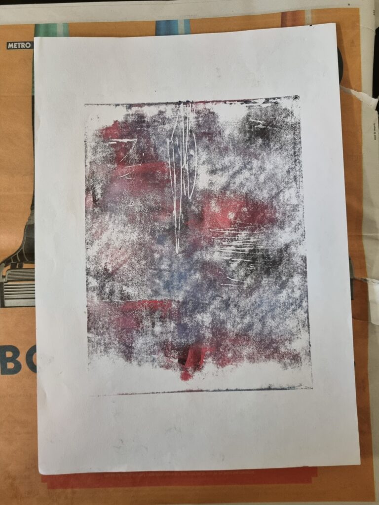
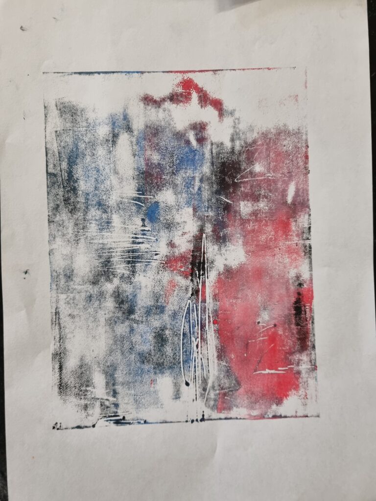
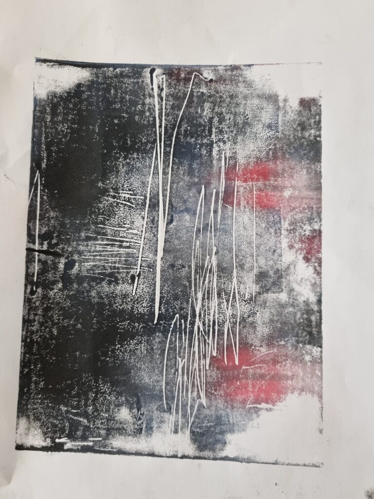
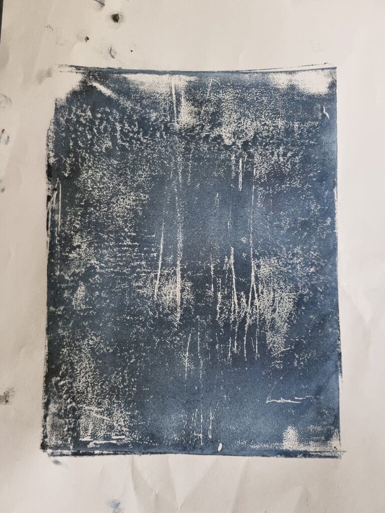
These were the backgrounds I had made with the Lino before cutting into it. As you can see I tried creating more dark backgrounds like the sky or even added pink and purple to show how the sky changes colours. The random lines that you see in the artwork weren’t intentional. The lino had some cuts and it created this effect. Hopefully when I put my design onto it that it doesn’t show through. Next time I’ll watch out for this and be more gentle with the lino. In the end, I won’t use mono printing for my final piece as I want something more to do with fabric maybe and it’s not certain the design would come out opaque.
Hand Embroidery
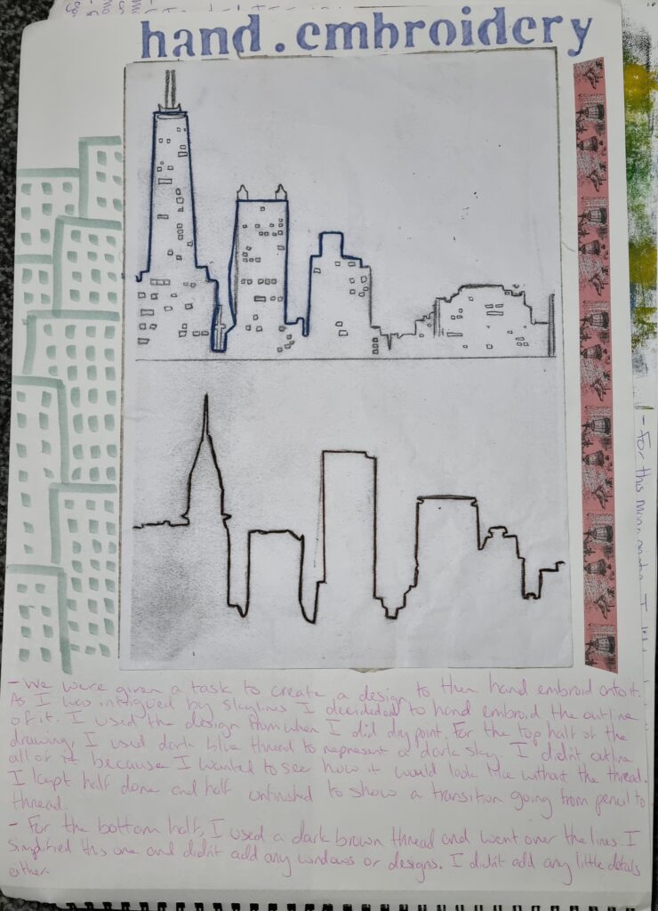
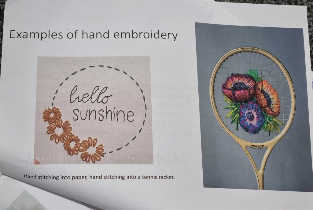
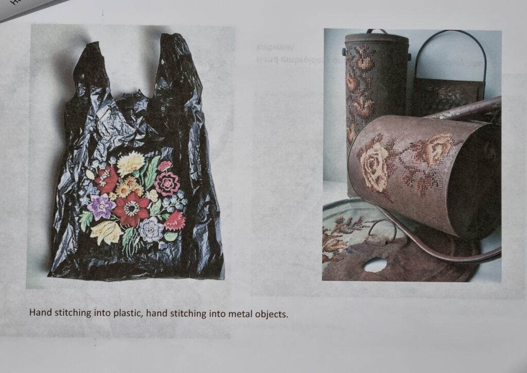
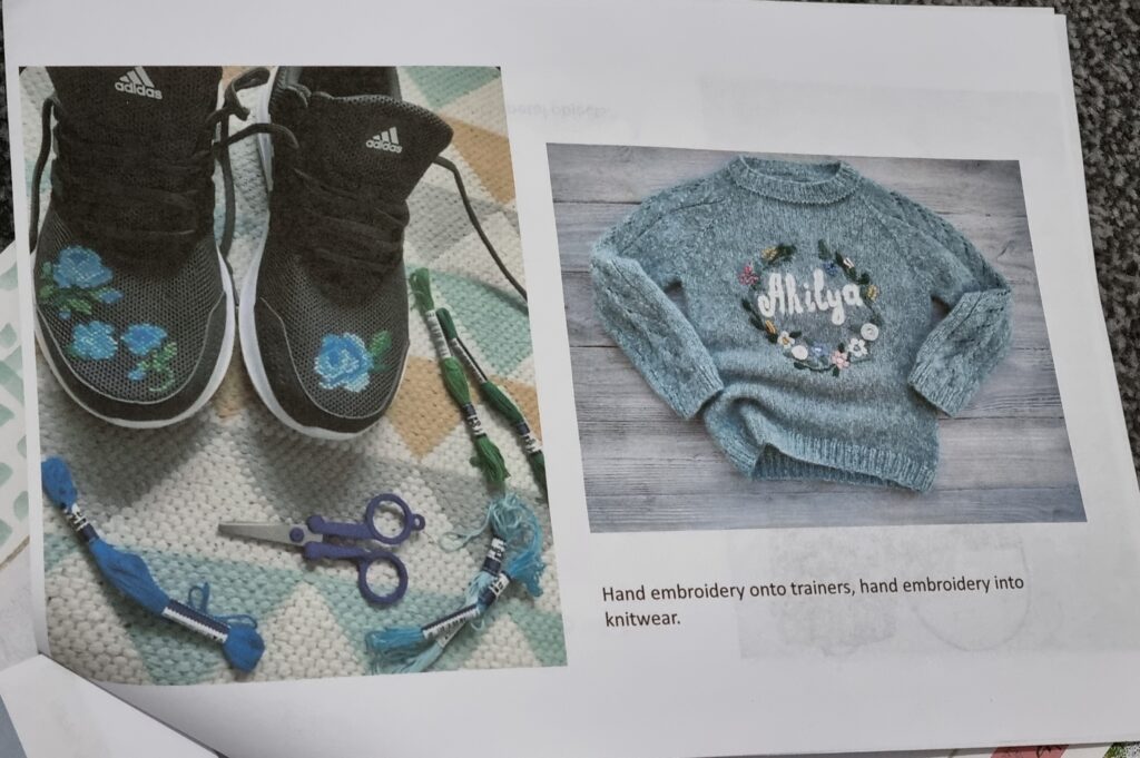
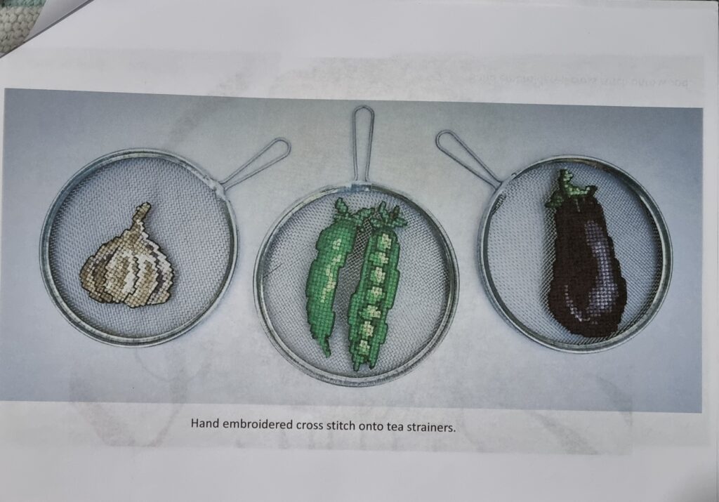
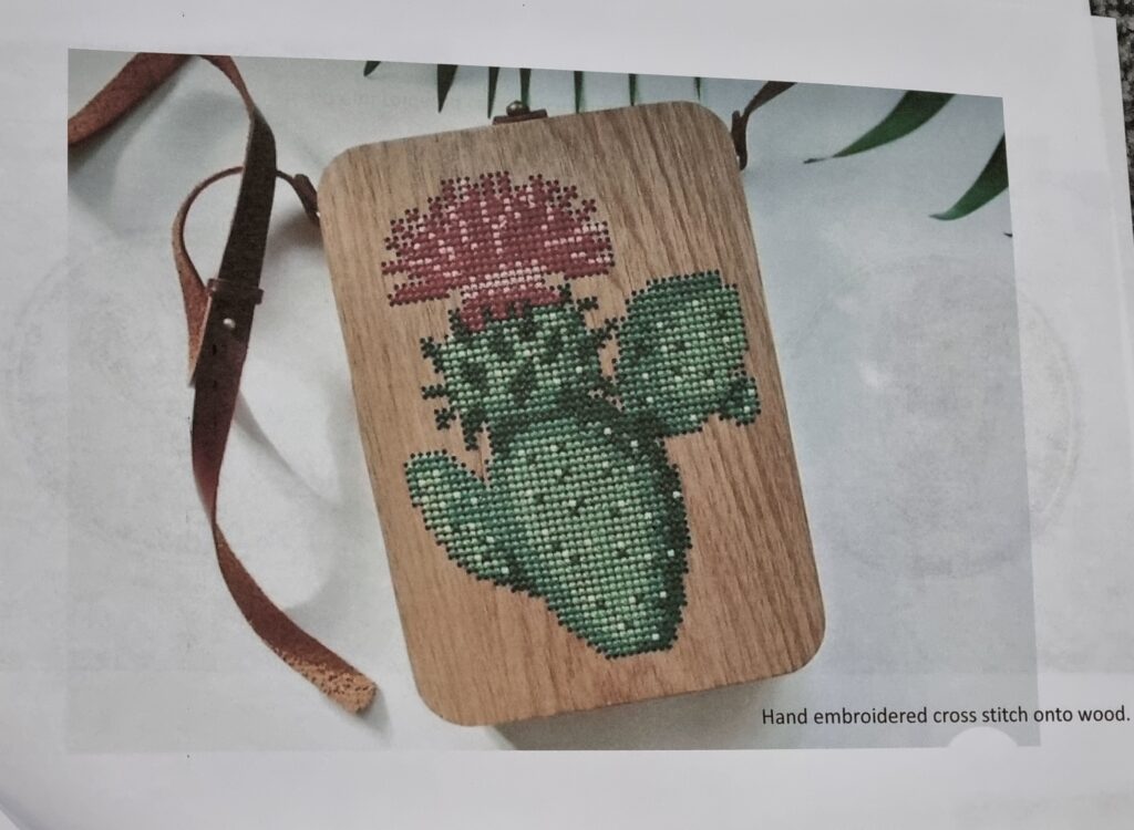
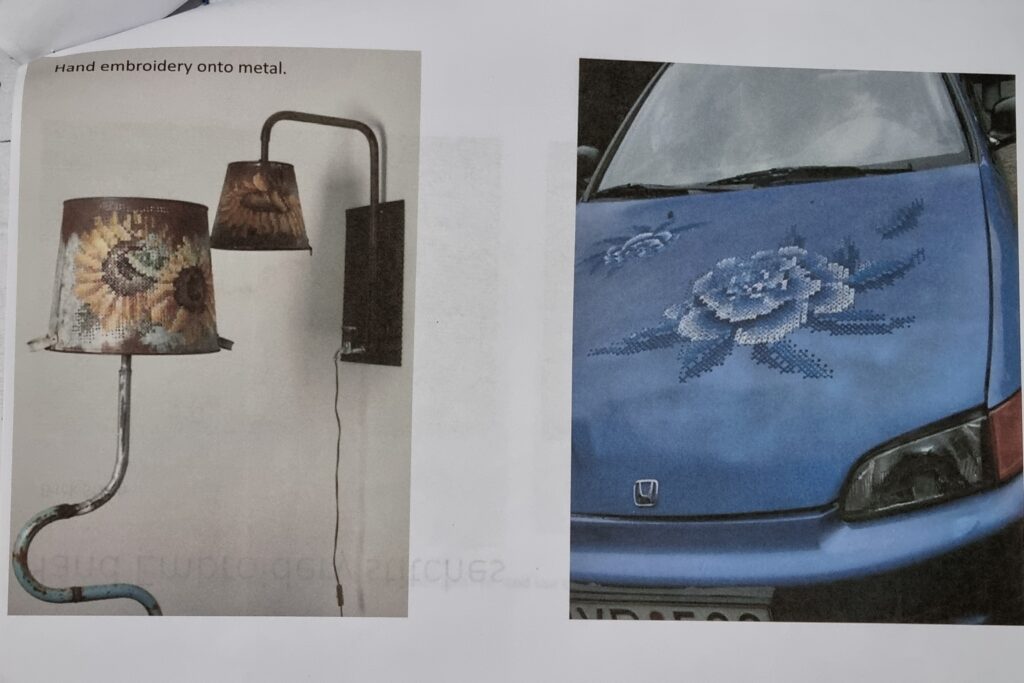
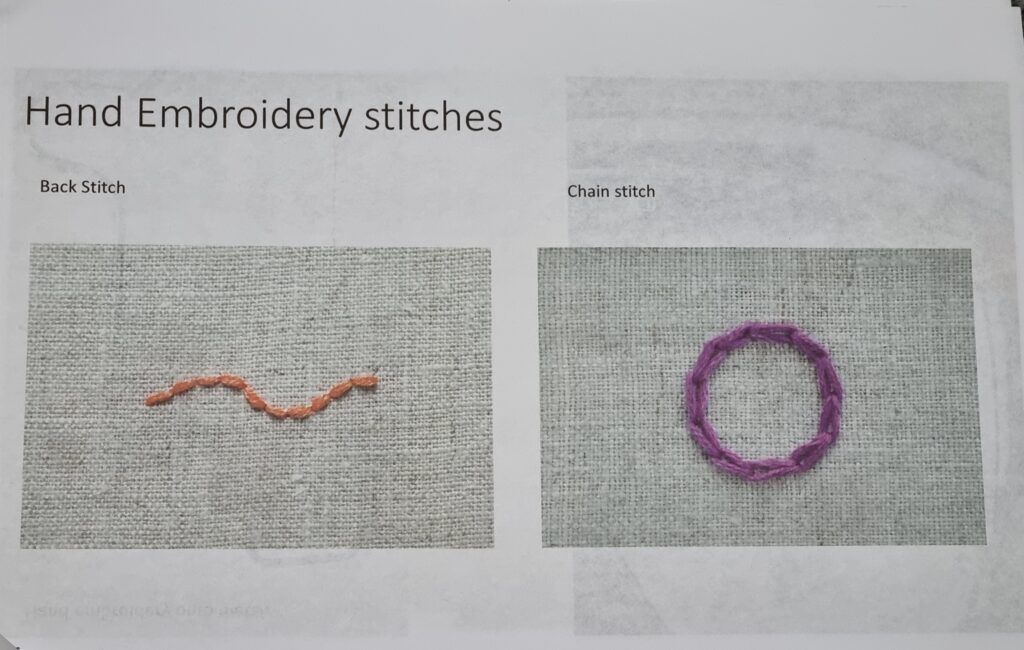
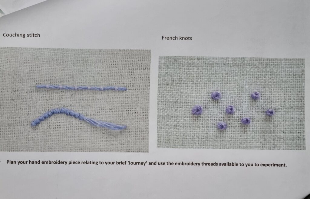
I decided to keep using the same image from doing dry point to carry my research and see if doing a skyline could link in with any of these workshops as I like the idea of doing a skyline but have no idea what method to use. I already explained how I kept half of the design while having the other half sewn for the first drawing. What I liked about this method is that hand embroidery linked into what I want to do for the future which is fashion. It linked in well which made me also think that I might want to do something fashion-related with the skyline like sewing it onto fabric. What I also liked is the design itself it’s simple but yet effective. What I could do next time is even though I wanted to keep half to show the original drawing, I should still hand sew on top of the design and should take a picture of the before and after. For the windows, I could even try doing a French knot like the booklet below suggests.
For the bottom design, what I liked was the simplicity of how it looked and how it wasn’t too busy. If I were to improve on it maybe I could do more details or try doing this design on fabric instead of paper to really show my progress of trying to do it on fabric and showing how I’m leaning towards the textiles aspect for my final project. I could even follow the booklet below and try doing different hand embroidery methods.
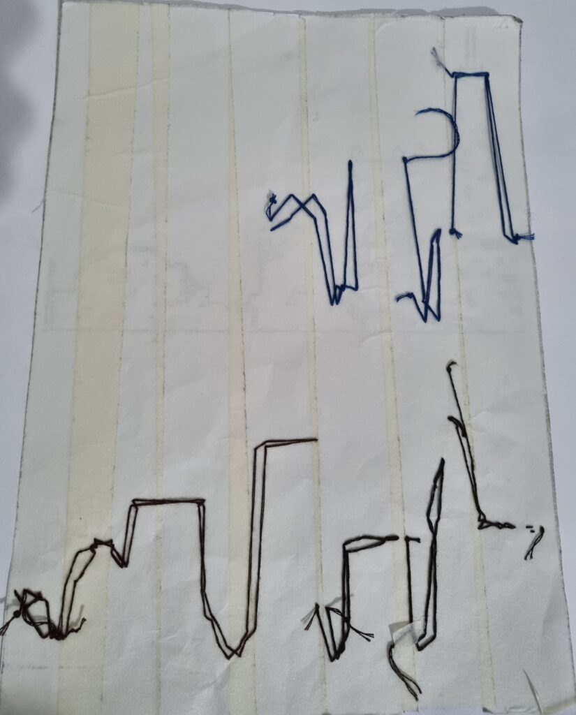
Booklet
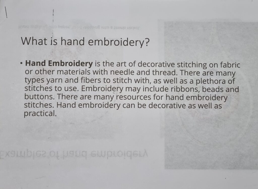
We were given this booklet by our fashion teacher to show different types of hand embroidery methods to use when were doing our work. Next time i should experiment more with different techniques instead of sticking with simple ones.
Sublimation
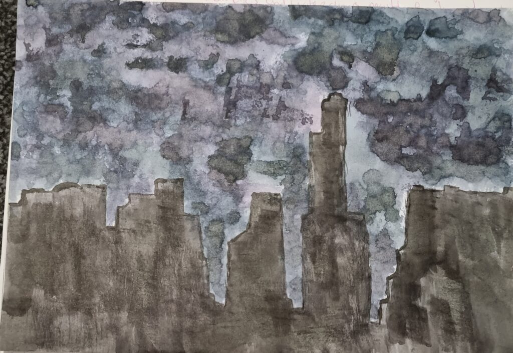
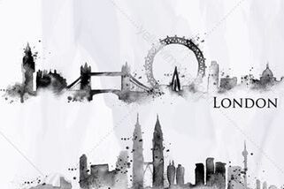
For this art lesson, it was all new to me so I didn’t know what to expect or what we were going to do. The teacher told us it’s a different form of printing but onto fabric. What we had to do was get a piece of paper and then use these specialised inks and paint our design onto it. I decided to stick with my skyline concept and decided to use black, blue and purple ink for this. I used black ink for the buildings and for the sky I mixed those 3 colours together. I used a botching kind of method where I dabbed it on paper to create a kind of splatter effect which resembled the sky and the clouds. For my second idea, I decided to draw the skyline of London and the Ferris wheel that I used a reference for. I decided for this one I wanted to use different colours. I used different vibrant colours like pink, red, green, purple and orange.
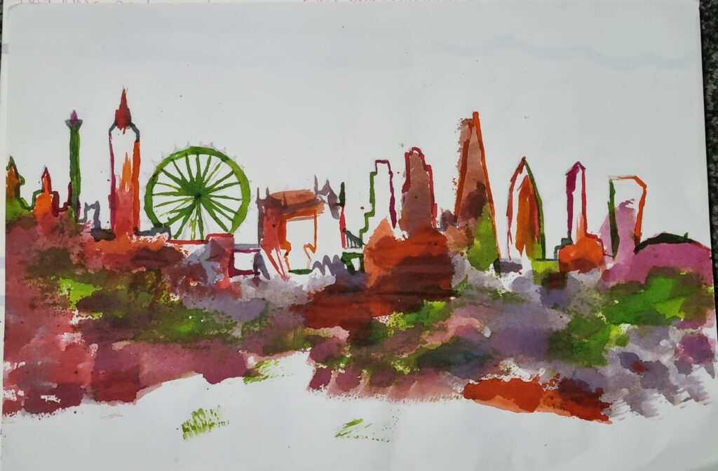
End result
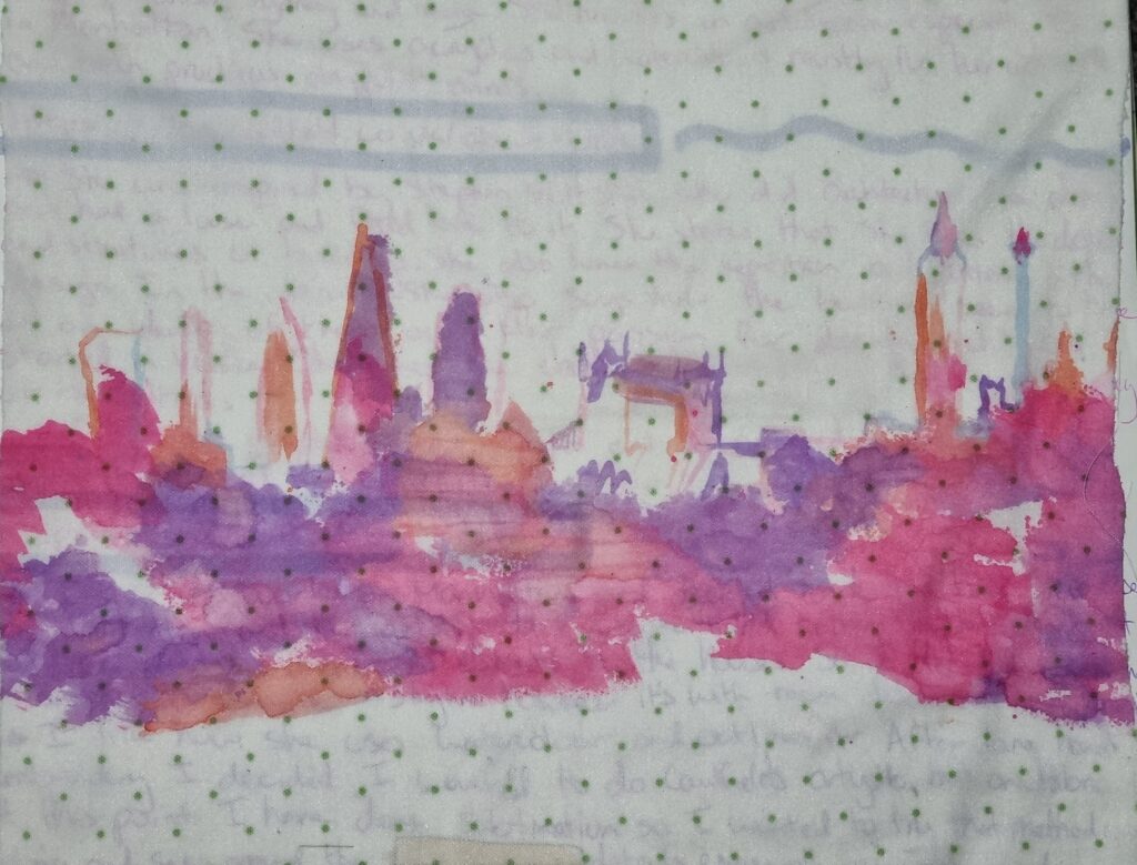
After we created our designs on paper, we had to bring our work to this machine that uses heat to press down the design onto fabric. We had to first choose what fabrics we wanted. For my first design, I chose this cotton squared designed fabric and for my second design, I chose a silky polka dot fabric. We put the fabric on top of our design and then sandwiched them together between 2 big pieces of paper due to it being so hot it could burn through the fabric and paper. After that, we waited for 15 seconds and then the machine was done. This was the end result of what the machine had done. My first design came washed out like the ink had been washed off and only the ink that got absorbed into the fabric remained and no excess ink. The black wasn’t strong either and washed out. For my second design, it came out more vibrant however the green didn’t show up which makes me believe that it was too light so it got washed out. What I liked about this process was how I learnt something new and how sublimation printing was another method that involved textiles that I could do for my final piece. For the first design, I liked how the purple was more predominant however I didn’t like how the rest of it got washed out. Maybe next time I could use different fabric to see if it would become more vibrant. For my second art piece, I liked how vibrant it came out and how the design turned out. What I didn’t like was the polka dots on the fabric as it took away from the art piece and I didn’t like how it interfered with it. What I could do next time is test it out onto different fabrics and see how well it works with it. I might experiment more with this as I could benefit from sublimation and use it for my final piece. For health and safety reasons, have someone around who knows how to work the machine because it is extremely hot and you don’t want to burn yourself with it. Also, wear an apron just in case the inks spill onto you.

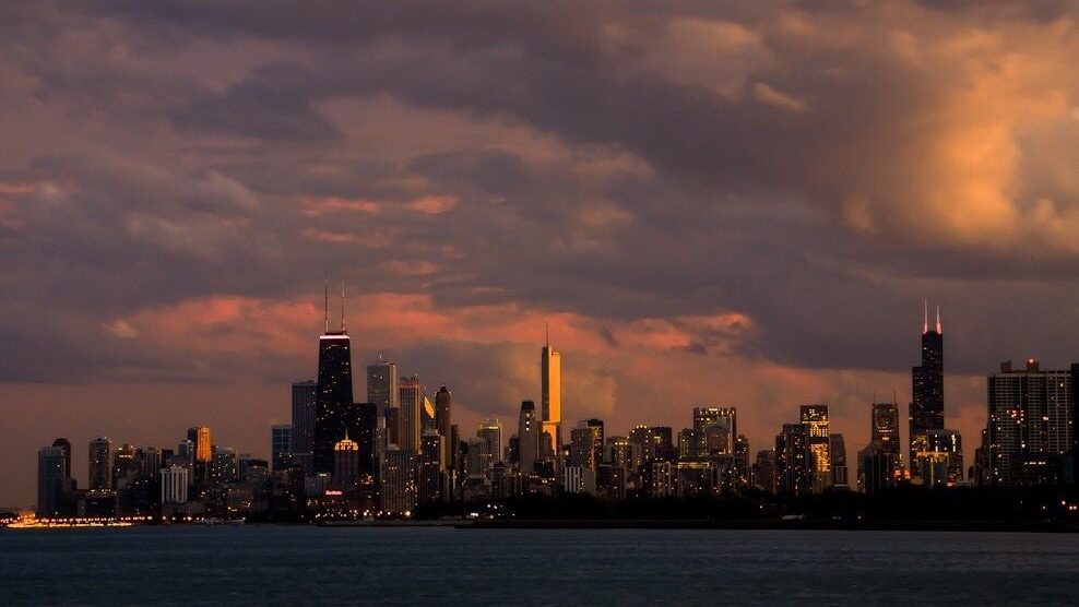
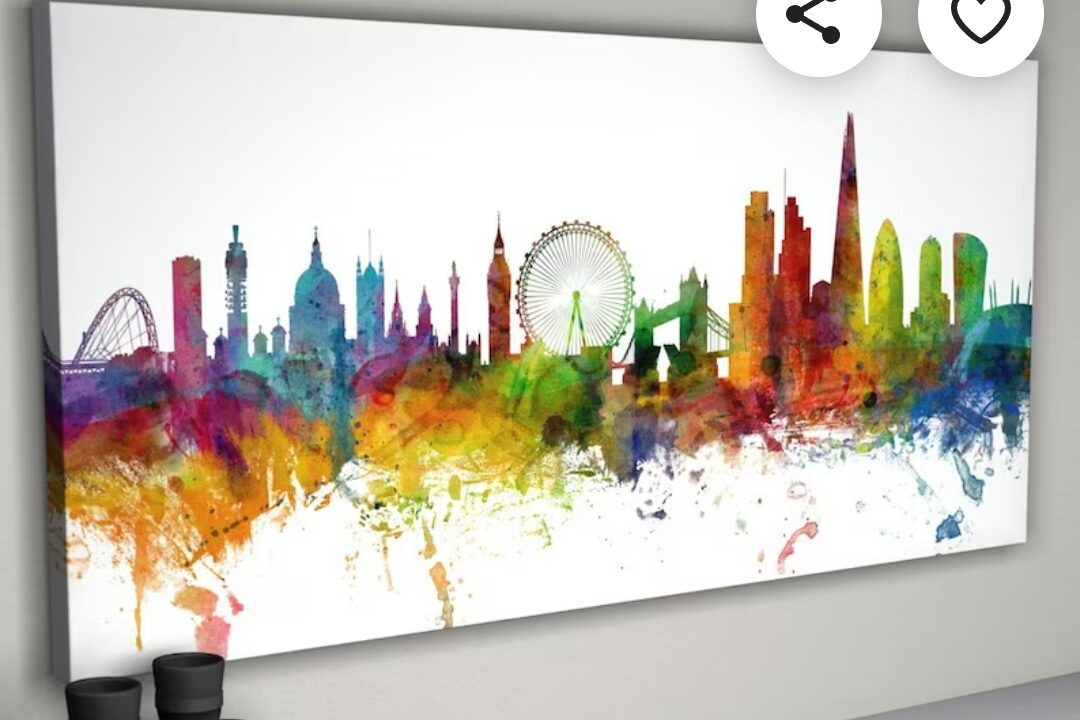
Reference
The first reference, I used it for my first inking and the last 2 references I used for my second artwork.
Photoshop
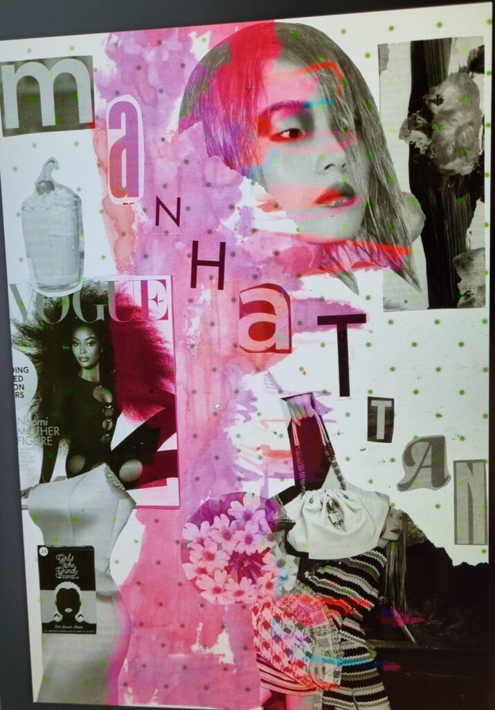
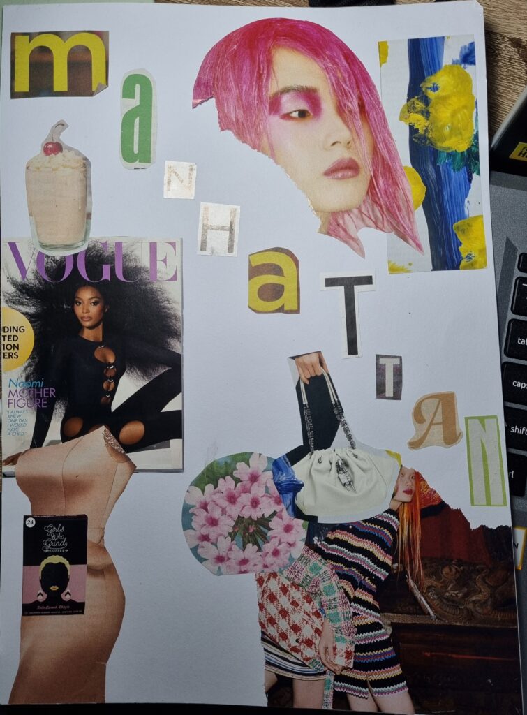
For this artwork we were given a task to create a word that resembled our concept and after researching about Clare Caulfield and how she had gone to Manhattan, I decided to base my project on Manhattan. I decided to do Manhattan as the lettering and added fashion elements around the word as if it’s like a magazine cover. The reason I added fashion type of elements was because that’s another thing I’m basing it off of. Fashion in Manhattan. I really liked how the lettering turned out and I have nothing to dislike. If I were to do this task again I’d try different words that linked to my concept like fashion or maybe New York.
End product
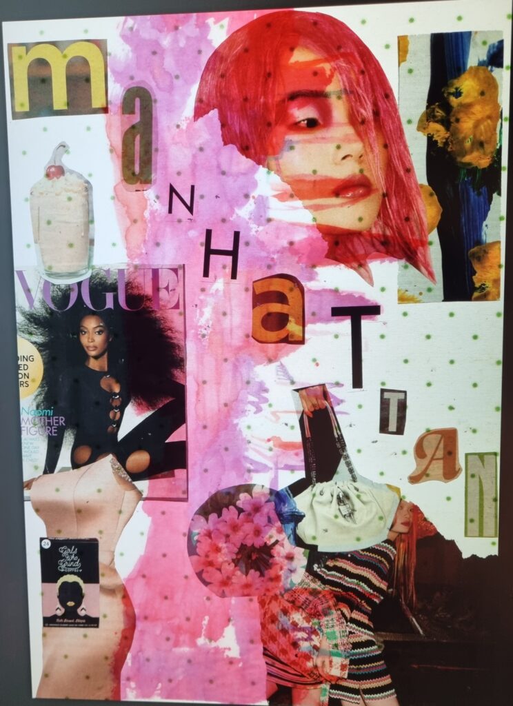
I put my artwork into Photoshop and used my previous artwork from the sublimation printing and combined both images together. I then tampered and messed about with the opacity and the different hues. I liked how the first 2 gave a vintage look to it which gave me a fashion in the 80’s type of vibe. I also liked how the pink matched with the background as the pink showed more for that too. I didn’t dislike anything but if I were to redo it again maybe I’d change the colours and make the foreground contrast with the background. I could even try using an image from Google, even if it’s not primary research, I could use a building or view from Manhattan.
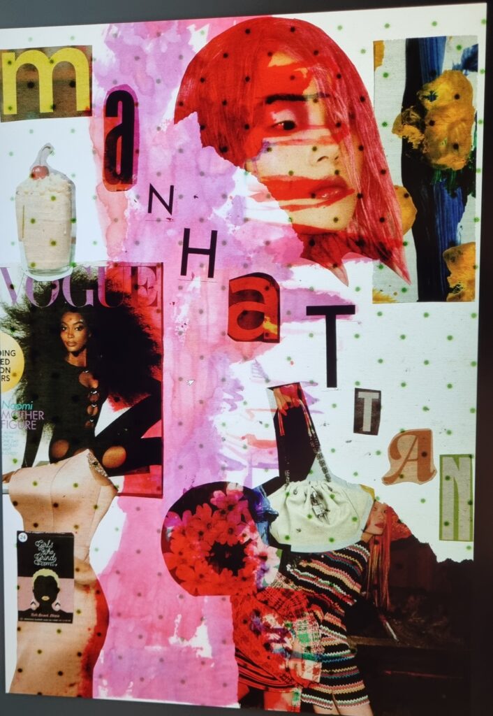
For this image, I made it more transparent. Nothing majorly changed however due to it being less opaque the polka dots came through more and it made it more distracting. I didn’t particularly dislike or like this piece however, if I were to improve on it I’d use another primary research image underneath it or before I combine the images on Photoshop I’d crop out the polka dots.
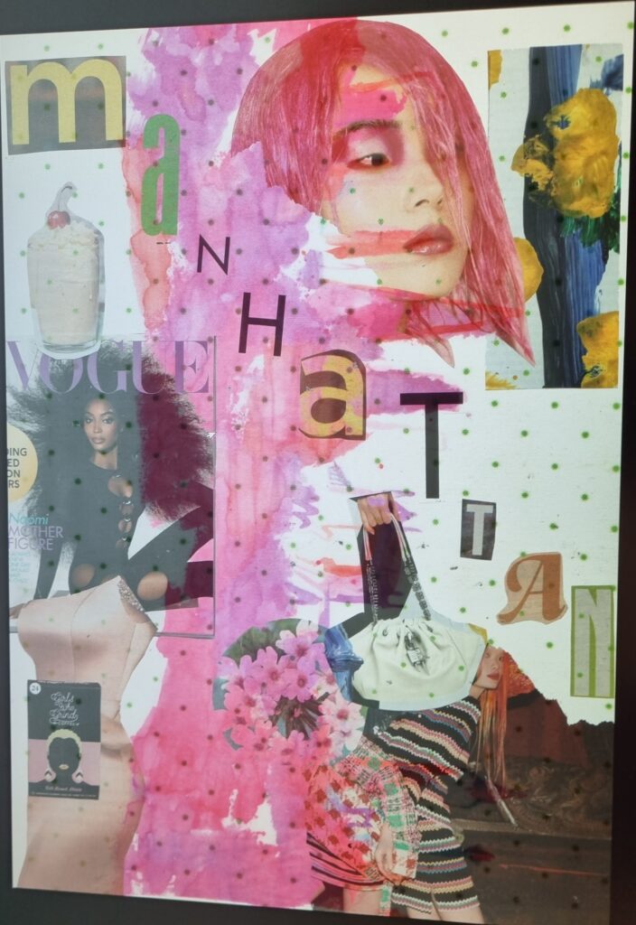
For the last image I photoshopped I liked how I made the lettering black and white. It contrasts with the colour in the background and makes it stand out more. If I were to do this again I’d maybe try positioning the sublimation print differently so the colour isn’t showing down in the middle but rather across. In the end, I think I won’t be using Photoshop for my final piece as I want to do it more textile-based.
