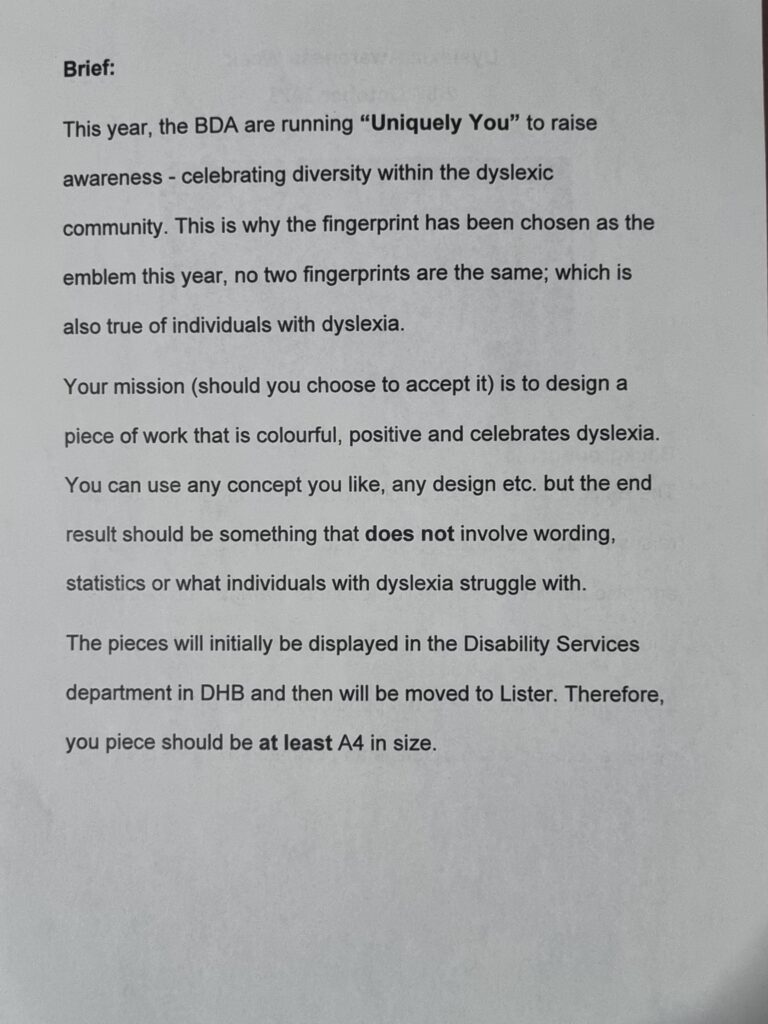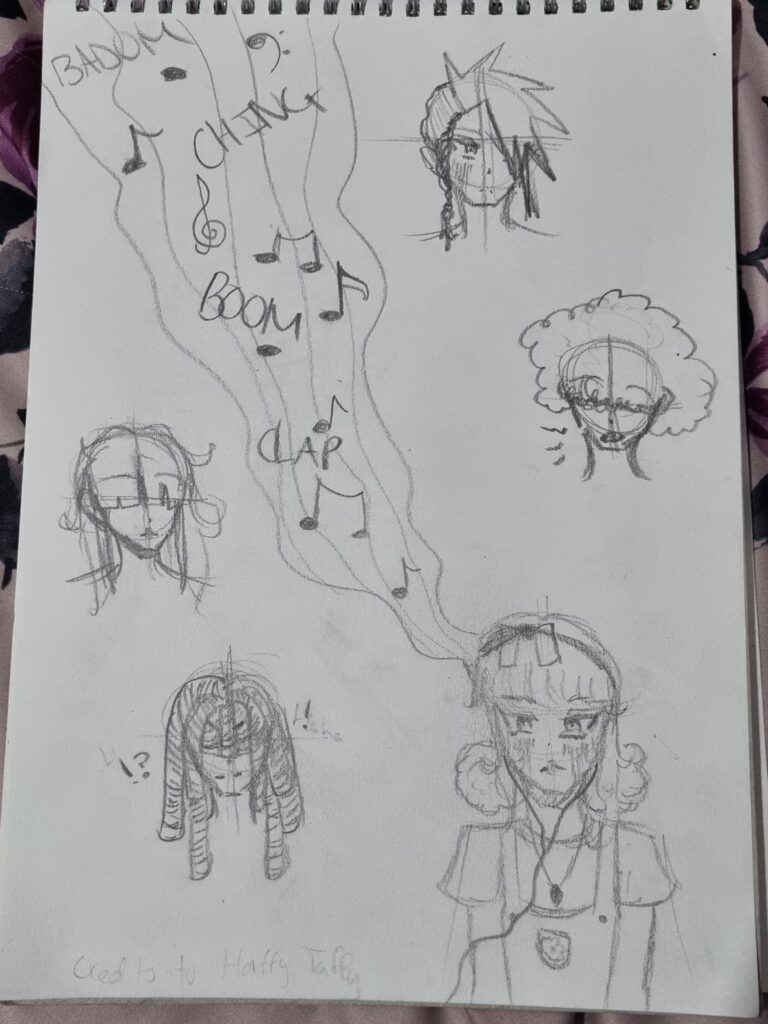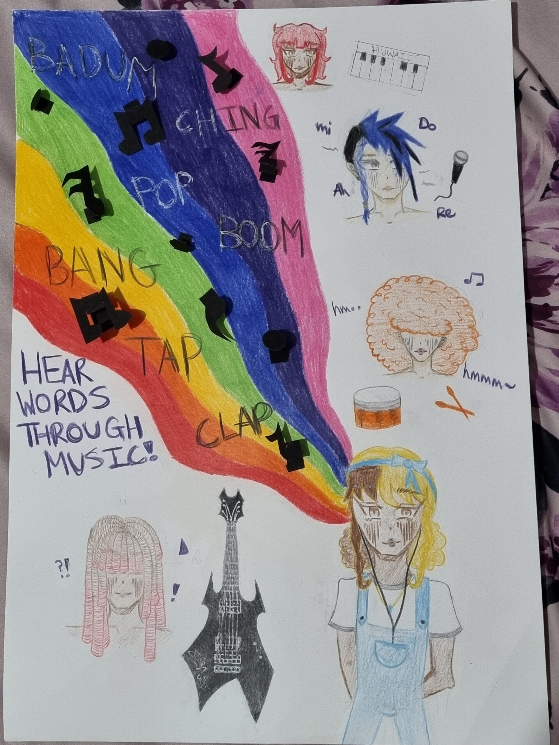
This dyslexic poster wasn’t part of my project however it was a task given to us for dyslexia week and we had to make a poster relating to that theme. I got the idea from what not do on a poster which is informing us what dyslexia is and how not to really fill the poster with too much words. It gave me the idea of using music as a sense of hearing words rather than reading them so I based my poster around music. I decided to add a rainbow as people see words through different colours as its much easier for them and used onomatopoeia to make the sounds of music. I even added band members around the girl who’s actually listening to their music to really immerse them in the music.

For the final idea of my poster, you can see I changed things around and have done a lot more than my planned sketch. I kept my rainbow design and the words on top of it but I added pop out notes instead to really show the notes coming out of the paper. I added the band members and gave them each their own style especially with their hair. I also gave them each an instrument. I wanted to make the main leader pop out more and really thought about their guitar design to really emphasise who’s in charge. I also added “Hear words through music” to really show other people who look upon this, the idea of my poster.


This dyslexia art task has helped by making me think of different ideas and it gave me some experience on how even with a main project going on there will always be small ones that clash with the one your doing and how to really finish it before the deadline while still carrying on my project at hand.