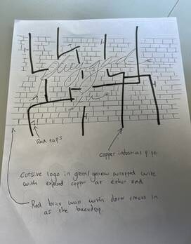
This is the first idea that I drew for the showcase poster, I thought that we could make the plugged in in a bright coloured electrical wire which ha d the background of a minimalistic brick wall with same pipes round the back which are quite dull and dark just so that it makes the plugged in font stand out. the most.

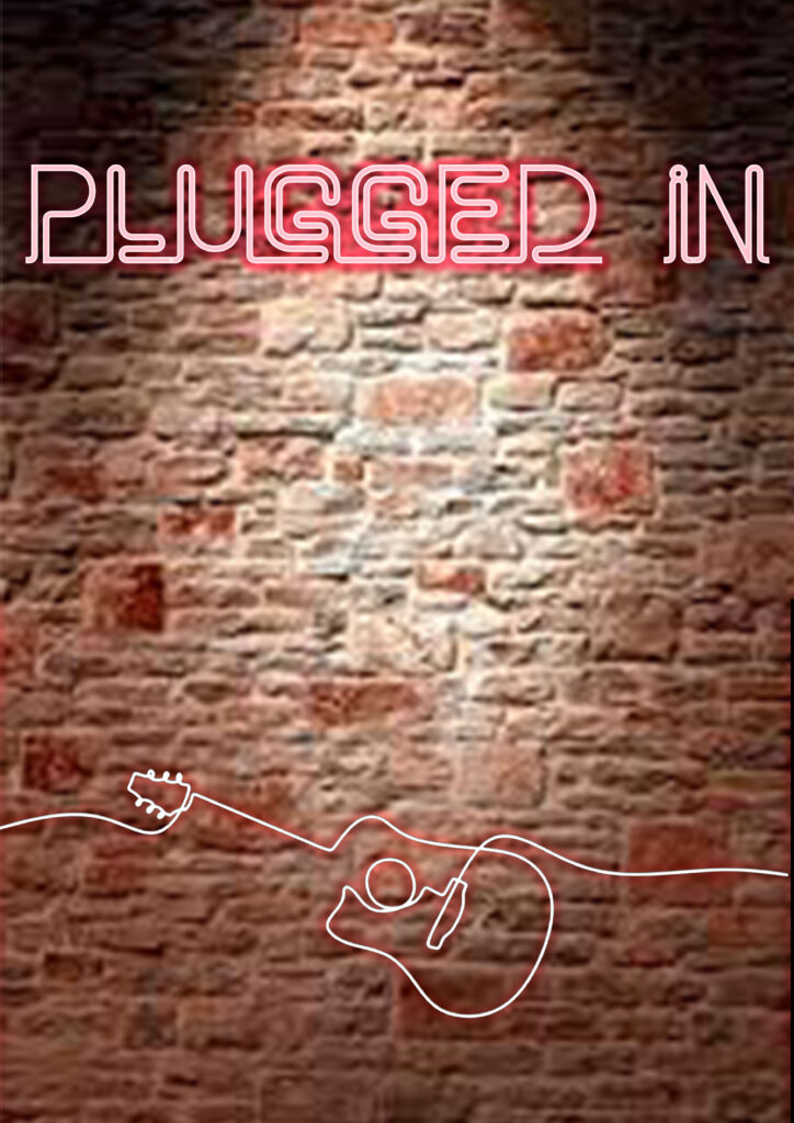
This is a poster that me and Isobel designed straight after I drew that first initial idea. This was quite hard for us because we don’t really know how to work any of the photo software but we just wanted to see what the vibrant logo would look like against the brick wall.

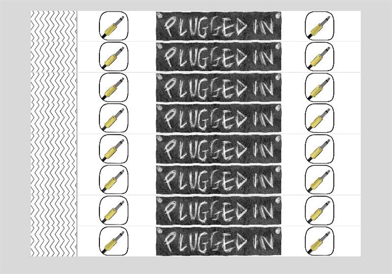
This plugged in design is a design that Kaitlyn made, I think its not that bad but it wasn’t the look and aesthetic that we was going for as a group. I think that this design looks very 90s where its been hand sketched and the bright yellow colour scheme.

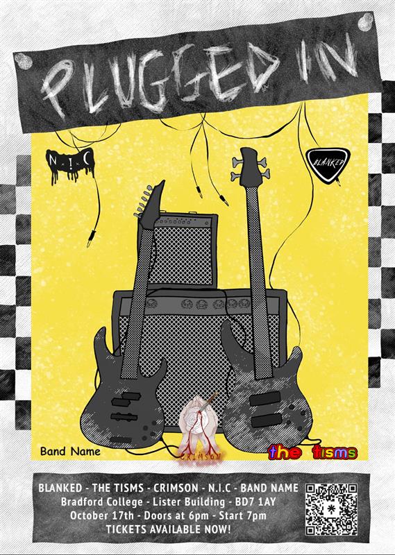
Finally this is the final poster that will be used for the promotion of the gig, this promotion will include, social media, a programme, and posters that will be handed out and put up around college. This poster has included all of the information for the gig like, the bands, the date and time, the location and even a QR code for the tickets which are free.