Initial research:
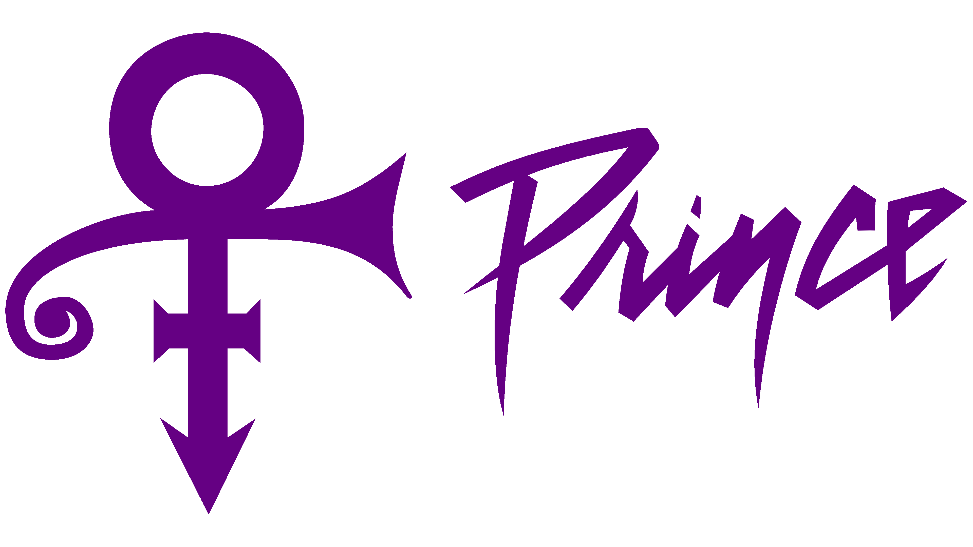
This graphic design was personalised towards prince and his style because, the ‘prince’ logo has some abstract pointedness just like the instruments that he played. The purple colour may symbolise his hit ‘purple rain’ or it just might be his favourite colour. The symbol on the left symbolises bringing the male and female genders together, i think this has something to do with gender equality.
This logo is Steve vai’s logo, I think he wanted to create an abstract logo made from geometric shapes to intrigue his audience to what it could possibly mean. This logo apparently has something to do with pyramid shapes and the number 7. Steve vai switched to this logo when he was already famous so it easily became popular and recognisable.
I think Eminem created this logo for himself because it has a cool vibe to it, and looks like it has been stencilled out, i also like how the second E is backwards and the M is connected to the N. This play on letters differentiate the logo from everyone else’s and make Eminem’s logo unique.

This symbol for Billie Eilish is a gender neutral figure which is slanting to the left. I think billie is trying to show that her music is for all genders to listen to or this may even be a statement for gender equality. One thing i like about this symbol is that it is usually in a neon green colour which represents the type of rebellious person billie is.
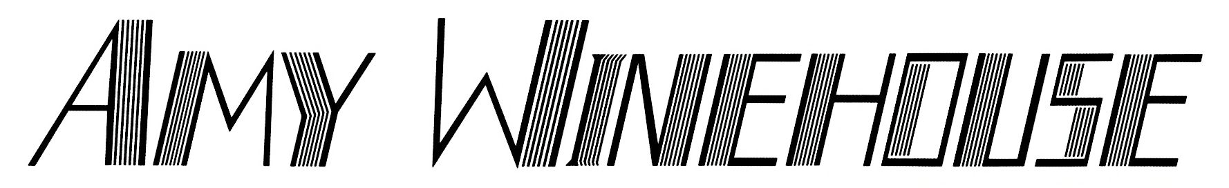
Amy Winehouse’s logo is different because of the set of parallel lines which run after every individual letter. This effect also kind of creates a shadow either before or after every letter. In this logo the colour scheme is kept minimalistic with it all just being black, This also means that the colour scheme can easily be changed since the logo is just one solid colour.
Self branding ideas:
When creating a logo for myself, i think that i could create a name, and a colour scheme that is aesthetically pleasing to the eye. I think for the name, that i should use my own name ‘Ethan Faulkner’ but keep the theme minimalistic. Personally i would like a one piece block logo so i can easily change the colour scheme, so that i wont have to stick to a certain colour scheme. i was also thinking that i could create a logo either with my initials, or a shortened version of my first and last name.
For the first logo concept, I tried to make something out of my initials using blocks in adobe illustrator. I think I should further expand on this logo by simply adding more to it, even if this is just a border or an eye catching colour.
I have expanded upon my first idea/concept by adding a bold circle with a transparent middle. I think that this logo is already starting to look better than the original because now it looks more professional and more eye catching than the first one.
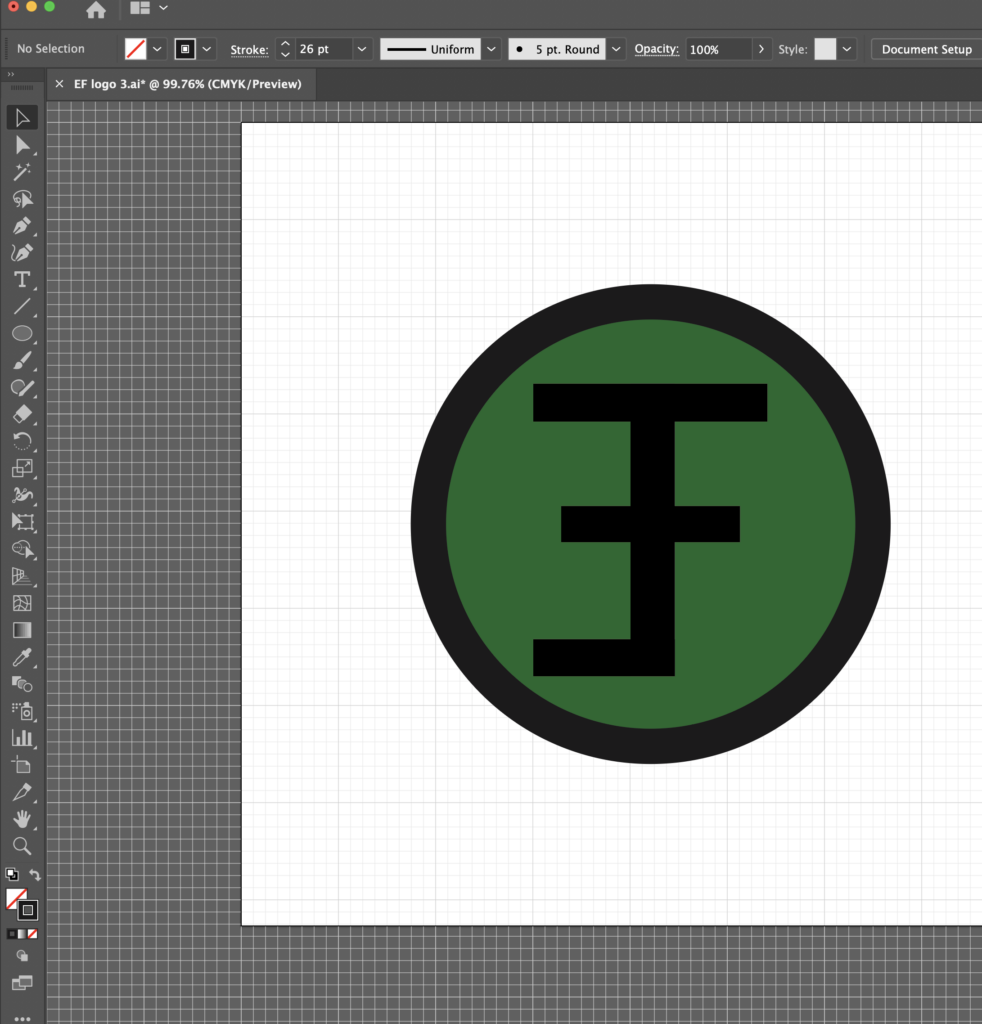
Here in adobe illustrator I have filled in the circle with a green colour, I have decided that this concept of the logo will be my final design because I can easily change the colour the theme of the logo to either fit the backgrounds of posters, or the style of music that I make.
Here is the finished product in a green colour, this is one of my favourite looks of the coloured versions of my logo because, the primary colour is just as eye catching as aesthetically pleasing and the play on my initials is almost like an optical illusion where sometimes you see it and sometimes you don’t.
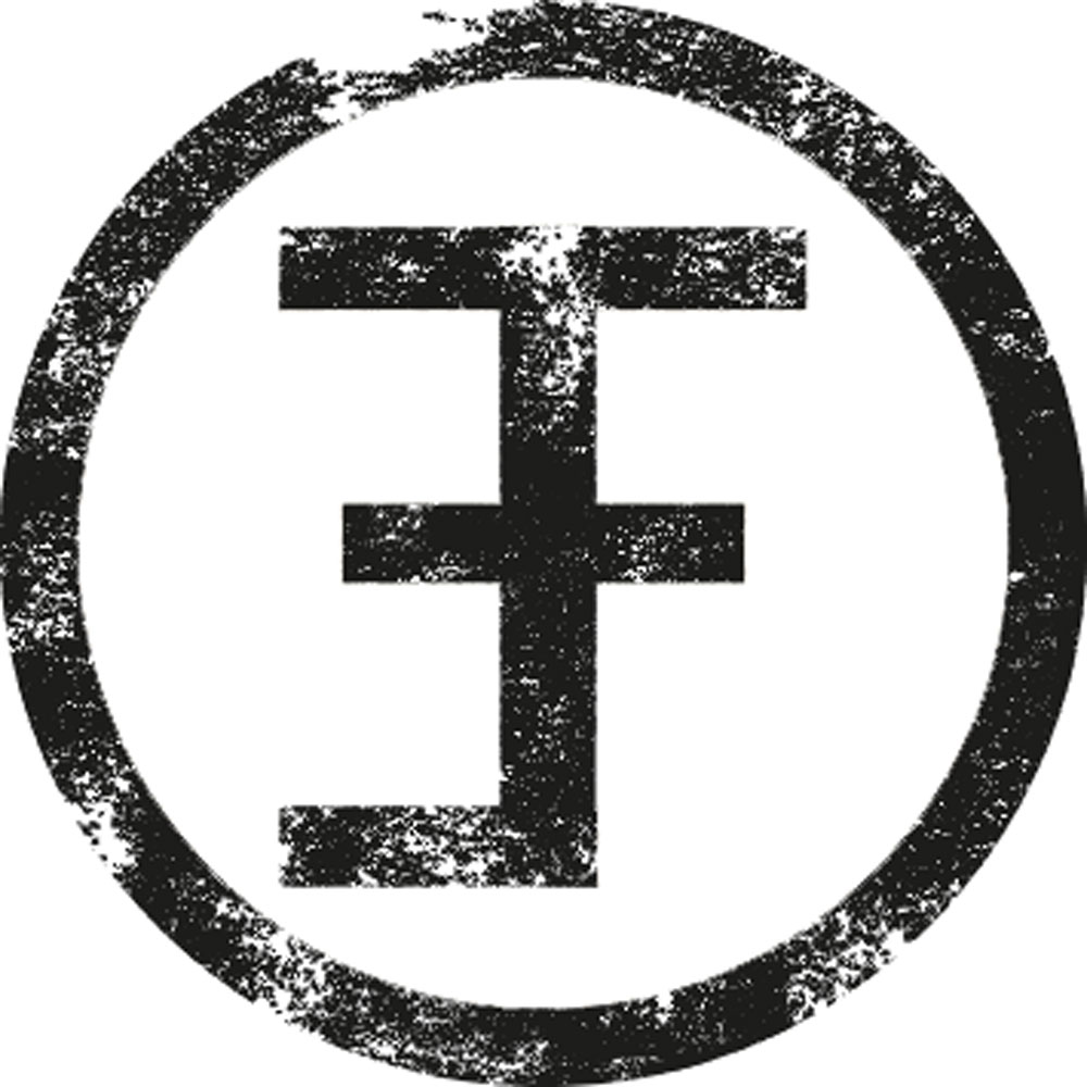
This ‘stamped’ effect was created by putting the logo into photoshop and putting multiple layers of a splatter like background behind the logo and making it transparent. I am really happy with how this turned out!