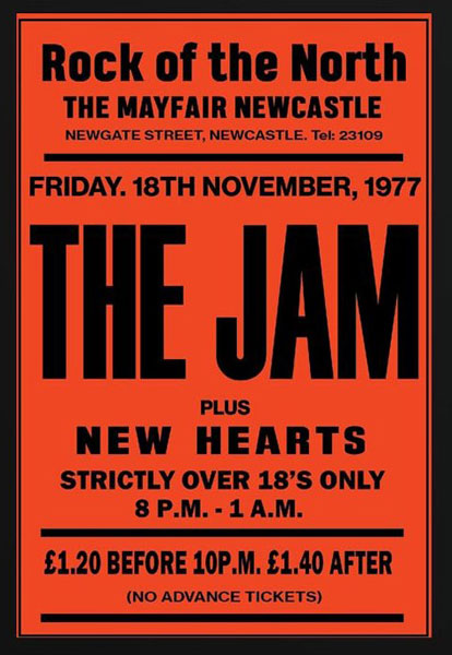
I’m a big fan of posters like this because of the Basic colour scheme and simplicity of them, they are also easier to see again backgrounds and overall more easier to read, I also like this poster because it even tells you who is headlining, the price and the date and time. overall these types of posters are minimalistic but despite being old they are very effective at promoting events.
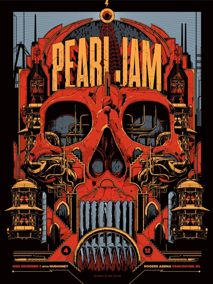
Im not really that keen on this poster because it just looks like its promoting the band and not an event, this is because the poster is more focused on the graphic and colour scheme than the actual event which is in small print at the bottom. One thing I do like about this poster is the steampunk vibe of it.
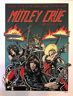
This poster is slightly blurry because its from 1981, but I really like this poster because int looks like a comic book version of the band, with bright primary colours and a nice aesthetic to it.
I like this poster because they have used an actual photograph of the band which you don’t usually see and its also very minimalistic, The poster also has very clear details in block capitals of the events details.
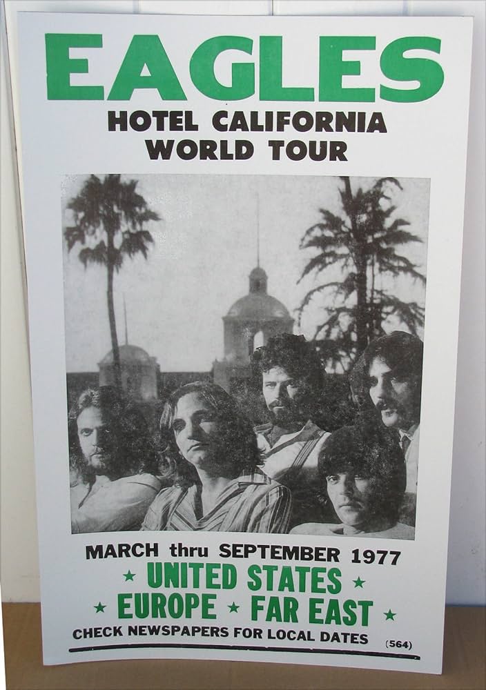
This poster has a good colour scheme because the neutral green colour makes the text stand out from the crowd and yet again its an actual photograph of the band and the background also looks like one of there album covers.
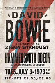
I like this poster because it makes use of bowies lightning bolt logo, This poster even specifies the price of the event which was unbelievable because £1.50 is insanely cheap to go see a big artist.
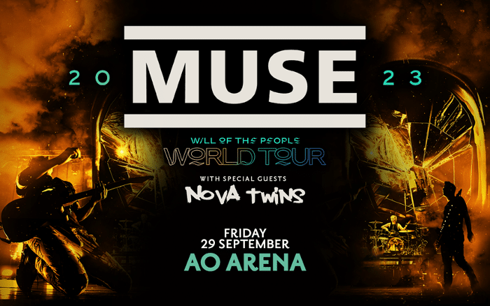
The dark colour scheme of this poster is a pretty good idea because it makes a good contrast from the vibrant text. I do think that the poster is mainly focused around muses logo, overall I think this is the most modern poster that I will talk about.