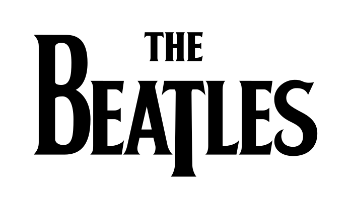
This logo is instantly recognisable and iconic, due to the big bold text and how popular the band is today. I think there is no set colour scheme to this logo, because back in the 60s when the band was formed, it cost significantly more to print things in colour than it does today. Also not all printers actually printed in colour 60 years ago. Despite their not being a colour scheme for this bands logo, its nice and clear and bold. also the animal theme for the name makes the band instantly recognisable and memorable.

The logo for the band ‘kiss’ is more famous than the band members itself. this is because the bands face paint logo and clothing is more iconic and identifiable than the actual people in the band itself. This is why the band have a simple but effective logo design.
This is one of the most recognisable band logos duo to the simplicity of the typography. This logo is also quite distinct to itself because of the pointedness of the characters. the bands name is split in the middle with a lightning bolt which is linked to current and charge, hence the name AC/DC. Also this logo is recognisable to non music listeners because the band are that famous, they have created a bold statement for themselves within the music industry.

This 60s/70s logo gives off a hippie vibe to the viewer because the style is quite comical. also pretty much everyone knows that this logo is for the band the rolling stones, despite their not actually being text that says the Rolling Stones. This is because the band are well established in the music industry.
Metallica’s band logo gives off quite an aggressive metal vibe because the logo is in all black, and the pointedness of the M and the A in the logo give off a hair metal look and vibe from the 90s. I think this bands logo was a success because it appealed to the generation of its prime in the 90s. also the logo looks quite aesthetically pleasing to the eye because the text in the middle is quite subtle compared to the two outside letters.
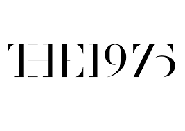
The 1975s logo is quite different to other bands logos, this is because it looks like its been stencilled on to a piece of paper. This stencilled text looks attractive and aesthetically pleasing to the eye. This logo will be mostly recognisable by teenagers or younger people, this is because they are a more recent band.
This logo was one of the most important band logos in history, this is because in the 90s it helped start the grunge movement. also the contrast between the yellow and black make the logo stand out amongst other bands.
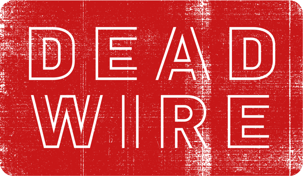
This logo shown above is the final logo for my band called dead wire. we chose the name because the amplified showcase event use to be called ‘live wire’ but now it’s obviously a dead wire. Paul (the graphics tutor) showed me using photoshop how we could change the old live wire logo and transform it into this. The old live wire logo didn’t used to be as detailed as this one because it didn’t have the rolled paint effect. We chose the old font and colour because this logo will still be recognisable to the audience that came to watch the live wire events.