
The logo seems very out of place when looking at the letters with the biggest being x. The logo perfectly describes the music of Pixies very strange and no real genre to put it in.
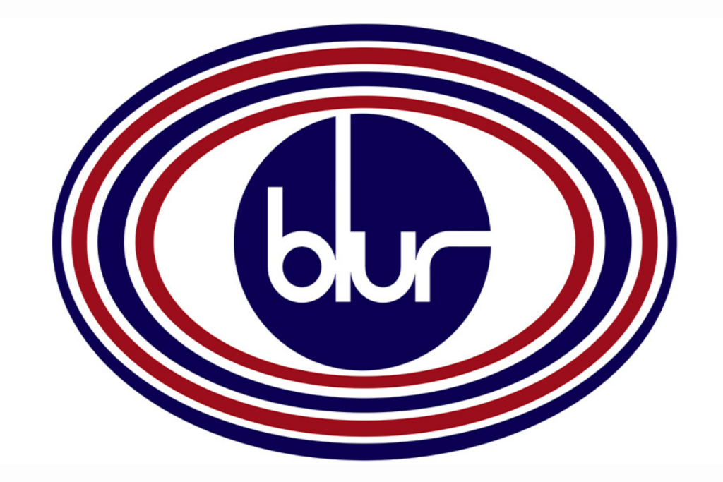
The logo is communicated through the colours similar to the Great British flag, showing that Blur are a very British band and most well known in the country.

The logo is very normal and elegant with the font mixed with boring black.

The Green and black font fit well with the bands style of music.
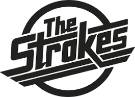
The logo communicates the music genre that The Strokes are a part of.
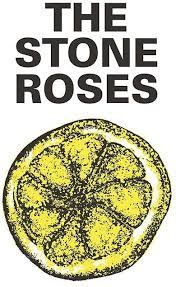
The logo perfectly describes everything The Stone Roses represents with the seemingly Out of place logo.

The colour and simple three letters communicate the genre of the band.
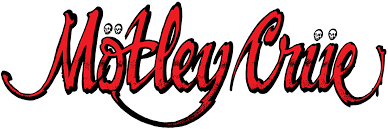
The colour and punctuation present the band as very dark and gloomy with their music.

The jagged font shows how messy but beautiful The Libertines music is perfectly summing up their music.

The colour and font communicate the style of the band with the different sizes of letters fitting well with boring but beautiful colour and design.