Sleeve Research
Tame Implala – Currents (2015)
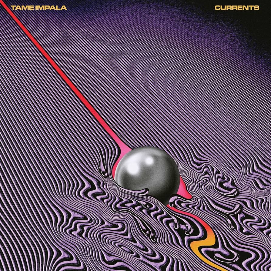
I really enjoy the way the lines bend around the ball and the way it then becomes wave the more the it touches the ball creating a kind of ripple effect. I would really like to create a similar ripple effect for my sleeve design.
Nine Inch Nails – The downward Spiral (1994)

I really enjoy the rust Stretching over the sleeve wrapping it slowly in wire.I also really enjoy the colours slowly losing their colour in the sleeve and its a really effective the way the colour reflects the same feeling of the album.
David Bowie – Low (1977)

I really enjoy the colour on this album sleeve where they’ve turned the saturation up and made the colour blurry to create a very distorted and grainy image, I would like to have a similar effect on the colours I choose to use.
Joji – Smithereens (2022)
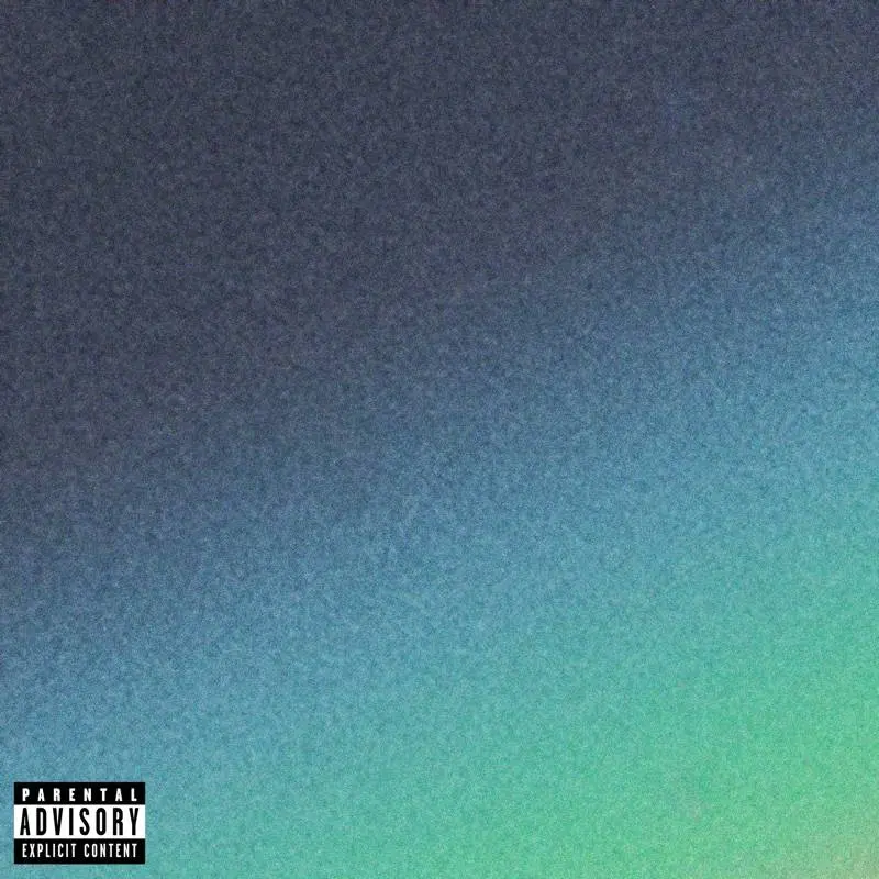
I really like how simple but interesting this sleeve because its unclear if your looking a water or the sky also I think how grainy the image looks makes it more simple but effective.
My EP Sleeve Ideas
First Sleeve Idea
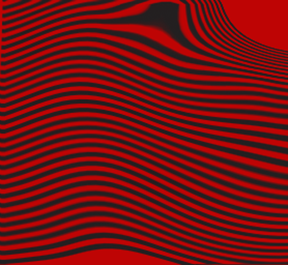
For this idea I tried a red background and but black lines over it,I then used a wave effect on photoshop to make the lines bend in the centre of the sleeve,I do really enjoy the giant line at the top of the sleeve.However I think its a bit boring and could do with more lines bending to create a more exciting cover.
Second Sleeve Idea
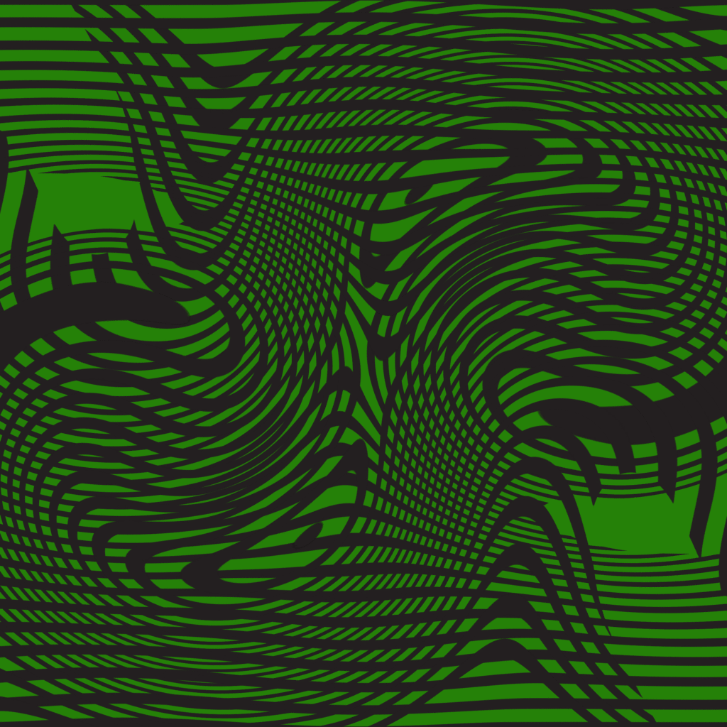
For this idea I decided to add more lines to my design and changed the colour to green, I also used the wave effect to in a circular motion to create more spirals.I also changed the colour just to see if it would look better than red.I think the adding more waves added a lot to the sleeve but I think the colour could be better.
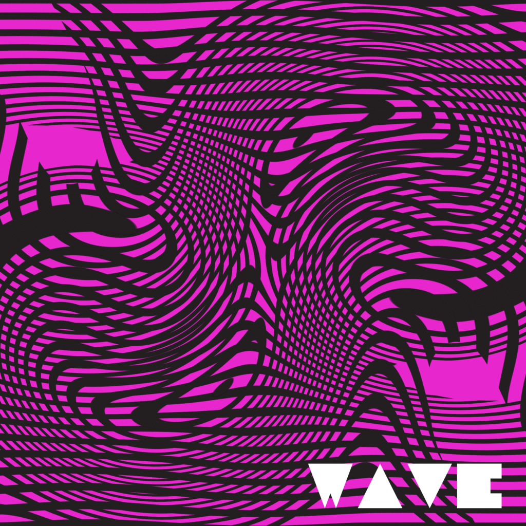
For this idea I decided to change the colour to a hot pink because it mixed much better with the black line than green,I also tried using a font in the bottom corner where the title will be.I think I would keep the colour as its the best option with the waves but I would definitely the font used for the title as it is a bit difficult to read and doesn’t look good at all.
Final Design

This is my final Sleeve design,I have decided to go with the colour pink because it matches the best with the black line and I decided to change the font to something a lot more cleaner and easier to read.I chose the name Wet brain because I thought it would reflect the type of music I am hoping to create.