For my EP I wanted to create a sleeve that was very unique, I wanted people to question the sleeve and I wanted a sleeve that fit well with the mood and sound of the EP itself.
Inspiration
The Smashing Pumpkins-Siamese dream-(1993)
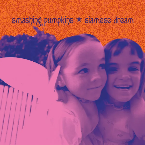
Something about the bright, vibrant and saturated colours really effects how the album is presented and you get a sense of what the album will be like from the sleeve.
REM-MurMur-(1983)
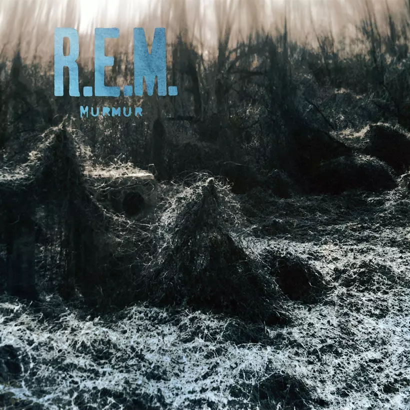
The uneasy colour of blue strangely fits perfectly with the photo itself.It makes the surroundings distorted which I always found interesting.
My Bloody Valentine-Loveless-(1991)
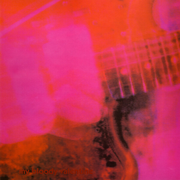
The interesting and bright colour matches well with the distorted photo of the guitar,This is kinda the same feel I would like for my design.
The Stone Roses-(1989)
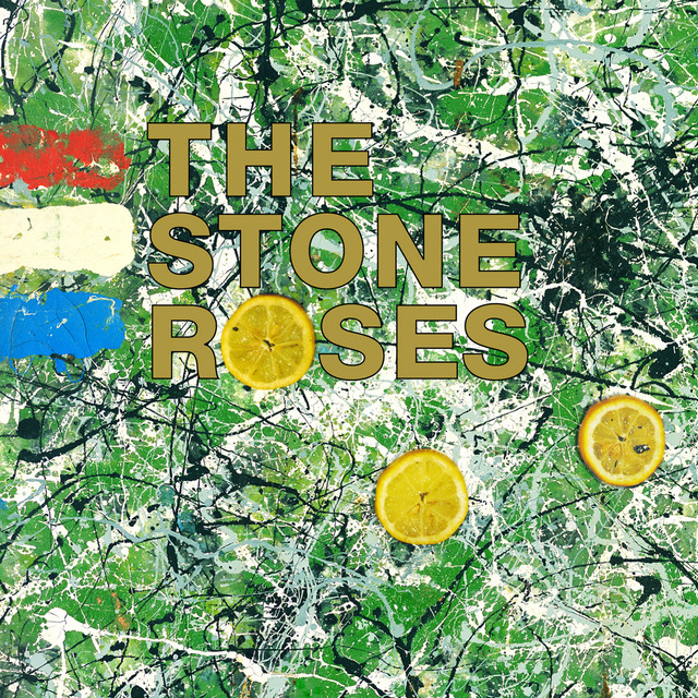
The bright colours mix well with the chaotic design of the paint,This is something I would love to do for my sleeve.
The Libertines-(2004)
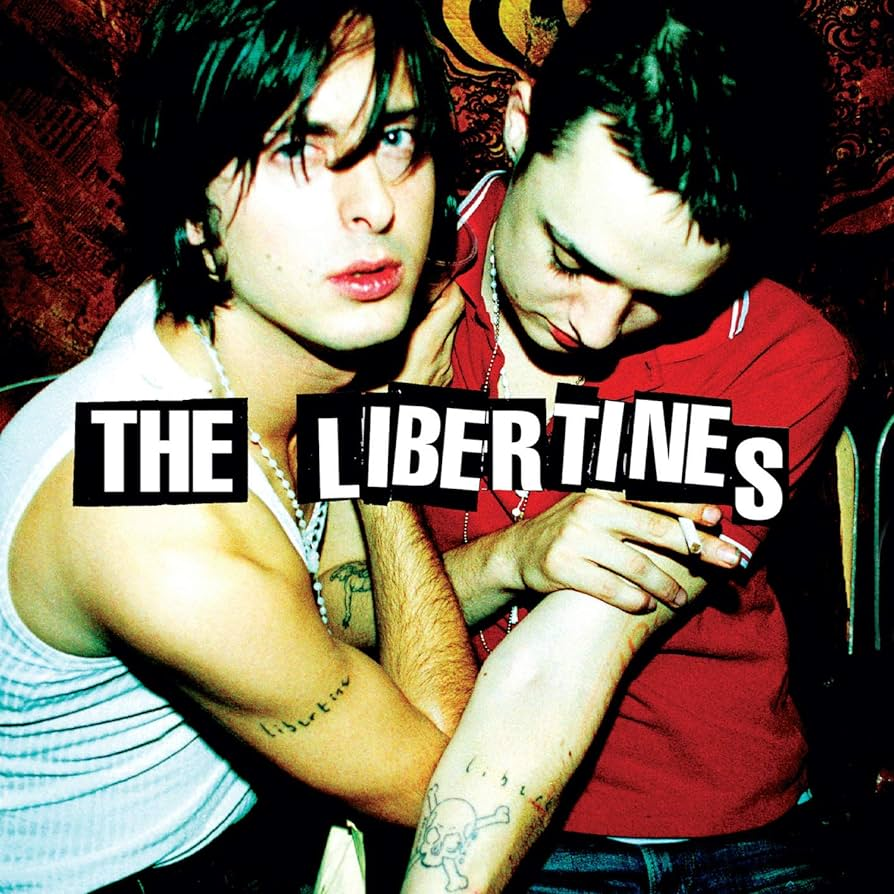
The title makes the image fit perfectly, with the crooked letters fit very well with the bright image.I would love to use a similar text for my album sleeve.
Radiohead-OK Computer-(1997)
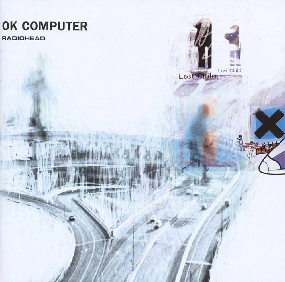
I really enjoy the idea of taking a regular image and distorting it,I also like when the sleeve somewhat reflects the sound of the album which I think this sleeve does very well.

For my picture I wanted something that was simple but effective so I took a fairly simple photo of lights.However the idea was to distort the photo so it would look completely different.Overall,I just wanted something unsettling and unique.
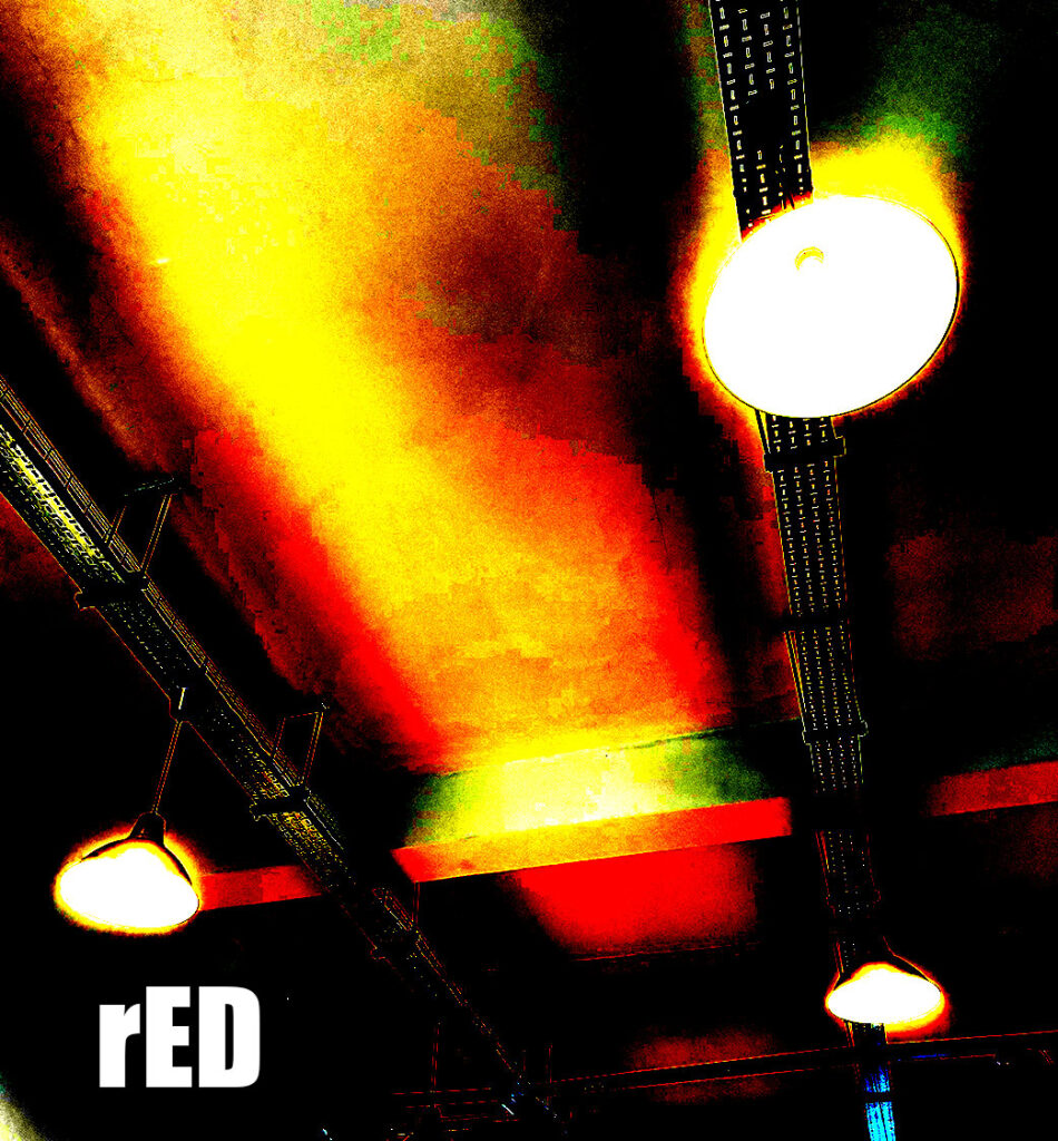
This is the final design for my sleeve design,I always found there was something unsettling about unusual colours that are difficult to look at and lights that are too bright so I increased the saturation and decreased lighting in the room to give the room a unsettling look and feel.For the title I wanted something simple but effective that felt like a robotic mistake and I think I did that pretty well.