Pixies – Doolittle (1989)
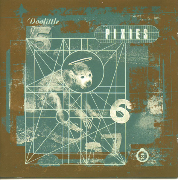
This album design is haunting but beautiful, a very disturbing image but very simple and friendly sounding name. Some songs fit well with the sleeves image like Monkey Gone to Heaven and Hey and other fit well with the name like Here Comes Your Man.
Pixies – Trompe le Monde (1991)
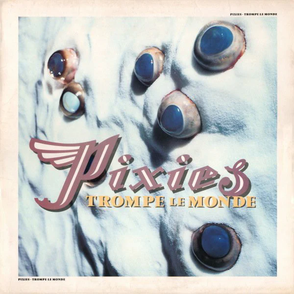
The design perfectly describes the album as a whole very moody and upsetting with even the name, which when translated Trompe le Monde means deceives the world. The sleeve fits with song like Planet of Sound, Alec Eiffel or The Sad Punk to name a few.
Radiohead – The Bends (1995)
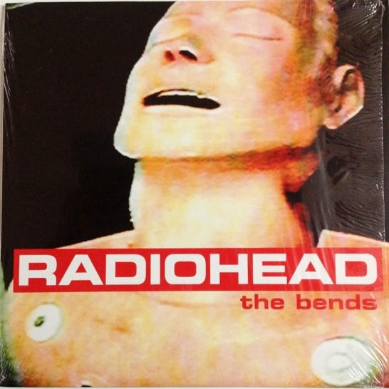
The album sleeve perfectly describes the revolutionised sound of The Bends which is a huge contrast the Radiohead’s previous album Pablo Honey where they’ve switched to a far more experimental sound. The simple but effective colours fit well with the image which tells you everything about the songs and feeling the band is going for. With songs like Planet Telex, High and Dry, Just and the title track presenting you with this feeling of ecstasy while listening.
Radiohead – OK Computer (1997)
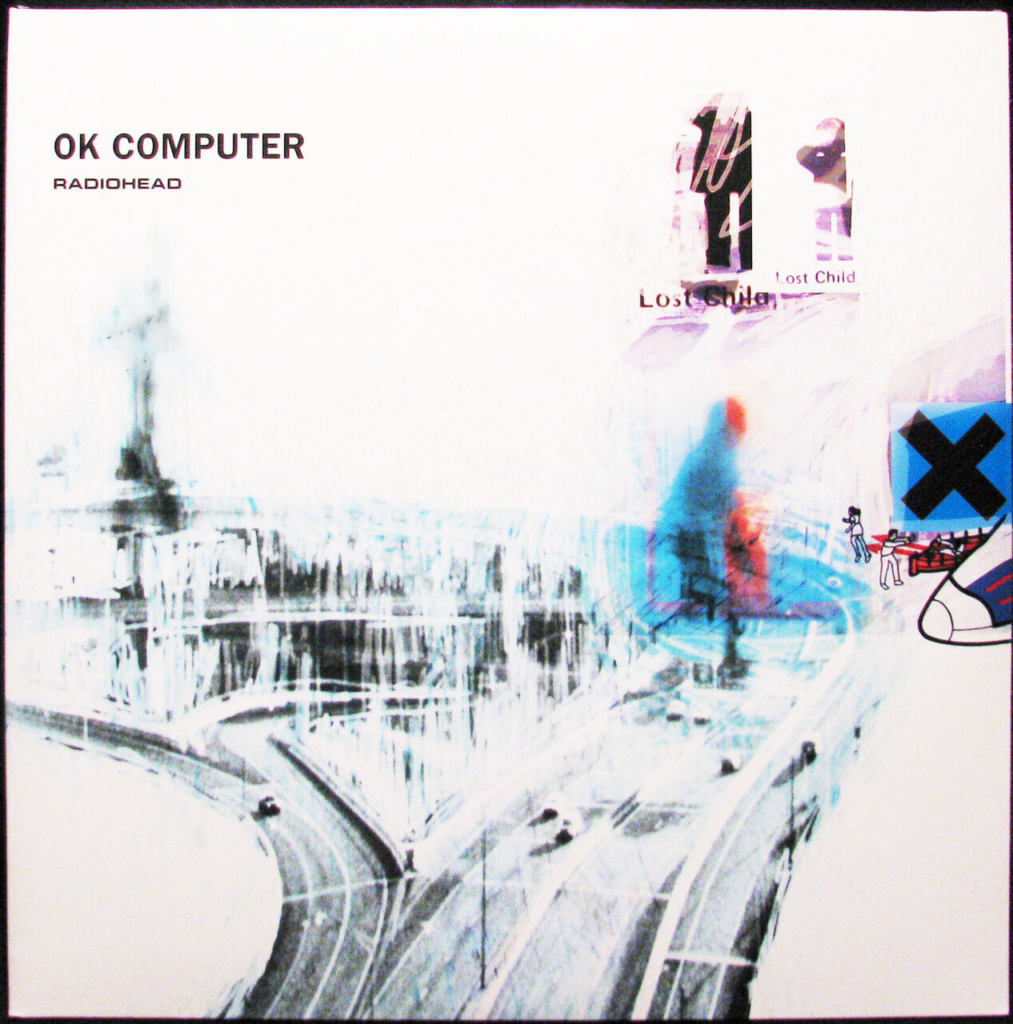
The album sleeve describes the moody and depressing sound of OK Computer, and while it doesn’t seem as experimental like The Bends the songs are more impactful and interesting much like the sleeve of the album. The sleeve is disturbing and everything on it seems out of place, along with a light blue to create the feeling the album is going for.
Nine Inch Nails – The Downward Spiral (1994)
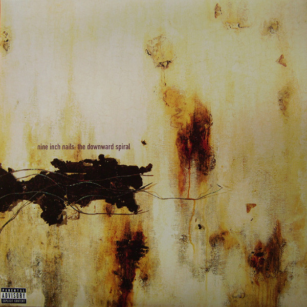
The album sleeve has multiple things that look off about it and thats what makes it so effective,The rust looks damp and decayed with what look to be wires stretched across from the left side and the right almost seems to look like a face. The look of the sleeve perfectly fits the songs for the album.
The Strokes – Is This It (2001)
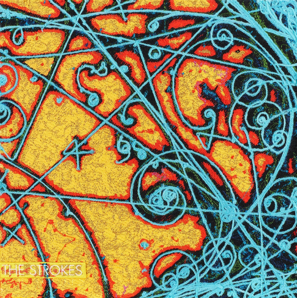
The album sleeve almost looks alien with these bright and contrasting colours the gross orange mixies well with the light scratching blue.
The Strokes – The New Abnormal (2020)
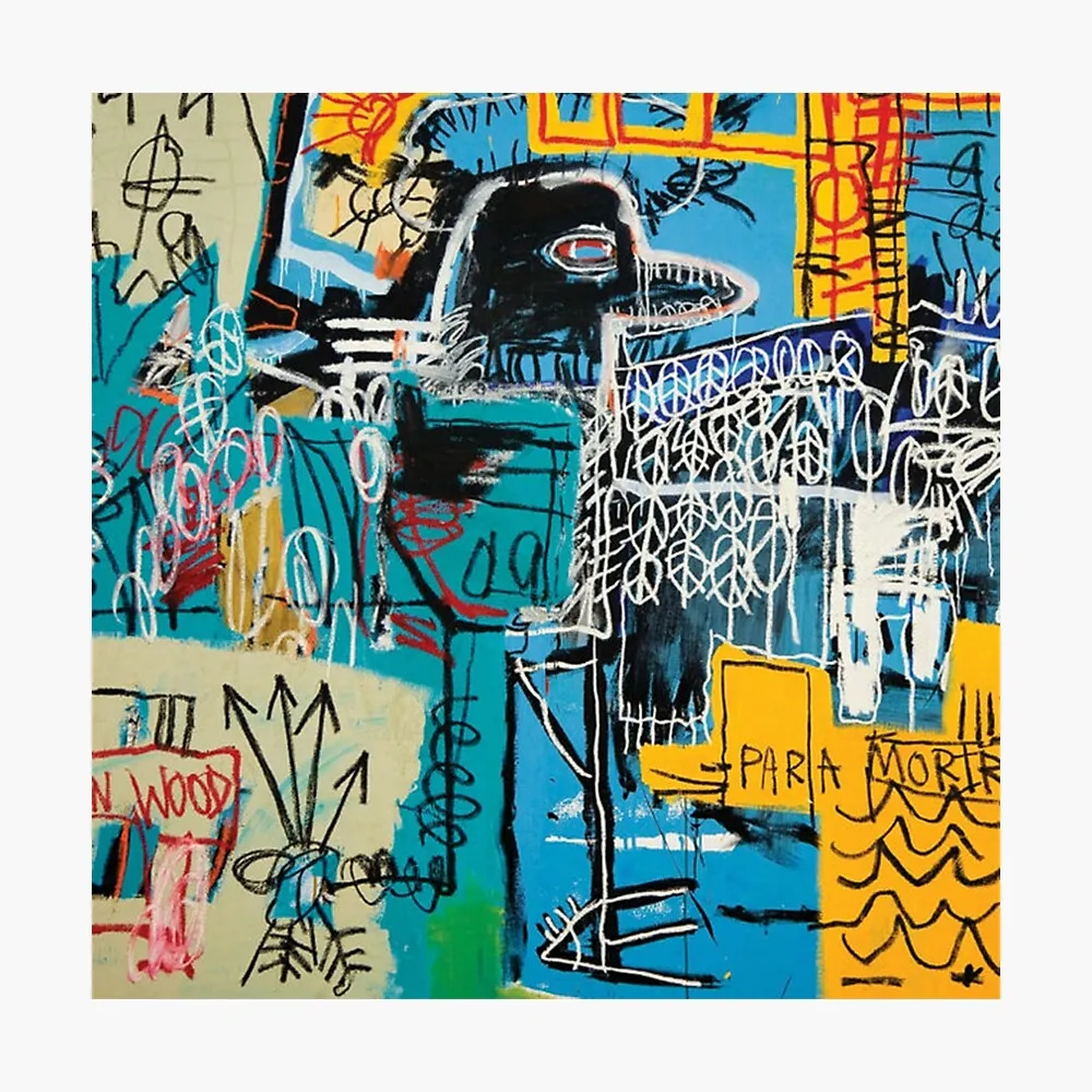
The album sleeve is a collective mess that strangely works, the white scribbles match well with the colours of blue, yellow and red works well with the half drawn crow.
Pixies – Surfer Rosa (1988)
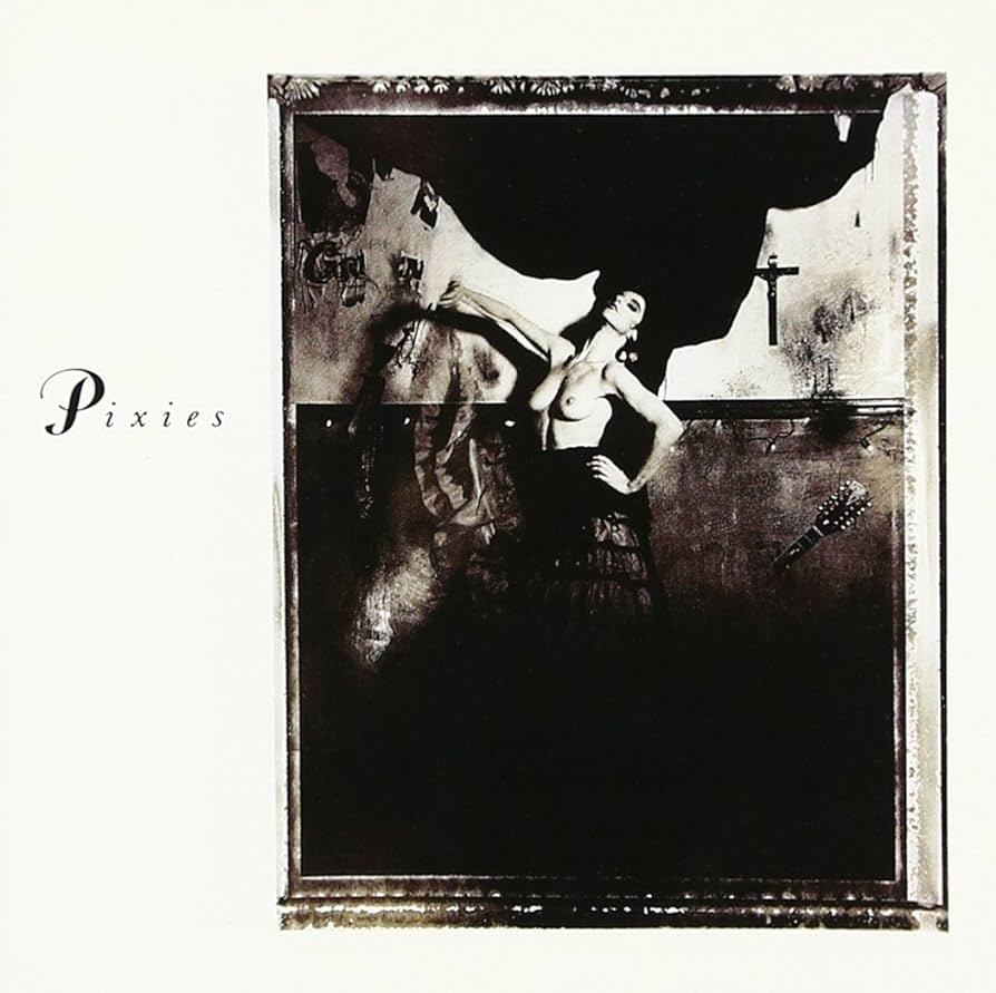
The album sleeve makes the album look elegant and sad at the same time with the pose making the women look almost superior but at the same time with her having no top this also looks like a sad seen at the same time.
The Breeders – Last Splash (1993)

The album sleeve features these beautiful but dark colours of red and green which blend in the background as the heart gleams through the sleeve.
Blur – Blur (1997)
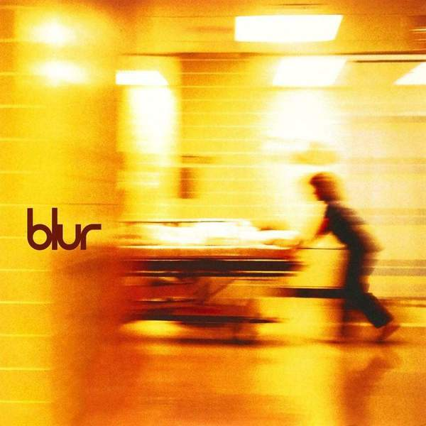
The album sleeve uses a distorted picture of what looks to be someone going to a surgery, the distortion make sit look like its urgent, the whole situation is like the title a blur.