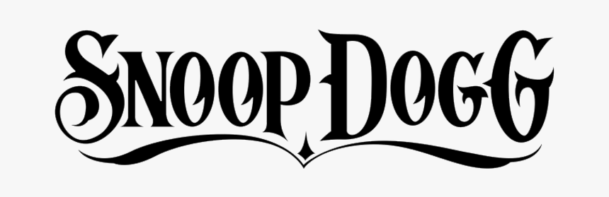
I have used this logo because i like the bold font and aesthetic it has. I like how the little black ribbon at the bottom is used as an underline showing the importance of the words.
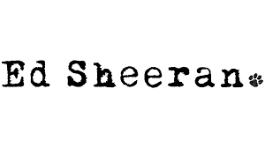
Ed Sheeran’s Logo really stands out to me due to his simplistic design and font. This all comes together as he is mainly an acoustic singer who plays his guitar most of the time. I really like the Carbon type font he used and the paw print showing that he is leaving his trace on this generation with his music today.
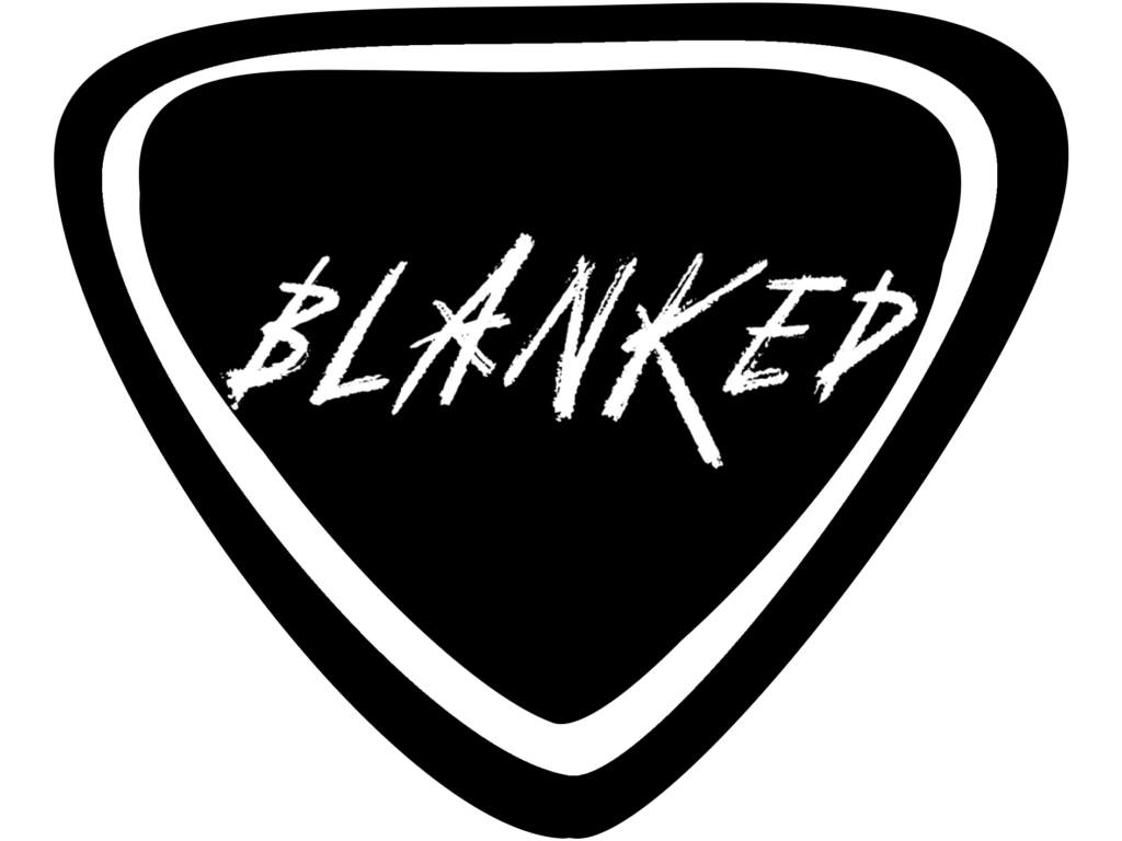
This was the logo that Kieran made for our band. We thought that the guitar pick represented our band and the name blanked really well due to the simplistic look and the curved edges of not knowing what to expect from us.