
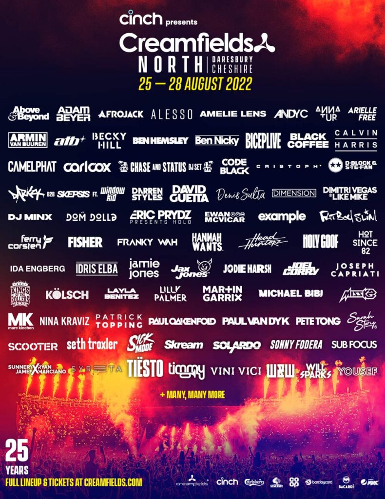
I’ve chosen this poster because it displays everything a good gig poster should. The picture of the main stage shows everyone exactly what they are paying for and is also a great background for all of the text. The poster tells us where it is and on what date. It also tells us some of the sponsors. Cream fields make it very clear who you are paying to see by putting each artist’s logo on the screen. The bigger artists’ logos are made a little bigger than the others to catch people’s attention.
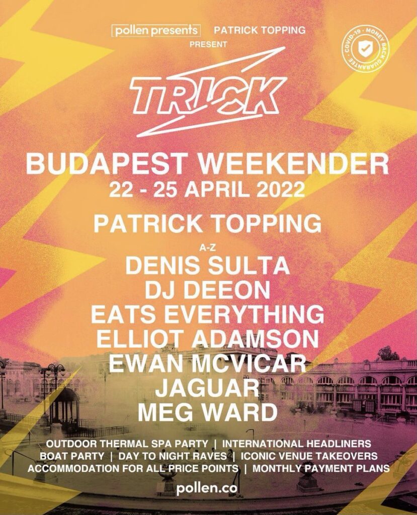
I chose this poster because it is simple. It is simple, informative and eye-catching at the same time. The poster gives a clear list of who will be performing at the event as well as the person who put it on, Patrick Topping and his Trick label. The picture of a discoloured Budapest is fitting for a poster promoting a gig in Budapest. The colours are eye-catching and make the poster stand out.

This poster is clean, simple and eye-catching. its bright colours intrigue you and make you look at the poster in more detail. The poster carries information that is displayed clearly. The whereabouts of the gig are shown clearly along with the time and where to get tickets from. There is also a clear list of who will be performing at the event allowing people to decide whether or not they want to attend. This is very different from Factory record’s older posters.
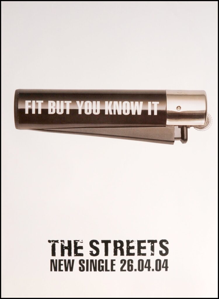
Less is more with posters. While scrolling, this poster really popped out and caught my eye, the simplicity of the poster allows me to get all the information I need quickly. The poster includes the name of the single being released, the band that is releasing the singles and the date the single is released. The neutral colours of the poster make something that is really nice to look at.
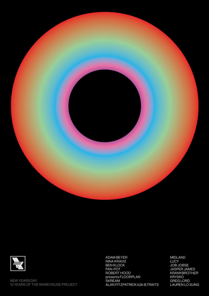
Just like the last poster, this gig poster is extremely simple to look at. Usually, the simpler the poster, the more attention it attracts. The poster does not show all the information needed such as the date, time, and where the gig will be held, but it does give a list of the DJs that will be performing at the event. The big circle in the middle catches the attention of the reader and gives a warm feel to the poster. The black background makes the circle pop and creates a contrast between light and dark within the poster. This poster is very minimal, but sometimes minimal is better.

This is the first poster on the list that includes a picture of the artist that is performing at the gig. Having the artist on the poster helps people understand quicker who they are paying to see and also what vibe they will be getting at this concert. The poster creates a dark, moody tone which fits J Hus’s style of music perfectly. All information that is needed is displayed on the poster to make it easier for the customer to know what they are going to do.