
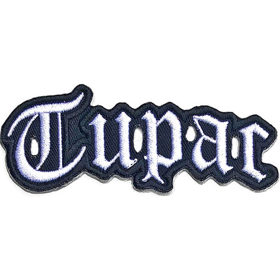
My first logo is 2pac. I think this is a very well-thought-out logo. The logo represents a patch that you would put on a denim jacket or other item of clothing. The logo is very eye-catching and unique. This can also be sold as merchandise if he chooses. This way his logo can be seen by more people and his music will become more popular. A very well thought idea.
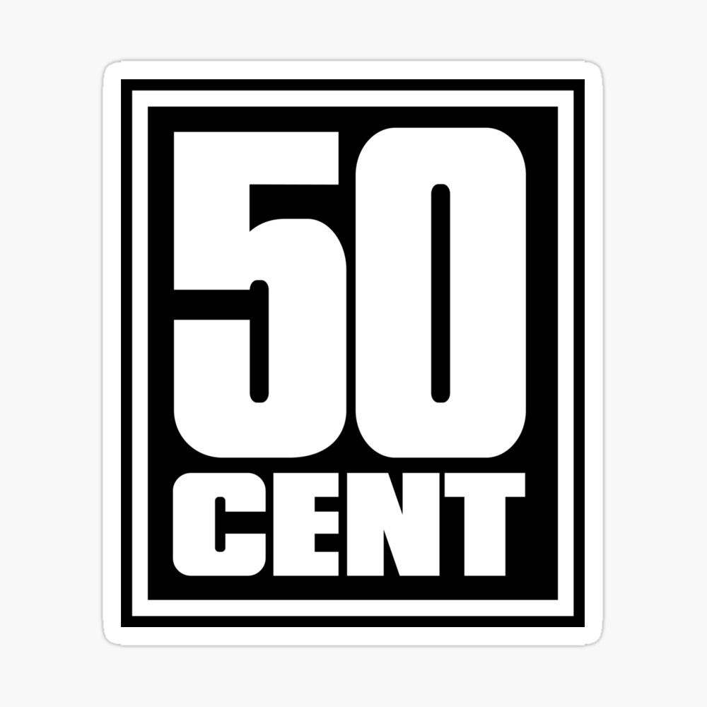
This is a clean simple logo. White writing on a black background so it can be seen clearly. The logo is easily recognizable which helps for gaining followers, and listeners and become a household name. The logo clearly shows who it is which means there is no confusion.
Biggie is already a household name. The artist’s songs have accumulated billions of streams and he has sold millions of records. Again, this is a clean simple logo that can be easily remembered. There is no need for a big logo with lots of colors and loads of things going on, don’t get me wrong sometimes this can work. However, with logos, typically less is more.
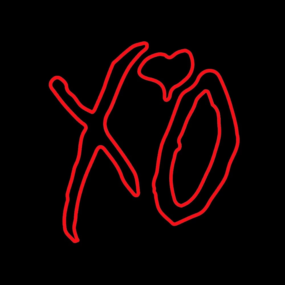
To people who aren’t fans of the weekend, this logo will make no sense. The logo does not show the artist’s name or even show anything to do with the weekend, however, I think this is a clean logo. The logo could have benefitted from having some clues as to whose logo it is, but other than that I think it’s a great logo.
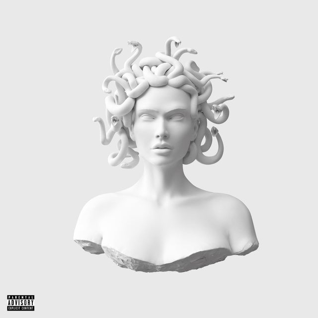
This is by far the best logo on this list. Like the weekend logo, this may be confusing to some people and may not be recognizable in the slightest. But despite that, this logo is clean, simple, creative, unique, and extremely nice to look at. The log belongs to the house artist Meduza who has released multiple award-winning albums. This logo perfectly fits their vibe.
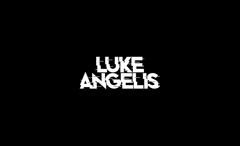
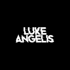
This is the logo I will be using for all my releases. I like the clean look of the logo and the white on black creates a very simplistic vibe. The glitch in the wording has been added to make my logo more unique and set it apart from the rest. This logo is nothing like any of the others I have collected above and I’m happy it is like that. I don’t like logos with symbols too much as it is sometimes hard to recognize. When people see this logo, they will instantly know it’s me because it is my name. As much as I love this logo, I wanted to add another option for variation. The one below will be a different version and will be used for videos and promo material.
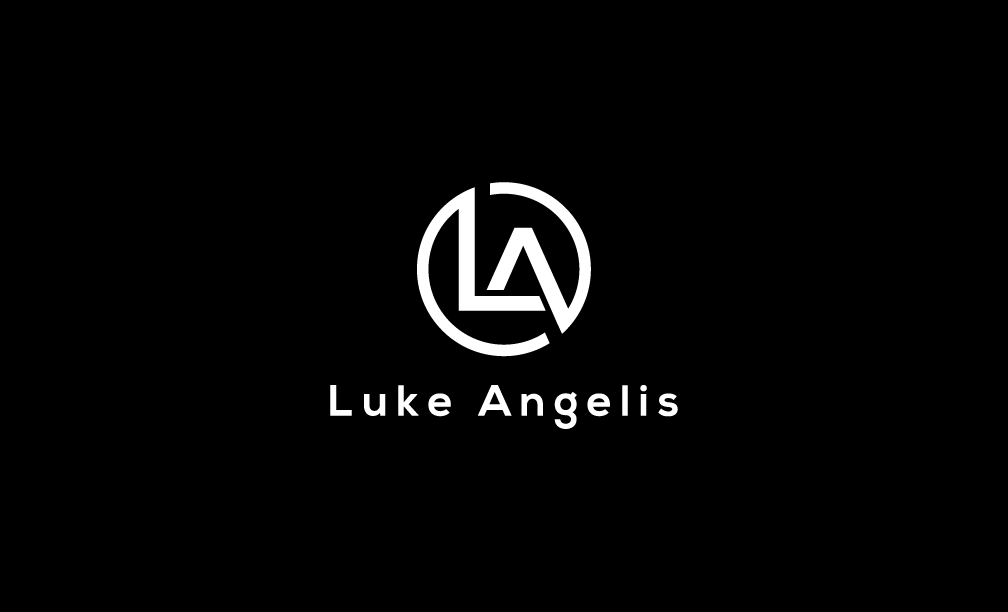
This is the variation of the logo I have. I don’t like logos that are just symbols so I added text underneath just so people know who the logo belongs to. I won’t be using this logo too much and it is strictly for promotional material. The 1st logo is better and will be my first choice. However, this is a very good second option. I’m happy with the logos I have made and think they will look good on the promotional material that I make.