

Just like i did with the other gig promotion page where i picked 5 posters that i liked, I will pick 5 logos that I think are great examples of a clean and effective logo. These may not necessarily be my favorite logos, but i admire them for their creativity and how effective they are.
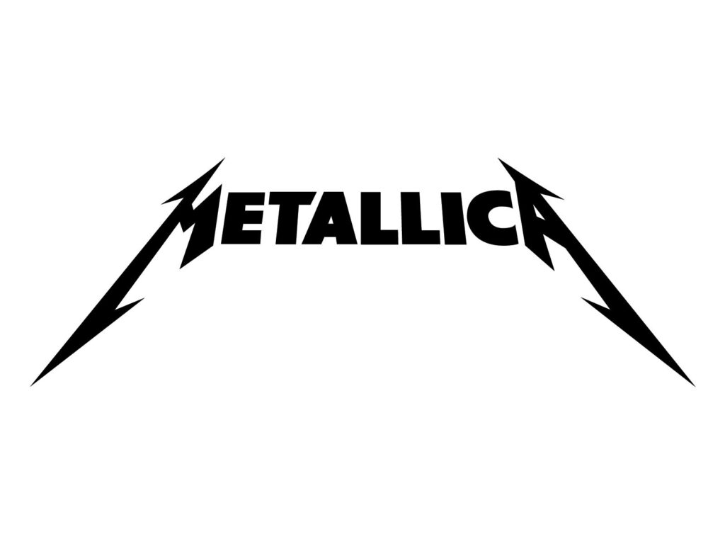
easily one of the most iconic logos ever. The Metallica logo is clean and sets a standard of what a good poster should look like. I like when logos are just the name of the band, but then of course it needs to be done in a creative way. I think metallica have done that perfectly. The logo is clean, simple but also interesting. The logo fits the vibe of the bands music perfectly.
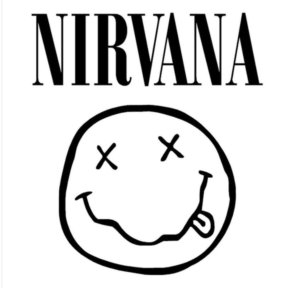
This is Nirvana’s logo. Maybe one of my favorite logos of all time. The logo is clean, simple, interesting and unique. I have no criticism when it comes to this. Most bands should strive to have a logo this great. The logo can be separated to just the name, or the face at the bottom, and of course you can have both together just like the picture above. We can take some inspiration for this.
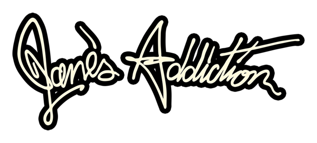
Another great logo. It is not as eligible as the other ones on the list but it is certainly interesting. I really like the font on this one, I think it adds a very different feeling to the logo. Once again, the logo matches the bands vibe perfectly. Not much else to say about this one, just a simple and clean logo.
This is the logo for my events company BULC. We went with a very clean approach. I like logos where it is just the band/event’s name, and we added the box around it just to make it more interesting. The logo is so simple that it wouldn’t really look out of place on any poster or any other piece of promotional material. We did this just so it can be used however we want over time. I will give an example.
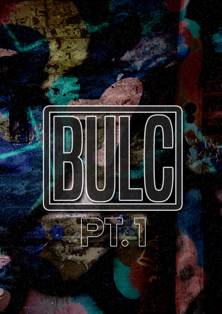
As you can see, the logo can be transformed into whatever we want. This way it fits on almost anything.

This is the Queens Of The Stone Age logo, and it is certainly different. From the logo you can not clearly see who the band is. However, the logo has become quite iconic and from that people know who it belongs to. I wouldn’t recommend a new band/event use a logo like this, as it needs to be easy to tell who the logo belongs to. While the logo is creative and interesting. I don’t suggest we go down this route.

This is the logo we have used for the event, I am not a fan. However, I’m not the only person working on this event, so we had to go with majority rules. While the logo is clean and well thought out, I just dont think it is easily recognizable. People could see this logo out and about, and they would have no clue who it belongs to. The logo could be improved, but as it is for a one off showcase, i believe it to be fairly decent. THe logo will only be used on other promotional material with our name on it anyway, so it is not too big of a deal.

This is the logo that we will be using for our band. As I have said before, we are taking a rather comedic approach for our band, in an effort to not take this so seriously. We aim to give a great performance, but beyond that, there is nothing we are really trying to achieve. As you can see the logo is EXTREMELY simple. It is very clear on who it belongs to and it is clean. While the logo may not be the most creative. It will be effective for this showcase. Amongst the other band logos which look incredible, ours will stand out as being, average. This is what we wanted, and i’m sure amongst all other promotional material, the logo maybe look half decent. Maybe.