
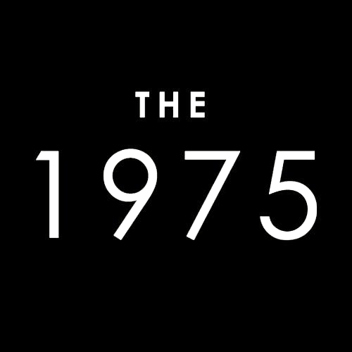
This Logo is clean and simple. The logo fits with the band’s branding and feel. In the logo, you can clearly see the band name as it is in a clean big font. The logo could be more interesting, but at least it is a simple logo that everyone can read, and is not complicated.
Again, like the 1975 logo, this logo is simple and easy for everyone to read. The band’s name is written in a big font and is white against a black background. This makes it very easy for people to see. With it being so simple it also makes the logo very recognisable. This is good for gaining new fans.
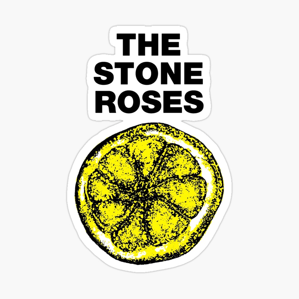
This logo is very unique and is very recognisable as the Stone Roses. Everyone who sees the lemon thinks of stone roses instantly. The logo also includes the band in a clear font which is very easy for people to read. If promoters wanted to use the logo for a poster or social media post they could use the lemon by itself, the name by itself or both. This is a very clever logo.
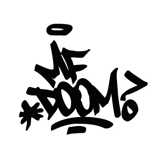
This MF Doom logo is very clever. The writing is in the style of graffiti which fits MF Dooms’ vibe and style of music perfectly. The logo is not too complicated and can be easily recognised. The logo is black writing against a white backdrop so it is easy to read. This may not have been made with a computer as it can be drawn with a marker pen and turned into a digital logo.
This is Drake’s logo. It is a good logo however, it is not clear that it is Drakes. If people know Drake, his music and his style, then they will recognise this logo. The logo is clean and has a nice colour way of gold and white, you don’t see that on many logos. Overall, it is a good logo but it would benefit from having some text telling people whose logo it is.
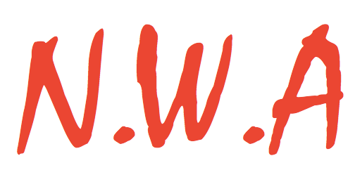
This logo is very nice as it is different to others. The logo includes the initials of the group’s name. The writing is in a nice red colour and has the font style of a piece of graffiti. Just like the MF Doom logo, this graffiti idea fits their music style and their vibe. The logo is easily recognisable.
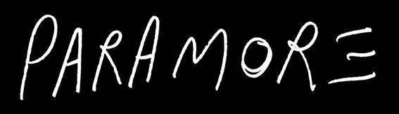
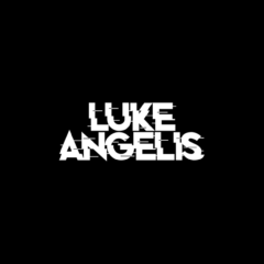
This logo is clean and simple and you can clearly tell what band the logo belongs to. The writing looks like it has been written with a pen which means that it could have been made in real life and changed into a digital logo. The logo is a black background with white writing meaning it’s easy to see and nice on the eye.
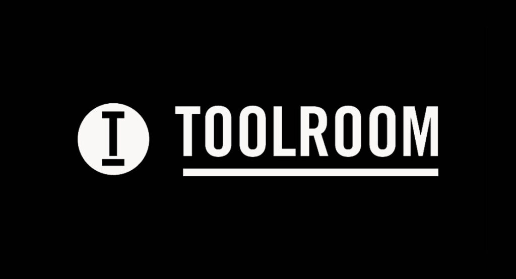
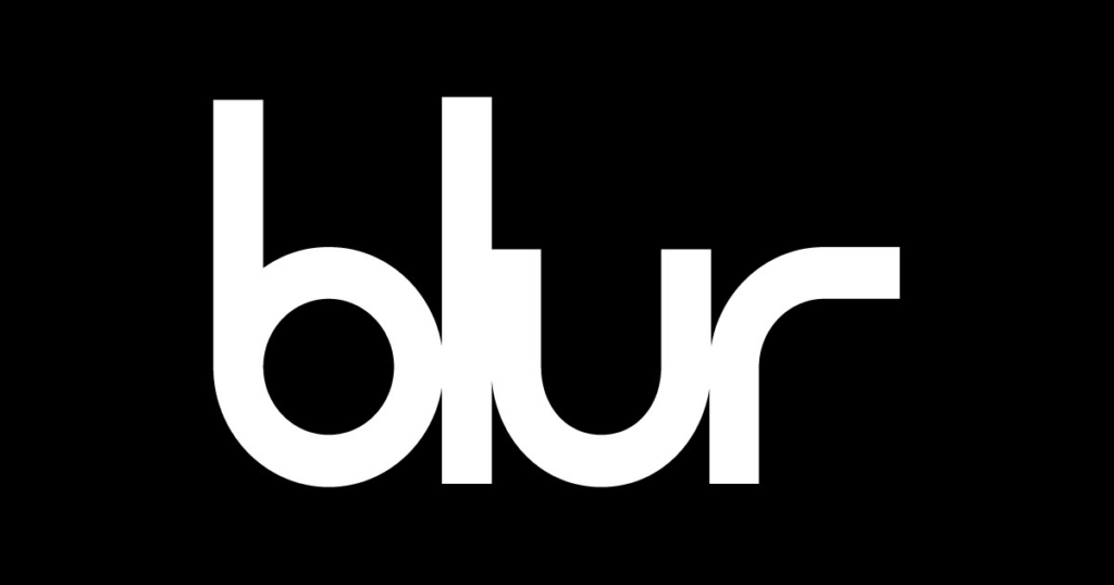
This logo is easily recognisable within the house music industry. The T logo has been put on many posters, videos, social media posts and other promotional materials. You can clearly tell whose logo it is because of the big writing next to the logo. Like the other logos I have shown, the writing is white on a black background, making it very easy to see both up close and far away.
Logo design.
When we were looking at ideas for our own band logo we typed in smoke break in google and just had a look at the images. We were looking for anything that could give us inspiration. It could be a font, picture or even colour. Here are some of the things I found.
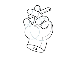
I liked this image due to its simplicity, this would make a great logo and it fits perfectly with the band’s name ‘Smoke Break’. I was pushing for this to be our logo because I thought it would fit very well. After a discussion with the band, we decided we would use letters rather than a picture to make it more clear who we are and what our name is.
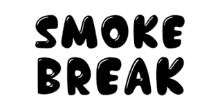
After our band discussion and the decision to make the logo just letters, I started to look at different fonts and colours. I found this design on google, I didn’t like it, but I needed to see the idea of just lettering come to life before I made any other decisions. Our band mainly covers rock songs, so this happy-looking bubble writing would not fit the vibe at all. The last design needed to be something stronger and more unique. we started looking at other band logos for inspiration, and here are the two that we found.
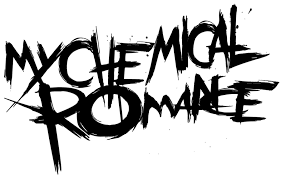
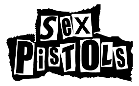
I really liked these two options. However, I did have a favourite. I thought that my chemical romance logo was a bit too messy. It also doesn’t fit the vibe of our band very well. I think the sex pistol logo would be much better suited to our band and would look much cleaner on promotional material. We had a discussion as a band and decided to make two different logos and then decide which one we would like to use. Here are the two that we made.
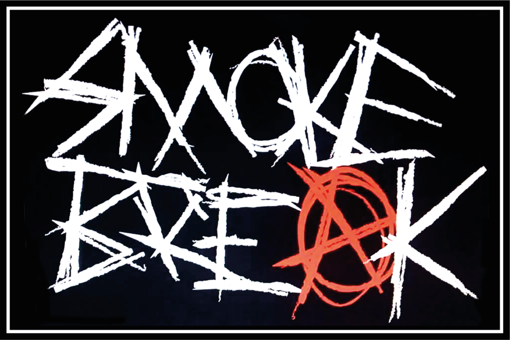

I personally preferred the sex pistols type of logo, but after a band discussion, we decided to go in the other direction. I was disappointed but the majority rules. They were both amazing logos so we couldn’t really complain. My chemical romance style logo was the logo we ended up using on all promotional material for the amplified gig.