

I am going to show you a few examples of what I want my artwork to look like. There have been so many different pieces of artwork that I have seen that I would have liked to replicate. However, I felt that the artwork I am going to use needs to be personal and carry the emotion that is displayed in the song. My track is about losing the feeling of excitement in going out to raves, and almost starting to feel anxious about attending them. By the end of the song he is has managed to find his love for the music again. For the artwork to display this emotion, it needs to be colourful with a dark undertone. Here are some of the examples I have found.
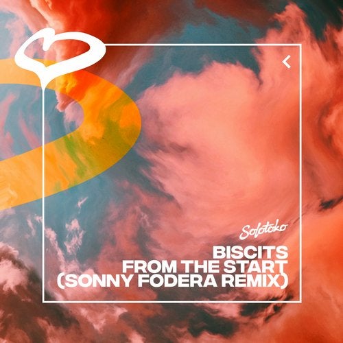
I love this piece of artwork. The colours all swirling around and mixing with each other reminds me of artwork for early 90’s house tracks. This is the feeling I am trying to create. It is colourful and eye-catching, but at the same time has the dark undertone that I was talking about. The artwork shows who made the track and what it is called, just to clear up any confusion. It also shows the label of which it was released on. It is not an easily recognizable album cover, but I like the vibe it gives off.
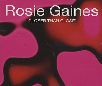
This is the perfect example of what I wanted my artwork to look like. This artwork is quite literally, straight from the 90’s and carries that vibe that I want. Not to mention that this song is also about finding love and comfort within a rave. “Closer than you ever could imagine”. I also love the grainy overlay that is put over this artwork. It gives it this complete old school vibe which I really like. Colourful, eye-catching and portrays the emotion of the song. Perfect.
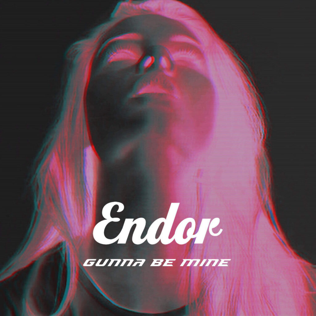
This is probably the piece of artwork that I have taken the most inspiration from. Although the track has come out in recent years, it has a late 90’s vibe. That is what I am striving for with this track. I love that there is a person on the cover. I didn’t just want my artwork to be colours, I wanted there to be more meaning behind it. This is why I have opted to have people on the cover. I like the glitch effect that he has put over the picture, and the colours chosen really make it pop. This is definitely a memorable piece of art work.
I have taken bits from each of these album covers to craft the perfect piece of artwork for my track. When you look at my artwork, you can really see the inspiration these 3 have given me. The artwork will be on a separate page.