
I will show 5 of my favorite gig posters and talk about what makes them so great. The posters will range across different genres and different time periods. Our job when creating a poster is making something that is both interesting, and eligible. We will take the best parts of all these posters and combine them together. That way we will have the best of all worlds. An all round solid poster.
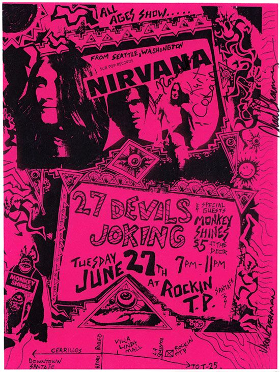
I love the style of posters they used in the 90’s. These posters are not only great for marketing, but eventually become pieces of art that a lot of people want to display in their home. The poster looks as if the art has been draw on. I love this as it creates a raw and natural effect. This poster isn’t the most eligible in the slightest, but it is very eye-catching. A great great poster for one of the best bands in the world.
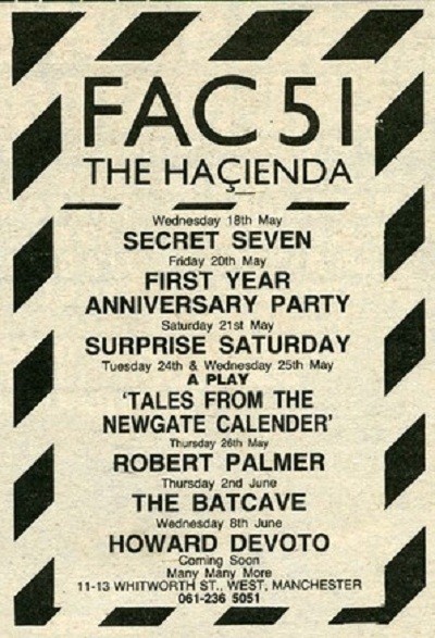
The hacienda always had some of the cleanest looking posters. This is what made them so great. They were so clean but effective. The were interesting to look at and very eligible. People knew exactly what they were going to. This style became very iconic and every poster they made followed the same blueprint as this, just with different patterns and colourways.
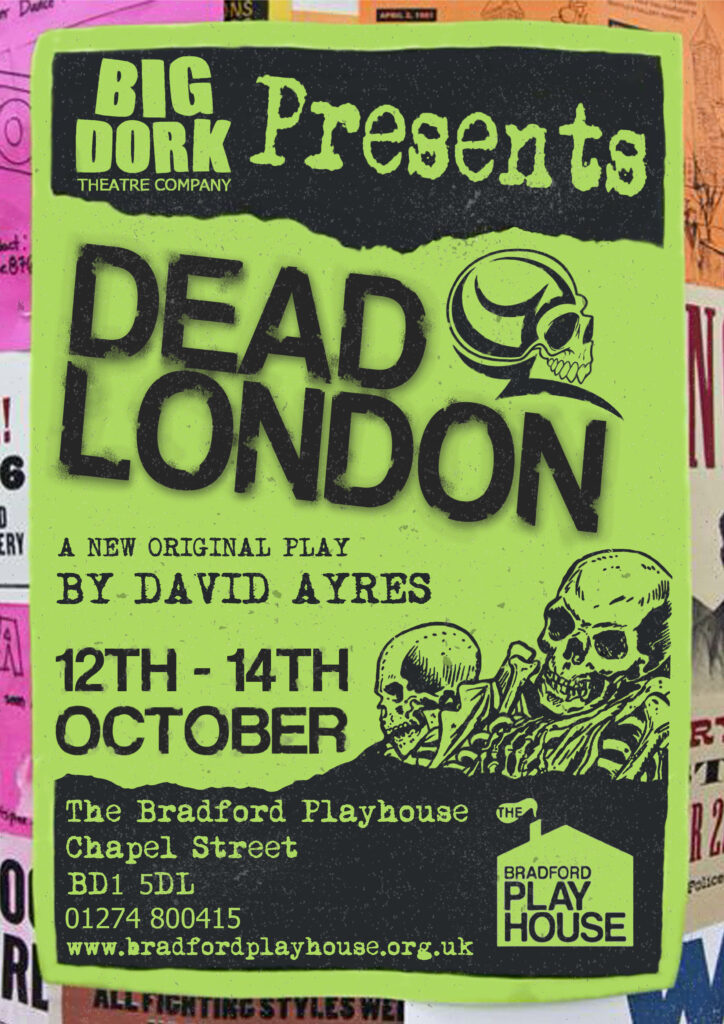
This may be cheating, but this is the poster for the play i am featuring in. It follows the same blueprint as the nirvana one, and looks very 90’s. I like the patterns and the graphics on the poster, they add a different element to the poster. The poster is eligible and clean. All information can be found easily.
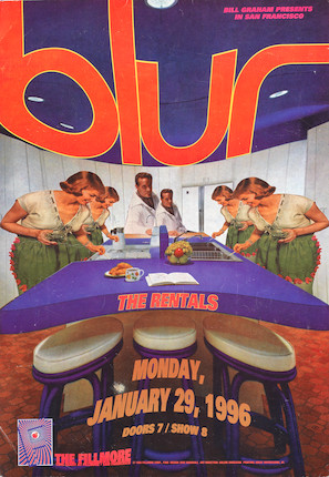
Blur poster almost always followed the same pattern. They mostly featured an interesting graphic. I like this as it adds something different to the poster and differentiates it from other gig poster. The poster is still eligible while being interesting. This is something we should strive to do. Like the nirvana one, this is something a lot of people would like to keep just as a piece of art.
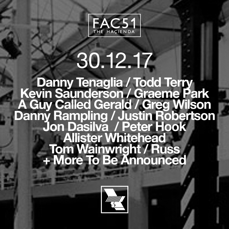
This is the only poster on the list that is not from the 90’s/early 2000’s. It is a hacienda party at the warehouse project in manchester. While not being extremely eye-catching, the clean look and bold letters make it interesting enough. WHP always have very clean designs when it comes to posters. There whole brand is very clean, and that sets them up for great promotional material. While this may not be my favorite on the list, its definitely a great poster.
If we can take the best elements of all of these posters, then we can create something great. I would really like to follow in the 90’s style, but of course, i will have to discuss this with the rest of the organisers.
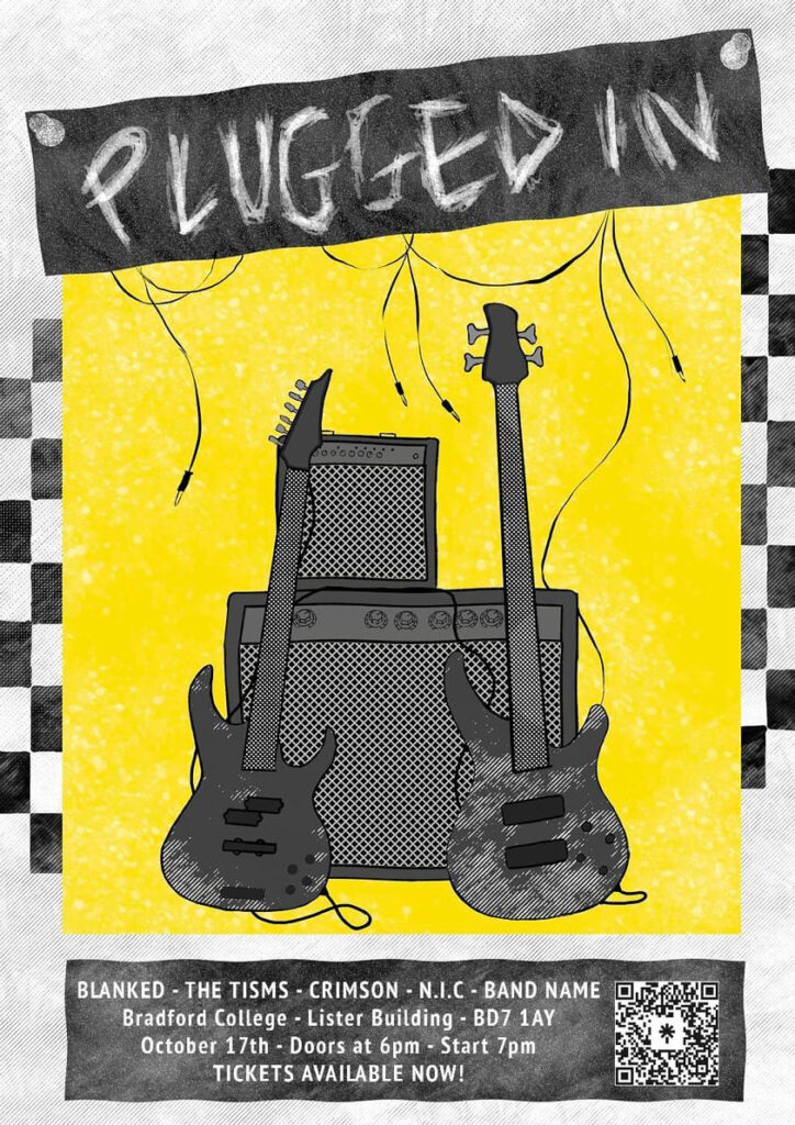
Here is the poster we have gone with to promote our event. You can slightly see the 90’s style that i was talking about previously. The poster was drawn which creates a raw and natural effect. The poster is interesting to look at and is extremely eligible. It has all the information that someone would need to know about the event. We have taken the best elements of all the posters. It is clean, eligible, interesting and creative.
I am very pleased with how the poster looks and I believe it will be a great piece of promotional material. We have the bradford music scene sponsoring the event, so the only thing I would change about the poster is the fact that we do not have there logo on here. That is my only criticism. Bar that, i think its a great poster.