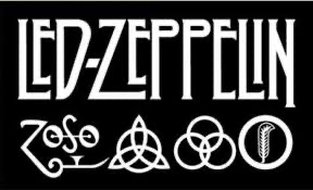
I like this Led Zeppelin logo because its simplistic but has a unique design to it where some of the letters are stretched out with a black and white design that stands out.

The Queen design is nice because it’s short and snappy but has also has a impactful name to it, as the word queen stands for someone that is a ruler there for giving the band name a powerful meaning. Also the text looks very royal and clean which also works with the name queen.
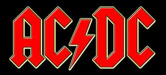
The ACDC logo looks good because mainly the red and black background and the text has a creamy outline to it so the letters stand out better between the red and black. Also you can see slightly the red letters have dirt on them so they don’t look so bold and new looking.
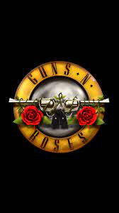
The selection of layers and colours match well because of the 3 main eye catching colours. A black background, the yellow ring with the curved and spaced out guns and roses text and the red roses under the gun barrels. Also the green ivy and leaves that are wrapped around the guns make it look less digital and a more professional logo.
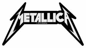
I like the Metallica logo because the M and A that are at the start and finish of the band name have a devilish look to them and instead of just pointing out at the bottom they go and point back into the text and then the top of the photo it does the opposite which gives It the mean, devilish look to the logo. The black outer Line is thick instead of thin which also makes the gray inner layer text stand out better.
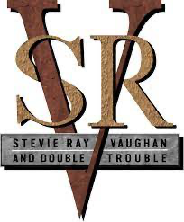
The layering of the shapes, fonts and text really stand out in this logo this the giant V cutting through all the text but also going all off the text together at the same time. The colours grey, gold, and brown and rusty texture of all the fonts resemble Stevie with his Texas look.
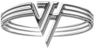
The Van Halen band logo is unique because of the shiny silver chrome look. But also the VH is large and right at the front of the logo so its stands out as its right in your face. Also the font of the VH is unique with the the H and V fitting together