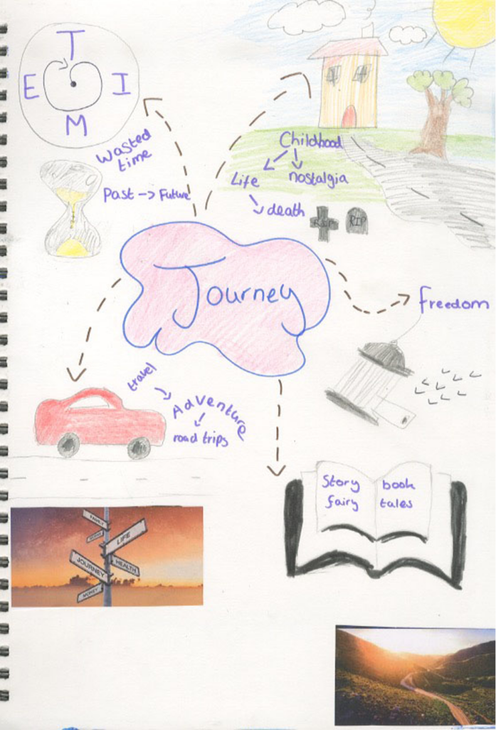
Journey mind map
I created a visual mind map to help me to generate ideas for this project.
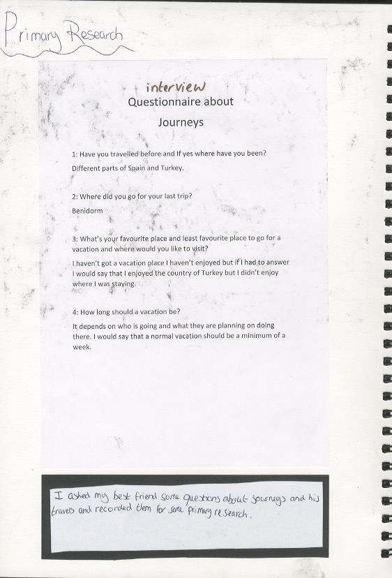
I asked my best friend some questions about journeys and his travels and recorded them for some primary research.
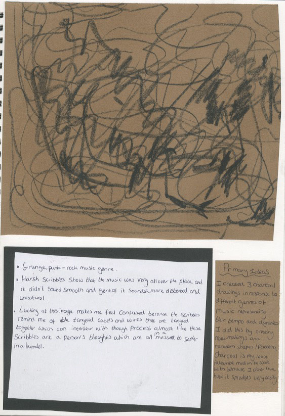
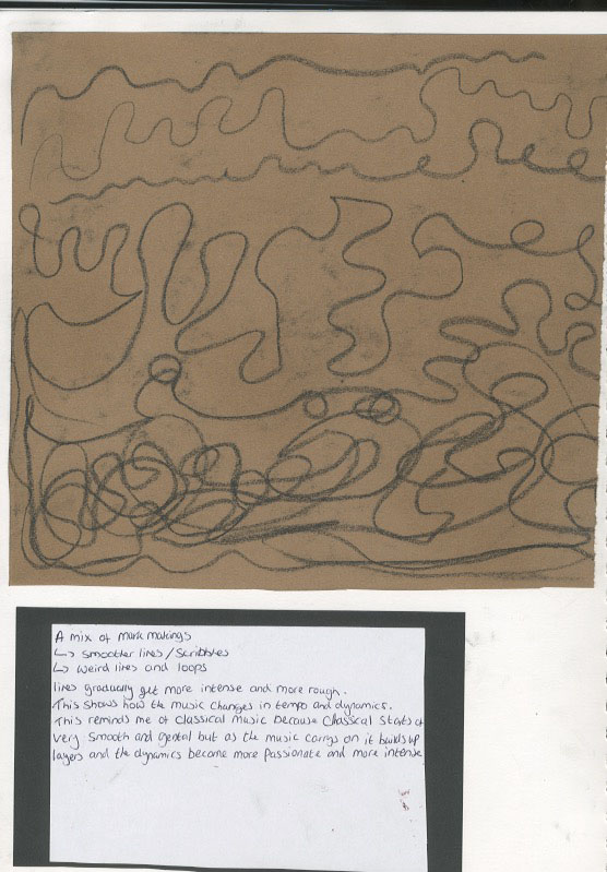
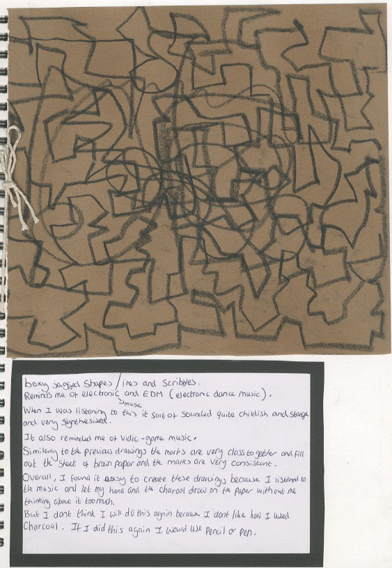
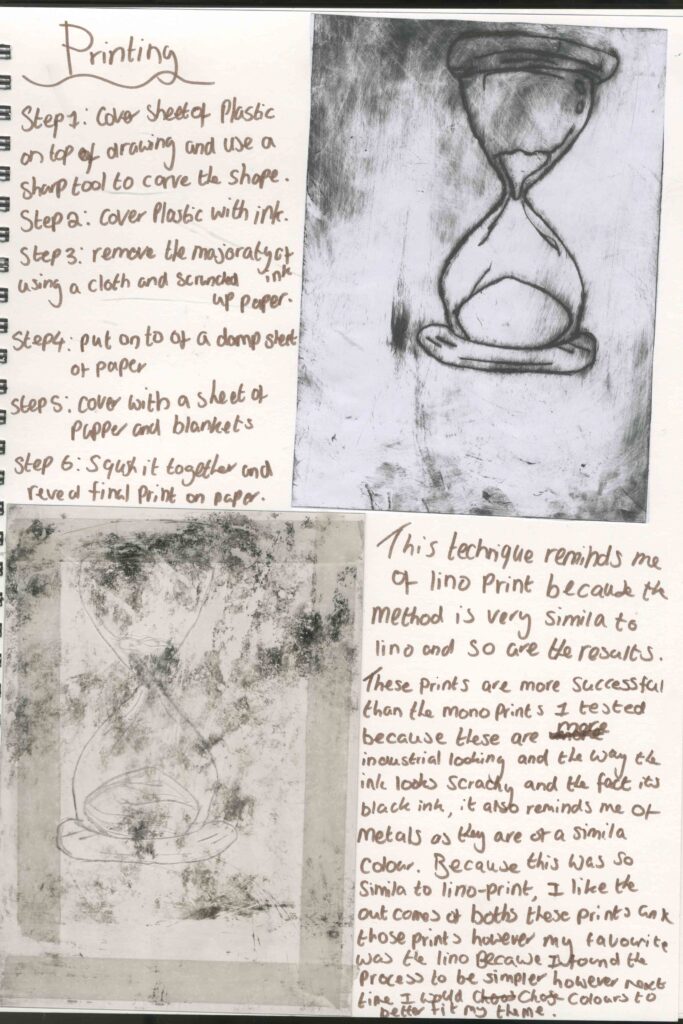
Charcoal drawings
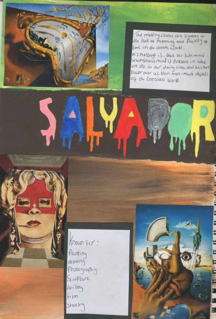
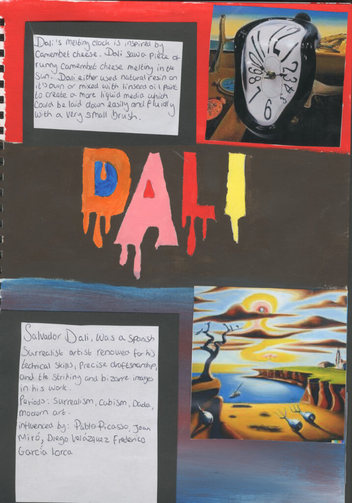
Artist research Salvador Dali
I did some artist research on Salvador Dali.
I think that he is a relevant artist to my project especially his melting clock works .this is because I’m doing clockwork especially and it reminds me of steampunk .
Artist research Pat Acton( artist sculpture)
Pat Acton is a steampunk artist that takes inspiration from boats and masks. He also likes to use recycled materials and repurposes them in his artwork. Even though I’m not doing sculpture and boats I think he is a relevant artist for my project as I’m also doing steampunk and his work is mixed media and my specialties practice is steampunk so I think he relates to my project intentions as well as specialist practice.
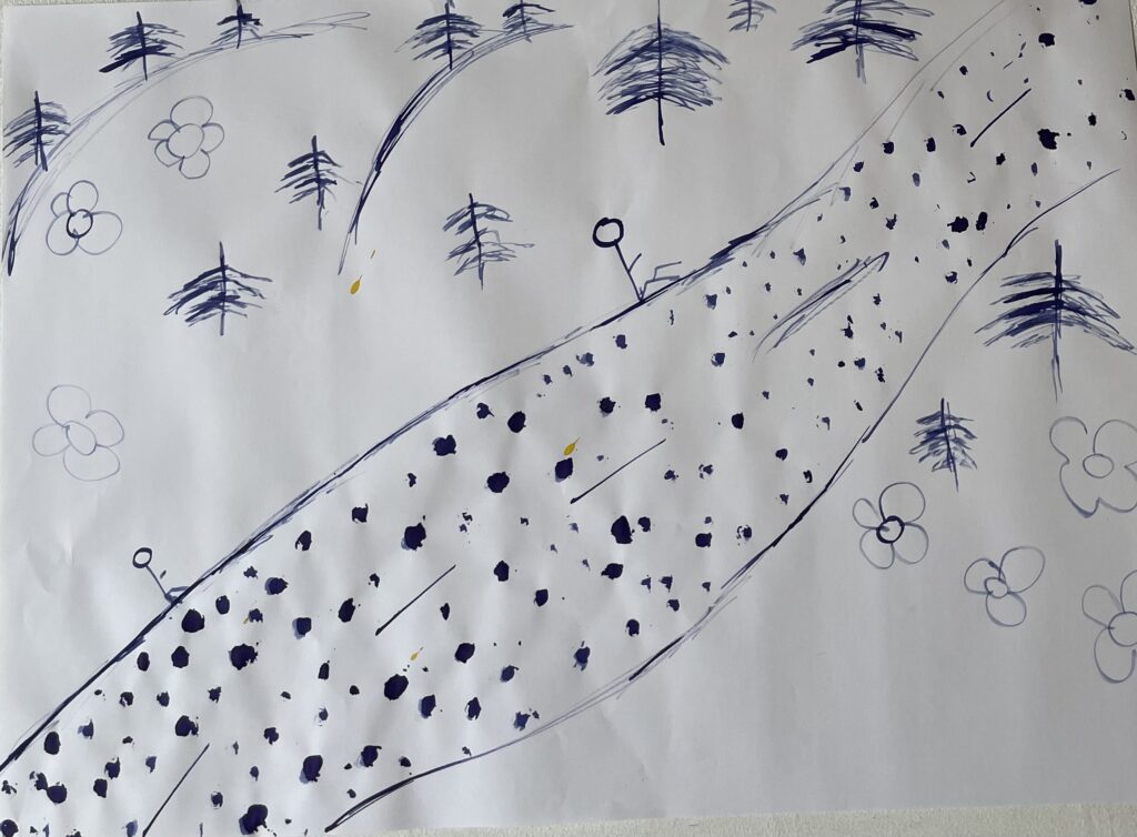
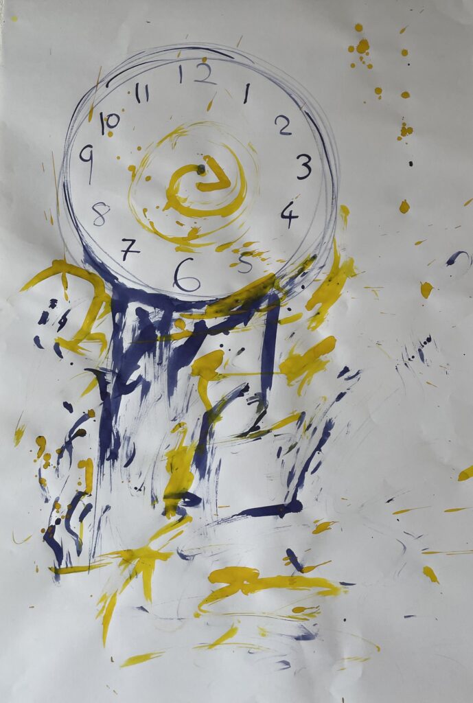
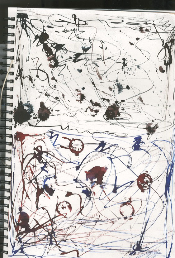
Ink drawings / paintings
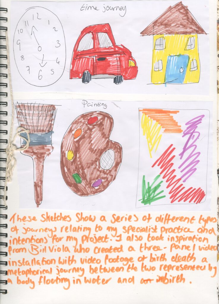
I created these with my fingers prints and a blunt pencil. Both of the paintings show different types of journeys . A physical journey of a person on a road and a journey showing time through a clock.
The physical journey was a an experimental test to help me to gather my ideas for this project and as I was creating this I had the idea to base my work off of time. The fact that the ink has traveled from both sides of the paper shows that the ink has also gone on a journey. The first one I did reminds me of a drawing i might of done in primary school because it shows stick men and the way it looks , I get the impression that a child has done it.
The clock one looks like time is on going and it won’t ever stop because of the arrow in the middle of it which gives a sense of hope and that there is always time .
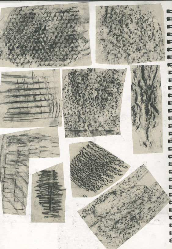
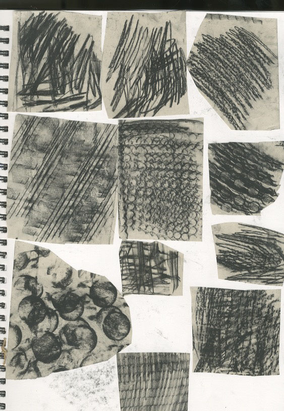
Frottage
A rubbing (frottage) is a reproduction of the texture of a surface created by placing a piece of paper or something similar material over the subject and then rubbing the paper with something to deposite the marks, most commonly charcoal or pencil but also various forms of blotted and rolls ink , chalk, wax and many other substances . This technique can be used to produce blur free images of minuscule way that can hardly be matched by even the most elaborate , elevations measuring only a few thousandths of a millimetre can be made visible.
I went around college and used charcoal pressed to paper to different textures and used charcoal to create rubbings . I found this to be very easy and successful and I can use them for further development.
https://en.m.wikipedia.org/wiki/Rubbing_(art)
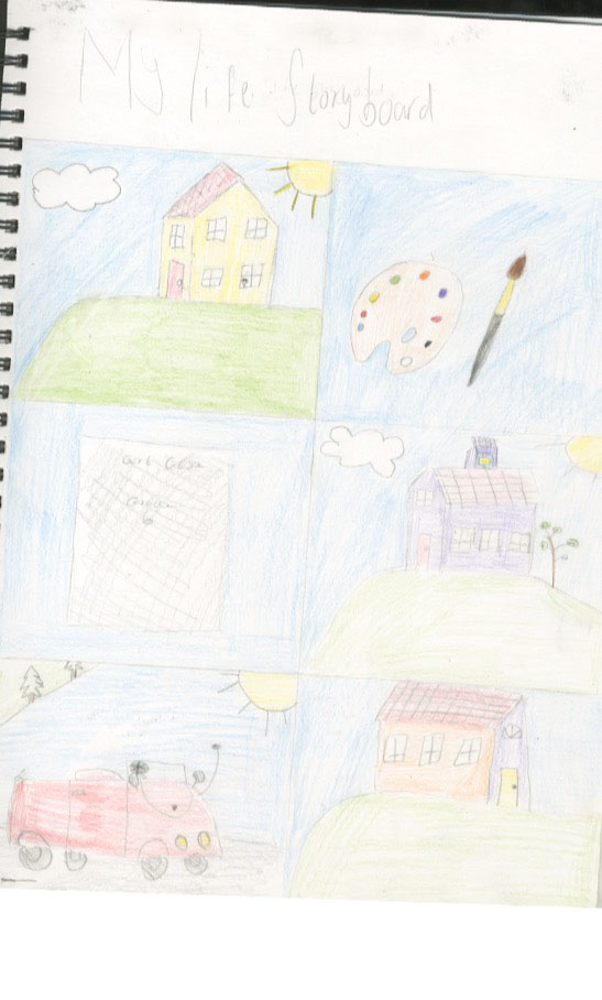
Story board.
I also created a story word narating my life from my past present and future.
In this story board , I started it from when we were all living through the pandemic which because of this I had t work home a lot and I would do all of my Gcse art work at home. Next is the little sketch of my gces certificate I was got which is something that I’m really proud of After that , the next image show things that I hope to get in the future showing me getting my drivers licence and going to university.
I also used coloured pencil to add the colour because it reminded me of a children’s colouring book and I also took inspiration from a very popular children’s tv show Peppa pig. This is because I wanted it to be something childhood related as well as relating to my life .
In children’s tv shows there tends to be a lot of repetition and in this I included repetition of the colours blue yellow and green.
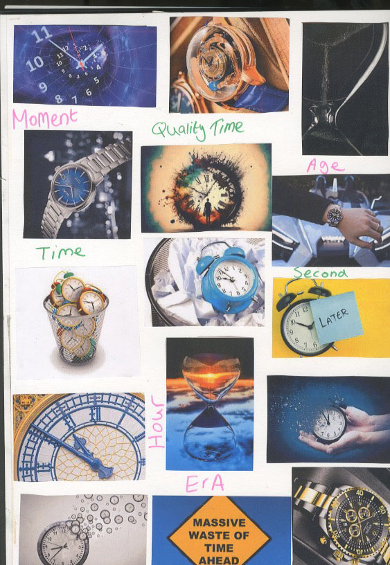
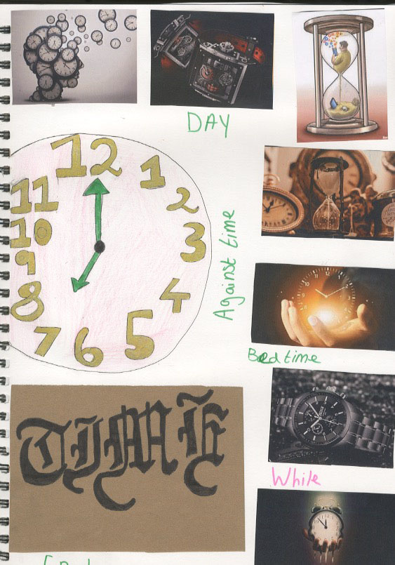
Time mood board.
I made a mood board to help me to generate my ideas and plan.
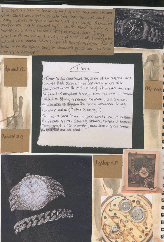
https://en.m.wikipedia.org/wiki/Time
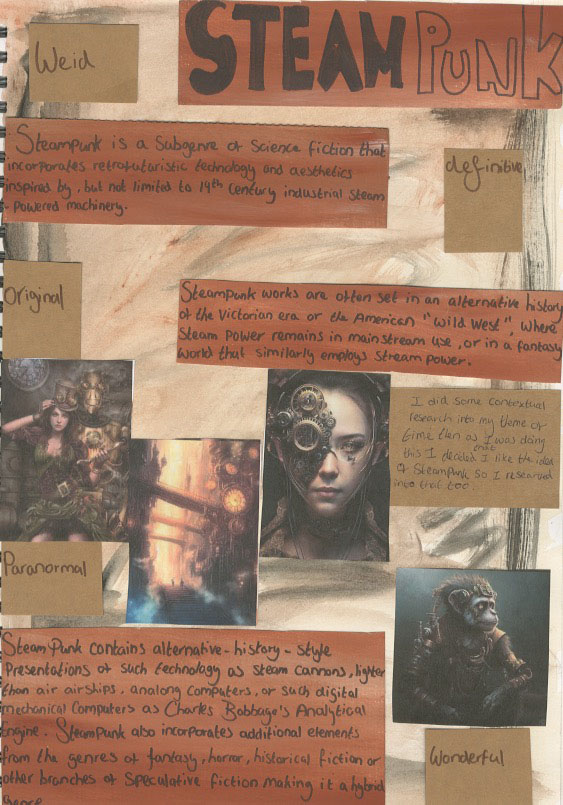
Steam punk reserach
https://www.google.co.uk/search?q=clockwork&ie=UTF-8&oe=UTF-8&hl=en-gb&client=safari
https://en.m.wikipedia.org/wiki/Steampunk
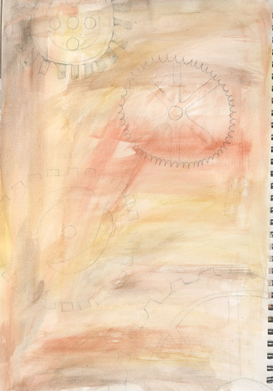
Clock work drawings
I drew these my right hand and left hand
I used pencil with my right and black pen with my left hand
I also used water colour on top of both pages because I thought that the background looked boring and basic also I chose colours that reminded me of rust:yellow, brown, red ,black.
My favourite drawings are the pencil drawings as I did that with my dominant hand. However I preferred the black pen because it was easier to see but because I used my left hand I felt like I had less control over the pen.
The images show drawings of clockwork showing dominant hand drawings and non dominant hand drawings.
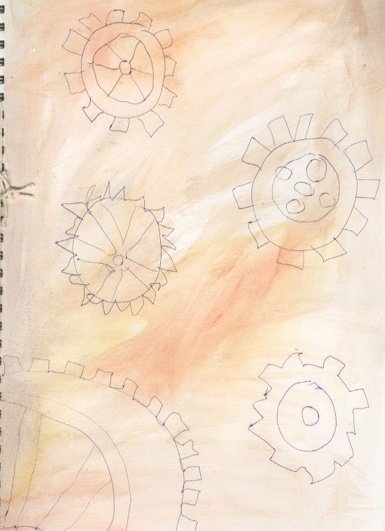
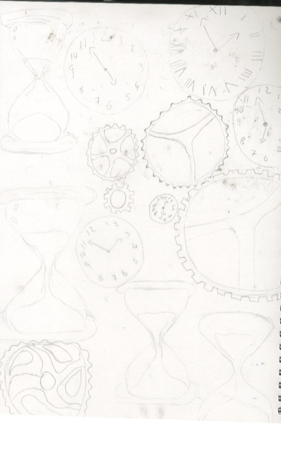
Sketches of clocks ,cogs ,hour glasses
I drew some images so I can use them for further research and development.
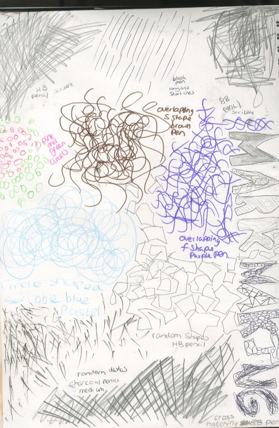
Mark Makings
I tested out some random marks with different materials: pencil, pen ,pastel, charcoal.
My most successful medium and marks were the scribbles using the pens and pencils because I felt like I had more control over it and it doesn’t smudge.
My left favourite is the pastel because it is messy to work with and is very soft so it kept on breaking and snapping.
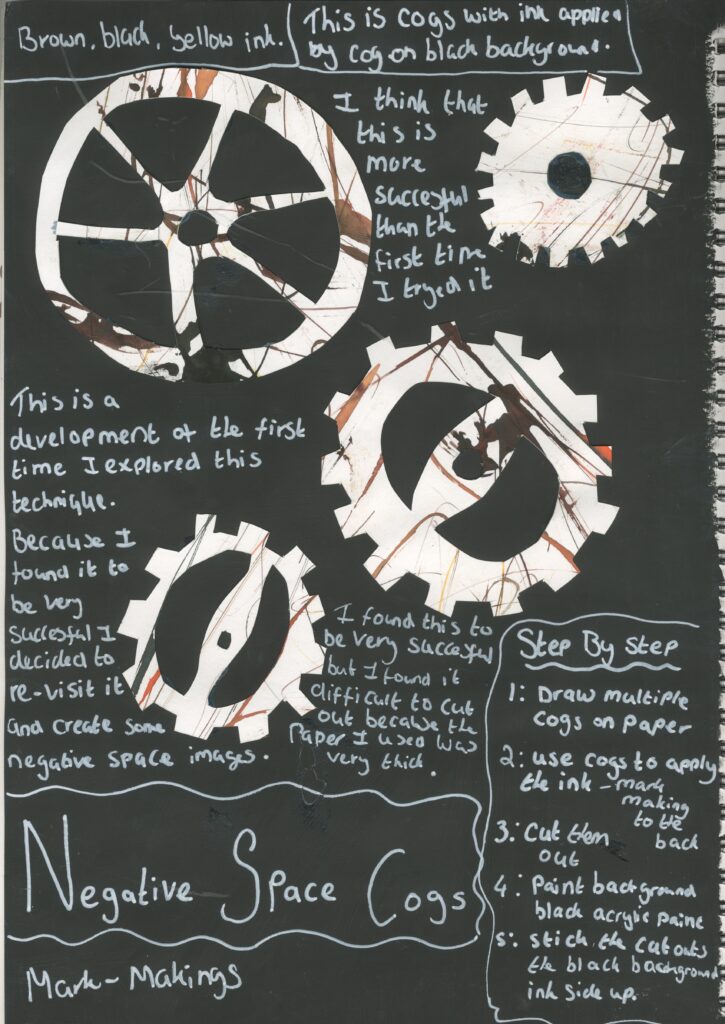
Mark making with a cog
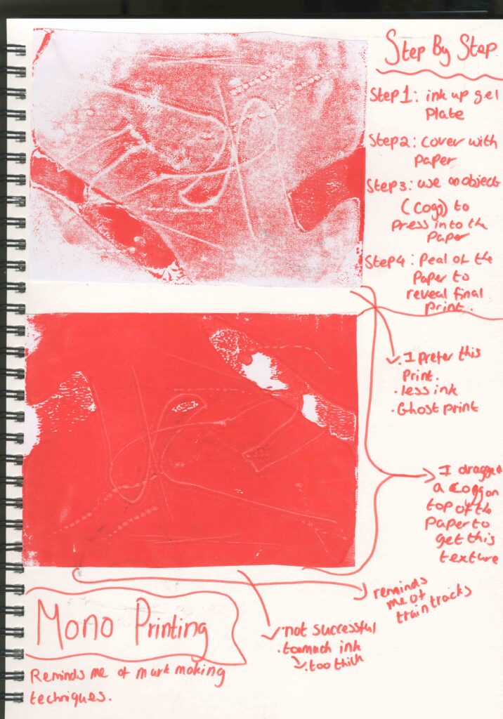
I also tested marks using cogs .I did this by dipping them in ink and dragging them across the paper. I also tried to lay flat to get a print of them however this didn’t work very well because I used too much ink and some of them look like blobs.
Brown, black , red , blue ink.
The brown and black ink reminds me of rusty metal.
Reminds me of ink drawings I did at the start of the project.
messy
abstract
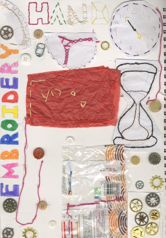
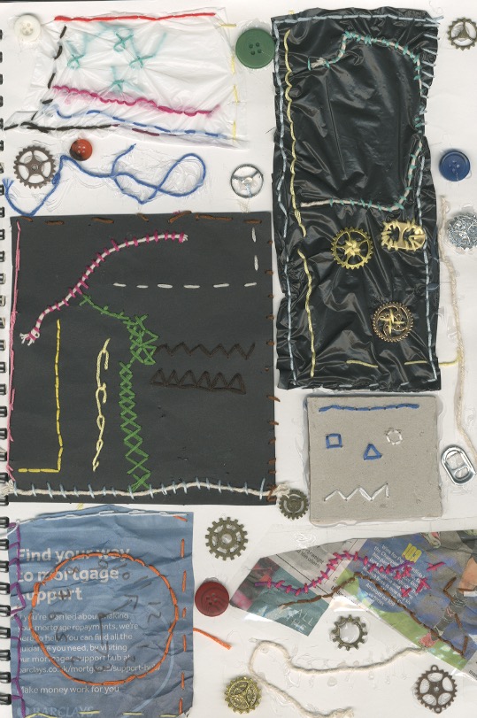
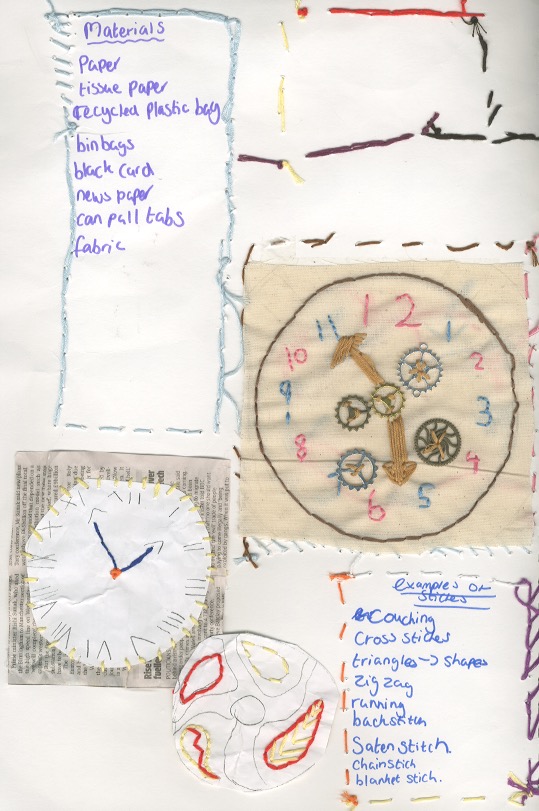
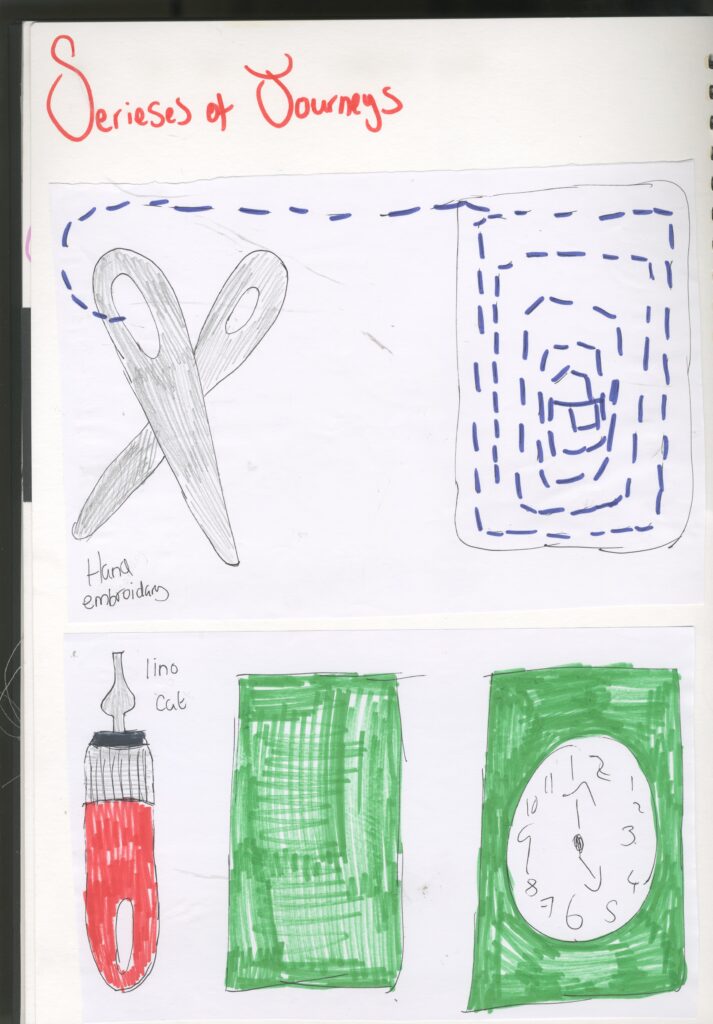
Hand embroidery
hand embroidery is the art of decorative stitching on fabric or other materials with needles and thread. There are many types of yarn and fibres to stitch with, as well as a plethora of stitches to use . Embroidery may include ribbons, beads and buttons. There are many resources for hand embroidery stitches. Hand embroidery can be decorative as well as practical.
I tested out different textures and materials as well as different types of stitches.
I also included recycled things: old plastic bags , aluminium can pull tabs these remind me of cogs and steampunk as well as buttons.
My most successful example is the fabric one because it was the easiest to stitch through and it was more durable so it didn’t rip which this did happen when I stitch through the papers. And I was able to embellish it with cogs and I also used multiple stitches to create it: running and satin stitch.
My lest favourite was the tissue paper and cardboard. This is because the tissue paper was too thin so it kept on ripping and the cardboard was too thick so it was very difficult for me to sew through it.
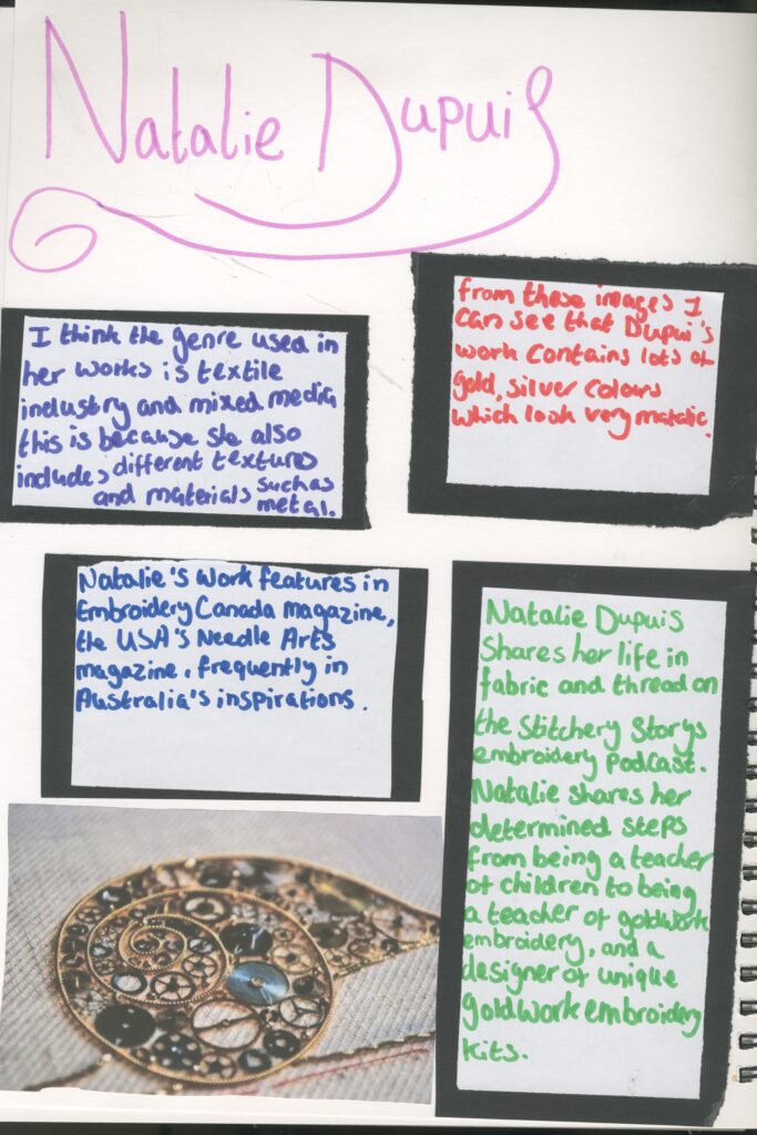
Artist Research Natalie Dupuis
I researched Natalie Dupuis who is an embroidery artist.
I think her work is relevant to my project because in interested in incorporating embroidery into my final piece.
https://dupuisnatalie.wixsite.com/mysite/about

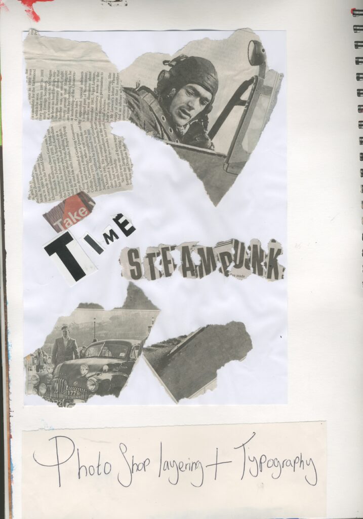
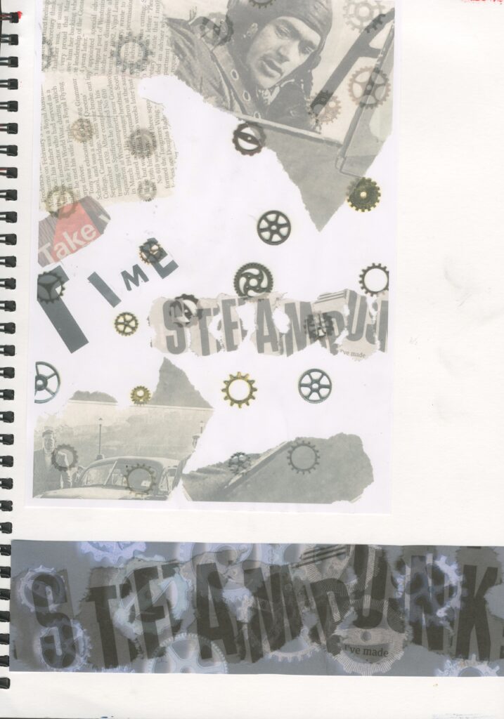
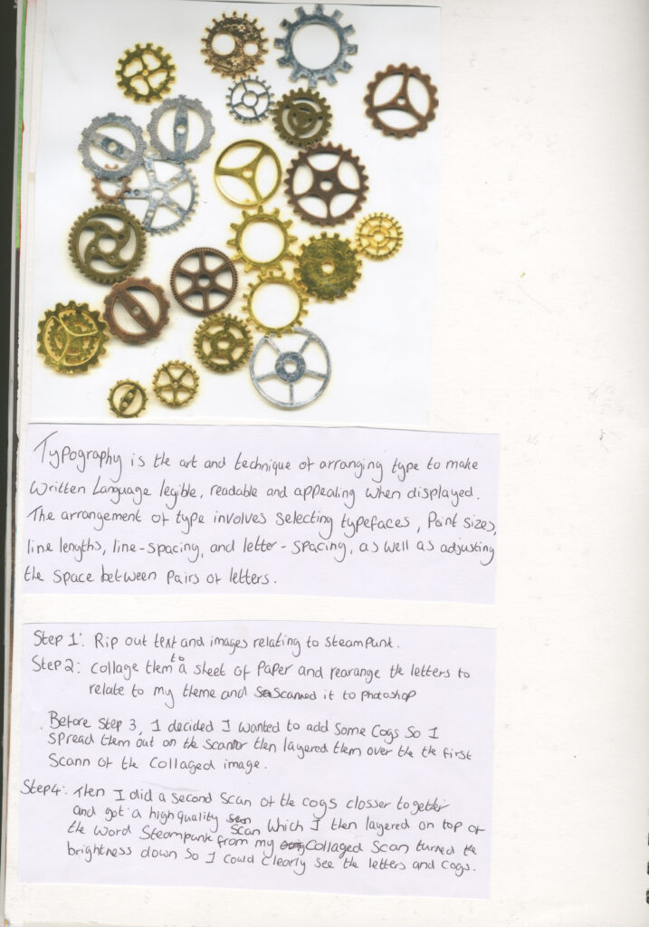
Photoshop layering and typography
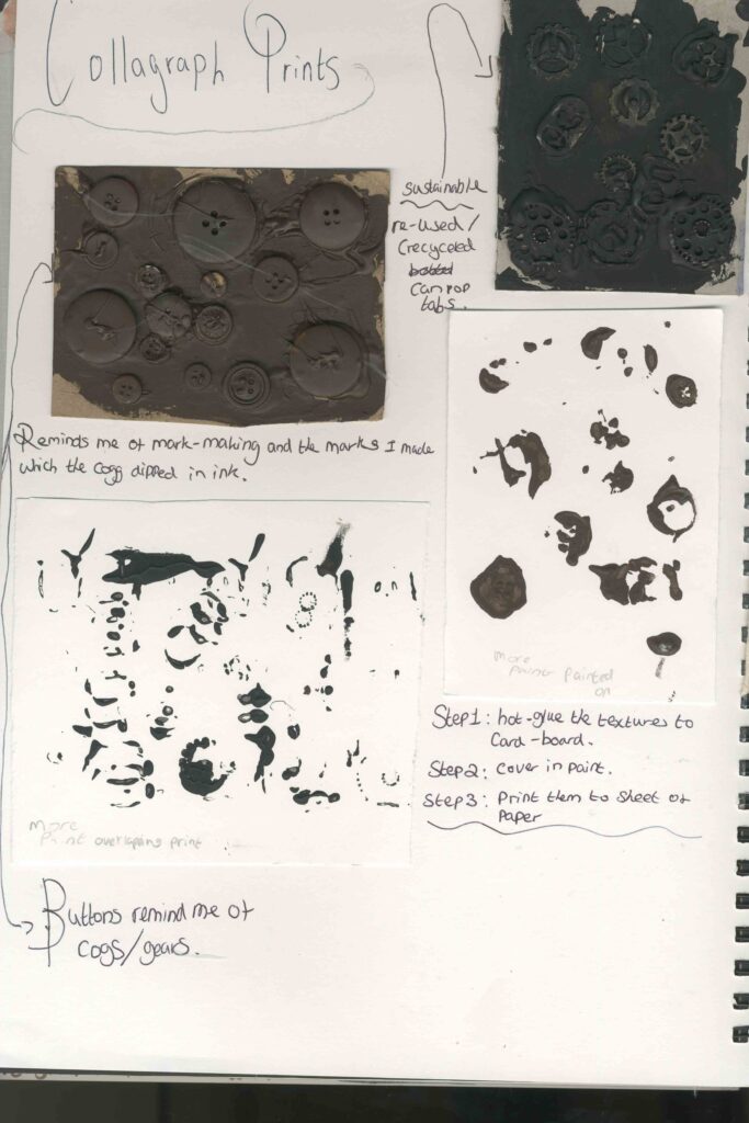
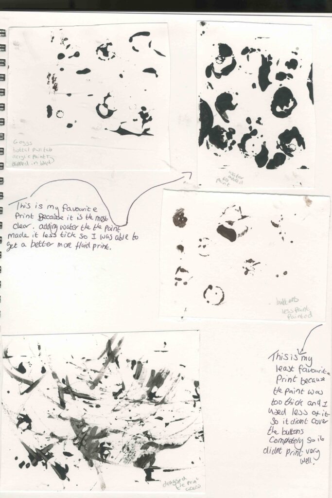
Collagraph Prints
Printing / etching

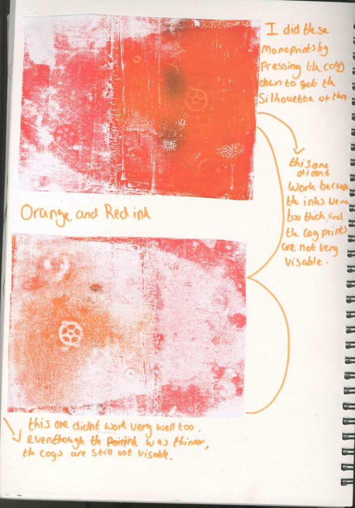
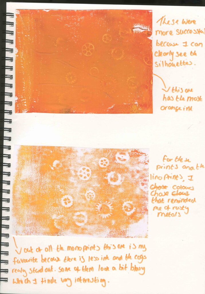
Mono printing
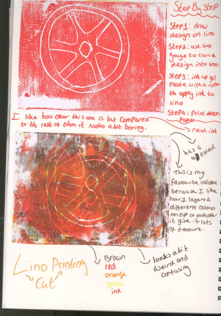
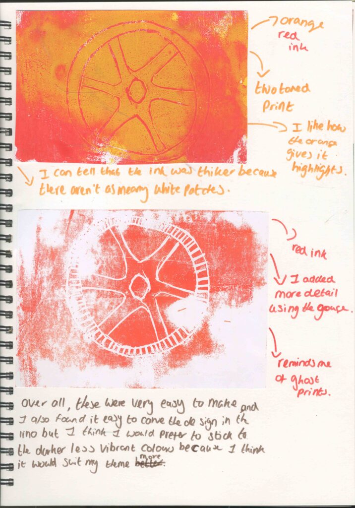
Lino printin
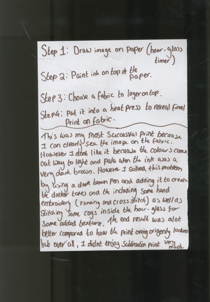
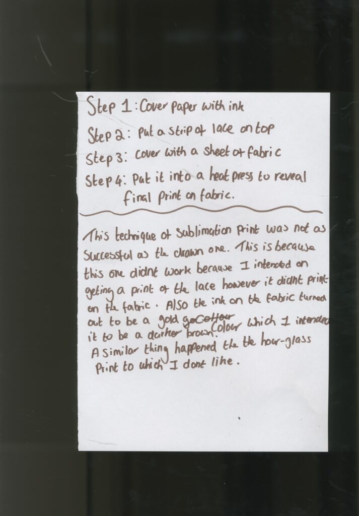
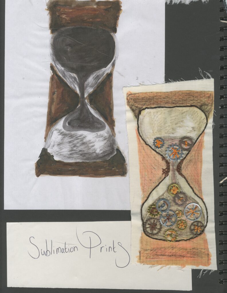
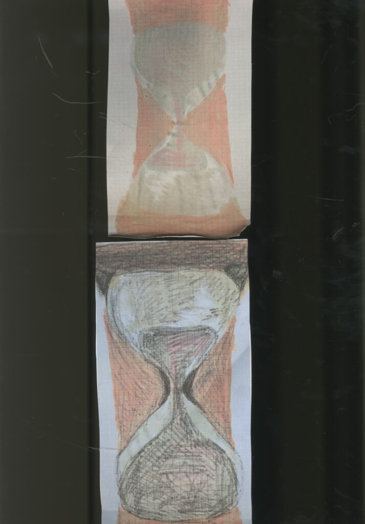
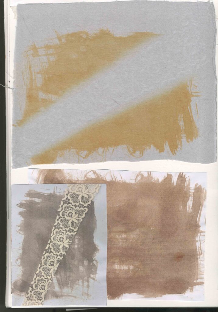
Sublimation printing
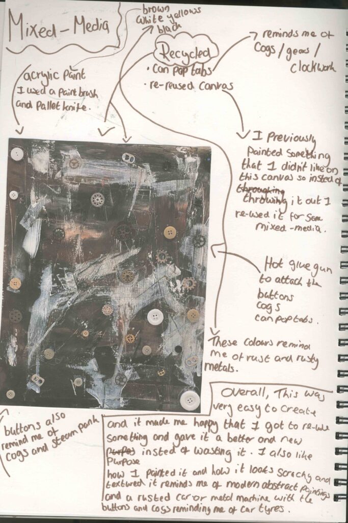
Mixed media
These are sketches were also a way to help me to pick my theme for this project.The fact that the drawings are figurative, reminds me of being in primary school and the way I coloured them in also reminds me of the art work I created when I was younger. And to further enhance this opinion, I used a coloured felt-tip pen which was a favourite art resource in Primary School.
The painting , embroidery and Lino cut are some of my favourite mediums to work with .
I don’t plan on continuing this way of working because I don’t envision my final piece to be multiple creations or in a series. I don’t think this relates very well to my intentions because Im focusing on clockwork and I think if I was doing a physical journey instead, this way of working would be more appropriate.
Magazine cover
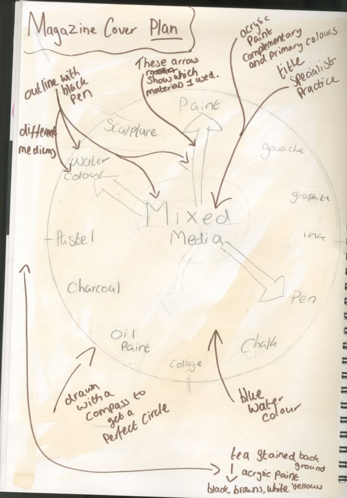
Materials:
Tea
acrylic paint
watercolour
black pens
coloured pens
pencil
Step by step:
step 1: cover the paper with tea and let dry
Step 2: draw a circle in the middle of the page
step 3: write different materials around the perimeter of the circle and the title in the middle
step 4: paint the title in acrylic paint: red ,green , blue, orange, purple
step 5: paint the circle in blue watercolour
step 6: colour the arrows with pen
step 7 : paint background with the acrylic paint and a palette knife: browns, yellows, black and white
step 8: outline everything in black pen
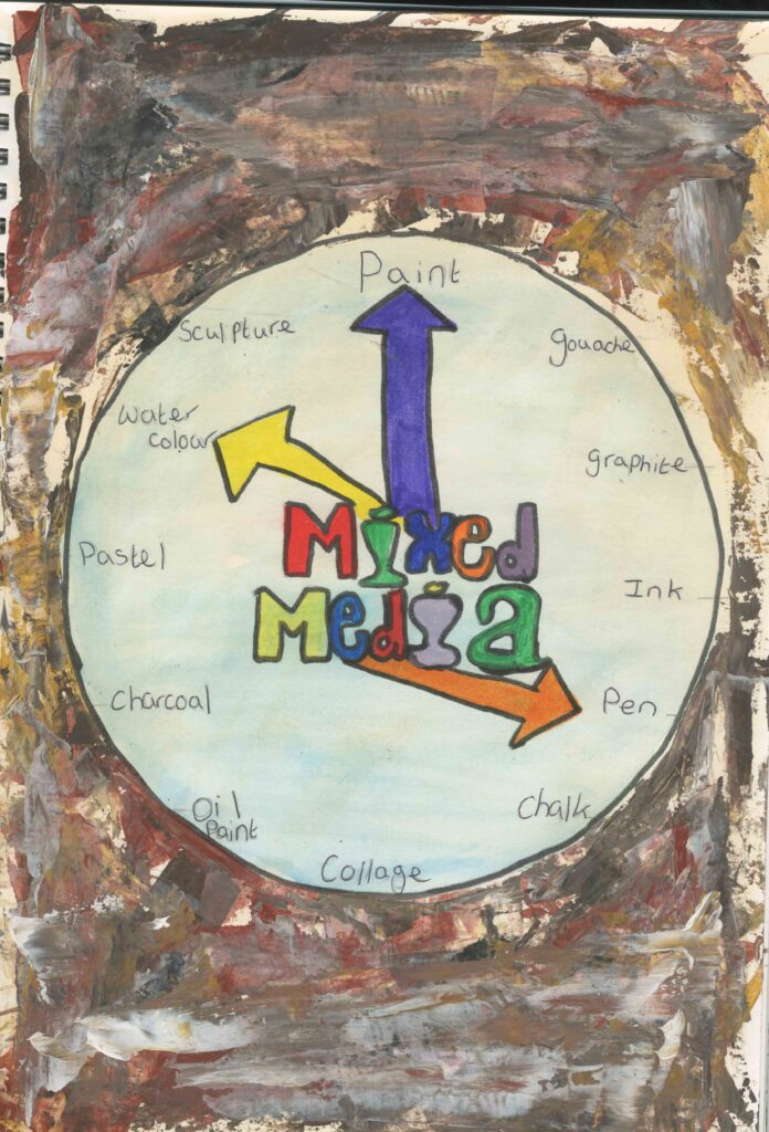
This is a magazine cover, combining my chosen theme and my specialist practice of mixed media. It shows a figurative clock , created in mixed media whilst being inspired by a clock. The arrows are pointing to some of the materials I used in this piece of work. I like how I used tea in the background and as a base for the rest of the materials. This is because it helps to tone down and neutralise the paint and it works very well in the background as there is no bright white coming through. I found it to be very useful to plan out my ideas first because it helped me to imagine how it was going to look and turn out and it helped me to remember my thoughts and ideas.
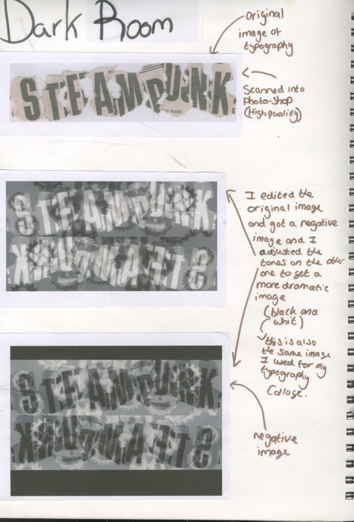
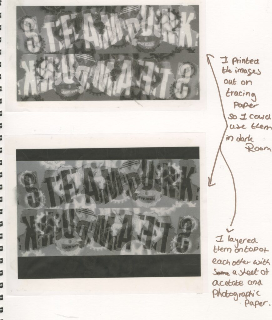
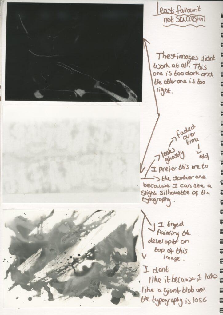
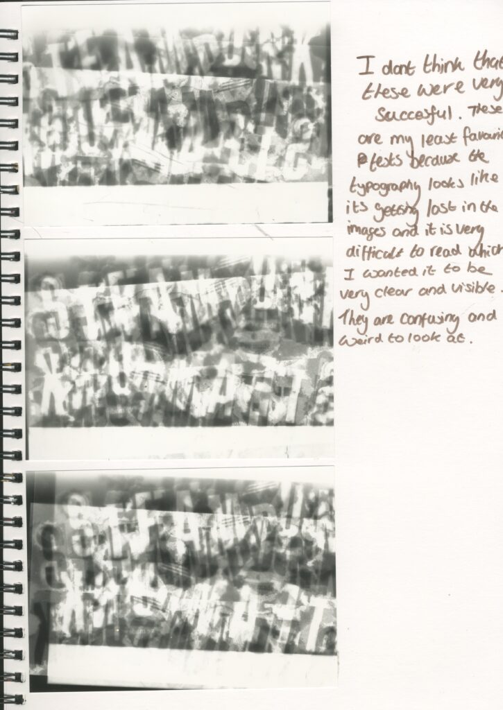
Dark room
Negative Space
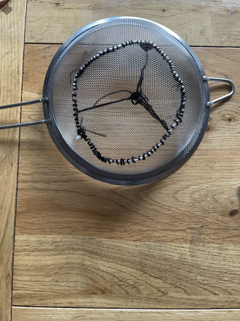
Embroidery on a sieve
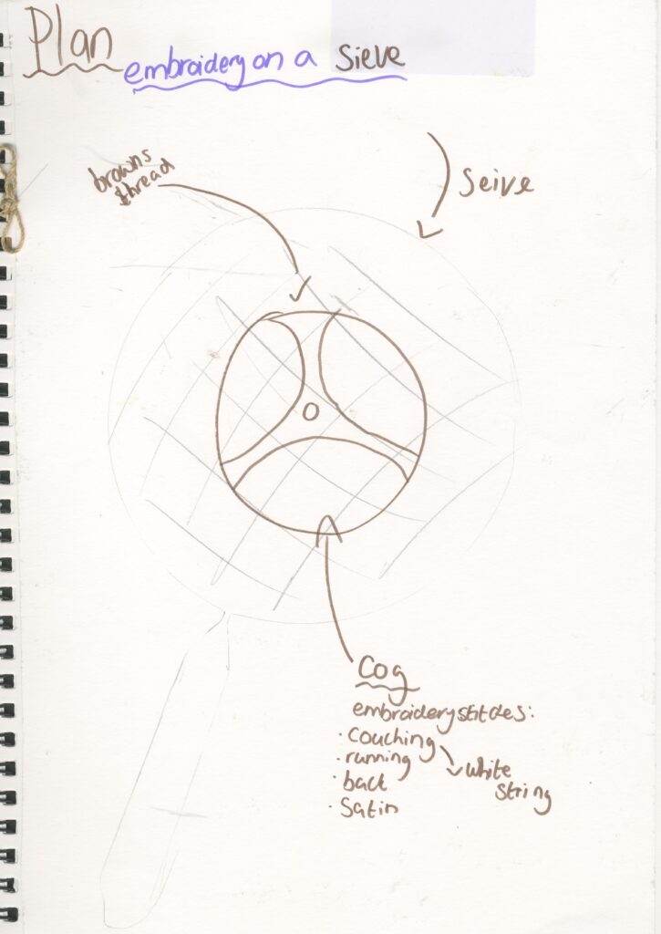
First attempt
very unsuccesful
I found it to be very time consuming
I don’t think I would have enough time to complete another one for my final piece.
satin stitch
back stitch
running stitch
These were very unsuccessful types of stitches for this particular pattern I struggled to achieve the circular pattern of a cog that I wanted.
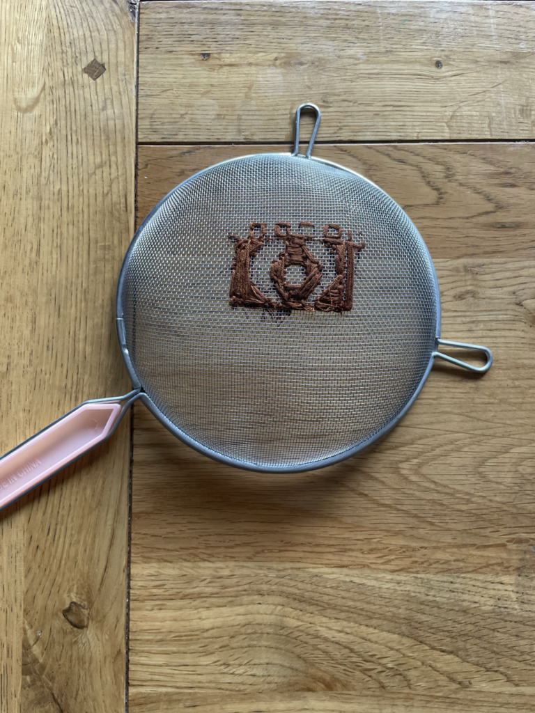
Second attempt
more successful but I still don’t like it
couching stich
satin stich
running stich
I found it easier to get the circular structure because I could easily manipulate the string on the sieve but I still struggled to get it to be a perfect circle and it still took a long time so I don’t wont to be perusing this as I don’t think I can get a professional looking outcome.