Final out come planning
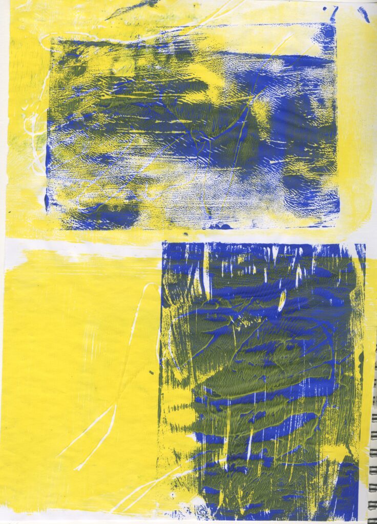
Then I tried this out again twice and these were very successful. I think this was because I chose complementary colours of the blue and orange . I also only printed one image in the centre of the page which I prefer to the other ones that I have tried.
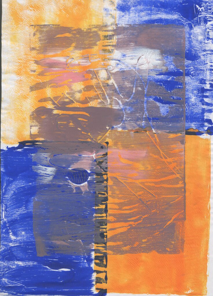
I then tried this again however I printed my design in a different direction ( vertical) on top of the horizontal background. This was unsuccessful because the print is very difficult to see and I hoped for the figure to be more visible.
At this point, I was struggling to figure out how I was going to incorporate the elements of nature into my final outcome. I decided to resort back to the flower prints that I made earlier on in the project. In the same way to those , I pained the background and used a different colour of acrylic paint to print the flowers.
Even though I previously said that I didn’t like it because it didn’t portray my intentions I have now decided to develop this and I think doing this has changed my mind for the better.
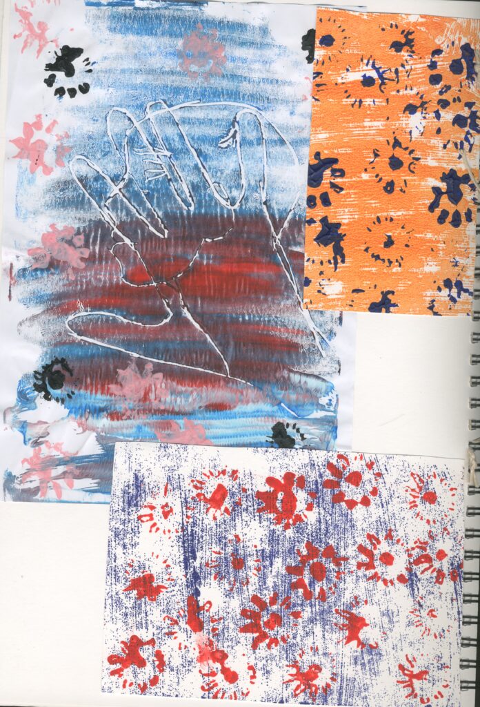
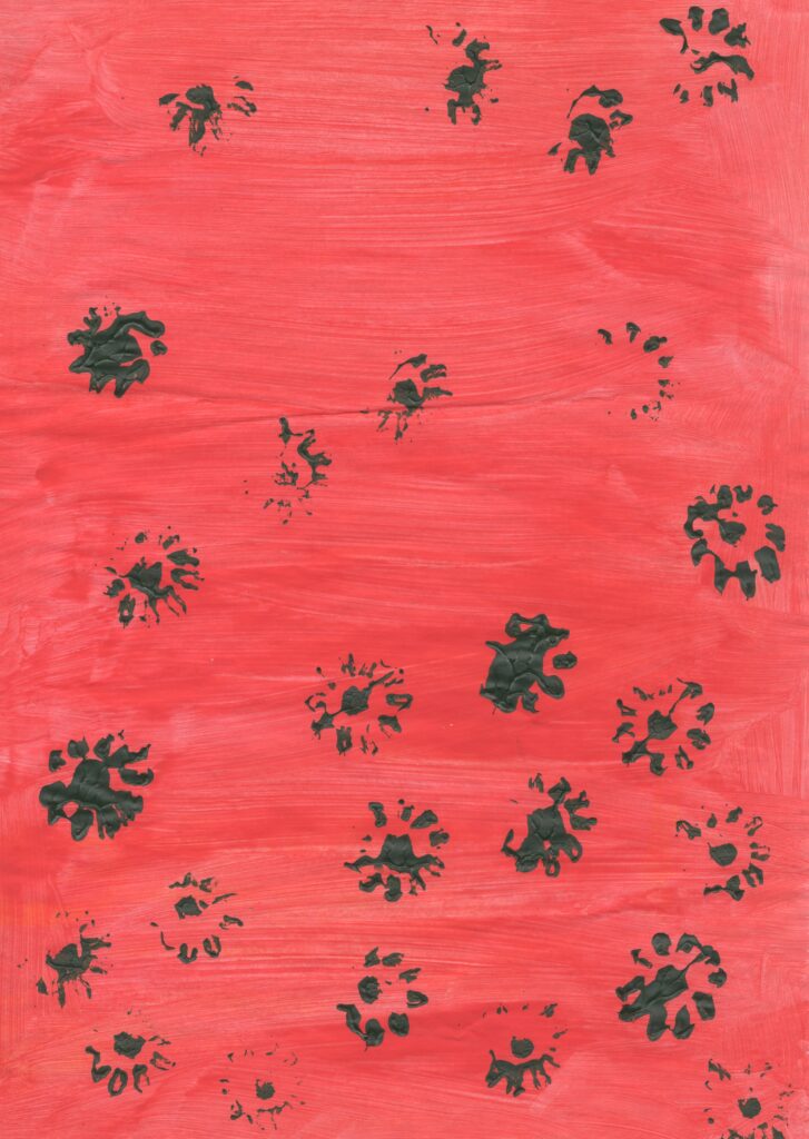
My favourite thing about this is the fact that I can clearly see the flowers and the figure. However I tried this again using orange paint and it completely took over the flowers so I cant see them which I don’t like.
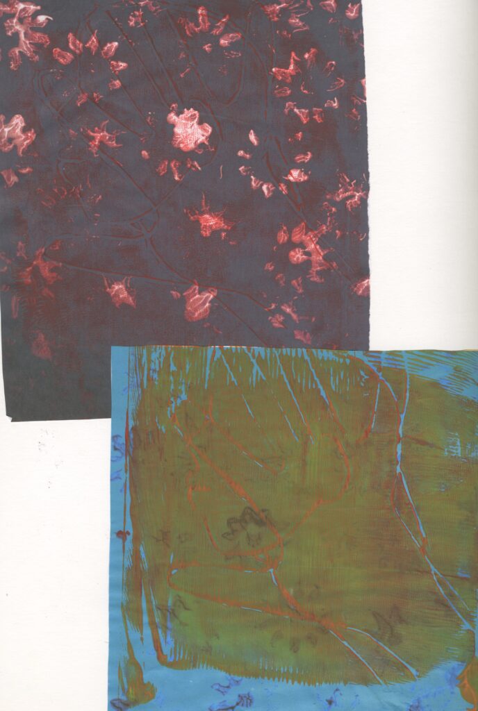
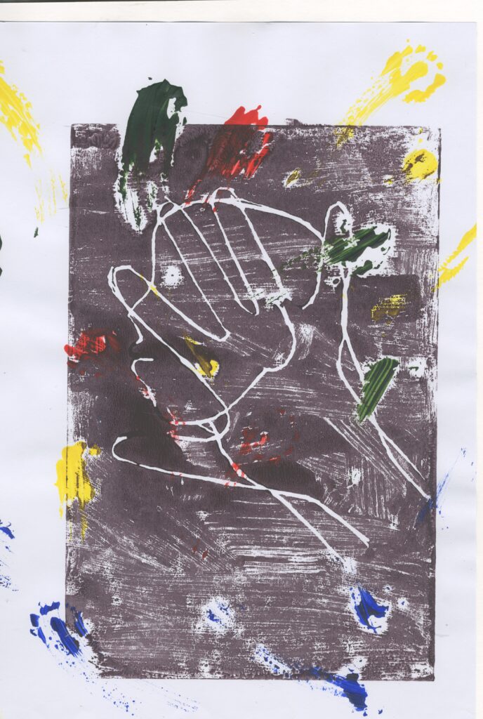
This is my least successful design because it didn’t print very well and it looks to busy and confusing because of how many colours I used .
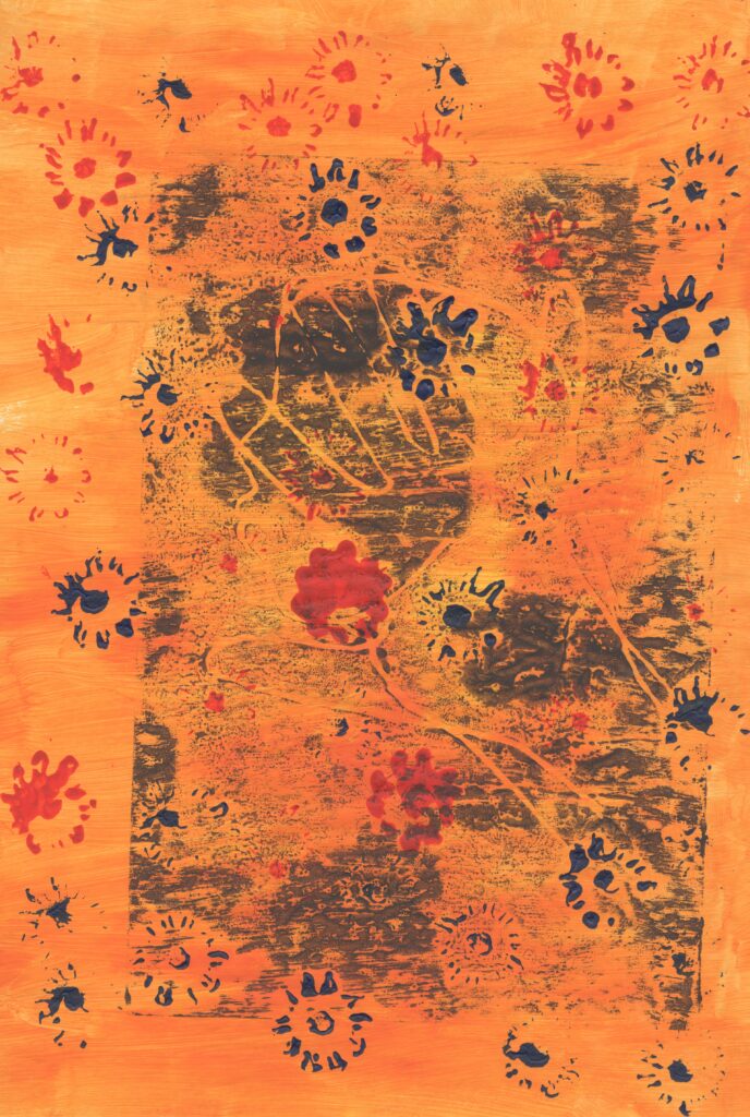
I tested out different placements of the flowers and different colours. My most successful one is the green paint with the flowers printed all over it. Because I love the colour combination and how random the flower prints are. I intended on creating a final piece using this Idea of printing.
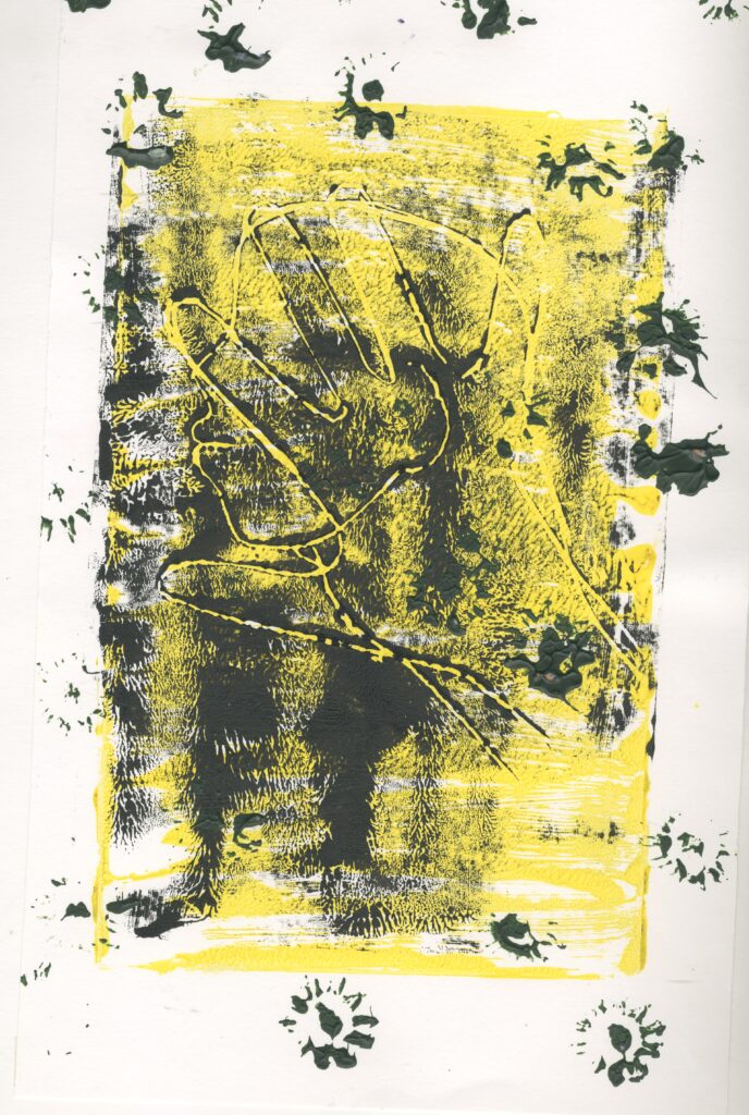
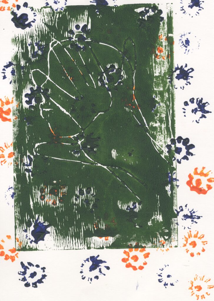
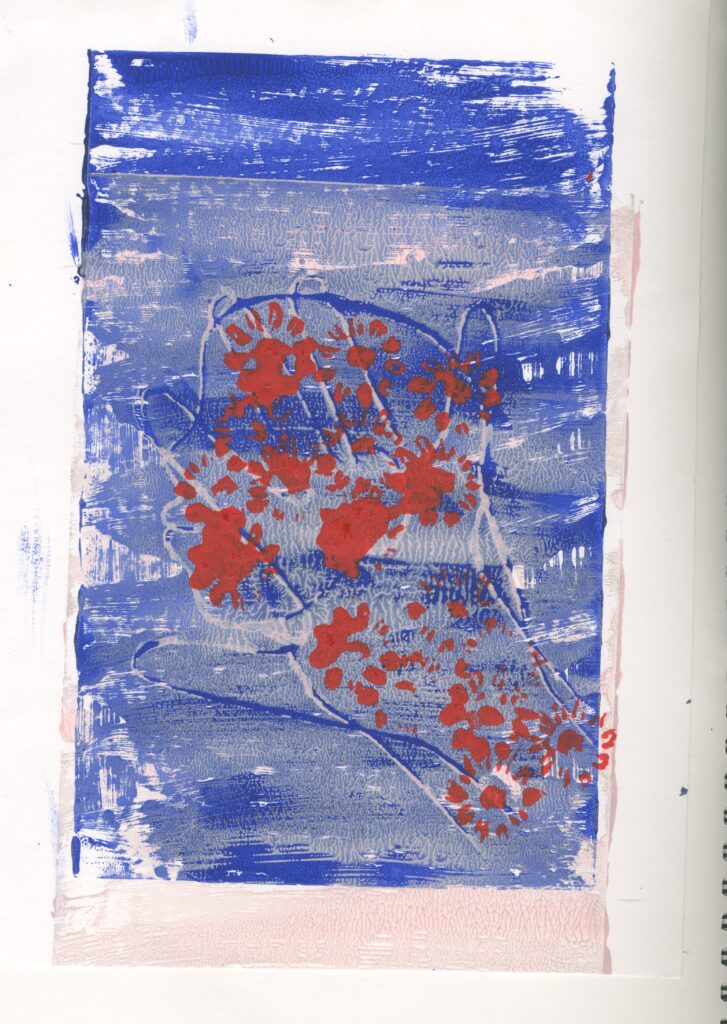
I also tested out using the flowers to print on top of the figure using red acrylic paint. This wasn’t as successful as the one with the flowers randomly placed round because it reminds me of nature is all around us and the flowers in this one are just in one place.
Because I liked how the flowers are random , I tested this out again but I used multiple colours and smudged the out. They remind me of comets which remind me more about space and not o much nature or concealment.
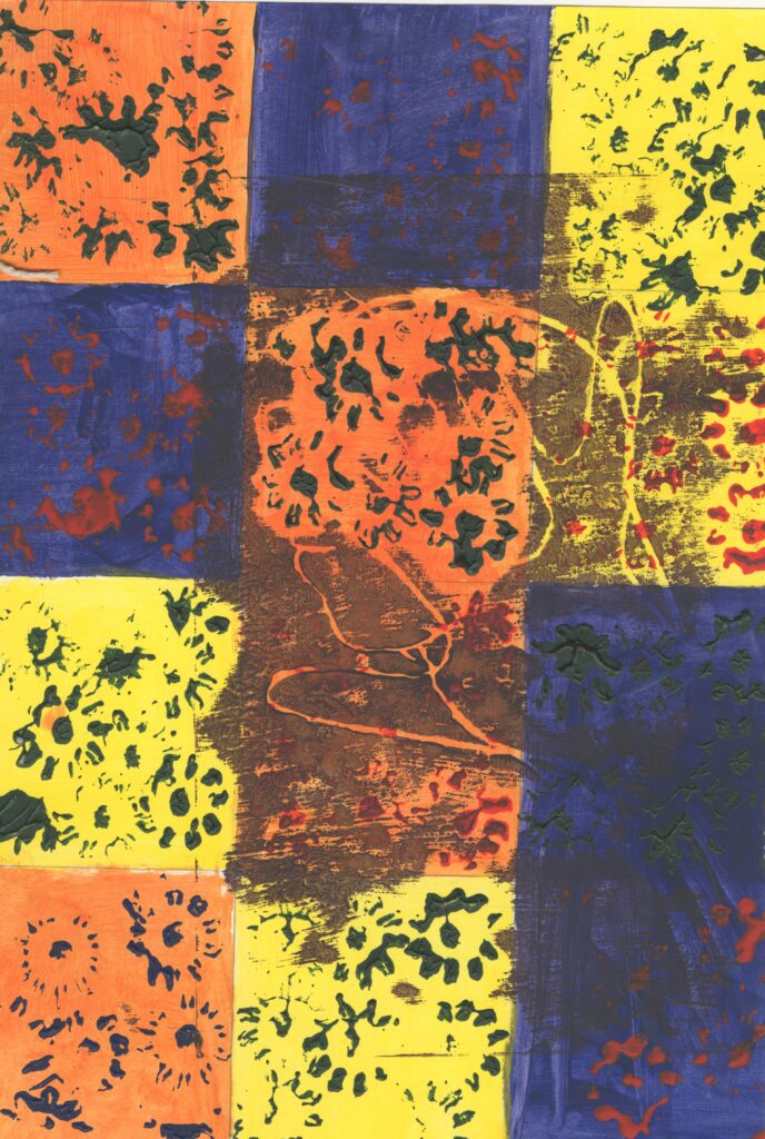
Then I tried to do a checkerboard pattern with different colours, however this was unsuccessful because I messed up painting it in this way. Also the flowers don’t look random and there is so many colours in it with make it look confusing .
