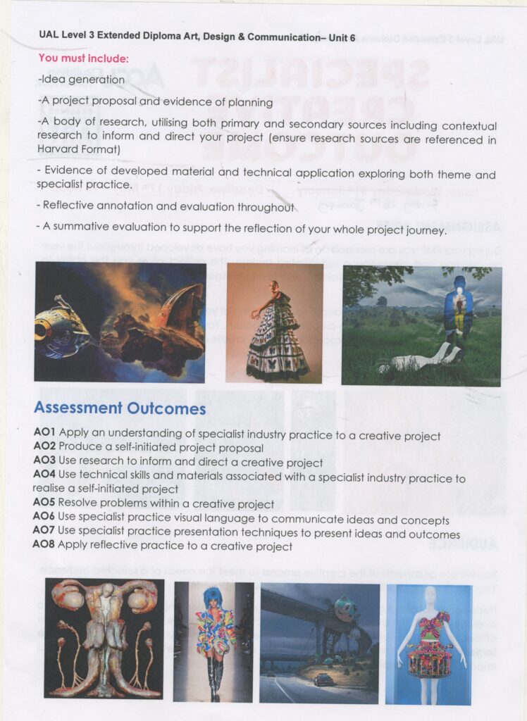
project brief
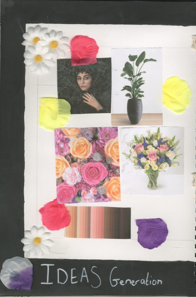
Theme Ideas Generation
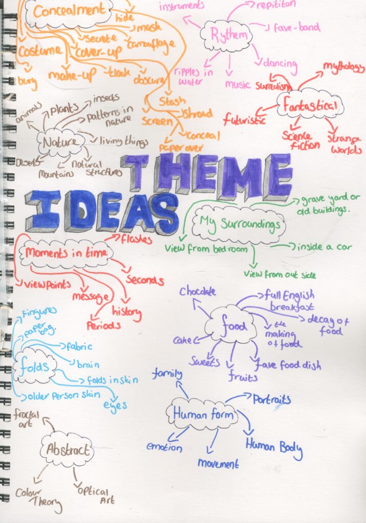
To help me to generate my ideas for my theme , I decided to create a mind map for different potential ideas .
I used some of my own ideas and the internet ( secondary research) to help me as well as m sketch books from when I was in Secondary school .
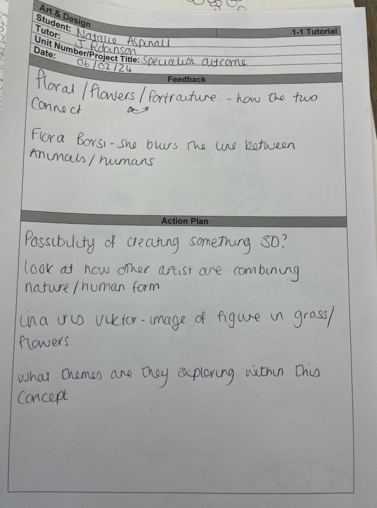
Because my specialist practice is mixed media and I like to draw animals , portraits and things from nature a ,I think these would be a good theme idea ( concealment, human form , nature)
I want to combine these ideas for my theme .
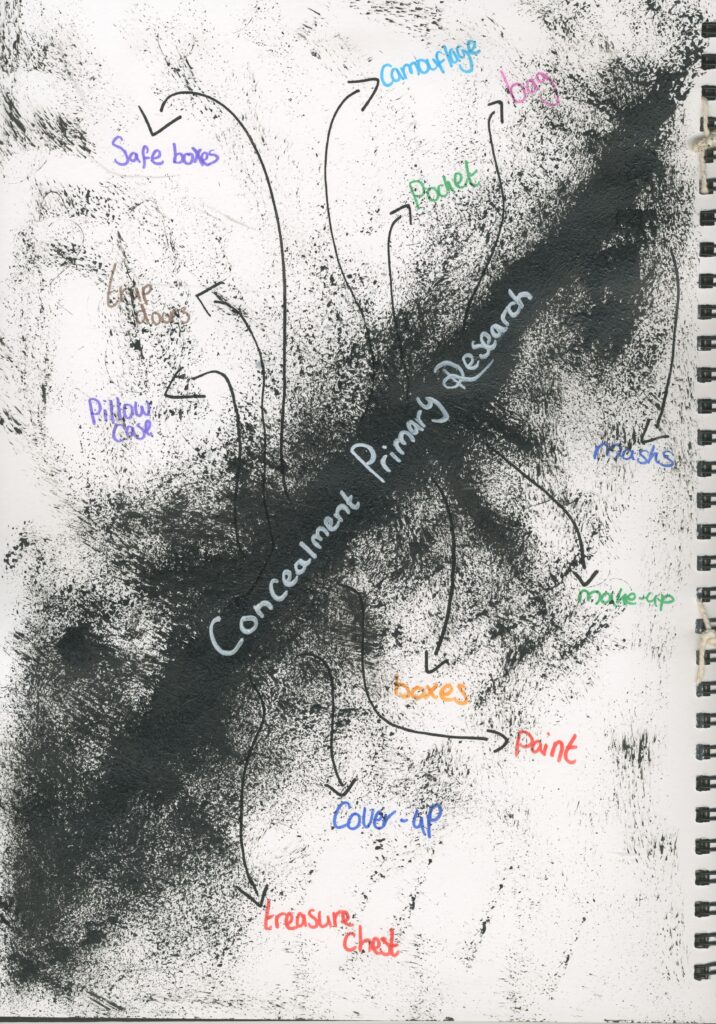
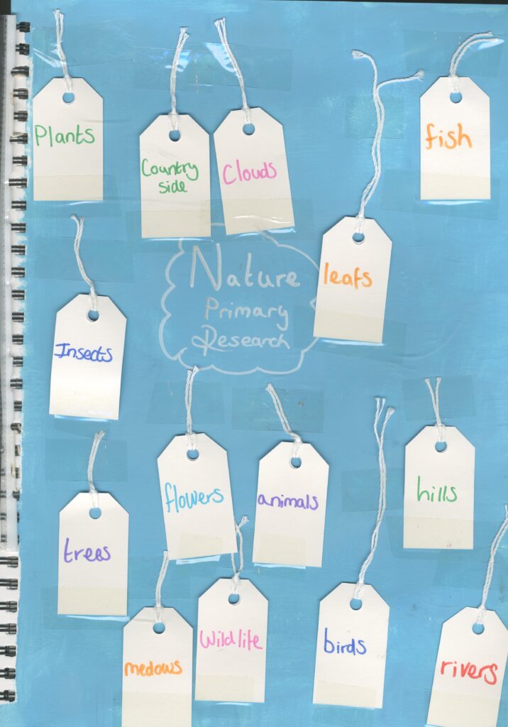
Primary Research
I asked my parents of things that remind them of concealment and nature. I like the idea of flowers but I still like my thoughts of portraits which I want to conceal with the nature.
I fond this to be very successful and helpful as it helped me to choose my concept and it gave me a wider choice of pathways which I didn’t already think of.
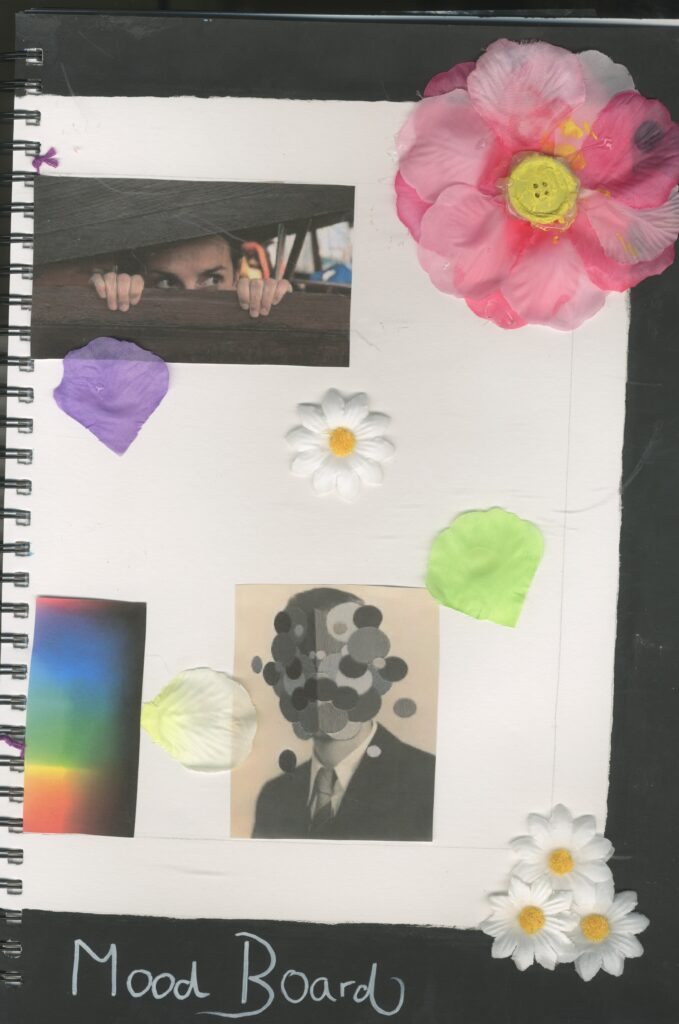
Mood board
I created a mood board to help me visually help me to show my thoughts and ideas for this project.
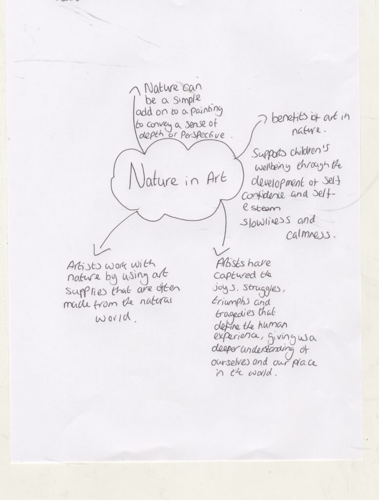
Contextual Research
I created another mind map about my theme.
I did some research in to it so I can have a better understanding about nature in art.
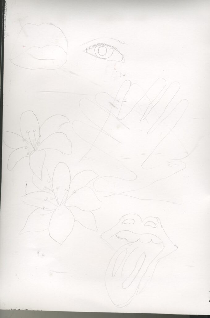
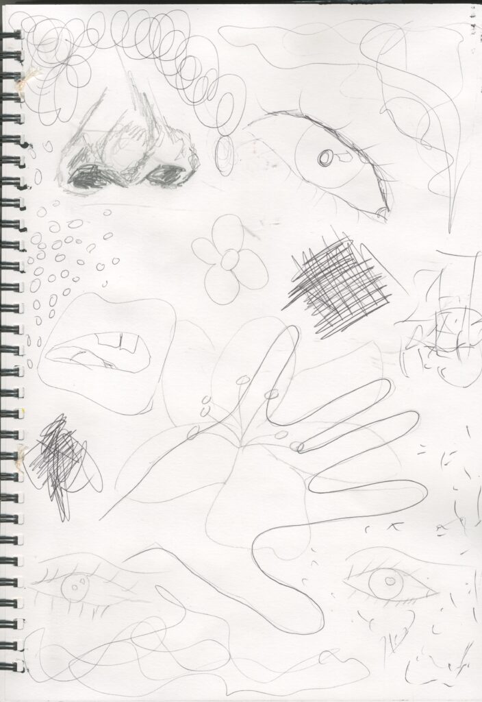
Facial Feature / Mark makings and Flower sketches.
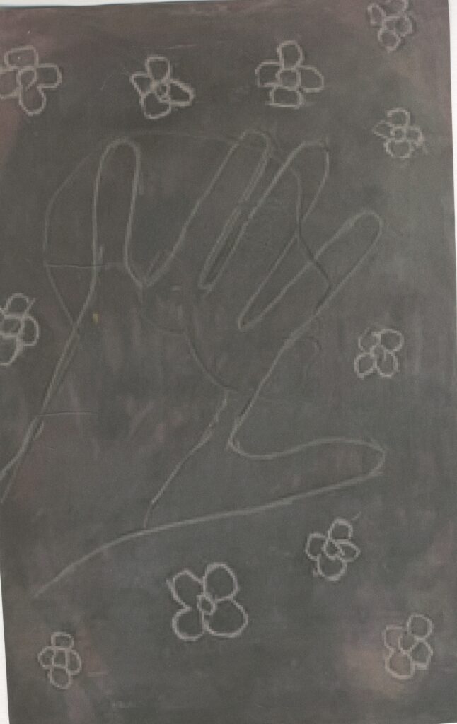
I have drawn some quick sketches of facial features and flowers as well as including some mark makings because I want to use human form and nature. I also took inspiration from the Rolling Stones logo of the tongue and traced around my hands overlapping to show that it is trying to conceal something. The mark makings can help to create a sense of emotion which if something is concealed, it can create a feeling of isolation.
(Primary Research) Embroidery
I did a test piece to test out different embroidery techniques:
Back stitch
Running stitch
Couching stitch
Satin stitch
Blanket stitch
I intended on also sewing some flowers around the bigger flowers however I decided against this when I started sewing the main flower because embroidery is very time consuming and if I went through with the extra flowers, it would of taken me even longer so I decided not to do that and instead I glued some flowers around the fill the gaps.
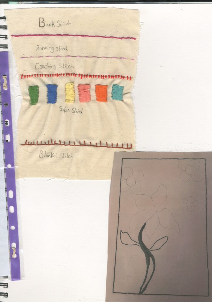
I especially like the way I used the couching technique and back stitch in the leaves. I think it captures the textures and patterns that are seen in leaves. However, the stem of the flower was the most time consuming , because I chose to use satin stitch. I originally wanted the flower petals to also be done in satin stitch but because it was the most time consuming, I decided against it and in stead , I used back stich and running stitch.
Because I had all ready drawn in pencil the flowers which I was going to sew, I tried to remove them with a rubber but this was unsuccessful. I think this is because I was working on a canvas. To solve this problem, I used a hot glue gun to stick the flowers on top of the pencil remains.
Lino prints
Tools
Lino
Black pen
Lino gouge
Paint
Paint brush
Paper
Step by step
Step1: draw design on Lino with a black pen
Step2: use Lino gouge to carve out the image
Step3: use paint brush to apply the paint to the Lino
Step4: place a sheet of paper on top and peel off to reveal the prints.
I decided to do a test piece testing out different shapes and patterns.
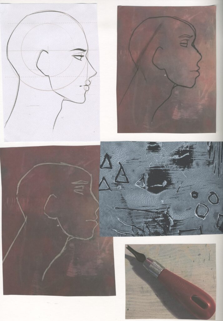
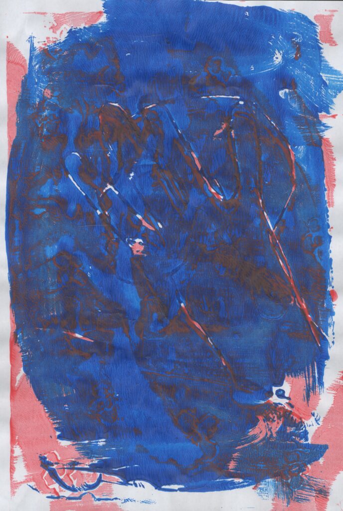
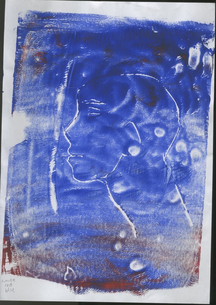
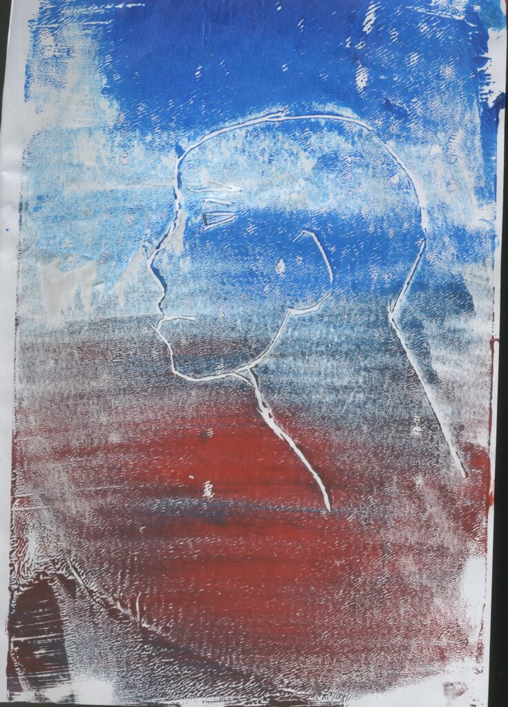
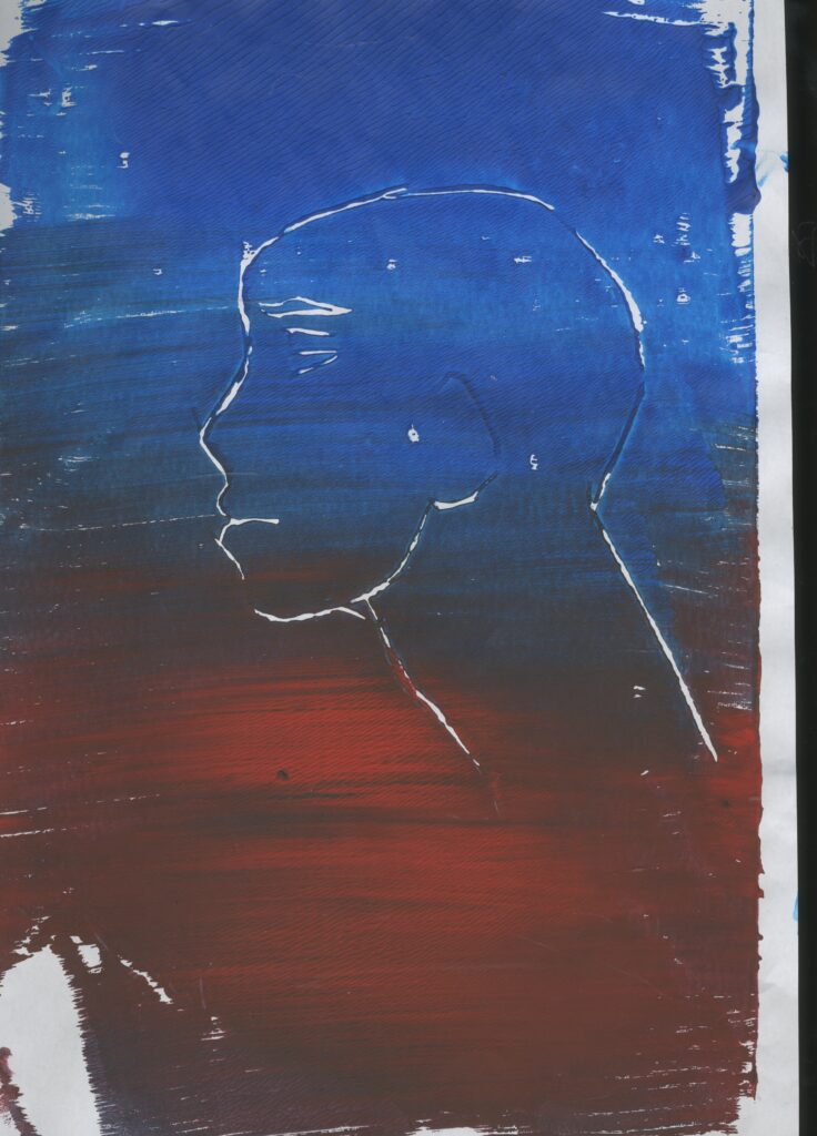
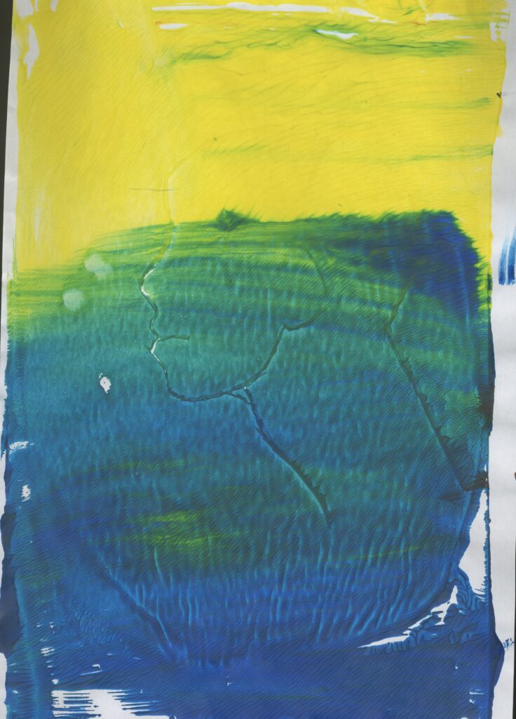
Then I printed images of a side profile face . For the first image, I used blue and red ink. This was successful. I also like the random splashes of red with the blue because I used the perfect amount of pain. It printed very well and I can clearly see the figure.
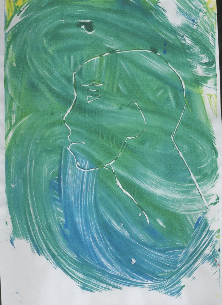
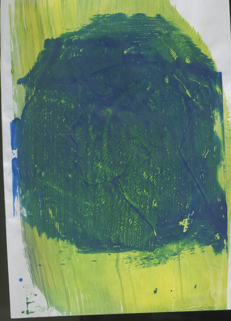
I then decided to use blue and green paint and swirled them together to sort of achieve a marbled effect. This was more successful than the first image because in the first image I can see more areas of white and finger prints from where I was printing.
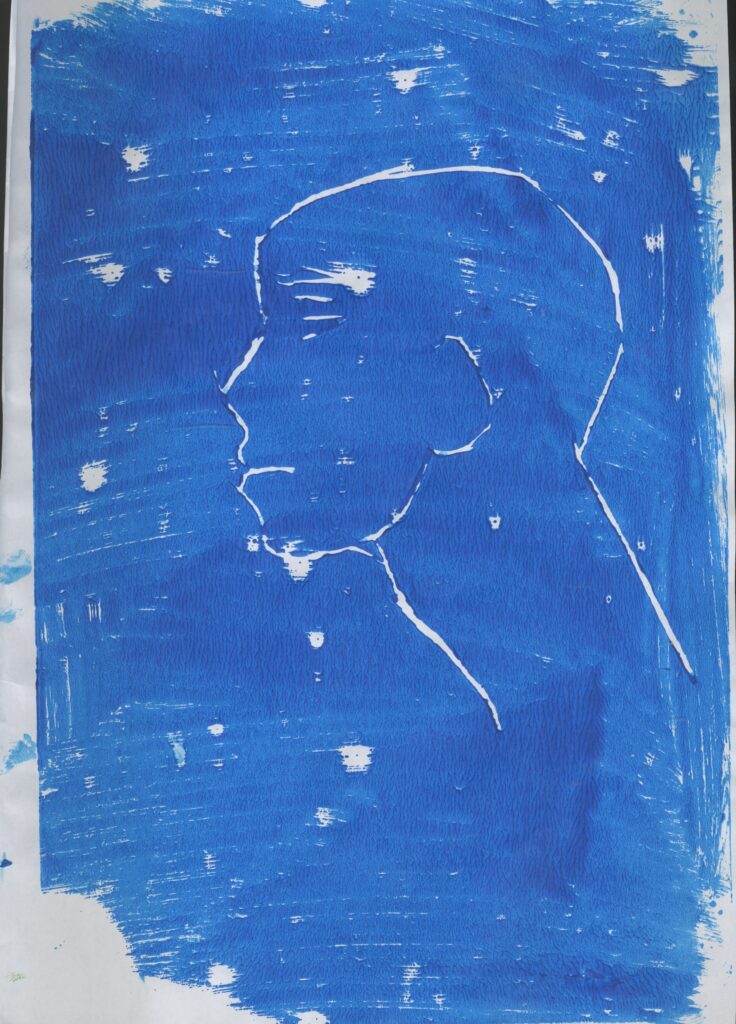
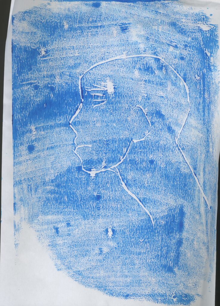
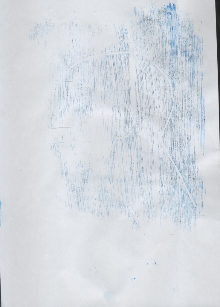
Then I made some prints of a series of 3 similar prints using less and less paint. This was very successful and I like how these came out even the final one. This is because on this one I used the least amount of paint making it a Ghost print. I didn’t think that this was going to work because of how little paint I used but it ended up working quite well even though it is a bit difficult to see but it is if you look closely at it.
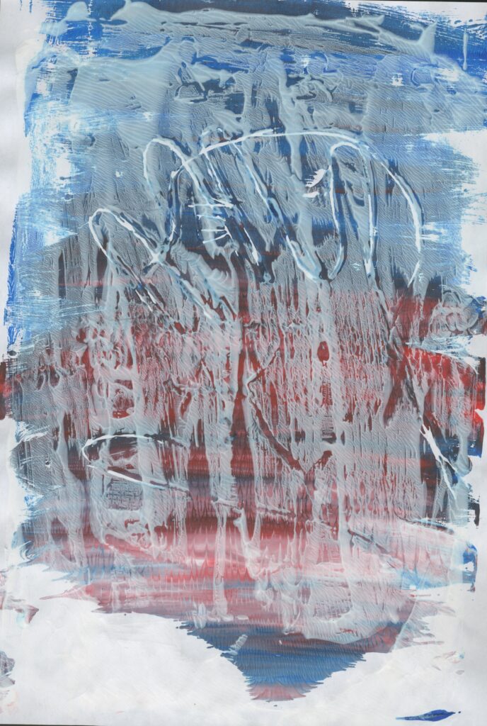
Then I decided to do some prints with a background. I did this by applying a layer of paint on the paper then printing my design on top. These were both my least favourite prints because the first one I tried using way to much paint and I printed the design with a darker shade go green which if I printed with the lighter colour on top it would off worked better.
This one didn’t work very well either because when I peeled of the paper it ripped. I think that this happened because of the lack of pant and it stuck to the Lino.
Similarly, to this one I don’t really like the colours because they are to dark and there is too much paint so it looks very thick.
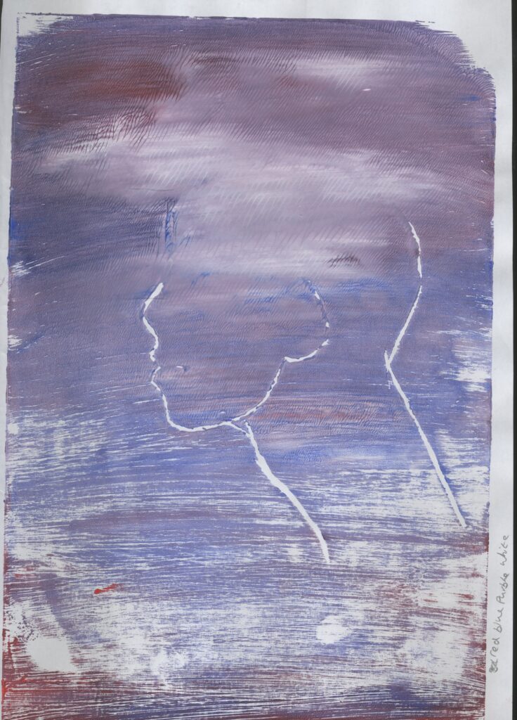
Theses two are my favourite and Mose successful prints. I like how bright and colourful they are and they both communicate nature to me because the yellow and blue reminds me of a beach and the purple one reminds me of the sky and the smudges of white look like clouds.
Reduction Print
To make these reduction prints, first I printed them like normal then I calved some more Lino then printed it on top.
This technique means that if you calve away any Lino, it should remain white and the areas which haven’t ben called will be coloured.
I found this to be unsuccessful because I tried this method twice and first I used red and blue paint. I used the lighter paint on the bottom and the darker on top. I think that if I had done this the other way around, it would have worked better. The blue paint darkened the image and the lighter paint would have lighted it.
Then I tried this again. First I printed with red and blue gradient then I printed on top with white paint. Even though I used a lighter colour on top, the still didn’t work. It looks dull and it dosen’t remind me of nature.