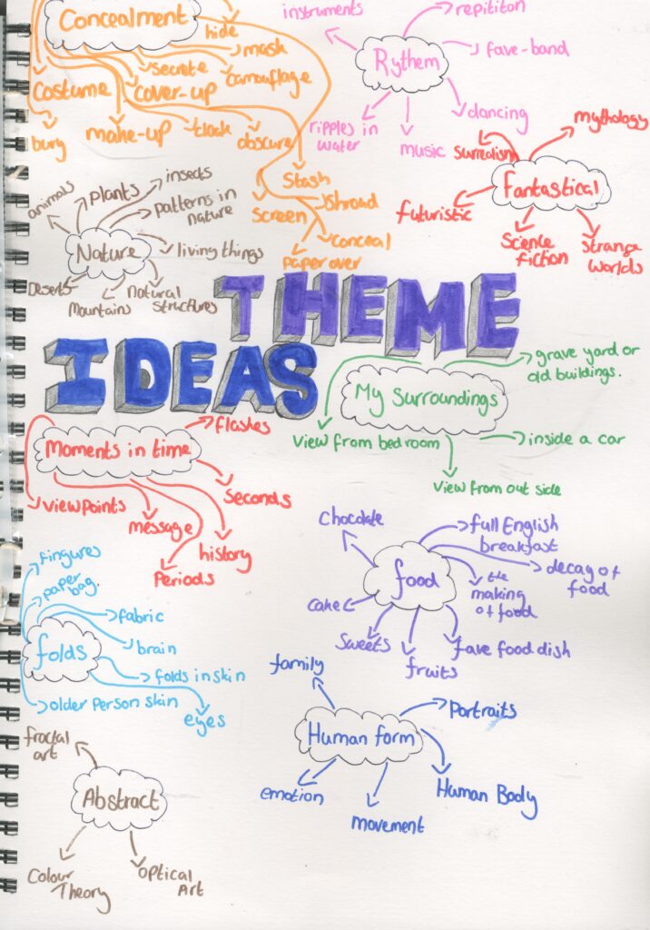
Theme Ideas Generation
To help me to generate my ideas for my theme , I decided to create a mind map for different potential ideas .
I used some of my own ideas and the internet ( secondary research) to help me as well as m sketch books from when I was in Secondary school .
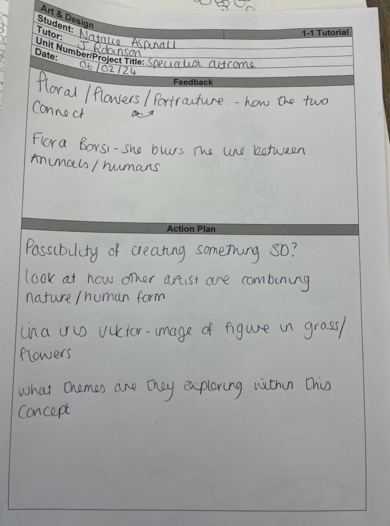
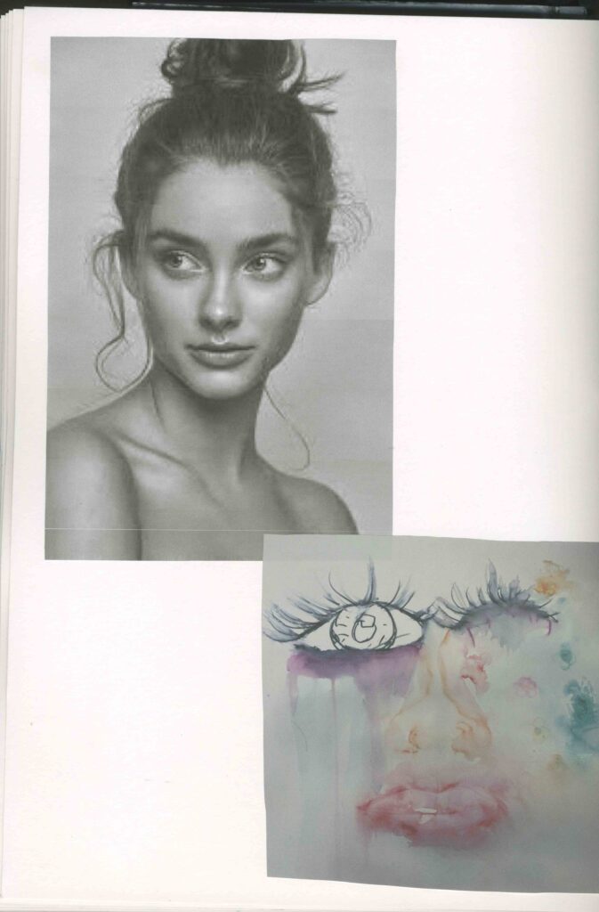
Because my specialist practice is mixed media and I like to draw animals , portraits and things from nature a ,I think these would be a good theme idea ( concealment, human form , nature)
I want to combine these ideas for my theme .
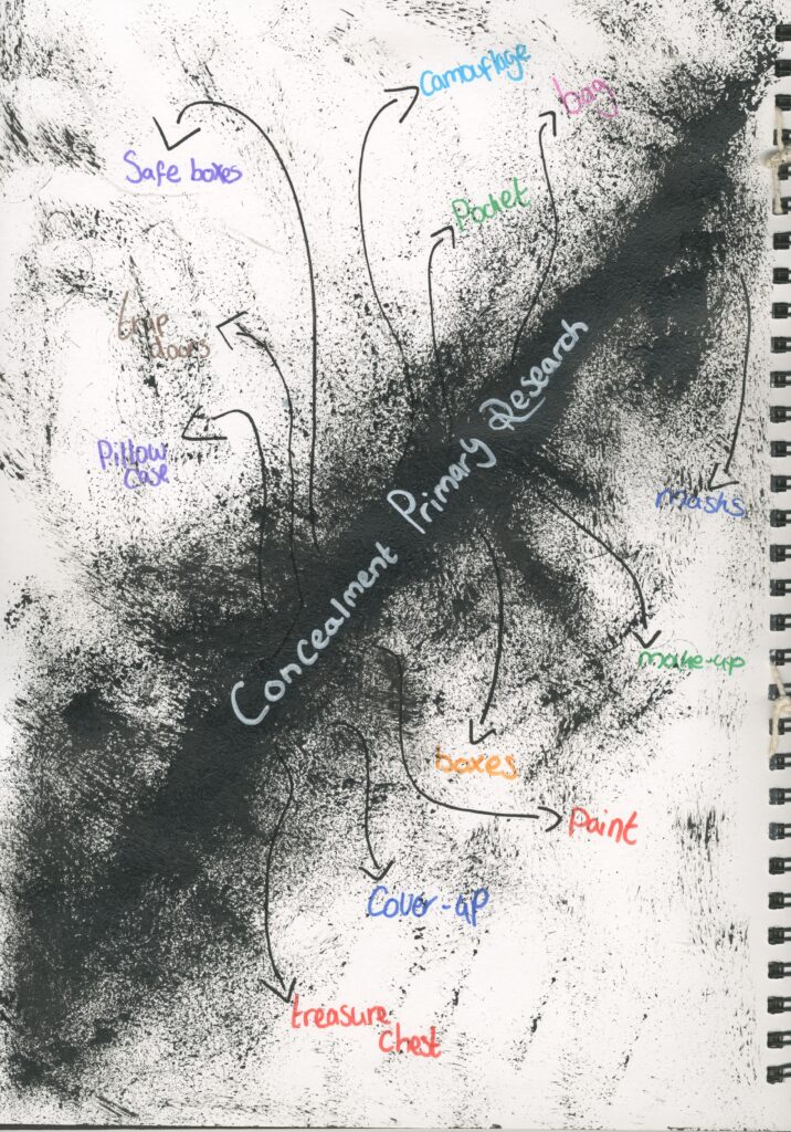
Primary Research
I asked my parents of things that remind them of concealment and nature. I like the idea of flowers but I still like my thoughts of portraits which I want to conceal with the nature.
I fond this to be very successful and helpful as it helped me to choose my concept and it gave me a wider choice of pathways which I didn’t already think of.
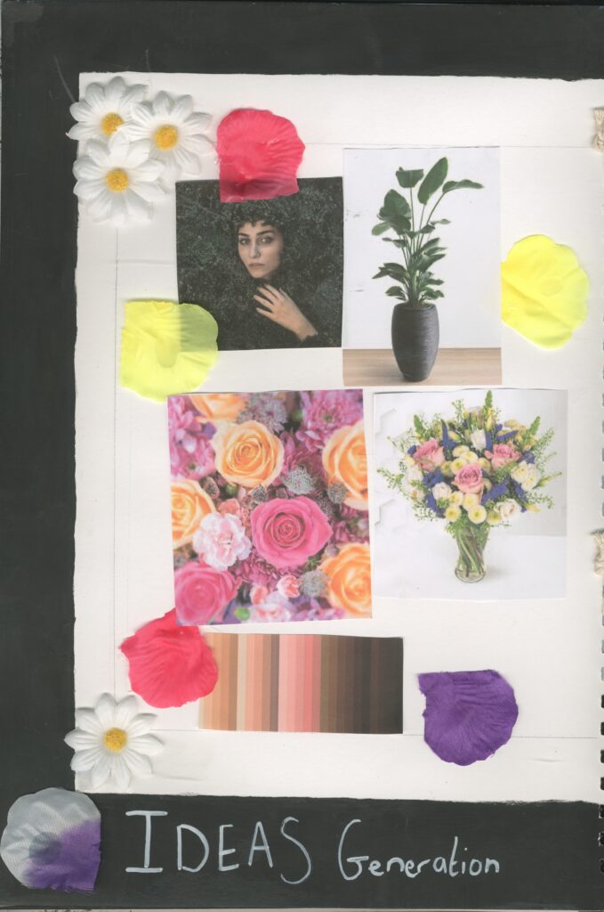
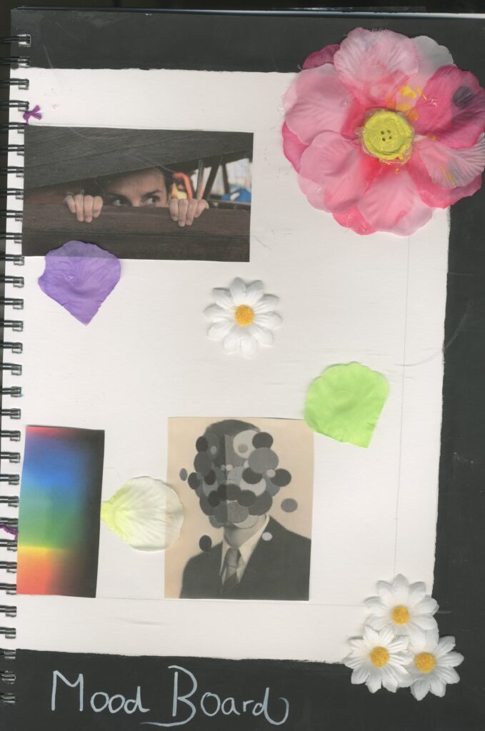
Mood board
I created a mood board to help me visually help me to show my thoughts and ideas for this project.
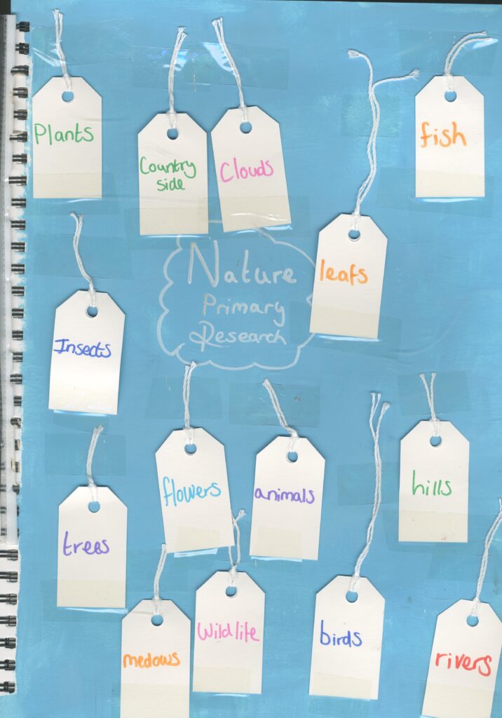
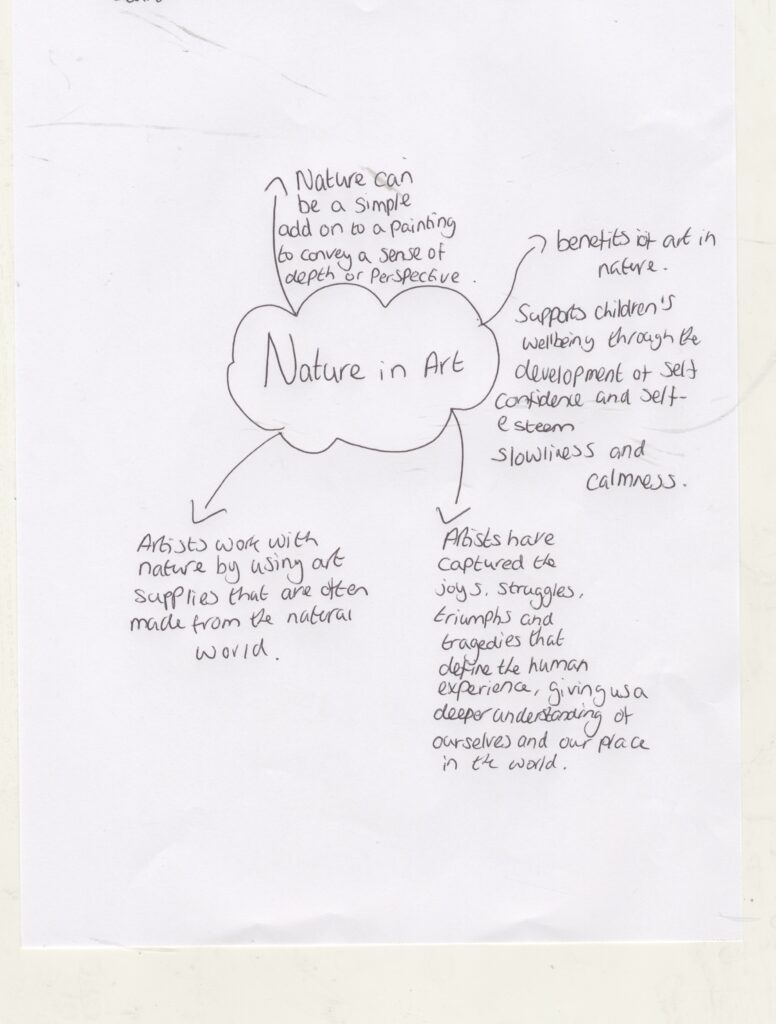
Contextual Research
I created another mind map about my theme.
I did some research in to it so I can have a better understanding about nature in art.
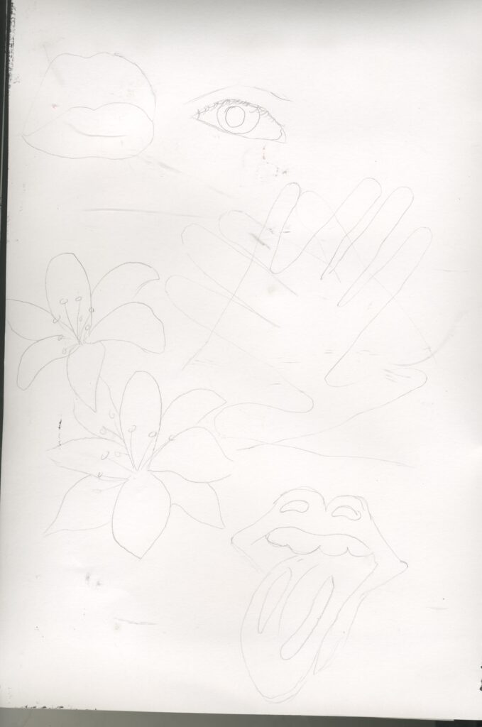
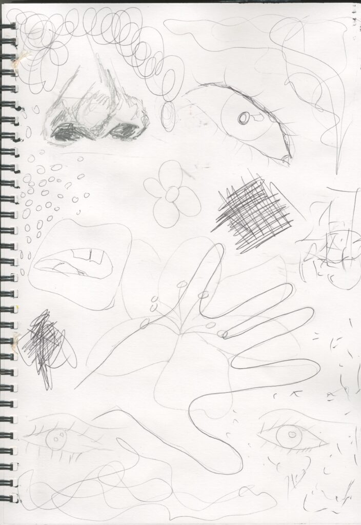
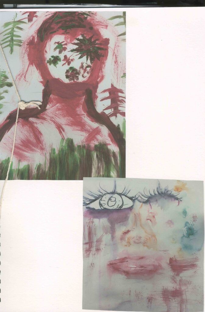
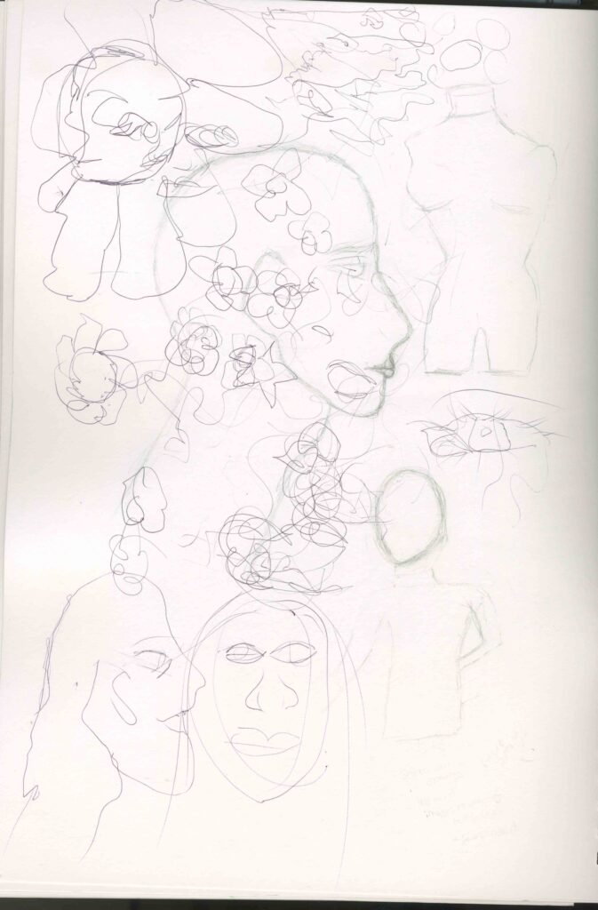
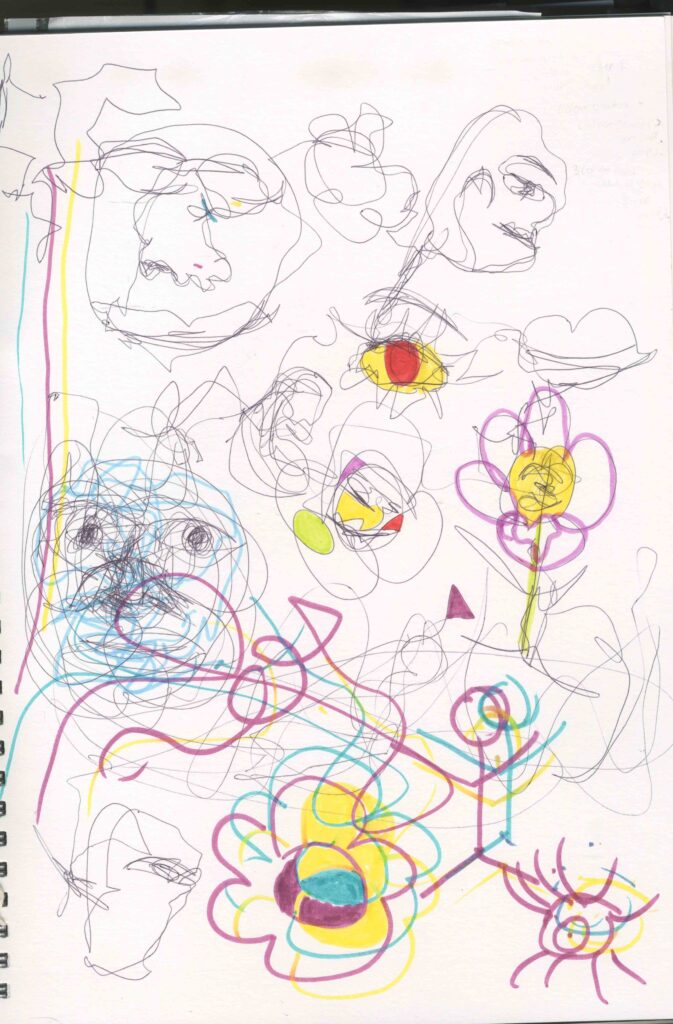
Facial Feature / Mark makings and Flower sketches.
I have drawn some quick sketches of facial features and flowers as well as including some mark makings because I want to use human form and nature. I also took inspiration from the Rolling Stones logo of the tongue and traced around my hands overlapping to show that it is trying to conceal something. The mark makings can help to create a sense of emotion which if something is concealed, it can create a feeling of isolation.
Artist research
Cristina Otero
Cristina otero graduated from Universidad Autonoma de Madrid in Art history. She is a visual artist who uses photography as a means to represent and reflect about human paradigms and experiences though the practice of self portrait. Inspired by American’s Next Top Model, Otero became fascinated with the endless possibilities photography offers.
I think that I could uses her style of work in my project but instead of using different types of fruits, I could use flowers and nature on top of a self portrait.
These 3 pictures are probably my favourite images of her work. This is because I like how vibrant and eye catching they are as well as looking a bit weird especially the green grapes one .
I also like how her work has inspired and influenced me to create work that is done in a similar fashion to hers as she is one of my favourite artists.
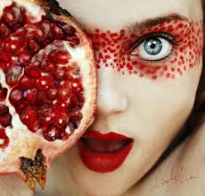
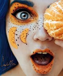
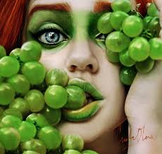
https://cristinaotero.com/about/
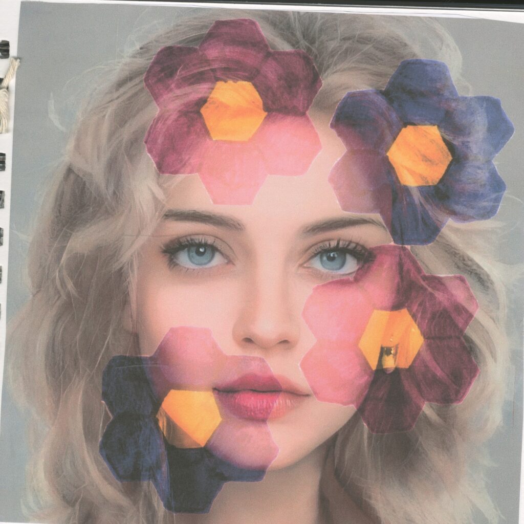
Art inspired by Cristina Otero
This relates to Cristina Otero’s style of art as it involves elements of photography and photo manipulation which I achieved on photoshop. I also used an image of a portrait which I found on the internet which I can clearly see that Otero does the same however these tend to be self portraits. I can also clearly see that uses bright intense colours in her work whilst remaining very realistic as well as using fruits on faces.
Instead of using fruits I decided to layer some hand drawn flowers which I used a nut to do so .
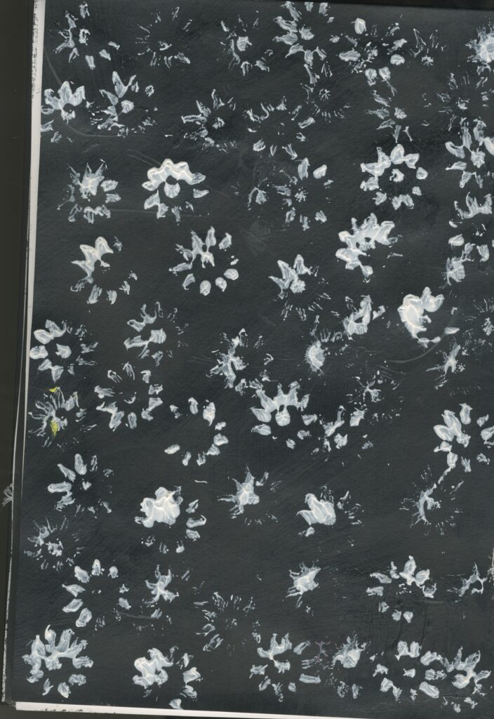
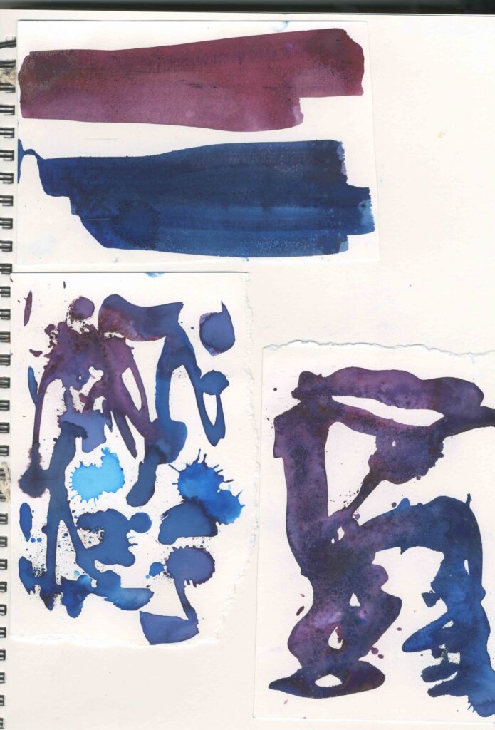
Primary Research Printing
materials
Acrylic paint: pink , purple, yellow, green , white and black.
Fake flowers: Daisy flowers.
Step by Step
Step 1: First I painted one side of my page black and left the other one blank.
Step 2: I took a fake Daisy and used it to stamp the flower shape on to the paper by dipping it in different acrylic paint.
I painted the background black and only used white paint to print the flowers. I did this to show contrast and the less colourful side changes my perspective about nature. Even-though I printed them in a informal fashion the black and white side looks formal and the black and white are to colours that I would associate with nature however the side with the colourful flowers are more appropriate for my project, because it is bright and reminds me of springand summer.
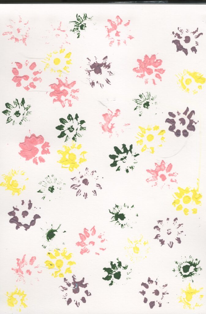
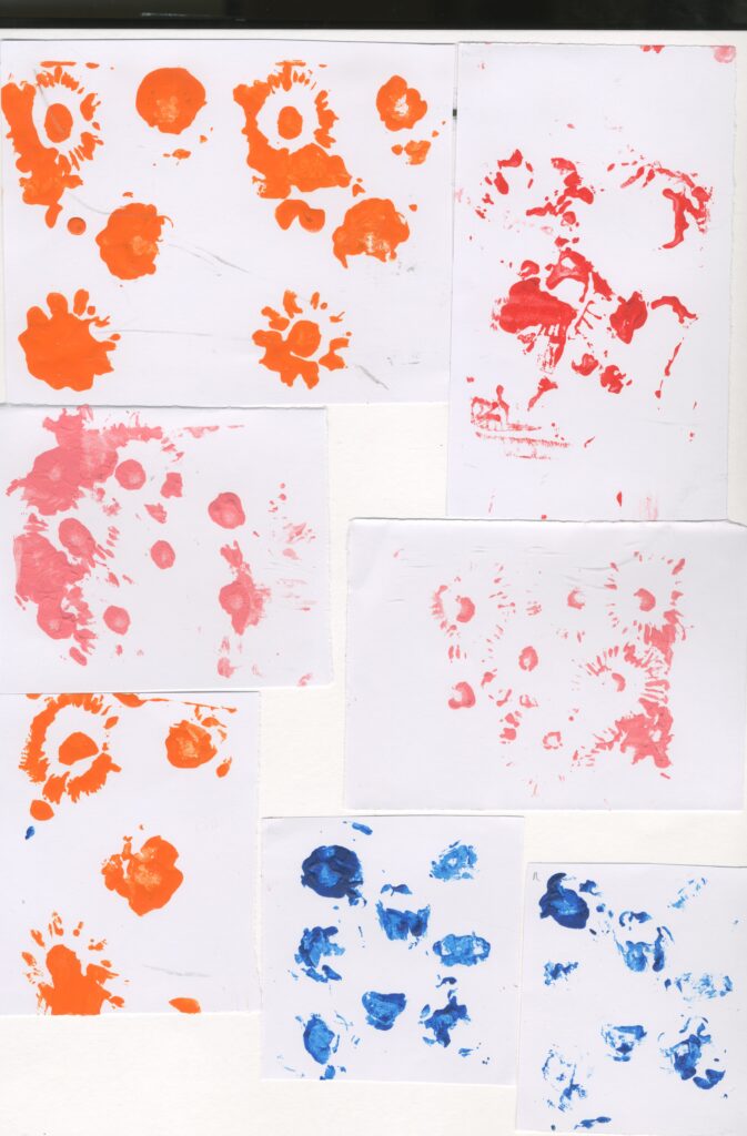
Primary Research Collograph prints
Materials:
acrylic paint: pink, blue, red, orange
cardboard
fake flowers/petals: daisies, roses
glue gun
paint brush
Step by step:
step 1:use hot glue gun and stick the flowers on a piece of cardboard
step 2:use a paint brush to apply the paint to each
step 3:immediately press the card on a piece of paper to record the print
Reminds me of mark making. This technique didn’t print the shapes of the flowers very well which I would have liked to see them as it would have been more relevant to my project. The orange worked the best because the paint was thinner so it captured the shape of the flowers better than the thicker paints. Not successful however I did enjoy creating these.
I also had to consider health and safety whilst doing this because of the hot glue gun so I kept it on a cutting mat so it would ruin my desk and I was very careful not to touch the hot glue by holding the glue gun with caution and holding the card by the edges so my fingers would be far away from the glue.
Artist Research Henri Matisse
Henri Matisse was a French artist, known for both his use of colour and his fluid and original draughtsmanship. He was a draughtsman, printmaker, sculptor but is known primarily as a painter. Matisse is commonly regarded, along with Pablo Picasso, as one of the artists who best helped to define the revolutionary developments in visual art throughout the opening decades of the twentieth century, responsible for significant developments in painting and sculpture.
In response to Matisse’s art I made some prints of flowers using collographs and prints by dipping a flower in acrylic paint and stamping them onto paper. I like how Matisse uses bright colours which I tried to replicate that in my own prints. I like how I can see shapes that look like leaves this is because it has relevance to my project. I also like the abstract style and it’s not obvious what the artist is trying to convey.
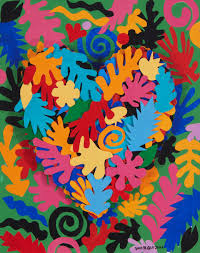
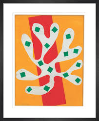
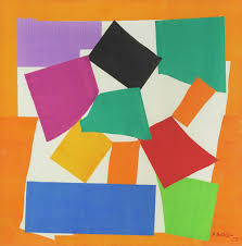
https://en.wikipedia.org/wiki/Henri_Matisse
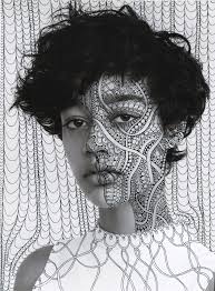
Artist Research Alana Dee Haynes
Alana Dee Haynes is an American artist who lives and works in New York City. Haynes is known for intricate hand drawn illustration over found photographs. Haynes’s works consisted of paintings, fashion, sculpture, digital media and illustration. She uses her recurring patterns to transform these found images or sculptures into something new and abstract.
She is also an inspired by music and she is trying to impose her own visions of what she hears into her photographs. Nature is also a big inspiration for her. She loves looking at nature and loves religious and cultural art for their use of symbols: hearts, eyes, hands.
Because she is inspired by nature and primarily works with portraits, I think that she is a relevant artist for my project as I have similar ideas and intentions.
https://en.everybodywiki.com/Alana_Dee_Haynes
https://uk.gestalten.com/blogs/journal/10-questions-with-alana-dee-haynes
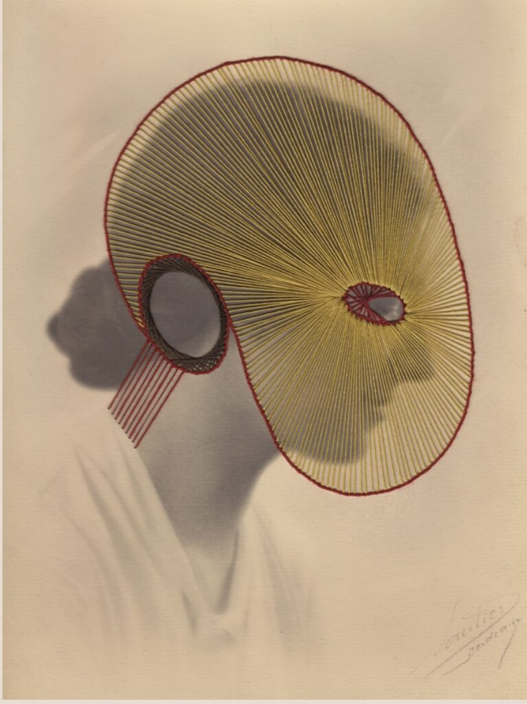
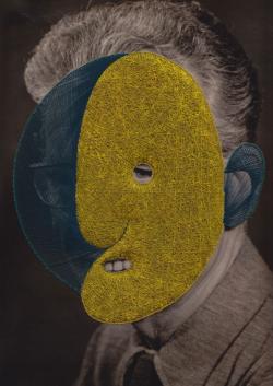
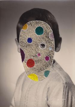
Artist Research Maurizio Anzeri
Maurizio Anzeri makes his portraits by sewing directly into found vintage photographs. His embroidered patterns garnish the figures like the elaborate costumes, but suggest a psychological aura, as if revealing the person’s thoughts or feelings.
The antique appearance of the photographs is often at odds with the sharp lines and silky shimmer of the threads. The combination media gives the effect of dimension where history and future converge.
The image used in Round Midnight is an early 20th century “glamour shot” that at the time would have been considered titillated for both the girls’s nudity and ethnicity.
Anzeri’s delicately stitched veil recast the figure with an uncomfortable modesty, overlaying a past generations cross-culture anxieties with an allusion to our own.
I also think that he is a relevant artist for my project because from previous work I have learned that I like embroidery and I like how he incorporates this in his works.
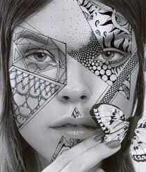
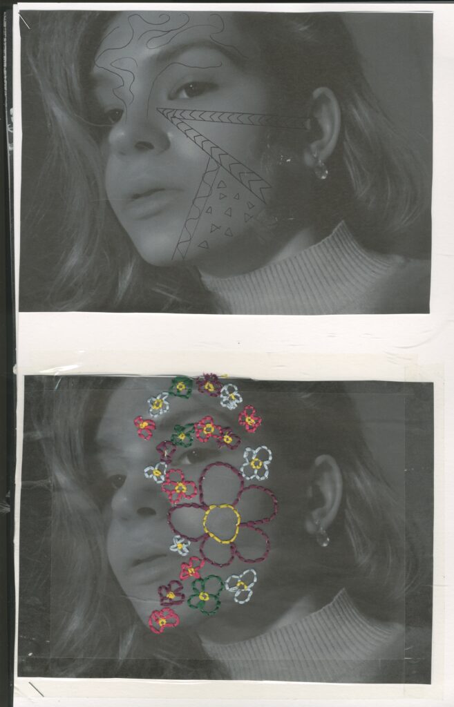
Primary Research Inspirational responses to Alana Dee Haynes and Maurizio Anzeri
In response to Alana Dee Haynes’s style of art , I decided to take a picture of myself in black and white with my phone, then I took a black pen and drew some random quick shapes in a similar way to Haynes . Then I decided to develop this further and researched another artist called Maurizio Anzeri who in a similar way to Haynes , creates work on top of a found portrait however he useless embroidery on vintage portraits.
I decided to combine the two and I stitched some flowers in bright colours on to my self portrait in black and white in a similar way to Alana Dee Haynes
I fond this very easy to do I really like how it turned out. I like how the bright colours of the thread really stick out because the image is dark. I also like the 3D textures which I get from the threads.
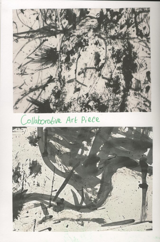
Primary Research Collaborative Art
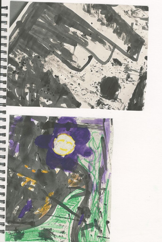
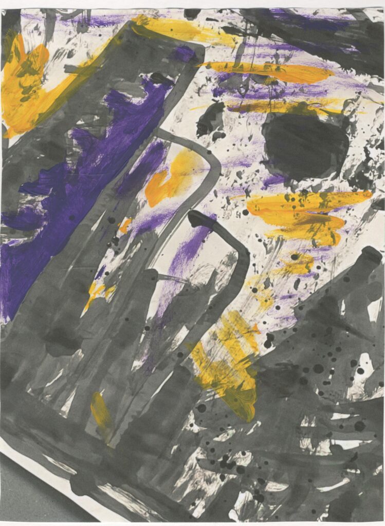
Created with a bamboo stick and paint brush attached to the end of it as well as some bubble wrap which I taped onto the end of the stick and black ink. Reminds me of mark making , Alana Dee Haynes, frottage, collagraph .
I found this to be very relaxing but because I was holding the bamboo stick at the top I felt like I had no control over it so the work looks messy and sketchy which I find very interesting.
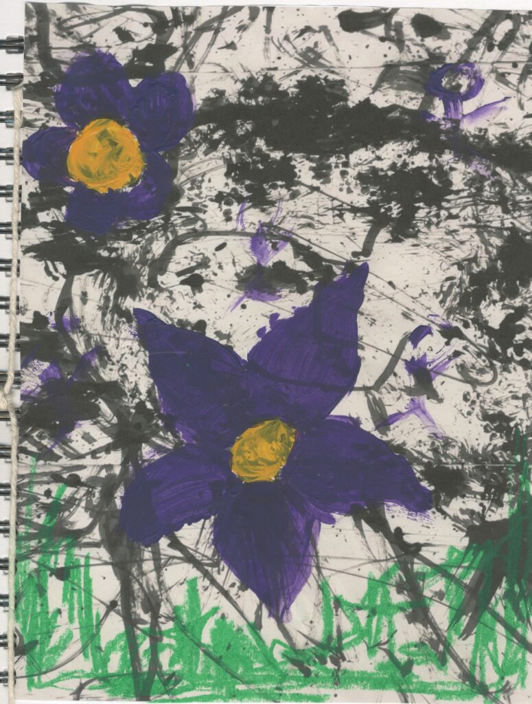
I also decide to use acrylic paint : purple and yellow as well as some green oil pastel. I used these to create some extra textures and bright sticking colours. Because my theme is based around concealment of portraits and nature, I decided to paint figurative flowers and I added faces to them to show that they are concealed within nature. The green jagged lines and scribbles, represent grass.
Overall, I prefer the painted ones more because they convey my intentions the most .
Primary Research portraits painting.
The green reminds me of nature and grass . The red and green create a muddy brown colour which reminds me of dirt and mud which is also found in nature. I used them to paint a quick picture of a figure and blended the colours into the green grass to simulate that we are one with nature.
I also painted some flowers on the face by using the edges of the brush to show that the face is concealed with nature. The ever green trees in the background help to re enforce this message.
I also like the sketchy look this has it’s quick and simple. Reminds me of the spontaneous drawings. Took inspiration from an image from Google but added my own ideas on to it.
I tried it again but used water soluble pens instead of acrylic paint. Instead of using an image I drew from my imagination and let the pen do the work. I drew facial features. I prefer the pens to the paint because i felt like pens gave me more control and I also like the water colour effect that I achieved by splashing water on top of the pen ink. However this one looks a bit creepy and demonic which I don’t like and the acrylic paint reminds me more about my theme and intentions. I also added some acrylic paint to the pen ink drawing I think this just adds to the fact it looks demonic which I don’t like .
Primary Research Spontaneous drawing/drawings of mannequins
I drew some spontaneous drawings on top of some figure drawings of mannequins. I did this by using my less dominant hand (left) and with my eyes closed. As well as this I drew some flowers and scribbles.
I also decided to try this again however I drew these spontaneous drawings in a continuous line, as well as using coloured pens to scribble on top and block out some areas with colour.
This reminds me of the sketches that I drew at the beginning of the project. I don’t like these because they look like a little child has drawn these which also reminds of a Primary school art lesson. However, I like how I used multiple pens at the same time. It reminds me a bit of illusions. I also think some of faces I drew look a bit weird and creepy which is not how I envision my work to come across.
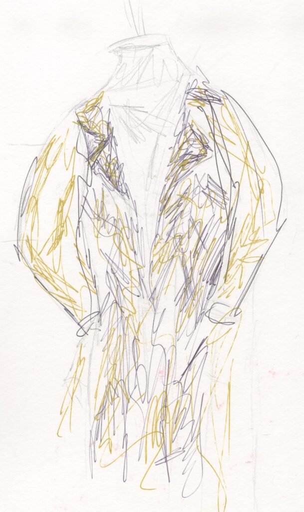
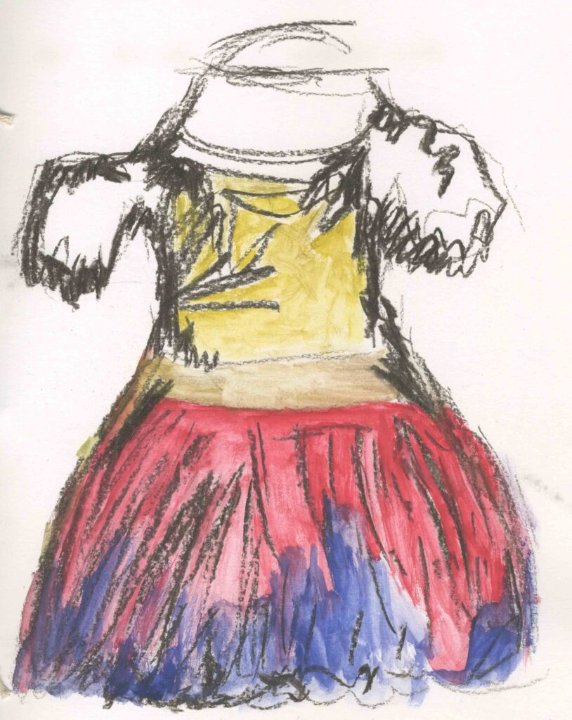
Primary Research Fashion sketches
I drew some sketches of different outfits using mixed media. I used pencil, pen , charcoal and water colour.
I don’t like the these because they look rushed and like something I drew in Primary school.
I don’t like the colours in the dress especially the charcoal because it’s extremely messy to work with and it smudges very easily. The yellow paint and charcoal mixed together to get a very horrible muted greenish yellow colour.
My most successful sketch is the suit this is because I had no problem with the medium smudging or mixing in a strange way. However,I drew it a bit too small and I wish I a better colour combination because the colours look boring.
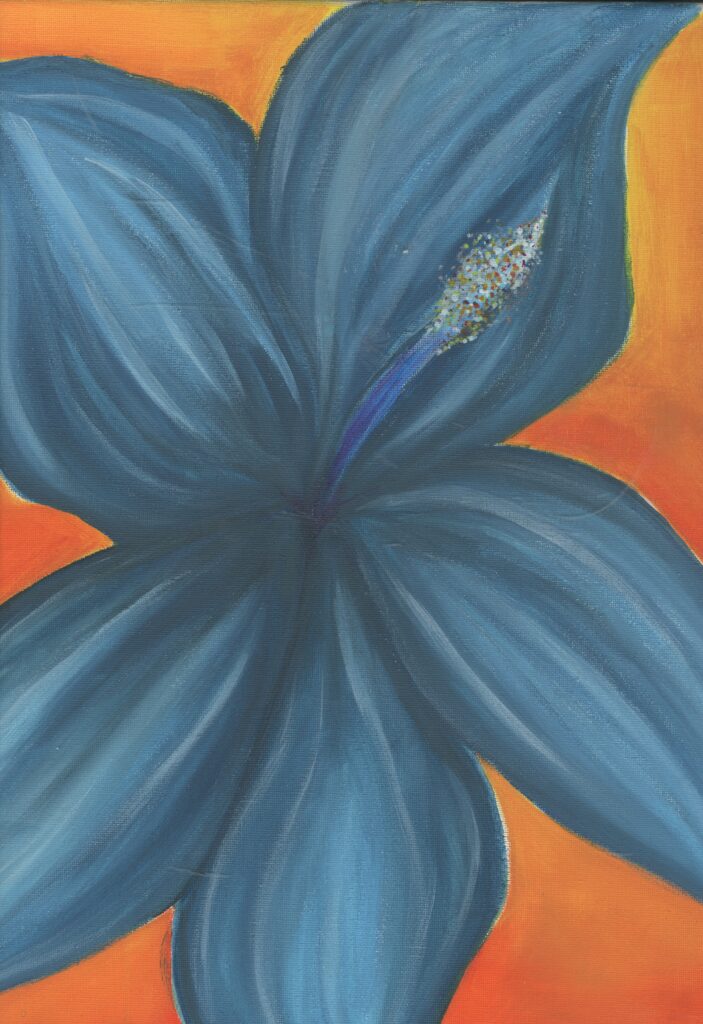
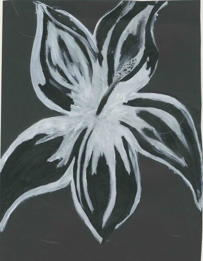
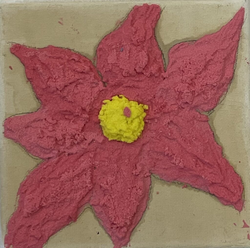
Primary acrylic paintings of flowers
I painted two hydrangea flowers. One on canvas , bright coloured acrylic paint and the other I only used black and white acrylic paint to get a negative space effect. I tried to paint the flower in a way that the white paint is where the darker areas would be and the black areas is where the lighter areas would be. This reminds me of an X-ray. This links to my theme better than the orange and blue painting because the X-ray idea reminds me more of human form but X-rays happen when parts of human form brakes. This is not the message i want to give off for my project but overall I prefer the black and white painting because it has more significance to my project.
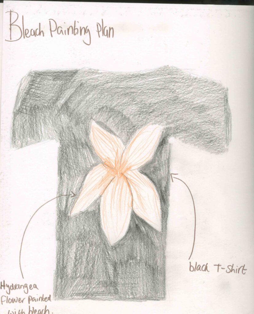
Primary Research Bleach painting
Materials:
white pencil/white pen
Black t shirt
cup of bleach
paint brush
Step by step:
step 1: first I covered my surfaces to protect them from the bleach as well as gloves to protect my skin.
step 2: Then I used the white pen to sketch out the flower on the t shirt.
step 3: Then I used the paint brush to carefully apply the bleach to fill in and paint the flower.
step 4: I left the shirt to fully dry then I hand washed it.
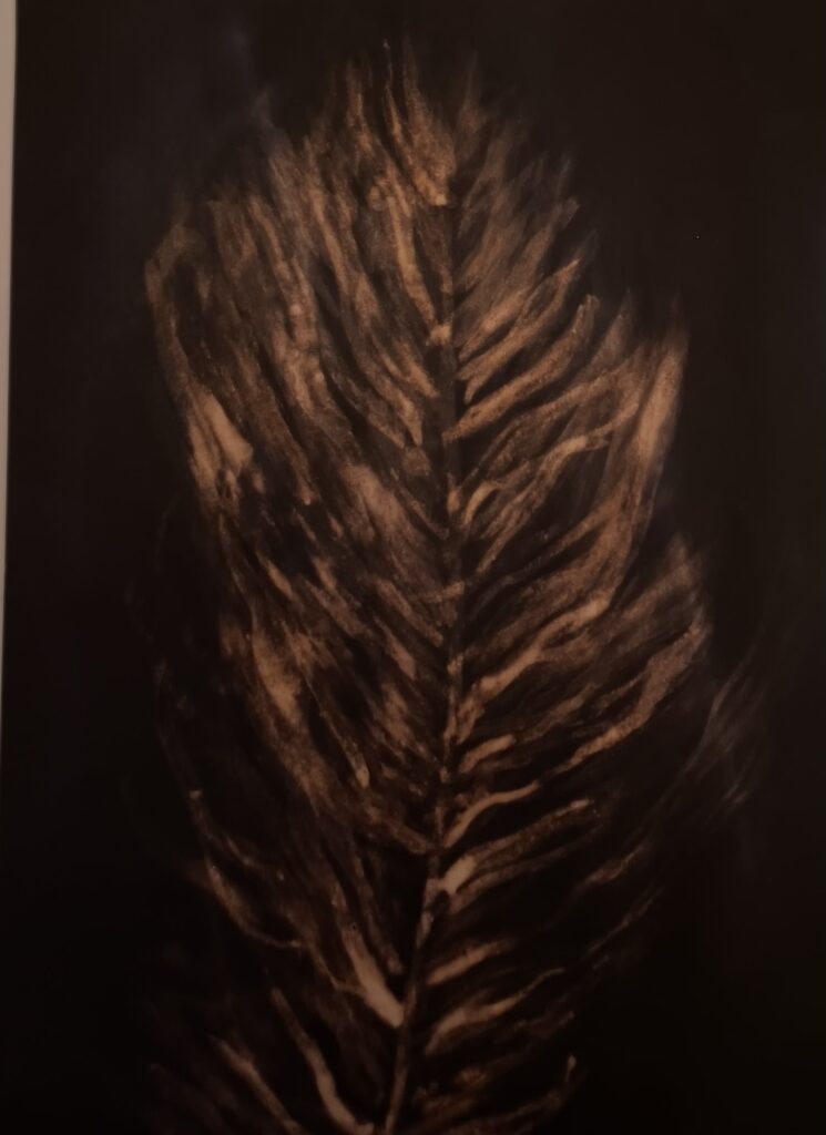
Because bleach is a very strong chemical, I had to be very careful with it because it can be very dangerous to use. I also know that it is so strong that it can remove the colour out of materials so I to advantage of that and decided to paint with it. When I first tried this out, I was in Secondary School and when I was going through my old work I came across a bleach painting of a feather that I did.
I found this to be very easy to make because it’s no different to painting with actual paints and painting is something that I think I’m quite good at. I also like the smell of bleach and cleaning supplies. Because bleach is a cleaning product and not associated with an art supply it shows that I’m being creative and imaginative. I also think that this relates to my project because I would associate cleaning supplies to nature as the fresh and clean smell makes me think of fresh air.
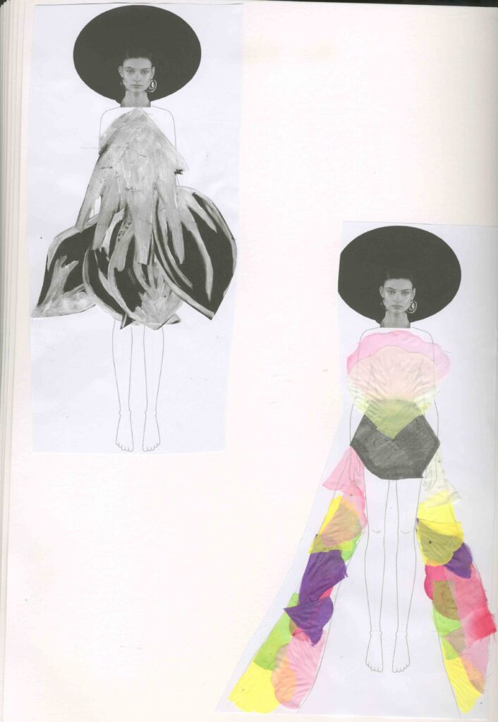
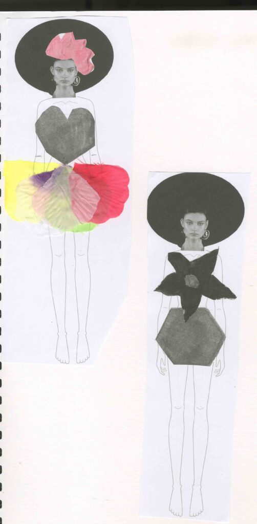
Primary Research creating outfits
I photo copied multiple pages from my sketchbook that I could use to create garments relating to my project. I copied my : digital art using a nut, flower painting and collaborative art work. I printed these in black and white as well as in colour. I also played around with the scale, some at 100% and 60% some even smaller. I did this to show contrast and to show how the different sizes of the prints could change the way and viewpoint of how I could use them to style an outfit.
I decided to go down the route of creating a more feminine style of clothing. I made primarily skirts and for the top the centre of the flowers. My favourite outfit is the one with the corset top and flower petal skirt. I even gave it a head piece. This is because I like the 3D fell of the skirt and I also like the skirt is bright and colourful and it contrasts well with the top. It looks very elegant which to me nature is elegant. I found this easy to create and think of these designs because I had a clear vision in my head of what I wanted these to look like. It also helped that I have a lot of drawings and work to work from.
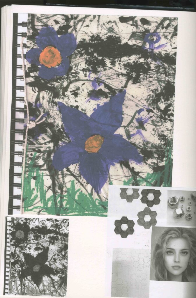
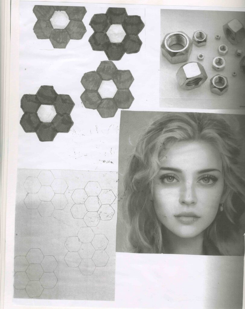
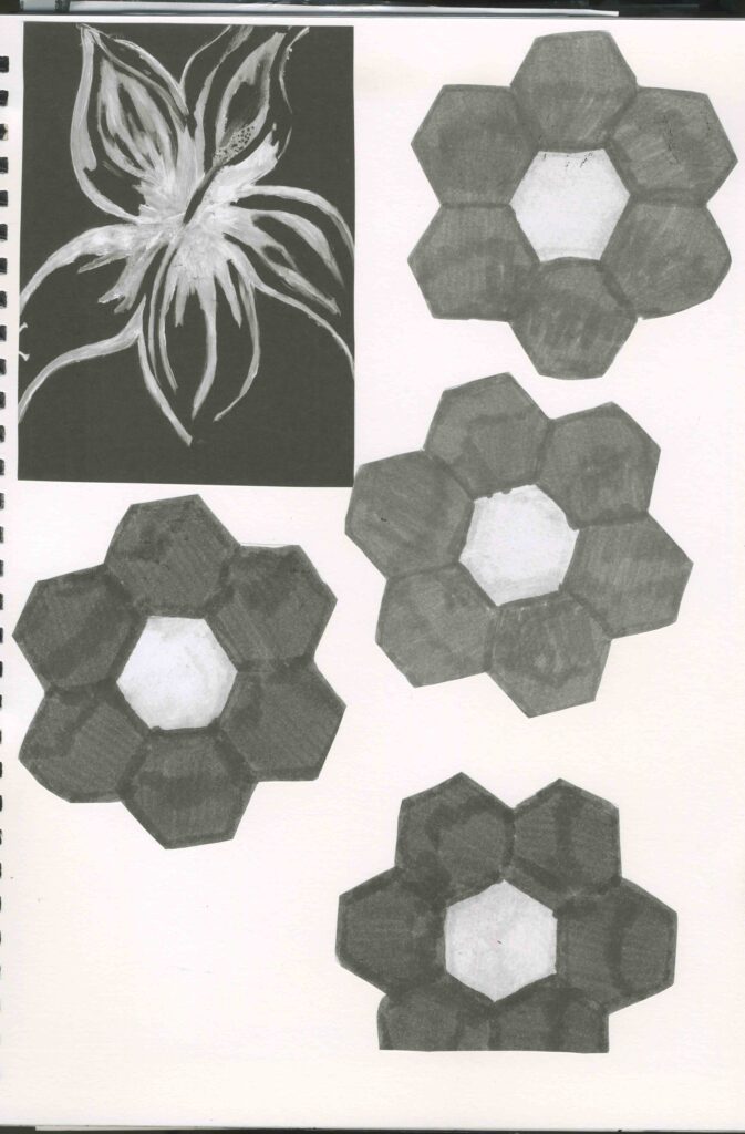
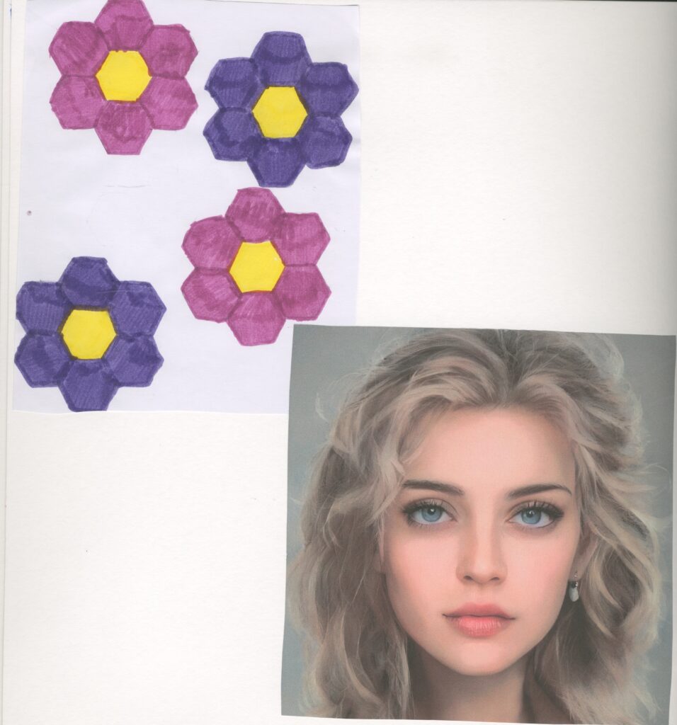
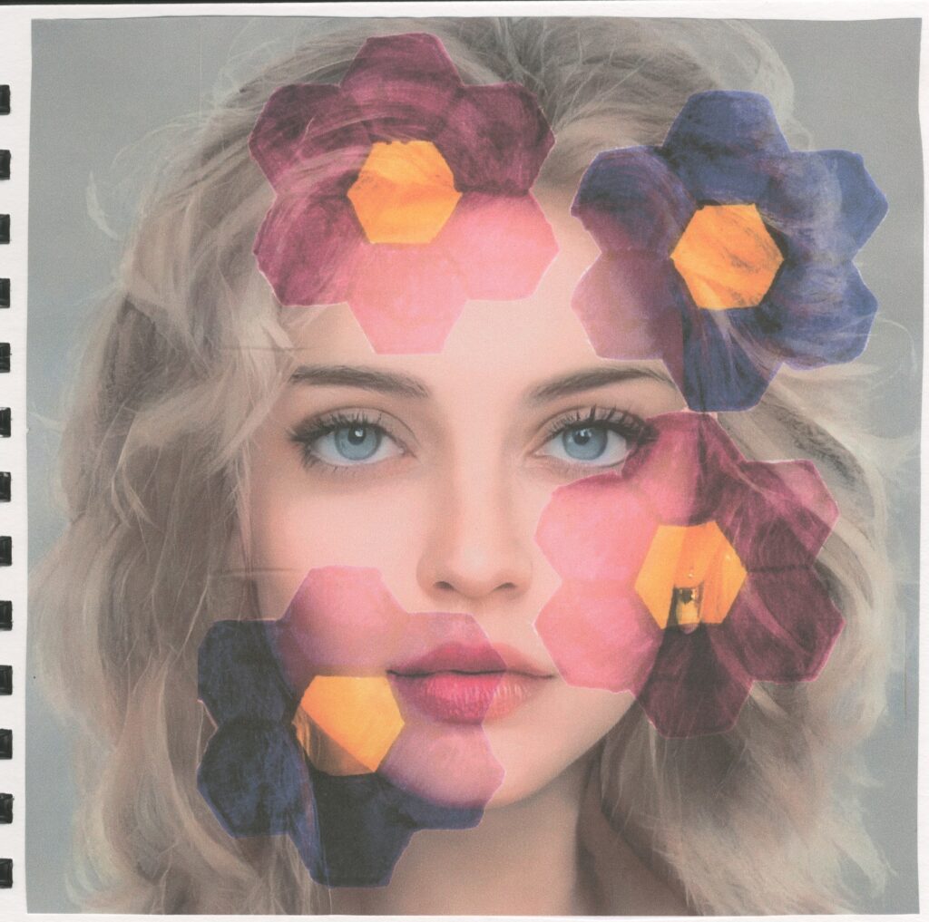
Primary experimental art using a nut
Step by step:
step 1: I traced around a nut to form a flower pattern.
step 2: I used coloured pens to colour the pens in
step 3: I found an image of a portrait on the internet
step 4: I scanned in my flowers and layered them on top of the portrait.
step 5: I edited it to make the flowers blend on top of the image as well as intensifying the colours.
The flowers remind me of an artist called Mary Quant who was a British fashion designer and icon.
I found it difficult to create as digital art is my least favourite artist practice. This also has relations to Accu who are the company that we are working with. This is because Accu sell things like nuts and bolts and other mechanical equipment.
Artist research Mary Quant
Mary Quant was the most iconic fashion designer of the 1960s. A design and retail pioneer, she popularised super-high hemlines and other irreverent looks that were critical to the development of the ‘swinging sixties’ scene. Our fashion collections include examples of her designs from across the 1960s and 1979s.
I think that Mary Quant is a relevant artist for my project because I have considered fashion and the digital work I made involving the nut reminds me the most of her work. This is because these flowers that she came up with are very similar to the ones I drew using the nut. Her works also remind me of Henri Matisse’s works. this is because she prints her work in a similar fashion to Matisse and they tend to be contrasting and I can see that she only used 2 colours.
https://www.vam.ac.uk/articles/introducing-mary-quant
Accu
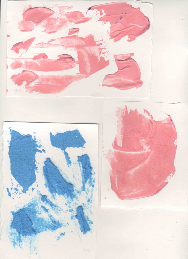
Primary research acrylic and salt painting
Materials:
acrylic paint ( pink and blue)
inks ( purple and blue)
salt
pallet knife
By adding the salt to the acrylic paint, I found that it dried out some of the moisture in the paint and it became thick and crumbly and the more salt I added the thicker and crumblier the paint became. I also got a really nice grainy texture by mixing the salt in the paint. I tested and experimented with different amounts of salt. I used the most salt in the blue paint and the texture reminds me of cement. It was thick and grainy so I found it easier to use my pallet knife to apply it to my paper. It also has a 3D feel to it which I really like.
However, I tried this again with the inks and it didn’t work as well. I think this is because, the inks are a lot more watery than the paints so if I mixed the salt with the inks, the salt would have dissolved into the inks. When I look closer at this it reminds me of an amethyst geode .
Because the acrylic paint worked the best, I decided to paint a flower on an old canvas. I used lots of salt to create that 3D effect and to add some texture.
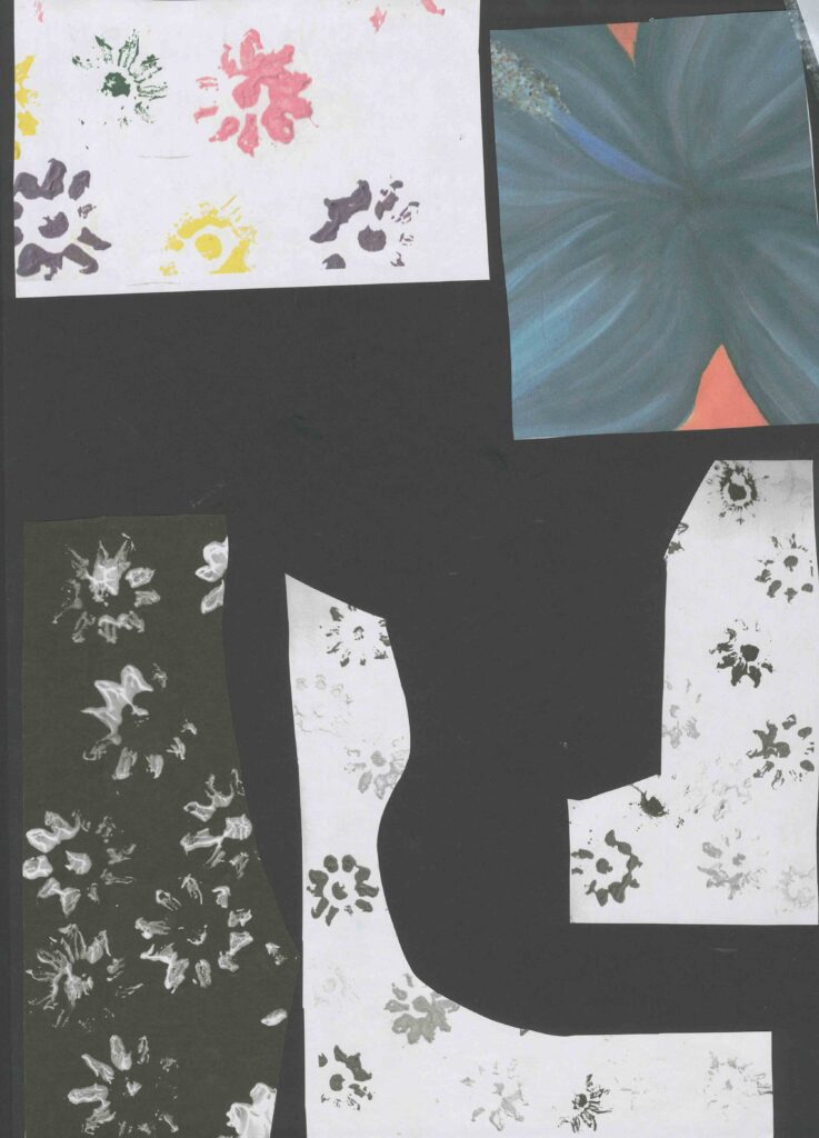
Primary research Negative space
I created these with photo copies of my previous work. I used my acrylic flower prints and my acrylic painting of a flower. Similarly to my fashion garments I designed, I used them to create side profile figures heads that remind me of negative space. And like the fashion one, I used black and white images and coloured images.
I did this by drawing the outline of the head on the back of the paper and then cutting it out to reveal the silhouette of the head with the pattern on the flip side.
This reminds me of Andy Warhol because he typically used repetition and they tend to be bright and colourful.
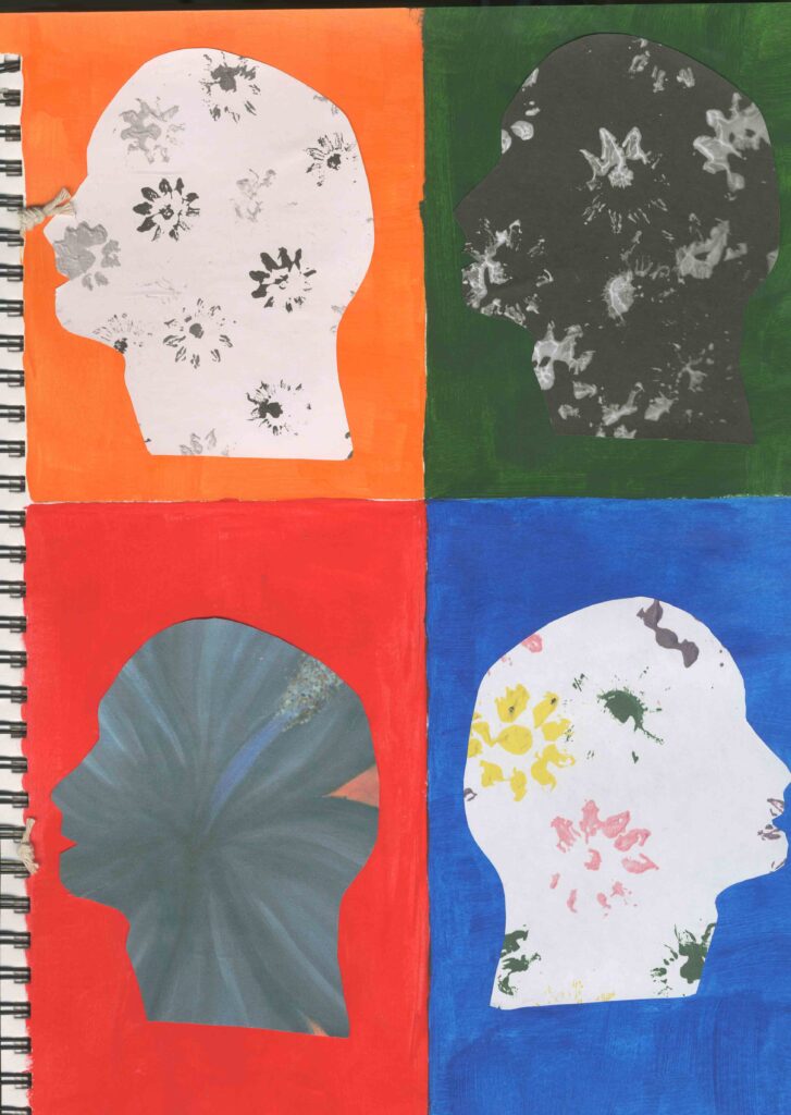
Artist Research Andy Warhol
Andy Warhol was an American Visual artist, film director, producer and leading figure in the pop art movement. His works explore the relationship between artistic expression, advertising and celebrity culture that flourished by the 1960s and span a variety of media , including paintings, silkscreening , photography , film and sculpture. Some of his best known works include the silkscreen paintings Campbell’s Soup Cans and Marilyn Diptych.
I also think that Andy Warhol is a relevant artist for my project. This is because I decided to create some negative space art out of some previous work of mine and when I arranged them on my page it reminded me of Andy Warhol. I particularly like his style of art and I have also taken inspiration from him in previous projects.
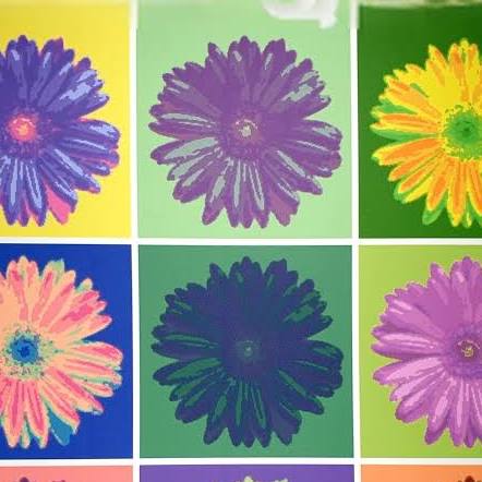
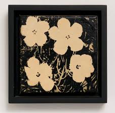
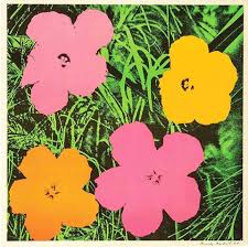
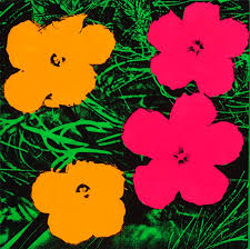
https://en.wikipedia.org/wiki/Andy_Warhol
Digital flower prints
These all relate to Andy Warhol, Mary Quant, Henri Matisse and it also reminds me of mono printing. Originally, my thoughts about this print idea was negative because I said that the colour scheme wasn’t appropriate for my project as I wanted it to be bright and colourful. So to solve this problem, I decided to create some developments in hopes to change my mind about this. So I decided to digitise it and played around with the different colours, intensity of colour and tones.
Because I originally used black and white, I intensified the white and darkened the black to help with the vibrancy of the colour. I really like all these prints apart from the orangey red one. Because I don’t like the colour and some of the flowers have a weird greenish black colour which I don’t like. But the thing that I like the most about the rest of them is that I can see from where the lightest areas are, it sort of looks like the flowers have veins similarly to leafs.
Overall , I think that this has changed my mind about how I originally felt about this and I would like to develop this further.
Artist Research Flora Borsi
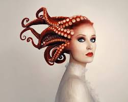
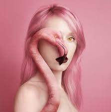
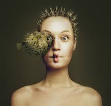
https://lanouegallery.com/artist/Flora_Borsi/biography/
Primary Research zine
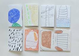
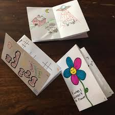
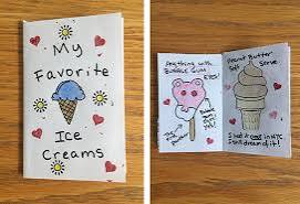
https://www.binderymke.com/what-is-a-zine