Final outcome planning
Because I used a bigger sheet of Lino, I decided to print a second hand on top of the figures face. I prefer this to the other prints because it’s more realistic to human form as most people have two hands which relates to my theme.
I wanted to make the cuts narrow so that when I print this, the image does not appear boldly. Adding further to the theme of being concealed.
Final potential out come tests
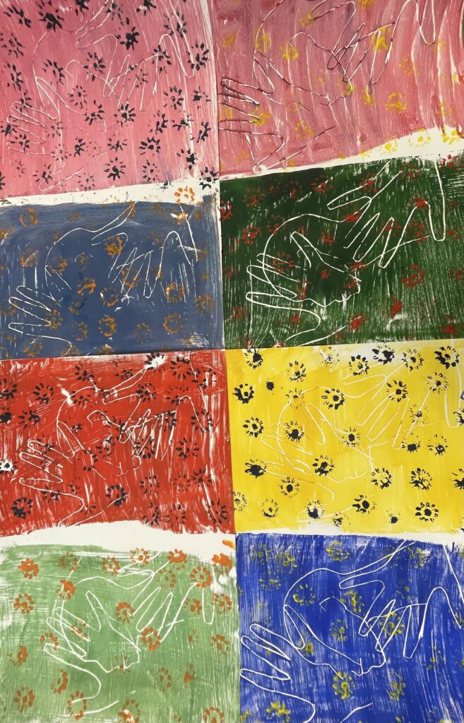
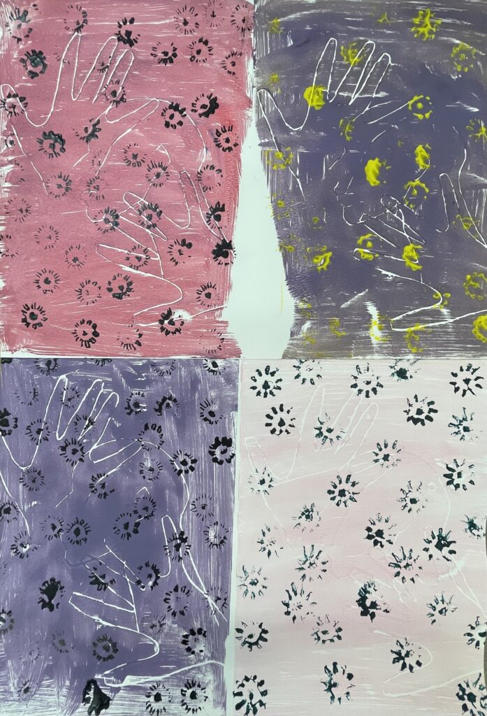
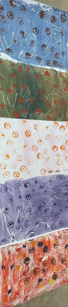
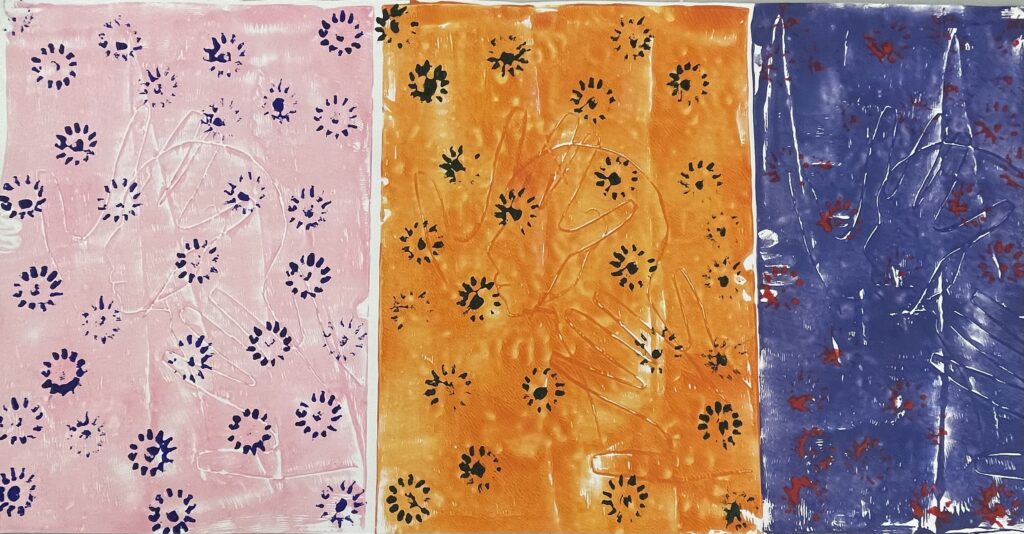
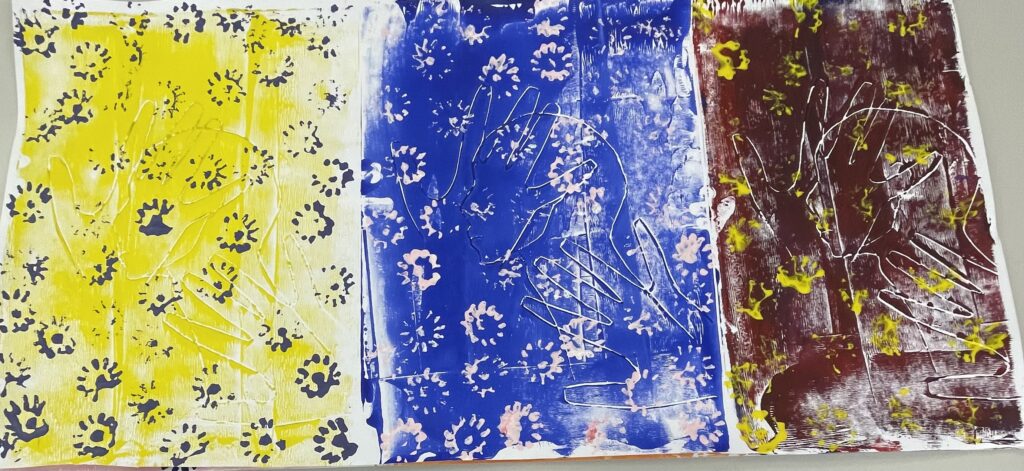
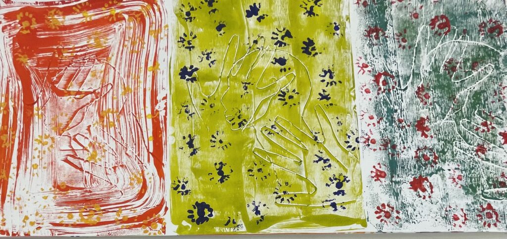
I experimented with amounts of prints, landscape and portrait I also decided to try panoramic prints. Because I wanted it to be on a larger scale I decided not to use the tests with only 4 prints as it wasn’t big enough.Then I tried eight prints and it reminded me of a picnic blanket which wasn’t what I wanted it to look like.
My favourite was the panoramic version because it completely changed the way I viewed it. The fact that it is a continuous piece of art it relates to nature as is continuous and never ending.
Secondary/ contextual research.
The colours that are most commonly associated with nature are shades of blue and green. Very rarely does red make a vibrant appearance, and researchers at the University of Cambridge may have explained why.
A team from the Department of Chemistry used computational modelling to determine that ‘matt structural colour-responsible for the most intense colours seen in nature-is often found for reds, oranges and yellows. They attribute this to structural limitations which affect the way different wavelengths of light and therefore different colours , are reflected and absorbed by surface.
https://www.verywellmind.com/color-psychology-green-2795815
https://www.verywellmind.com/the-color-psychology-of-blue-2795815
https://www.adobe.com/uk/creativecloud/design/discover/color-meaning.html
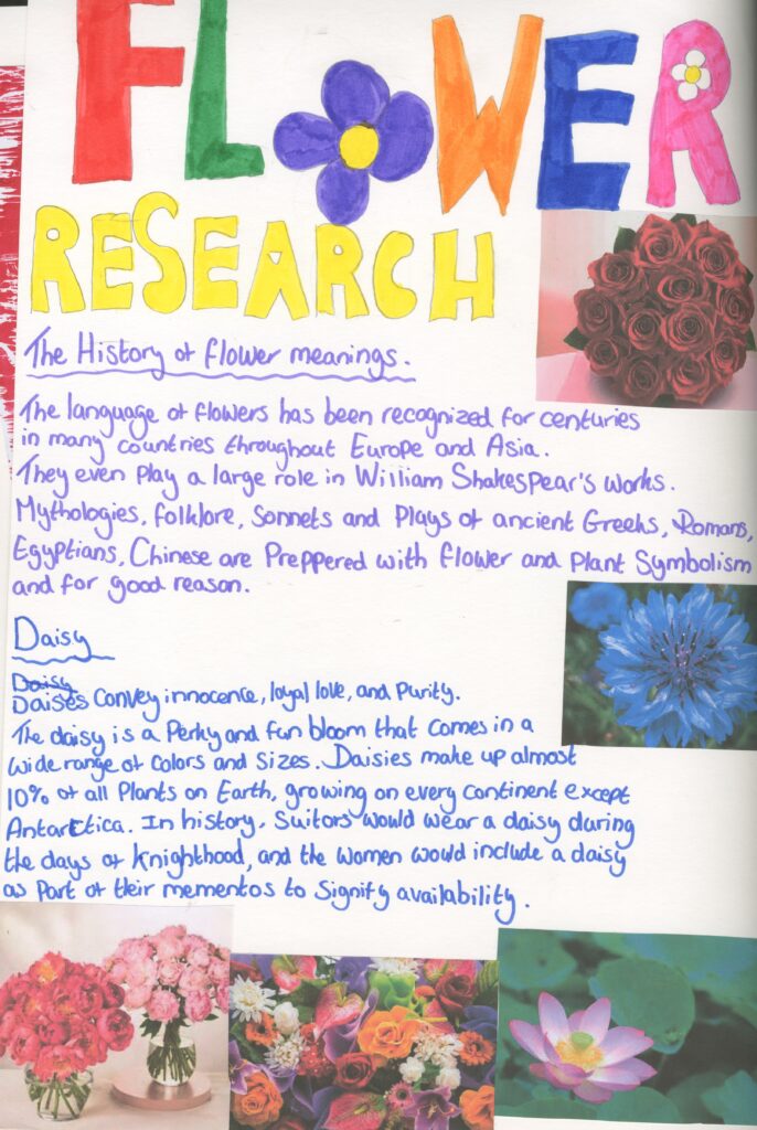
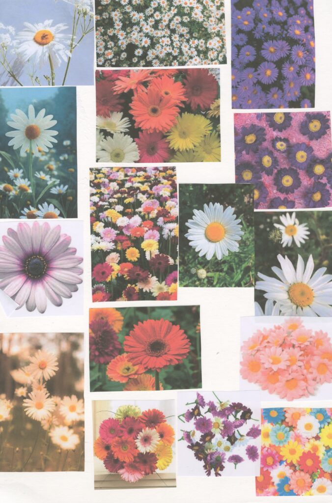
I have done some research into flowers and done some research about my chosen flower of a daisy. I also made a mood board of images of these.
I thought that this was helpful for me because all of this research of colour theory and the psychology of flowers helped me to understand better and it also helped influence my final piece as I can figure out which colours and flower would be most appropriate.
https://www.almanac.com/flower-meanings-language-flowers
https://www.chicagolandflorist.com/more/flower-meanings
Final Outcome
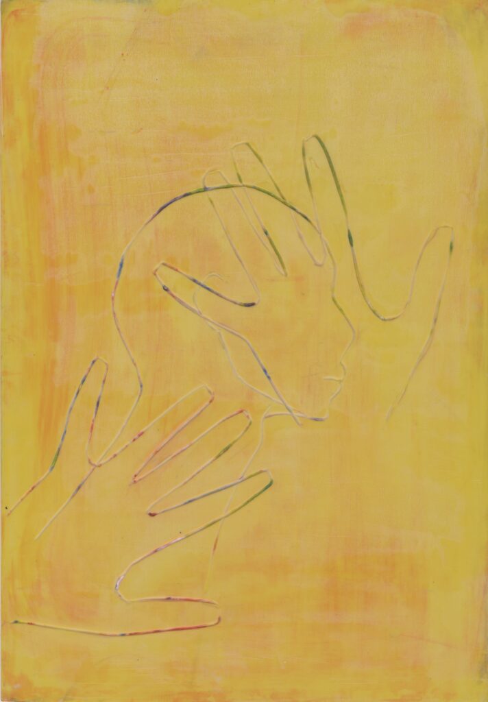
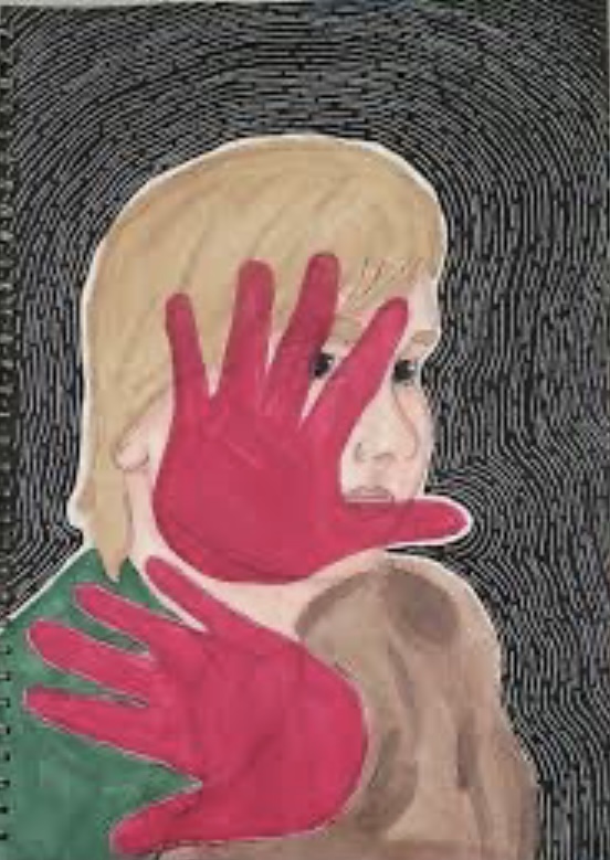
I as took inspiration from the image below as well I love the way the hands are concealing the face. However, when I create my own prints I chose not to give it any features as I want the identity of the person to be concealed further. By giving it more features it could gender the person. By keeping it neutral and not basing it around a specific gender it adds to the concealment of the person.
When I exhibit my final outcome, I want it to be in a panoramic fashion not a grid formation because it was my most successful way of presenting my work. I was inspired by Andy Warhol who is an artist who I have looked at before in previous projects. His work was mostly focused around pop art and I like how the bright captivating colours communicate nature to me. I used acrylic paints , Lino and daisies to print and create this as this was successful for me when I first tried it.
Final Evaluation
over all I think this project went really well I have done lots of different types of research and I feel like I have learned a lot. However I wish I did some more research into human form and took some primary photos of flowers and human form as those were the elements that I was focusing on in my theme of concealment.
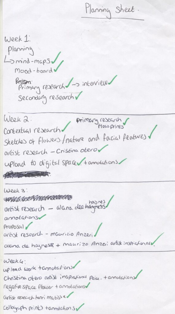
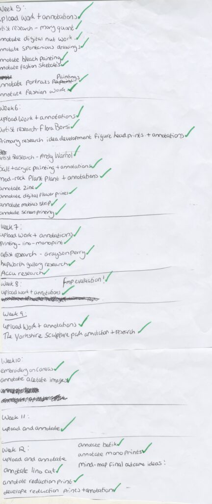
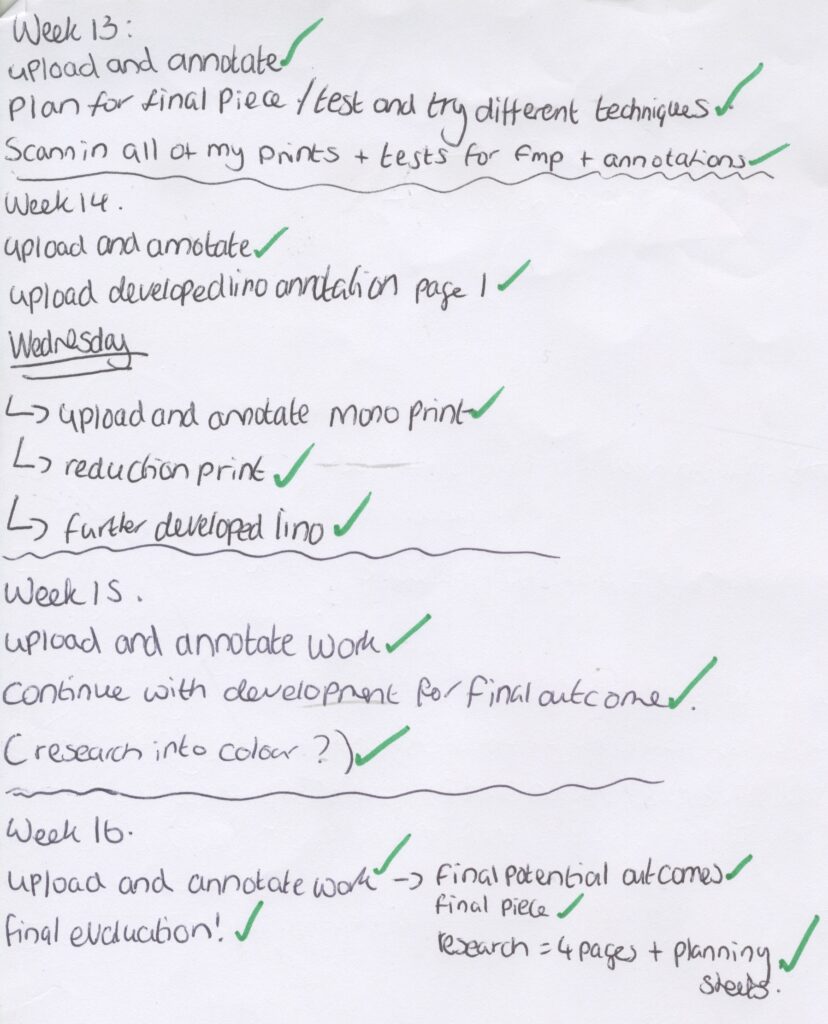
Planning sheets