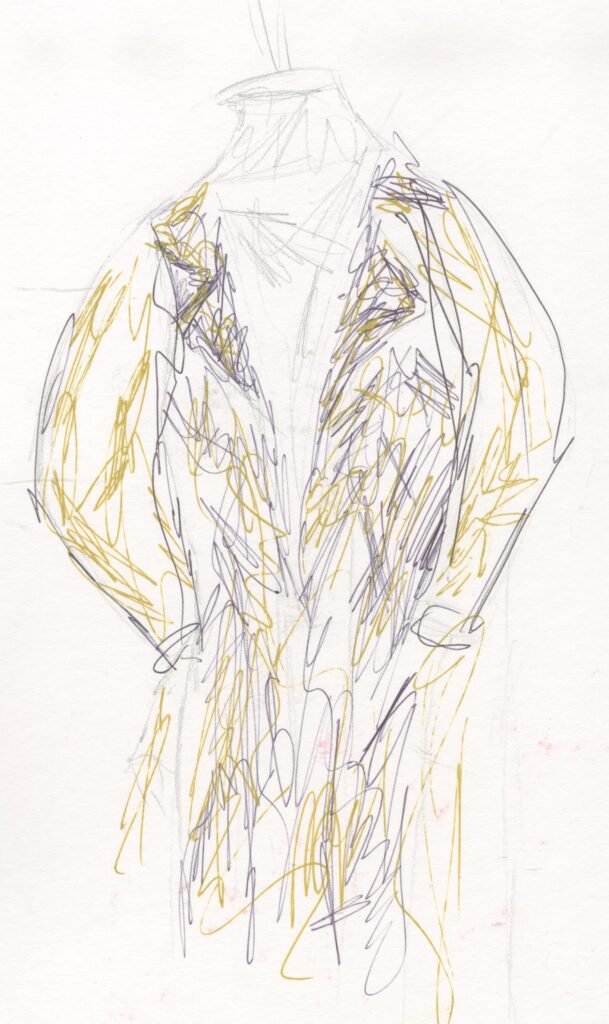
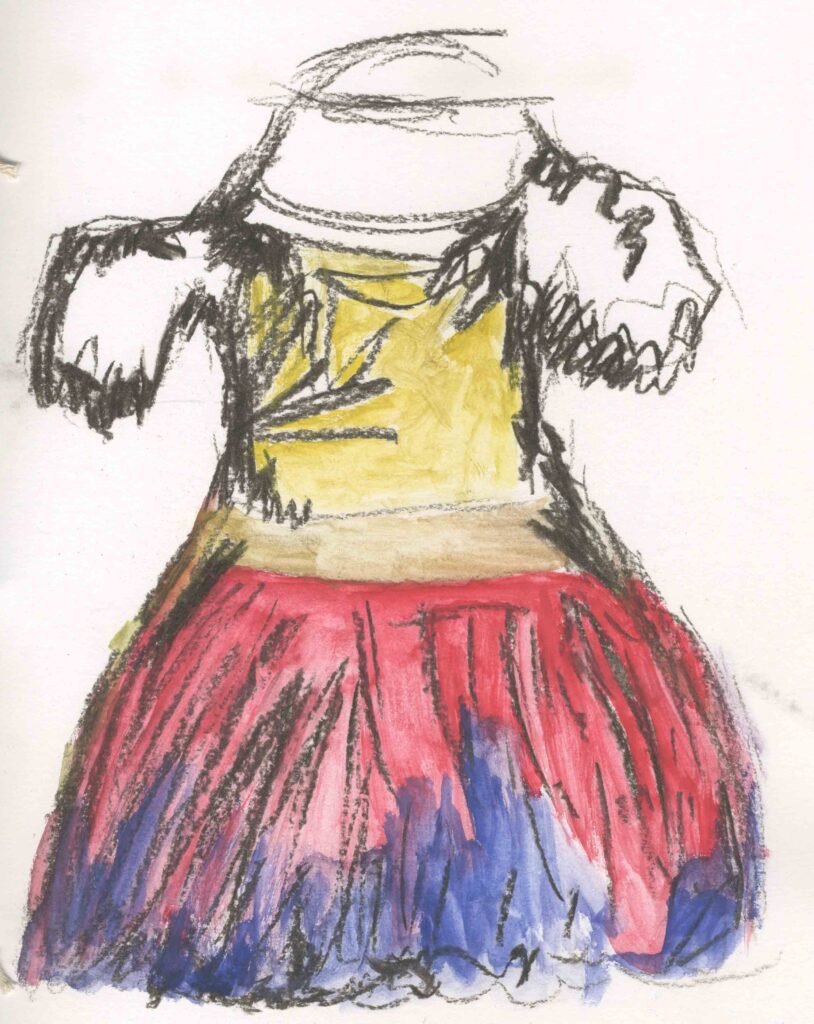
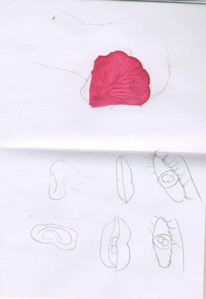
Primary Research Fashion sketches
I drew some sketches of different outfits using mixed media. I used pencil, pen , charcoal and water colour.
I don’t like the these because they look rushed and like something I drew in Primary school.
I don’t like the colours in the dress especially the charcoal because it’s extremely messy to work with and it smudges very easily. The yellow paint and charcoal mixed together to get a very horrible muted greenish yellow colour.
My most successful sketch is the suit this is because I had no problem with the medium smudging or mixing in a strange way. However,I drew it a bit too small and I wish I a better colour combination because the colours look boring.
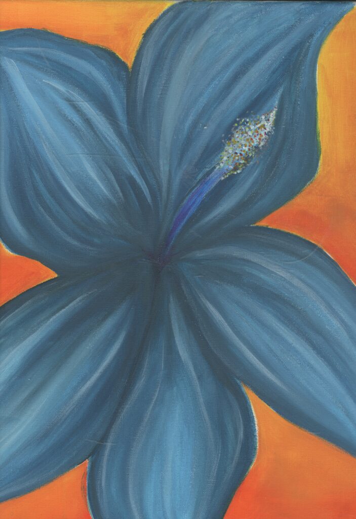
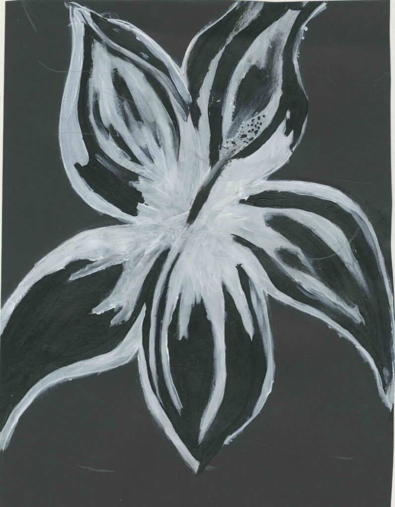
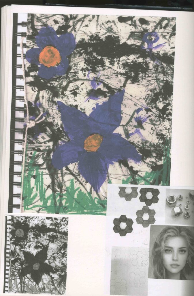
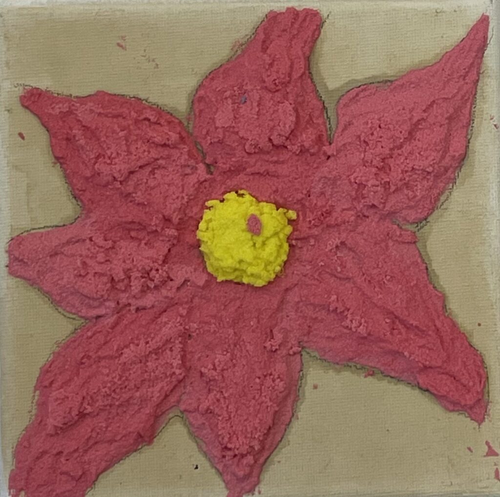
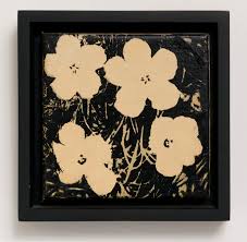
Primary acrylic paintings of flower
I painted two hydrangea flowers. One on canvas , bright coloured acrylic paint and the other I only used black and white acrylic paint to get a negative space effect. I tried to paint the flower in a way that the white paint is where the darker areas would be and the black areas is where the lighter areas would be. This reminds me of an X-ray. This links to my theme better than the orange and blue painting because the X-ray idea reminds me more of human form but X-rays happen when parts of human form brakes. This is not the message i want to give off for my project but overall I prefer the black and white painting because it has more significance to my project.
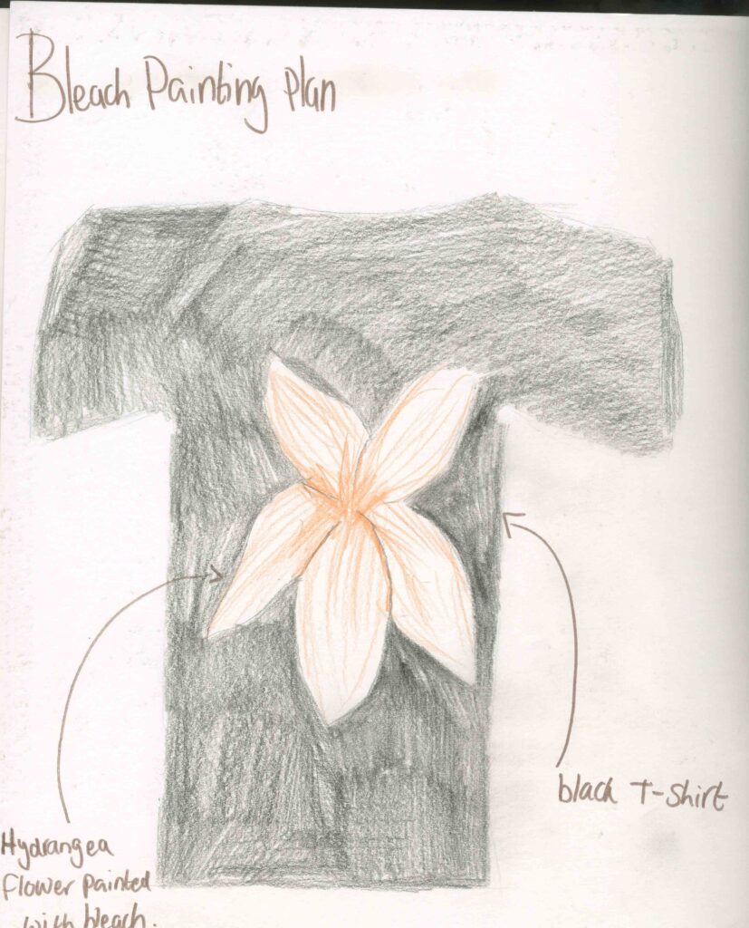
Primary Research Bleach painting
Materials:
white pencil/white pen
Black t shirt
cup of bleach
paint brush
Step by step:
step 1: first I covered my surfaces to protect them from the bleach as well as gloves to protect my skin.
step 2: Then I used the white pen to sketch out the flower on the t shirt.
step 3: Then I used the paint brush to carefully apply the bleach to fill in and paint the flower.
step 4: I left the shirt to fully dry then I hand washed it.
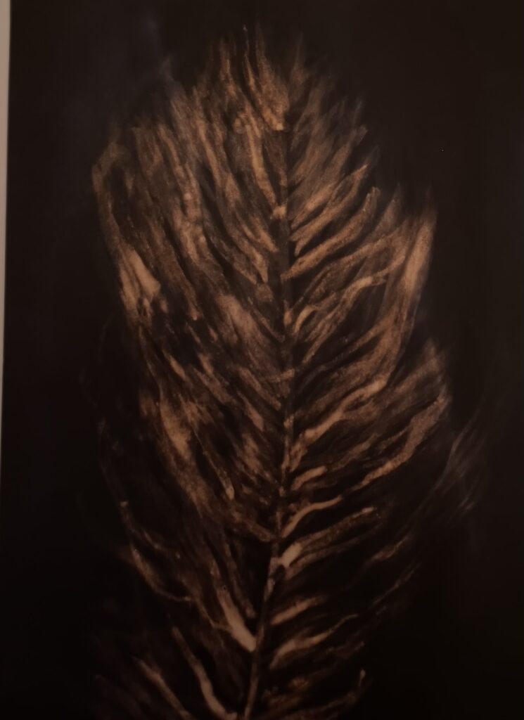
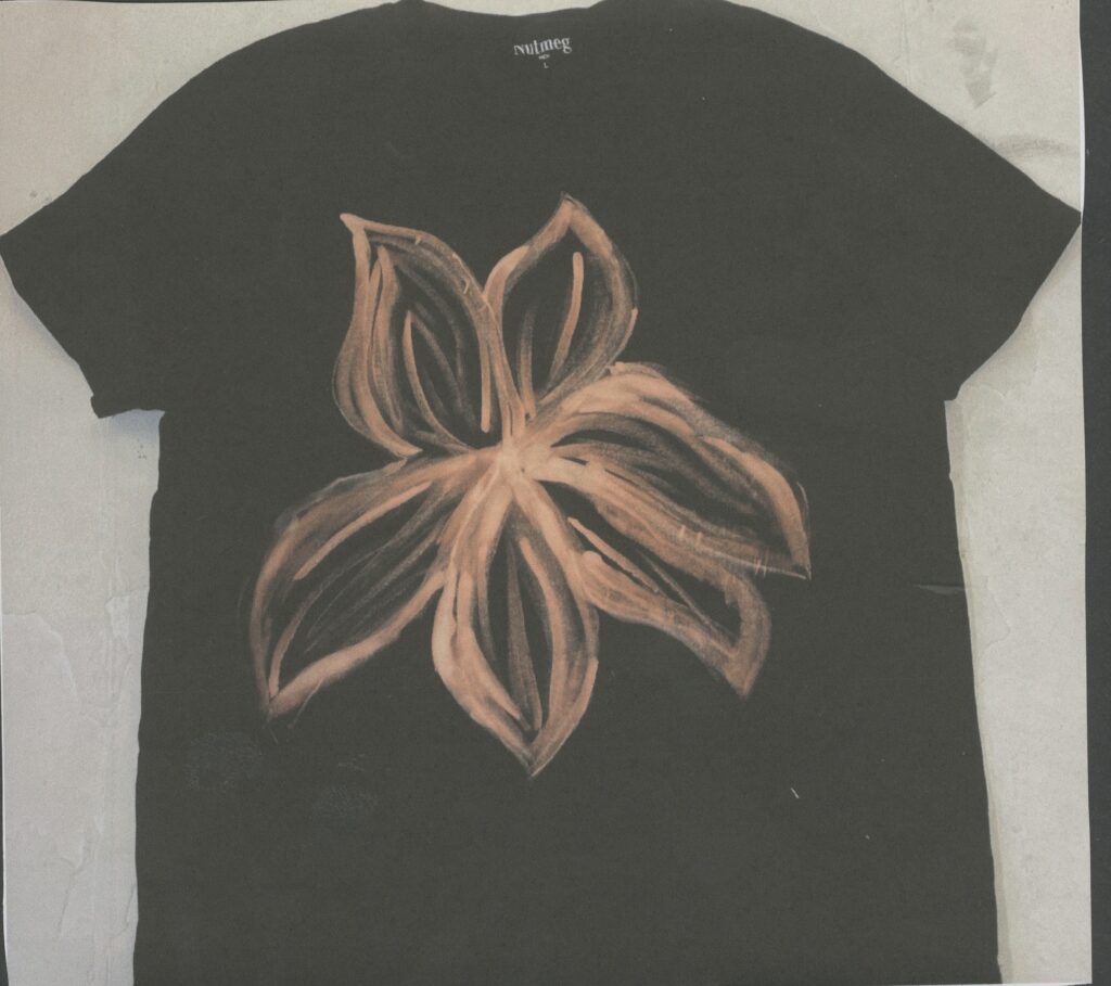
Because bleach is a very strong chemical, I had to be very careful with it because it can be very dangerous to use. I also know that it is so strong that it can remove the colour out of materials so I to advantage of that and decided to paint with it. When I first tried this out, I was in Secondary School and when I was going through my old work I came across a bleach painting of a feather that I did.
I found this to be very easy to make because it’s no different to painting with actual paints and painting is something that I think I’m quite good at. I also like the smell of bleach and cleaning supplies. Because bleach is a cleaning product and not associated with an art supply it shows that I’m being creative and imaginative. I also think that this relates to my project because I would associate cleaning supplies to nature as the fresh and clean smell makes me think of fresh air.
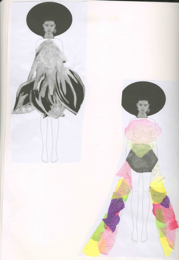
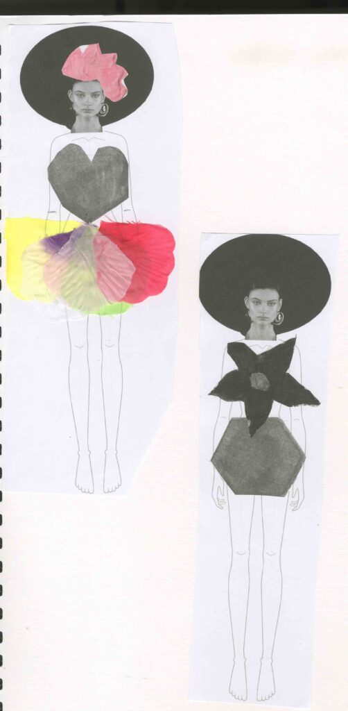
Primary Research creating out fits
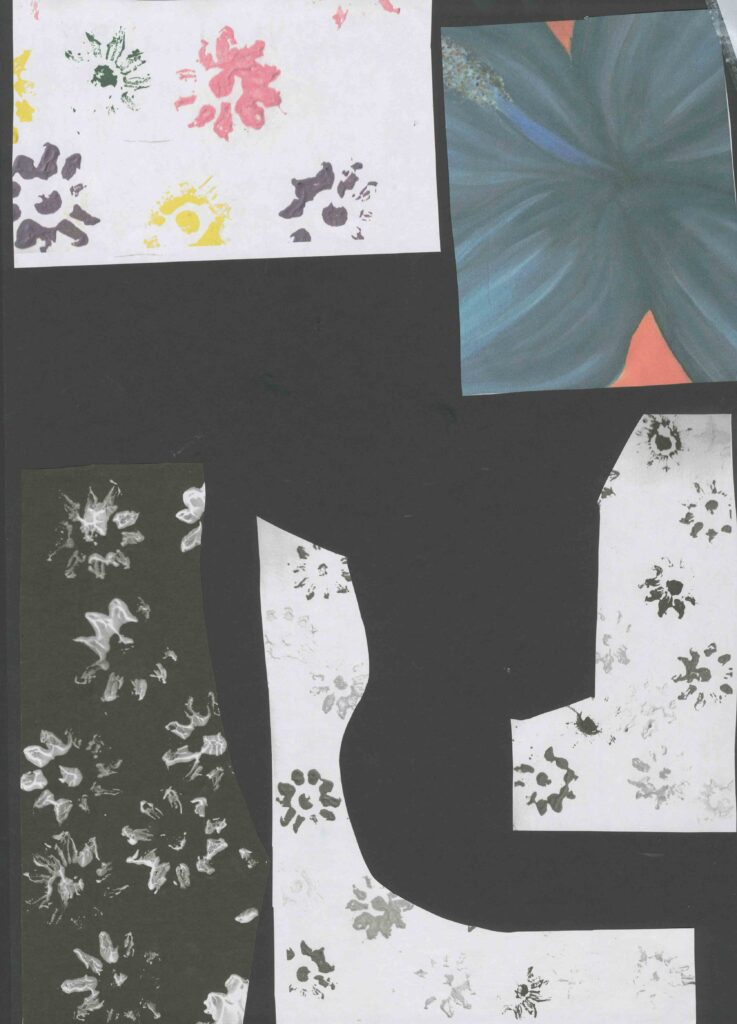
I photo copied multiple pages from my sketchbook that I could use to create garments relating to my project. I copied my : digital art using a nut, flower painting and collaborative art work. I printed these in black and white as well as in colour. I also played around with the scale, some at 100% and 60% some even smaller. I did this to show contrast and to show how the different sizes of the prints could change the way and viewpoint of how I could use them to style an outfit.
I decided to go down the route of creating a more feminine style of clothing. I made primarily skirts and for the top the centre of the flowers. My favourite outfit is the one with the corset top and flower petal skirt. I even gave it a head piece. This is because I like the 3D fell of the skirt and I also like the skirt is bright and colourful and it contrasts well with the top. It looks very elegant which to me nature is elegant. I found this easy to create and think of these designs because I had a clear vision in my head of what I wanted these to look like. It also helped that I have a lot of drawings and work to work from.
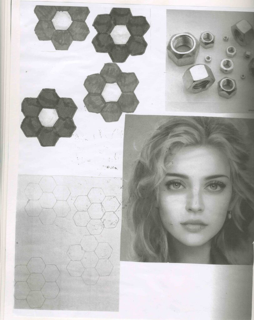
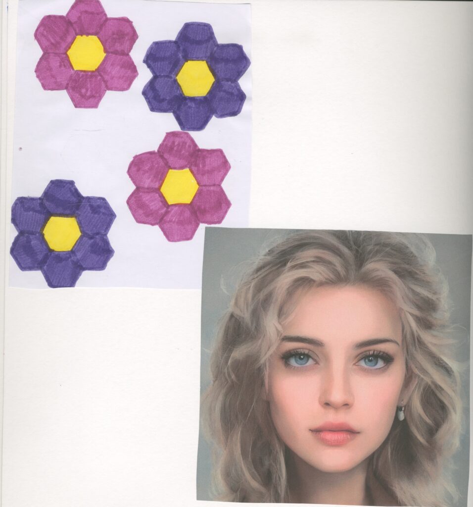
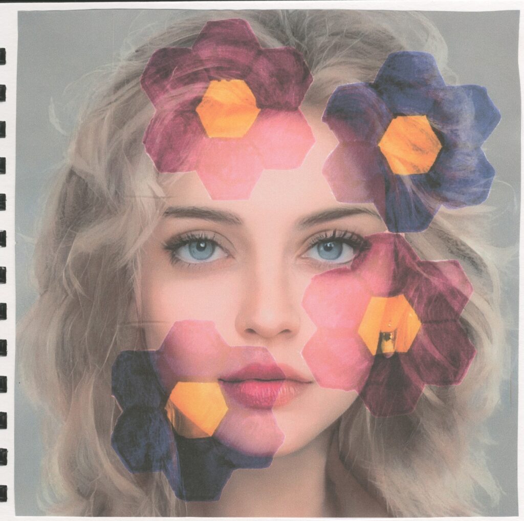
Primary experimental art using a nut
Step by step:
step 1: I traced around a nut to form a flower pattern.
step 2: I used coloured pens to colour the pens in
step 3: I found an image of a portrait on the internet
step 4: I scanned in my flowers and layered them on top of the portrait.
step 5: I edited it to make the flowers blend on top of the image as well as intensifying the colours.
The flowers remind me of an artist called Mary Quant who was a British fashion designer and icon.
I found it difficult to create as digital art is my least favourite artist practice. This also has relations to Accu who are the company that we are working with. This is because Accu sell things like nuts and bolts and other mechanical equipment.
Artist research Mary Quant
Mary Quant was the most iconic fashion designer of the 1960s. A design and retail pioneer, she popularised super-high hemlines and other irreverent looks that were critical to the development of the ‘swinging sixties’ scene. Our fashion collections include examples of her designs from across the 1960s and 1979s.
I think that Mary Quant is a relevant artist for my project because I have considered fashion and the digital work I made involving the nut reminds me the most of her work. This is because these flowers that she came up with are very similar to the ones I drew using the nut. Her works also remind me of Henri Matisse’s works. this is because she prints her work in a similar fashion to Matisse and they tend to be contrasting and I can see that she only used 2 colours.
https://www.vam.ac.uk/articles/introducing-mary-quant
Accu
Accu was founded 13 years ago. The founders saw an opportunity to offer an exceptional e-commerce experience to engineers and manufacturers, disrupting the traditional, catalogue and quotation way or doing business.
The Headlines:
70% sales e-commerce
95% 5 star reviews on Trust Pilot
76 net promoter score
40% growth year on year
£13million turnover
100+employees
Accu Brand Personality:
Radical
Bold
Colourful
Loud
Optimistic
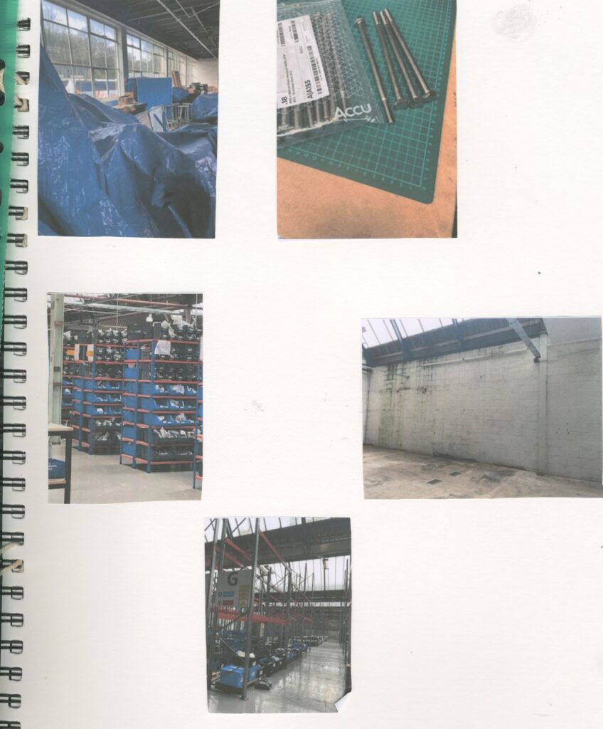
We went on a trip to the Accu warehouse. Accu is the company that we are working with. We have been asked to create work that coud be used in their new office spaces. I took some pictures of potential areas which I could exhibit my work. I’m considering displaying my work on the massive white wall. This is because I tend to work on a larger scale and because it’s so big, I have a wider choice of things to create.
It was good to see there is a lot of scope for places to exhibit and was really interesting to go see and speak to the client.
Because Accus brand is about being bold and colourful I want to link this to my own work. Whatever I create, I want it to be really colourful. I know my work is about concealment but I think I can link to Accus brand with my bold visuals
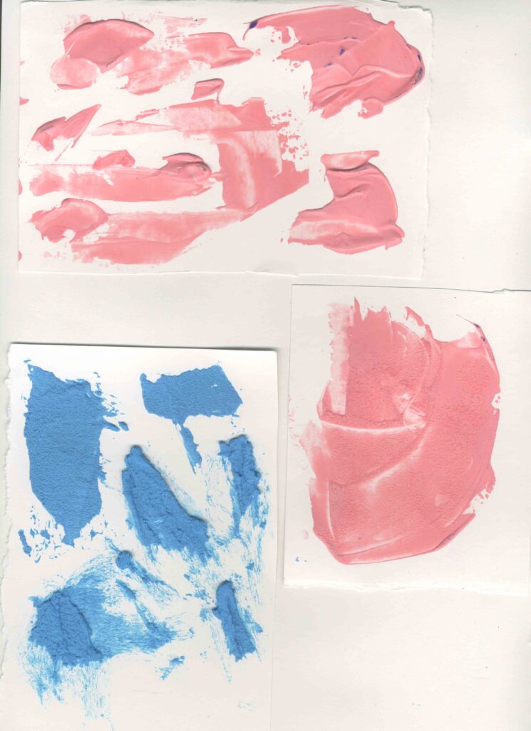
Primary research acrylic and salt painting
Materials:
acrylic paint ( pink and blue)
inks ( purple and blue)
salt
pallet knife
By adding the salt to the acrylic paint, I found that it dried out some of the moisture in the paint and it became thick and crumbly and the more salt I added the thicker and crumblier the paint became. I also got a really nice grainy texture by mixing the salt in the paint. I tested and experimented with different amounts of salt. I used the most salt in the blue paint and the texture reminds me of cement. It was thick and grainy so I found it easier to use my pallet knife to apply it to my paper. It also has a 3D feel to it which I really like.
However, I tried this again with the inks and it didn’t work as well. I think this is because, the inks are a lot more watery than the paints so if I mixed the salt with the inks, the salt would have dissolved into the inks. When I look closer at this it reminds me of an amethyst geode .
Because the acrylic paint worked the best, I decided to paint a flower on an old canvas. I used lots of salt to create that 3D effect and to add some texture.
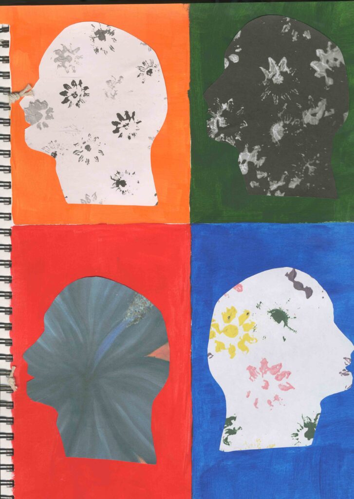
Primary research Negative space
I created these with photo copies of my previous work. I used my acrylic flower prints and my acrylic painting of a flower. Similarly to my fashion garments I designed, I used them to create side profile figures heads that remind me of negative space. And like the fashion one, I used black and white images and coloured images.
I did this by drawing the outline of the head on the back of the paper and then cutting it out to reveal the silhouette of the head with the pattern on the flip side.
This reminds me of Andy Warhol because he typically used repetition and they tend to be bright and colourful.
Artist Research Andy Warhol
Andy Warhol was an American Visual artist, film director, producer and leading figure in the pop art movement. His works explore the relationship between artistic expression, advertising and celebrity culture that flourished by the 1960s and span a variety of media , including paintings, silkscreening , photography , film and sculpture. Some of his best known works include the silkscreen paintings Campbell’s Soup Cans and Marilyn Diptych.
I also think that Andy Warhol is a relevant artist for my project. This is because I decided to create some negative space art out of some previous work of mine and when I arranged them on my page it reminded me of Andy Warhol. I particularly like his style of art and I have also taken inspiration from him in previous projects.
https://en.wikipedia.org/wiki/Andy_Warhol
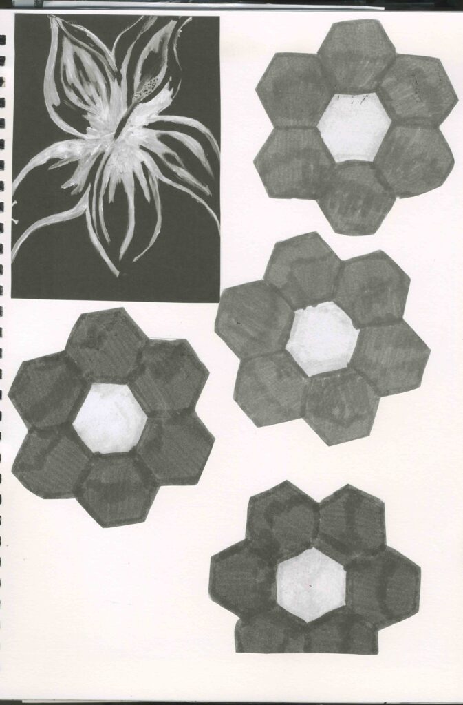
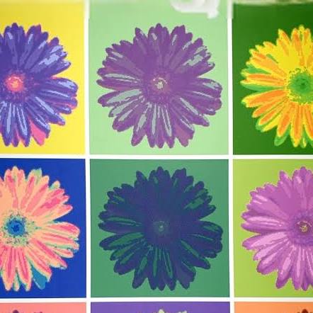
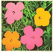
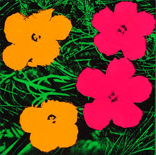
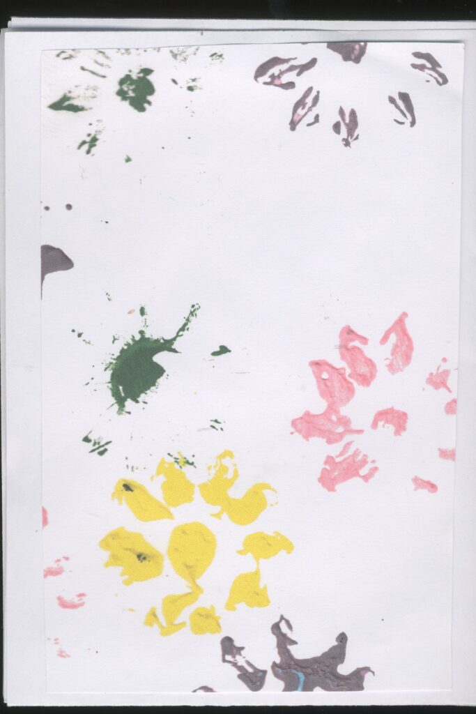
Digital flower prints
These all relate to Andy Warhol, Mary Quant, Henri Matisse and it also reminds me of mono printing. Originally, my thoughts about this print idea was negative because I said that the colour scheme wasn’t appropriate for my project as I wanted it to be bright and colourful. So to solve this problem, I decided to create some developments in hopes to change my mind about this. So I decided to digitise it and played around with the different colours, intensity of colour and tones.
Because I originally used black and white, I intensified the white and darkened the black to help with the vibrancy of the colour. I really like all these prints apart from the orangey red one. Because I don’t like the colour and some of the flowers have a weird greenish black colour which I don’t like. But the thing that I like the most about the rest of them is that I can see from where the lightest areas are, it sort of looks like the flowers have veins similarly to leafs.
Overall , I think that this has changed my mind about how I originally felt about this and I would like to develop this further.
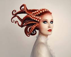
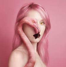
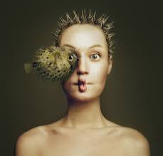
Artist Research Flora Borsi
Flora Borsi is an award winning, fine art and photographer from Budapest, Hungary. Having taught herself photo -editing at age 11, Borsi uses masterful photo manipulation to create surreal images that are thematically focused on identity, relationships, emotions and dreams. Her immaculate technique and subtle conceptual ideas create beautiful evocative of universal emotions, from lust and desire to despair and loss .
Her work often features the female body and she plays with hiding and revealing the eyes or face to leave only the feminine form, exploring questions of female representation and the relationship between body and self.
https://lanouegallery.com/artist/Flora_Borsi/biography/
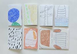
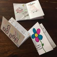
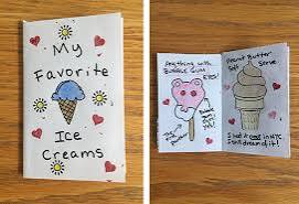
Primary Research zine
Step by step:
step1: fold the paper in half
step2: fold again
step3: fold again
step4: unfold to find 8 page
step5: fold in half and cut the centre
step6: fold in half and push together
A zine is a self-published, non-commercial print-work that is typically produced in small, limited batches. Zines are created and bound in many DIY ways, but traditionally editions are easily reproduced-often by crafting an original “master flat”,pamphlets.
Zines may also be sewn, taped, glued.
People who create zines are likely to be more motivated by self-expression and artistic passion than they are by profit: Zines are usually inexpensive and sometimes distributed for free or in trade for other zines, goods and services.
Zines can touch on a variety of topics: music and art, politics, sexuality and humour. Their content may be written, drawn, printed, collaged or any other form of combining words and imagery-a zine’s structure may be narrative, journalistic, comic-like or completely abstract.
For my zine, I used bits of my work and 3D flowers to create my zine. I decided to use the work that I thought was the most successful. I did this beat this point in my project I got a bit stuck for ideas so I thought that it would be a good idea to make a zine but unfortunately this was not the case. Also I didn’t enjoy making it because it took me a couple attempts to put the zine together.
zine examples
https://www.binderymke.com/what-is-a-zine
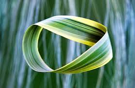
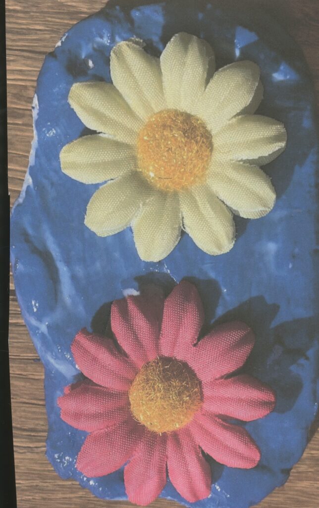
Mobius strip
Step by step
Step1: I hot glued a strip of cardboard to two strips of canvas fabric covering the cardboard
step2: I dipped a fake daisy into some acrylic paint: pink, yellow and blue
step3: I repeated this on the other side
step4: I used the hot glue to art the ends together
Because I used a hot glue gun I had to be very careful with it. I used my cutting mat so the hot glue wouldn’t get on my desk and made sure I switched it of and unplugged it and left it to cool down completely before I put it away.
Mobius strips are a surface that can be formed by attaching the ends of a strip of paper together with a half-twist. As a mathematical object, it was discovered by Johann Benedict Listening and August Ferdinand Möbius in 1858, but it had already appeared in Roman mosaics from the third century.
I didn’t like this because I felt restricted to my ideas. I think this is because I’m not used to being restricted to smaller scales. Because it was smaller I had to think harder about what design I wanted to create on it . I ended up recreating the flower prints that I did at the start of the project as they were successful.
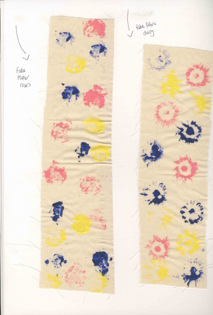
Before I created the final product, I tested out my design on some strips of canvas. I decided to use acrylic paint to print them as water colour wouldn’t have worked as it would be very translucent and the canvas would soak it up. This also reminds me of Mary Quants flowers and Andy Warhols flower prints. I also tested out paper roses and daisies. I think the daises were more successful because I liked how the prints came out I think they resemble a flower more than the roses as they look like colourful blobs.
Mobius strip examples
My Mobius strip
https://en.wikipedia.org/wiki/M%C3%B6bius_strip
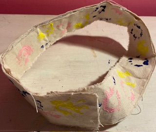
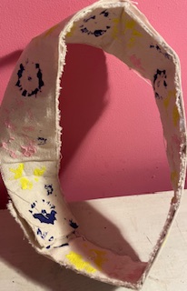
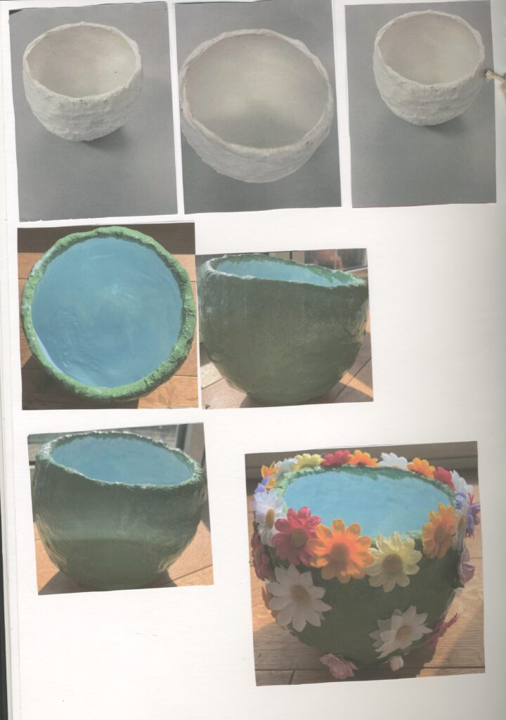
Primary Research Mod Rock Bowl
Step by Step:
step1: first I covered the surface to make clean up easier.
step2: then I found a bowl that I could put my balloon in to help it balance.
Step3: I blow up my balloon and placed it in the bowl and got a bowl of water
step4: before I started applying the mod rock, I pre cut some strips to make it easier for me.
Step5: To apply the mod rock I dipped it in some water to activate the mod rock and place it on the balloon and smoothed it out with my fingers.
Step6: I let it fully dry before I removed the balloon
Step7: I smoothed it with some sand paper
Step8: I mixed some water and glue together and painted it over the bowl.
Step9: I covered the bowl with some white acrylic gesso
Step10: I painted the inside of the bowl blue and the outside green.
Step11: I varnished to bowl once it had completely dried.
Step12: Finally, I hot glued some fake flowers to the out side of the bowl.
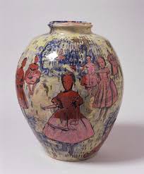
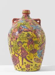
In a previous project, I also researched Grayson Perry and I made a mod rock bowl. However, I did it in a similar way to Perry, which I made my own typography and drawings on newsprint, which I decoupaged on to the bowl. I also used pink tissue paper in stead of acrylic paint. I preferred the paint to the tissue paper because the paper is not as opaque as the acrylic paint.
I even went to a café in Haworth on the main street which you can also paint there( Cobbles and Clay) I painted another bowl however this is a ceramic bowl which originally, Grayson Perry’s bowls are ceramic. I decided to paint it yellow with a purple hydrangea flower in side it. I like the overall product however painting the flower was a bit difficult because of the shape of he bowl. I like how I chose to use complementary colours though.
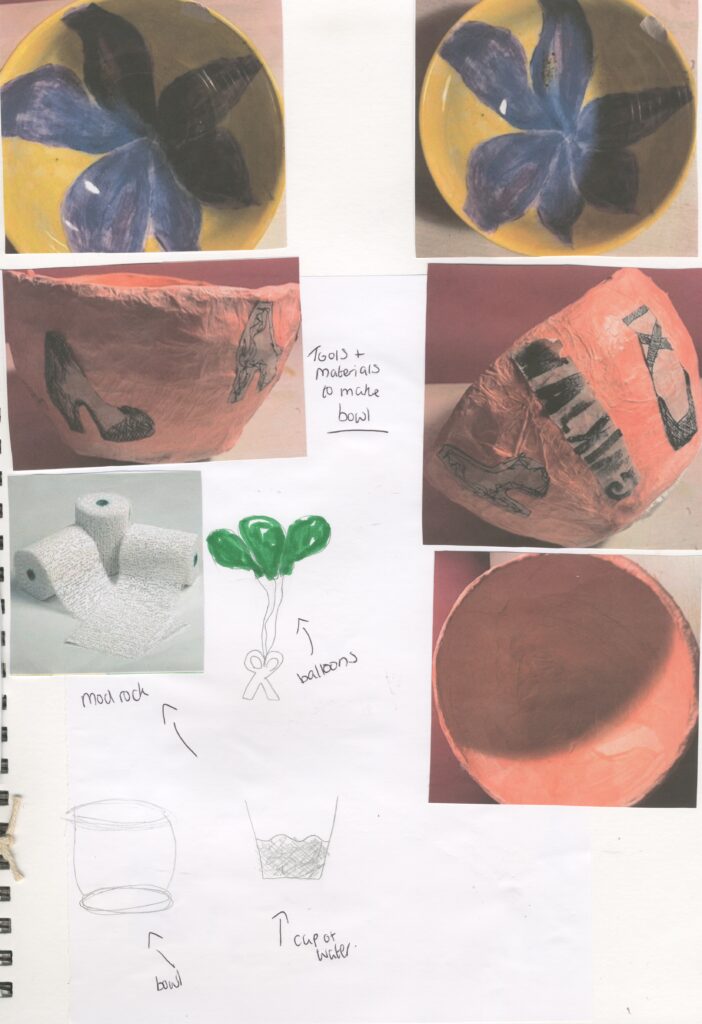
Before I made this bowl, I decide to make a quick test piece so I could make sure that it would work and especially if the flowers would stick to the glossy coating that I put on the bowl.
I created this bowl to represent flowers in a grassy field. The green acrylic paint on the outside represents the grass and the blue paint inside the bowl represent the sky. I intentionally didn’t let the white acrylic gesso dry completely before I painted it blue because I wanted it to mix slightly with the blue to create the effect of clouds.
I found that the mod rock is very easy to use however, it is extremely messy and dries very quickly. Because of this, I had to be quick and careful as to where I was going to put it. I also ran in to some problems when creating this. After it had completely dried, I decided to use some sand paper to smooth it out. As I was doing this, I noticed that it was developing some weak spots so I immediately stopped and filled them in with some more mod rock for some extra strength and support. I really like that I glossed it because it reminds me of wet grass or morning dew drops .
Overall, my favorite bowl was the green and blue bowl. However it did take me 12 steps to complete and it was time consuming, I thought that this was the most successful out of all of them because I like how I used the paint, I like the idea of basing it around flowers in a field, I also like the glossy finish it has.
Artist Research Grayson Perry
Grayson Perry is a contemporary British artist best known for his ceramic vessels, printed tapestries and design for a House for Essex. His work contains a prominent autobiographical narrative which often features his alter ego Claire. The narrative chronicles a troubled childhood.
In response to Grayson Perry’s work, I made a sculpture of a bowl using mod rock . I found this to be very successful even though it was messy and took a lot of steps to complete.
https://www.artnet.com/artists/grayson-perry/