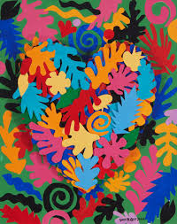
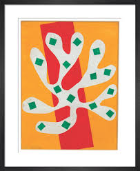
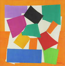
Artist Research Henri Matisse
Henri Matisse was a French artist, known for both his use of colour and his fluid and original draughtsmanship. He was a draughtsman, printmaker, sculptor but is known primarily as a painter. Matisse is commonly regarded, along with Pablo Picasso, as one of the artists who best helped to define the revolutionary developments in visual art throughout the opening decades of the twentieth century, responsible for significant developments in painting and sculpture.
In response to Matisse’s art I made some prints of flowers using collographs and prints by dipping a flower in acrylic paint and stamping them onto paper. I like how Matisse uses bright colours which I tried to replicate that in my own prints. I like how I can see shapes that look like leaves this is because it has relevance to my project. I also like the abstract style and it’s not obvious what the artist is trying to convey.
https://en.wikipedia.org/wiki/Henri_Matisse
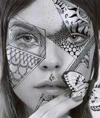
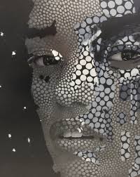
Artist Research Alana Dee Haynes
Alana Dee Haynes is an American artist who lives and works in New York City. Haynes is known for intricate hand drawn illustration over found photographs. Haynes’s works consisted of paintings, fashion, sculpture, digital media and illustration. She uses her recurring patterns to transform these found images or sculptures into something new and abstract.
She is also an inspired by music and she is trying to impose her own visions of what she hears into her photographs. Nature is also a big inspiration for her. She loves looking at nature and loves religious and cultural art for their use of symbols: hearts, eyes, hands.
Because she is inspired by nature and primarily works with portraits, I think that she is a relevant artist for my project as I have similar ideas and intentions.
https://en.everybodywiki.com/Alana_Dee_Haynes
https://uk.gestalten.com/blogs/journal/10-questions-with-alana-dee-haynes
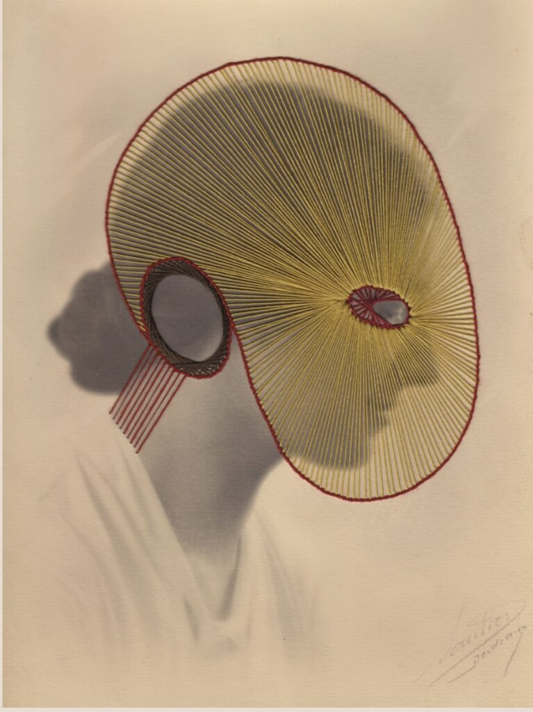
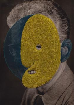
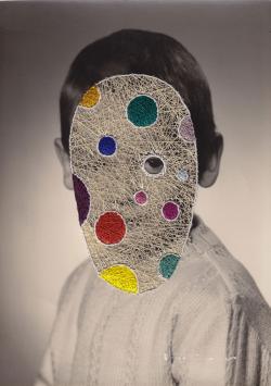
Artist Research Maurizio Anzeri
Maurizio Anzeri makes his portraits by sewing directly into found vintage photographs. His embroidered patterns garnish the figures like the elaborate costumes, but suggest a psychological aura, as if revealing the person’s thoughts or feelings.
The antique appearance of the photographs is often at odds with the sharp lines and silky shimmer of the threads. The combination media gives the effect of dimension where history and future converge.
The image used in Round Midnight is an early 20th century “glamour shot” that at the time would have been considered titillated for both the girls’s nudity and ethnicity.
Anzeri’s delicately stitched veil recast the figure with an uncomfortable modesty, overlaying a past generations cross-culture anxieties with an allusion to our own.
I also think that he is a relevant artist for my project because from previous work I have learned that I like embroidery and I like how he incorporates this in his works.
https://www.saatchigallery.com/artist/maurizio_anzeri/embed#?secret=kXyA1KerEu#?secret=i90sD6NIfL
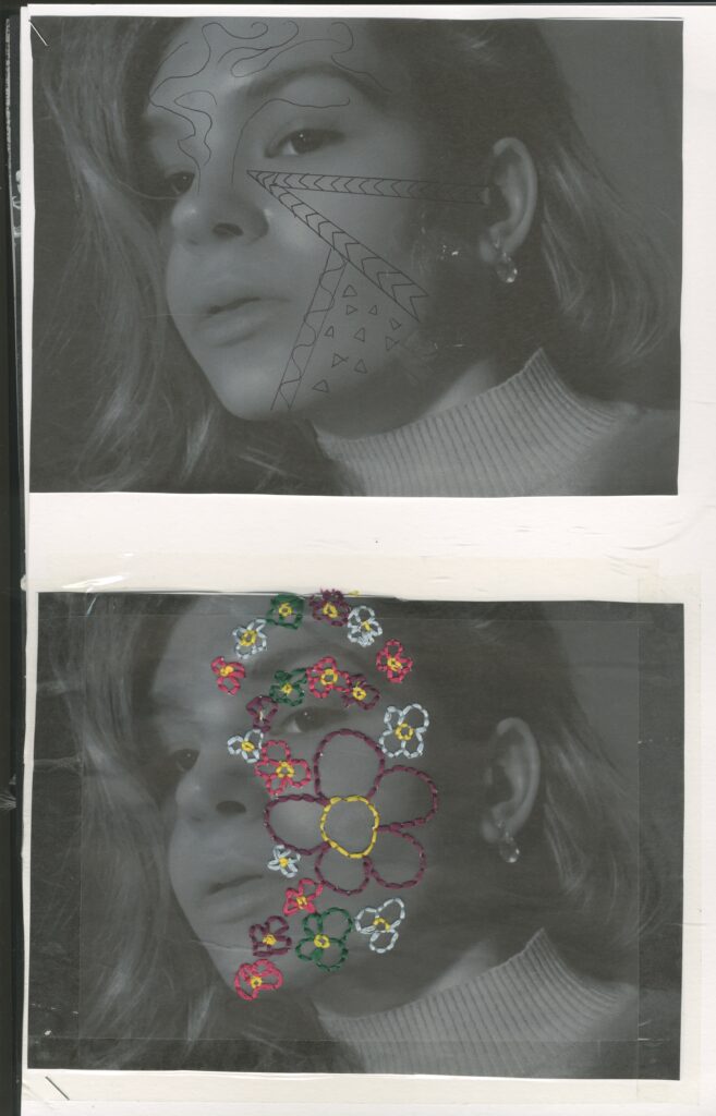
Primary Research Inspirational responses to Alana Dee Haynes and Maurizio Anzeri
In response to Alana Dee Haynes’s style of art , I decided to take a picture of myself in black and white with my phone, then I took a black pen and drew some random quick shapes in a similar way to Haynes . Then I decided to develop this further and researched another artist called Maurizio Anzeri who in a similar way to Haynes , creates work on top of a found portrait however he useless embroidery on vintage portraits.
I decided to combine the two and I stitched some flowers in bright colours on to my self portrait in black and white in a similar way to Alana Dee Haynes
I fond this very easy to do I really like how it turned out. I like how the bright colours of the thread really stick out because the image is dark. I also like the 3D textures which I get from the threads.
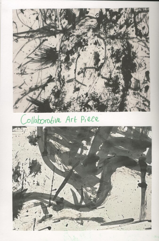
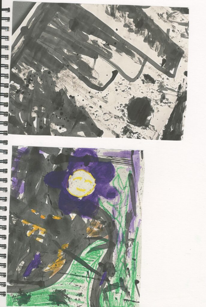
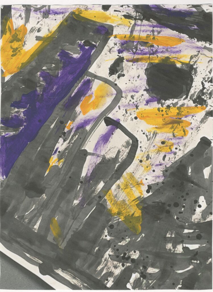
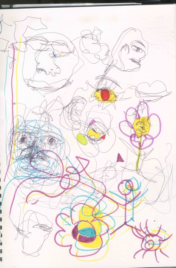
Primary Research Collaborative Art
Created with a bamboo stick and paint brush attached to the end of it as well as some bubble wrap which I taped onto the end of the stick and black ink. Reminds me of mark making , Alana Dee Haynes, frottage, collagraph .
I found this to be very relaxing but because I was holding the bamboo stick at the top I felt like I had no control over it so the work looks messy and sketchy which I find very interesting.
I also decide to use acrylic paint : purple and yellow as well as some green oil pastel. I used these to create some extra textures and bright sticking colours. Because my theme is based around concealment of portraits and nature, I decided to paint figurative flowers and I added faces to them to show that they are concealed within nature. The green jagged lines and scribbles, represent grass.
Overall, I prefer the painted ones more because they convey my intentions the most .
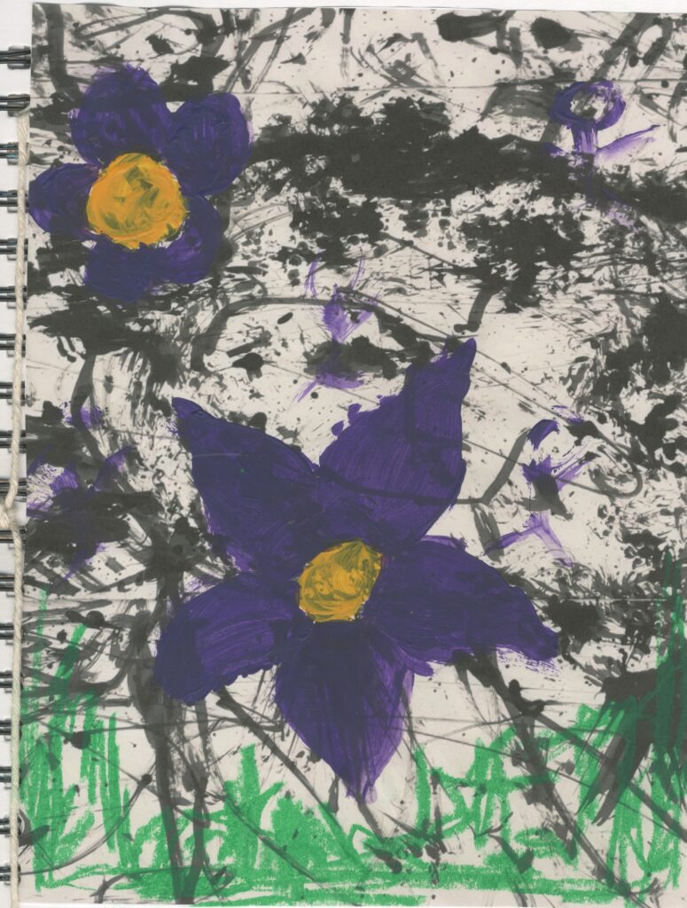
Primary Research portraits painting.
The green reminds me of nature and grass . The red and green create a muddy brown colour which reminds me of dirt and mud which is also found in nature. I used them to paint a quick picture of a figure and blended the colours into the green grass to simulate that we are one with nature.
I also painted some flowers on the face by using the edges of the brush to show that the face is concealed with nature. The ever green trees in the background help to re enforce this message.
I also like the sketchy look this has it’s quick and simple. Reminds me of the spontaneous drawings. Took inspiration from an image from Google but added my own ideas on to it.
I tried it again but used water soluble pens instead of acrylic paint. Instead of using an image I drew from my imagination and let the pen do the work. I drew facial features. I prefer the pens to the paint because i felt like pens gave me more control and I also like the water colour effect that I achieved by splashing water on top of the pen ink. However this one looks a bit creepy and demonic which I don’t like and the acrylic paint reminds me more about my theme and intentions. I also added some acrylic paint to the pen ink drawing I think this just adds to the fact it looks demonic which I don’t like .
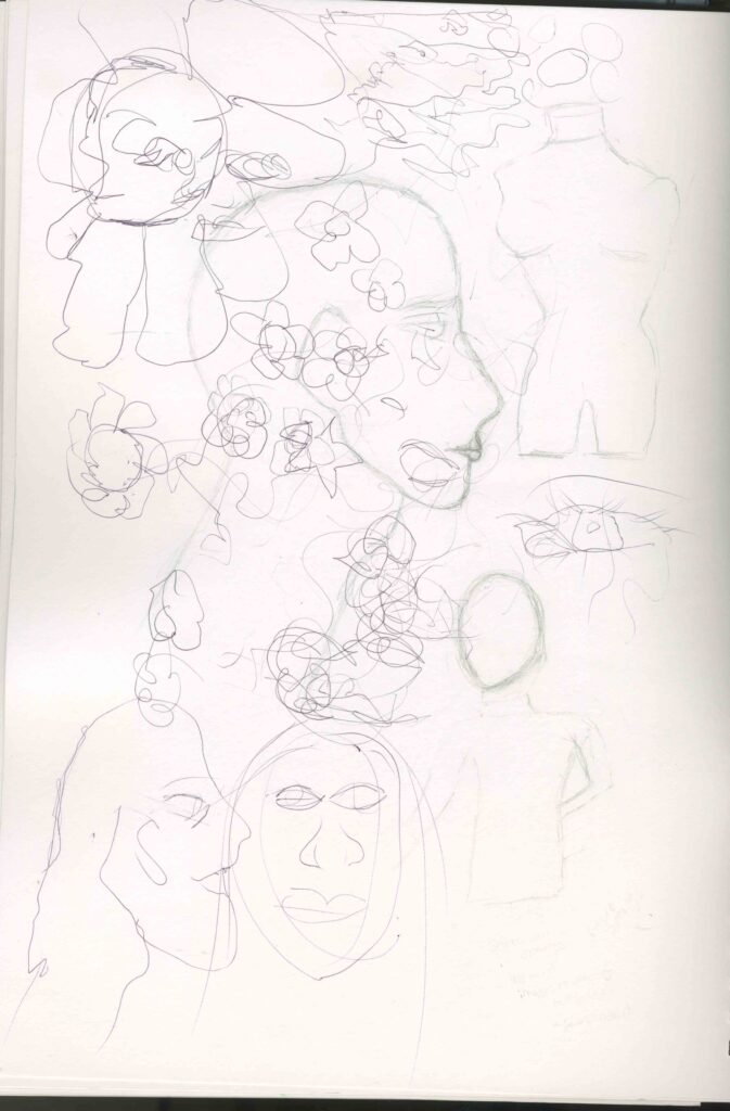
Primary Research Spontaneous drawing/drawings of mannequins
I drew some spontaneous drawings on top of some figure drawings of mannequins. I did this by using my less dominant hand (left) and with my eyes closed. As well as this I drew some flowers and scribbles.
I also decided to try this again however I drew these spontaneous drawings in a continuous line, as well as using coloured pens to scribble on top and block out some areas with colour.
This reminds me of the sketches that I drew at the beginning of the project. I don’t like these because they look like a little child has drawn these which also reminds of a Primary school art lesson. However, I like how I used multiple pens at the same time. It reminds me a bit of illusions. I also think some of faces I drew look a bit weird and creepy which is not how I envision my work to come across.
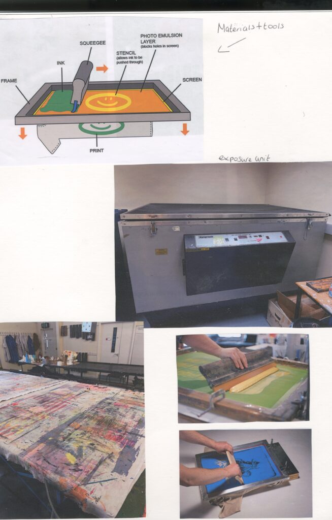
Screen Printing
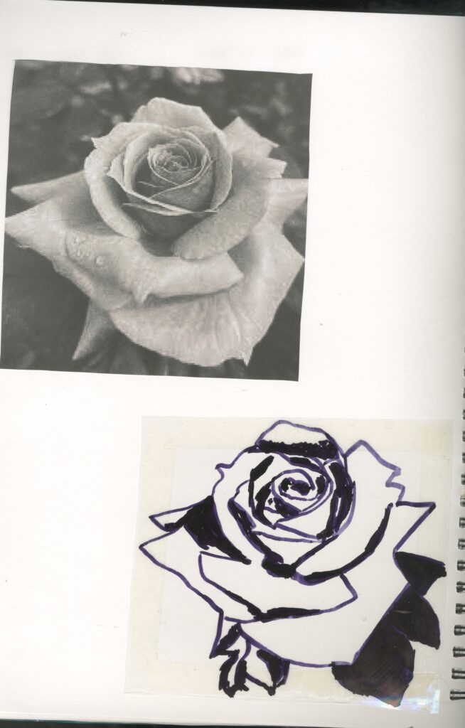
Step1: I printed out an image of a rose in black and white.
Step2: I used a black permanent marker and traced around it on to a sheet of acetate.
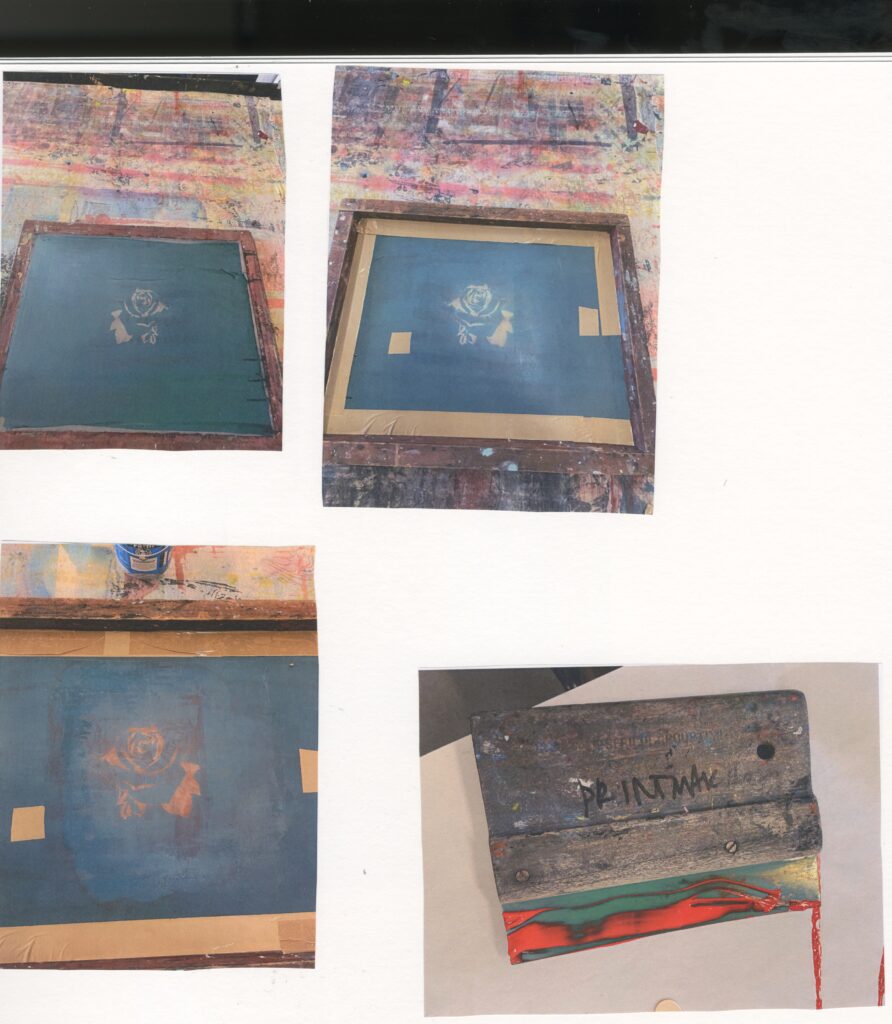
Step3: I placed my acetate design under a coated screen in the exposure unit.
Step4: Once exposed, I washed it down to remove the areas of my design that I wanted to print.
The black areas of the design don’t let the light though, therefore these areas will be your print. Ordinary pens won’t work, its best to use permanent ink pens or black acrylic paint.
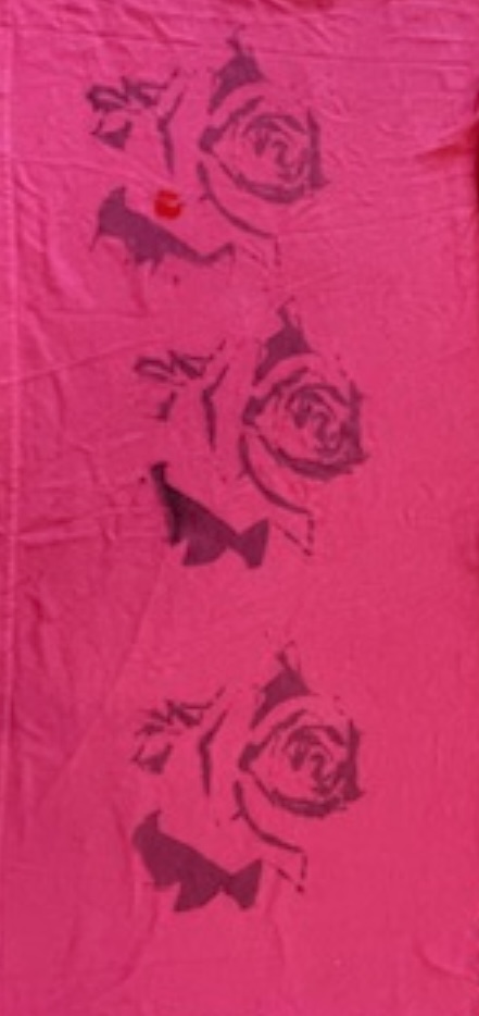
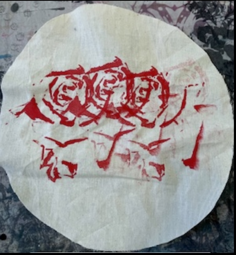
I chose to print a rose flower for my screen prints because it fits in with my theme and it reminds me of Andy Warhol’s flower prints and Mary Quant’s flowers.
I also decided to print on a plethora of different fabrics: jean/ denim shorts, calico, velvet and an old t-shirt. Before I printed I taped up the sides of the screen and any where that I didn’t want to be printed and transferred on to my fabric. Then I ironed my fabric of choice before placing it under my screen. I chose my ink, placed a small amount above my design, then I took a squeegee and dragged the ink down to cover my design. Finally, I lifted up the screen to reveal my print on the fabric.
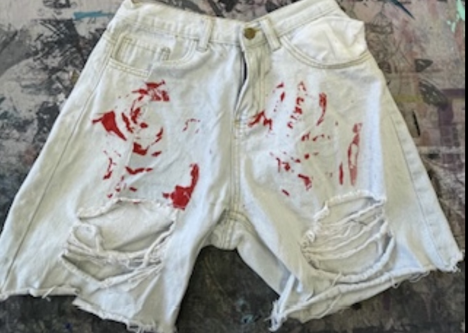
My least successful attempts were the shorts because I don’t think that I used enough ink so the pattern didn’t print as well as I hoped so its a bit difficult to tell what it is. However, this does link well to my theme of concealment because it looks like its hiding its’s true form and it looks like it’s trying to conceal it’s self into the shorts.
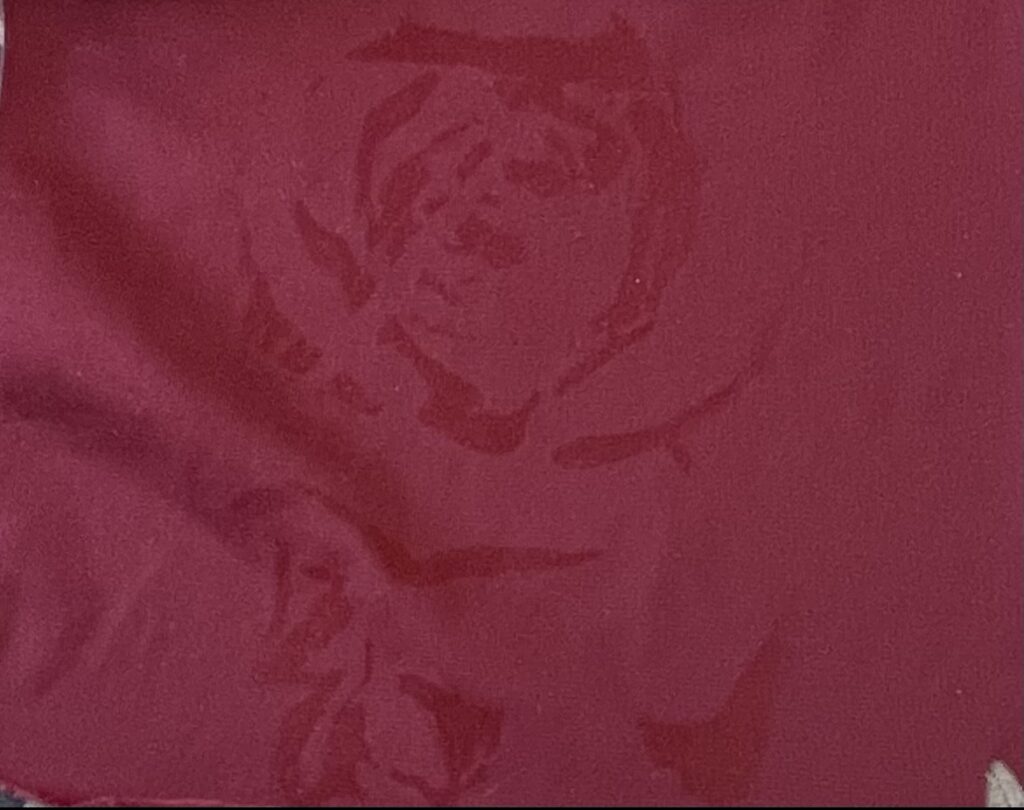
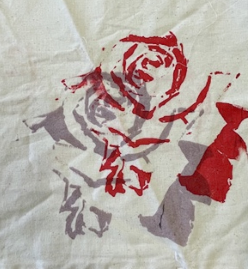
I also think that the velvet isn’t successful. I think this is because I used red ink to print on this fabric. Because the colour of this fabric was a darker burgundy red colour, the red ink didn’t show up very well. However, this also fits well with my project because it looks like it’s trying to camouflage it’s self into the fabric which reminds me of concealment.
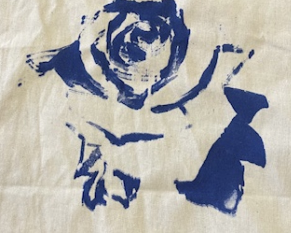
This is my most successful print. This is because I can clearly see the image of the rose because I used an intense colour (dark blue ) and plenty of ink so that the image is clearly visible. I also think that the calico was the best material to print on as it also worked well for all of the prints I did on calico.