Final Major Project
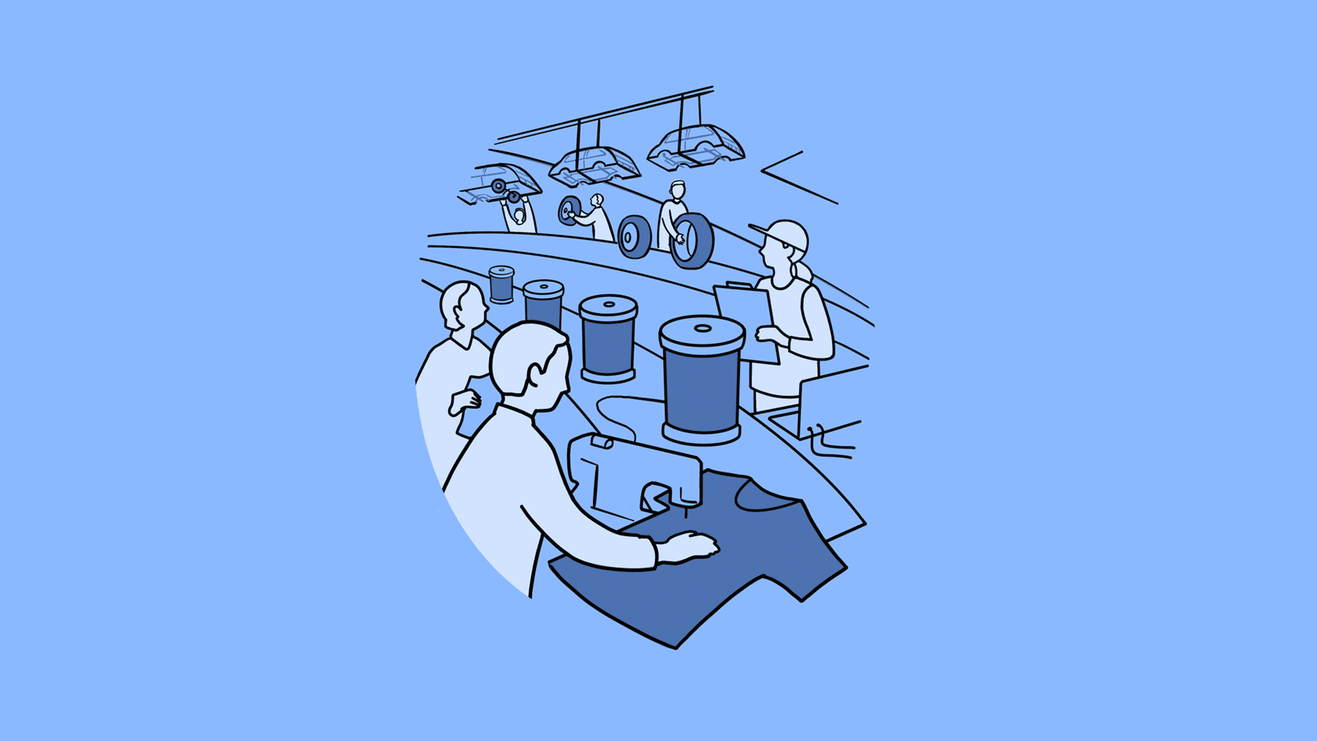
[ Production ]
The Setup
Softwares
- Adobe Illustrator
- Adobe Photoshop
- Blender
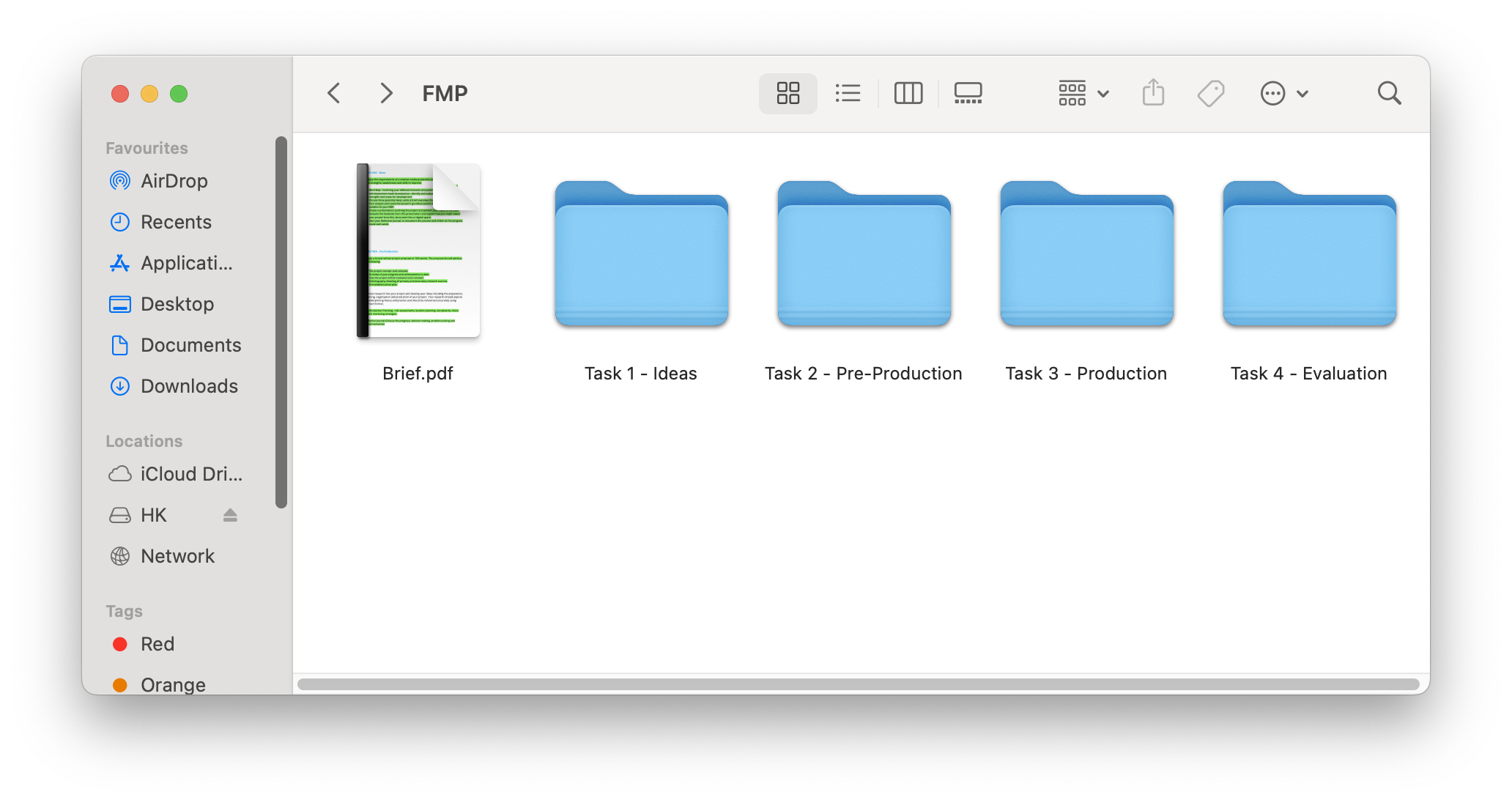
All files for my project will be stored on a USB. I will keep my work organised into folders to help navigate through the many documents and images. I will backup the files on my PC every so often incase my USB is lost or corrupted. Folders were created for each step of the project: Ideas, Pre-Production, Production and Evaluation.
The Logo
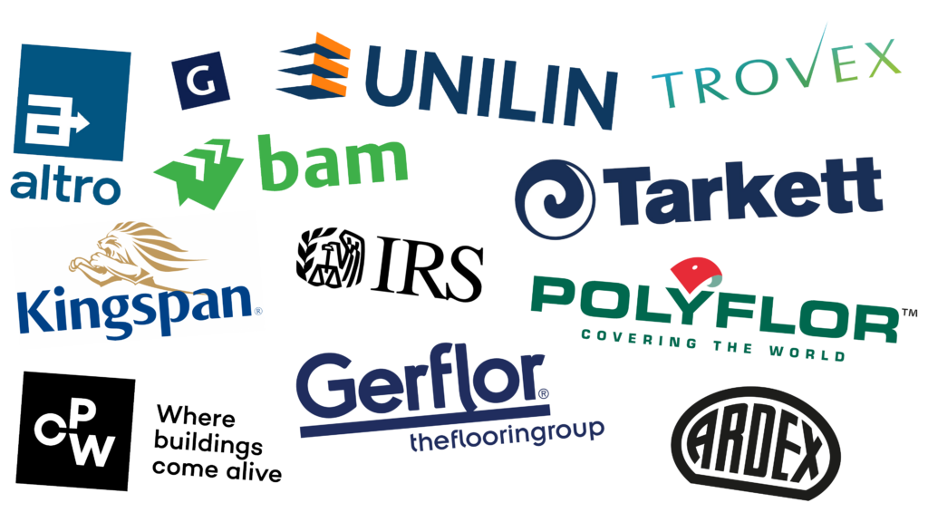
I created a moodboard that consists of logos from relevant brands. I chose logos that appear simple but are actually quite complex in the way they serve their brand. A few of them feature sharp edges and corners that give a feeling of rigidity. Hardware and construction companies love to be big and bold, subconsciously telling everyone that their products are sturdy and masculine.
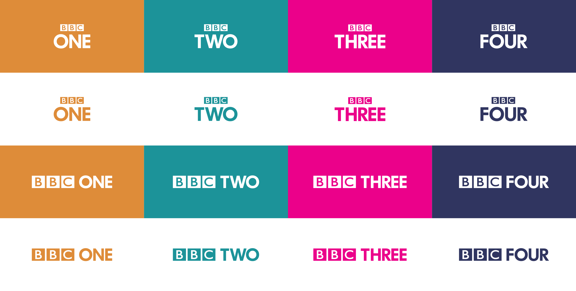
Because my client has a base brand and 3 sub-brands, I started looking into sub-brands for inspiration. Considering this was my first time dealing with sub-branding, this served as an interesting lesson in sub-brands and the strategies behind them.
The BBC Channels are pretty straight forward sub-brands, they use different text and colours but the primary base BBC logo remains. This formula is very popular and is used across many other popular multi-brand businesses
With this, I looked at the beginning letter of the name “Envira” and combined it with the shape of a leaf or waterdroplet… which gave me my logo. The sub-brands were distinquished by text following the logo. Examples: “Group”, “Clad”. I added a path gradient going from the brand’s blue to the brand’s green.
This draft went onto to remain as a draft and was not used by the director. The reason for this was that I had deviated from the base brand and created an uninteresting sub-brand formula, as the logos for the sub-brands don’t show have any of it’s product.

Because of this, I went onto studying his current brand (logo, font and colours) to create the appropriate sub-brands. I took the already existing logo and attempted to “modernize” it. I made sure the logos looked unified with the text by following it’s subtle rounded edges.
I brightened the colours to make them friendlier, as the previous colours were quite dull and uninviting, going against the brand’s objective. A gradient across the logos also helped in the way of making the brand friendlier and more modern, gradients create a “flowey” feeling, as opposed to solid elements that feel opposing and too professional. Different colour versions were created to show how the logos should look in black & white and when printed in solid colours.
The logos were also created with rounded corners, keeping sharp corners and edges were necessary – this helped in making the brand even more friendlier. The new brand focused less on the hardware part of the products and focused more on the feeling of something new, fresh and healthy. New cladding, new flooring, new tiles? – feels new and fresh like looking beyond the horizon… the brand wanted to reflect this, instead of coming across as sharp and dull. The logos were created with legability in mind, making sure they are recognisble when used at different sizes. The logos themselves won’t be used without the “Envira” text, which explicitly tells the viewer what the key brand and product is at a glance.
Original EnviraClad Logo
Brand Guidelines
The 2025 Brand Guidelines PDF for EnviraClad, EnviraFloors & EnviraTile were created to demonstrate the acceptable usage and communication to be expected through the brand’s resources.
A brand guideline is usually a multi-page PDF document created by a designer to inform other designers on how their brand should be replicated. This helps the brand retain a compounded design language that feels the same, striving to be recognisable at a glance.
A brand guideline PDF will often contain descriptions of the brand’s keywords and overall aesthetic based on colours, shapes, words, moodboards and images. Pages may be dedicated to showing how the logo should be used and placed. Other pages may also be dedicated to showing what NOT to do with certain brand elements.