Final Major Project
[ Pre – Production ]
Proposal
After reviewing all of my options, I have reached out to a business named EnviraGroup. They specialise in the installations of cladding, flooring and tiles for a multitude of other businesses. Each sector of their firm is intended to have it’s own brand. The business started roughly 10 – 15 years ago and since then they’ve racked up a hefty clientele. Despite their success, the director seems to be in dyer need of some new branding to keep up to the current times. A quick glance at their current logo immediately tells us that they had no intention of acquiring a proper brand until now.
Before I begin producing a brand for my chosen business, I will need to conduct research into different sub-brands to get an idea of what works best. The logos have to be recognisable and distinguishable for each of the three sectors at EnviraGroup. It will also be important to consider the original branding as to not confuse the company’s audience, most likely keeping a similar color scheme. Sub-brands are one thing, but what about the aspects of a brand? It’s paramount that I make efforts to show my understanding of every aspect of a brand. From colors, geometry, connotations and usage to the history and technical operations of graphic design.
Throughout my project, I may be doing more than just a brand – the director is free to ask me to do whatever he sees priority at the company. I may have to develop catalogues, social media posts, brochures, etc which will be showcased in the production segment of this project. With this, I feel like this project also offers me a variety of different experiences From effectively communicating with a client to working with their current marketing members – I feel like this project will strongly benefit me. Any draft that is discarded will be used within my project and my portfolio. I get to do professional work for a business, fulfil my project’s brief, gain unique experiences and portfolio materials all at the same time.
At the beginning of production, sketches and drafts will be produced in order to experiment with different colors and shapes – these will also give me some insight into the director’s preferences for certain elements. This is a step in a communication to help settle on a definitive design and/or idea. I can take a draft from this and continue to develop it. Alongside my production work, a written journal will keep track of all my progress. Any unused drafts will be kept as evidence of work, this can help others understand my thought process with each step.
Once production has been finalised, I can get to work on evaluating my project to determine what could’ve been better. I will pick out any problems I faced and talk about what I did to overcome them, aswel as any unresolved problems that may have impacted my outcome. A showcase will be attached into this segment, appropriately presenting my production work.
Research
Logos
Logos
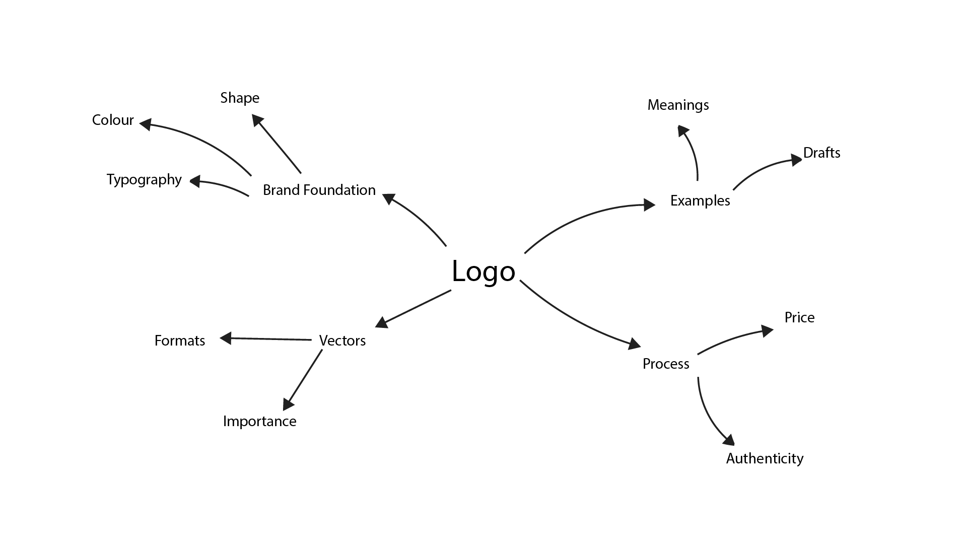
The beginning step of any logo, the shape. As I have mentioned in my last FMP, logos can evoke different emotions and connotations due to what shapes are used. The Nike logo could envoke a feeling of accomplishment, as the logo is also a tick mark, often meaning things are “checked” or completed. This logo paired with it’s sharp, tapered flicks are what make this logo feel powerful, yet the logo has a smooth relaxed curve, this could emphasize how comfortable Nike clothing is, they are well known for making a variety of joggers. However, these are what the audience MAY feel. The logo was originally created based on the wing of a goddess which symbolises speed, movement & power.
Another good example is Gymshark, first things first, the logo appears to be an abstract illustration of a shark’s head. The straight lines and sharp corners emphasize the power of the gym and a shark. A shark’s teeth are very sharp, hence the sharp edges and corners, aswel as going to the gym gives a sense of power.
Like colors, shapes have connotations too, just like the Gymshark logo above, shapes that are opposite to sharp, “shark” like are rounded. Rounded shapes can be linked with comfort, relaxation and flexibility, traits of a comfy sofa, chair, etc. As people we memorise everything we see and when we see something we try to create a pattern, to identify that thing and to link it with something we’ve seen before, so when there’s trends of colors and shapes, people will see these connotations and hidden meanings within brands all the time.
Related Reference: Bicaku, E. (2023). Logo Shapes: What They Mean & Why They’re Important – Looka. [online] Looka. Available at: https://looka.com/blog/logo-shapes-meanings
Colours
Colours
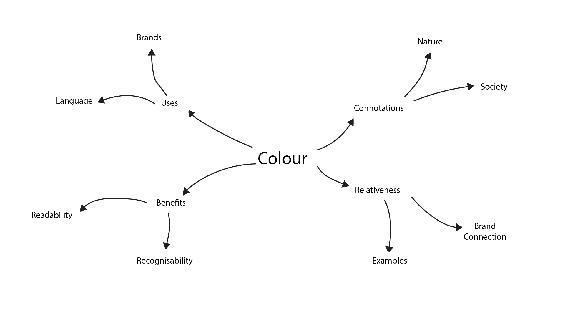
Colors are so important because whether by society or nature – color is applied to certain objects, which then have the power inflict emotion based on what that thing is. For example: the grass is naturally green, grass grows – therefor green can represent growth, which can be linked back to nature. If someone wants to create a brand with a focus on nature, they can apply green to their branding. Aslong as you’re not color blind, the connotation of nature is instant. Color is also as simple as it is complex, the complex side of color is known as color theory.
Related Reference: Velarde, O. (2019). Color Psychology in Marketing: The Ultimate Guide. [online] Visual Learning Center by Visme. Available at: https://visme.co/blog/color-psychology-in-marketing-the-ultimate-guide
Black
Is a colour with mixed connotations, often seen as a negative colour derived from nature and darkness. Laying dormant in energy deprived areas. Black is associated with “nothing” as it fills empty space, replacing what the eyes cannot see. Because of this, we often think of black being the last thing we see when we die. It can mean the end of something, as it means nothing. However black also has a fair few positive connotations from luxury to simplicity due to it’s timeless and mystic nature. Black also has some practical uses – it absorbs more light than any other colour, meaning it can become garner a lot of warmth from the sun. Black can help to mask stains on clothing, making it a popular choice on clothes intended for cooking.
White
Is the total opposite of black, where black darkness cannot reach is met by white energetic light. White is a popular choice for clothing because it can imply renewal, giving a sense of freshness and achievement. Though white is a hard colour to maintain, it can fade and become yellow over time becoming the world’s most popular color for paint. White is also seen as a “soft” colour as nature implies from fluffy clear clouds in the sky. A darker shade of white can create grey, a middle ground between black and white which is often seen as a depressant due to it’s associated with rain and poor weather. Another example would be Summer clothes, people may avoid wearing black in the Summer time as the color black absorbs the light (heat) of the sun, rather than deflecting it. The same is true for large camera lenses that are coated in white to prevent the glass elements from heating up.
Red
Colour is a quick and dynamic way to give an immediate sense of correlation. A lot of what we know about colour was determined by nature. A really good example of natural correlation is blood. Because blood appears to be red, we made a connection between harm, danger, violence, etc and the colour red. Because red is linked to our hearts and blood, red can be seen as a “loving” and/or “primal” colour.
Orange
Gets it’s connotations primarly from nature, it can evoke a feeling of happiness and warmth as it’s usually emitted from the sun. Because of the sun, orange can also been preceived as a very energetic colour. A darker shade of orange may become brown, another colour with it’s meanings.
Yellow
Is unique in it’s complexity of meanings, it is commonly seen as a happy and optimistic colour. Yellow is commonly used in children’s play areas, ice cream vans, hospitals to serve as an uplift. However, yellow can be seen as a hazardous colour as it is used to garner attention towards warnings. A duller yellow can be seen as uninviting or off-white.
Green
Is typically thought of to signal growth and health as it resides alot around nature. Green can also mean money, as money is a sign of growth in society as much as it does in nature. Though green can be seen as a healthy indicator, it can also be attributed to sickness from historical and medical observational reasons.
Blue
A colour’s meaning can sometimes determined by how rare the colours were before we could reliably fabricate them. An example of this would be purple. Purple and blue were seen as colours of wealth due to how difficult they were to create as a dye. Therefor the respective dyes were scarce and expensive until later discoveries were made.
Blue is strongly associated with computers and, is quite artificial when considering how rare the color is in nature, making it a very “unnatural” color, just as machines are also viewed as being unnatural, they keep us entertained in doors. Blue was one of the most difficult, most expensive colors to be created artificially with old methods including lapis, costly things are usually obtained by rich people and blue eyed people were seen as superior. This series of events and connotation leads us to the modern blue as we know it today.
Colours can be used in a lot of different ways. They can be used to differentiate between different things, this is commonly known as color-coordination. Colour is an effective coordinator due to how easy it is to read and recognise at a glance, however there are only so many colors and shades that are unique to eachother to the extent that this works as intended. People use this method of coordination to produce guides, routes, hierarchy, importance and even warnings. Colors even have physical implications… a lot of chefs will opt to wear a black uniform opposed to a white or brightly colored uniform. This is because the colour black doesn’t contrast well with most spillages, it would be much easier to see grease on a white uniform than a black uniform. Black seems to hide mess well, whilst white only seems to magnify it.
Some camera lenses are actually made in white rather than black to stop the lens elements from heating up and becoming distorted from the sun.
Related Reference: Wonderopolis (n.d.). Why Does Black Absorb Heat? [online] wonderopolis.org. Available at: https://wonderopolis.org/wonder/why-does-black-absorb-heat.
Colours are nothing short of a way to be as recognisable as possible. Fast food chains do this well.. Burger King is associated with the colors brown, beige and yellow. McDonalds is well known for it’s red and yellow hues. KFC is known for it’s red and white. Although there are only a few primary colours in the universe, we are able to recognise distinct tones that help us think of a brand. The colours in a brand can be decided based on the select color’s connotations. A medical business may decide to use greens and blues due to their relationship with nature and growth = health.
Related Reference: ux4sight.com. (n.d.). Color Associations: A Designer’s Guide to Their Significance | UX 4Sight. [online] Available at: https://ux4sight.com/blog/designers-guide-to-color-associations.
Typography
Typography
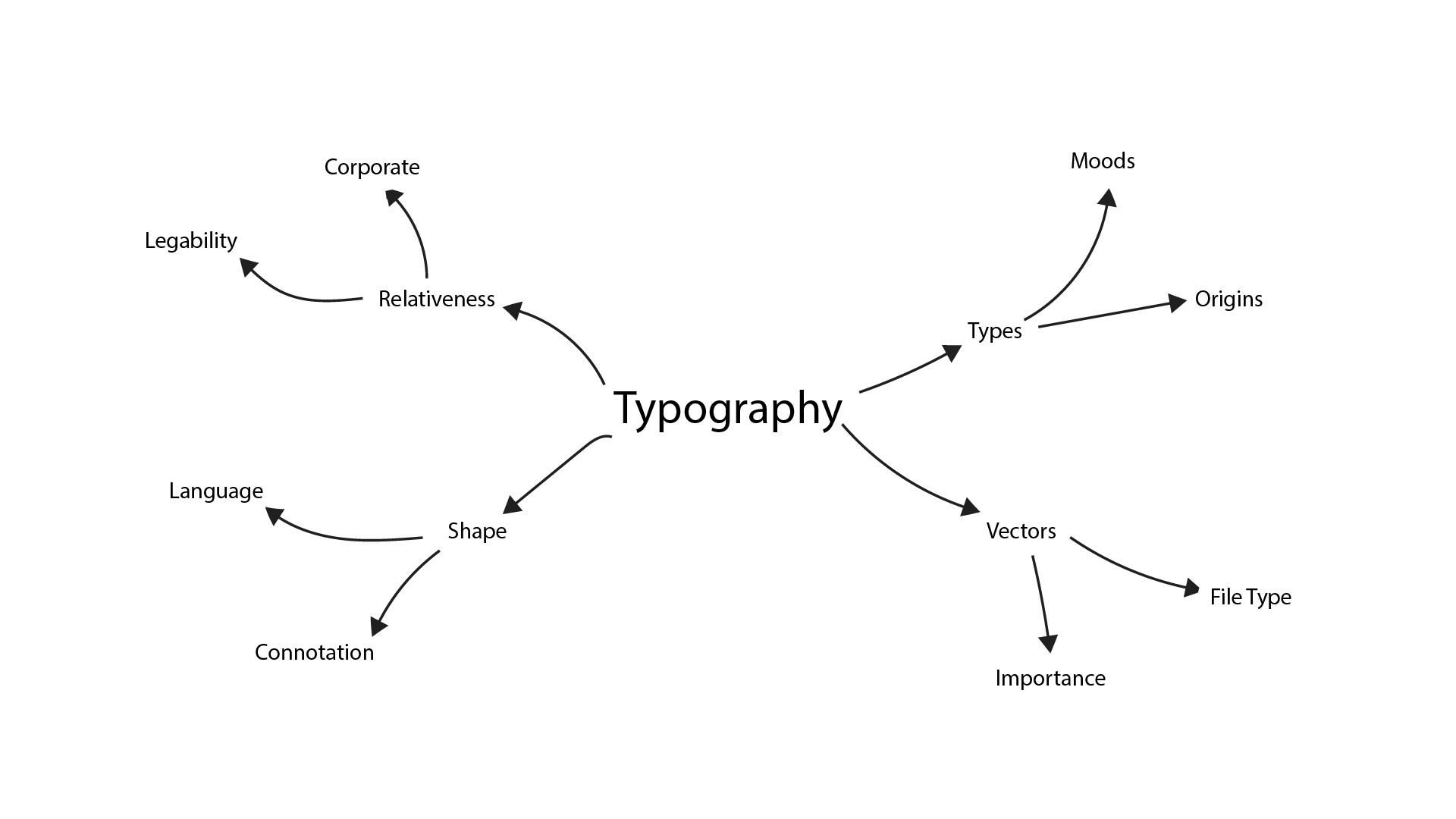
Typography is an important part of a brand, inheriting properties of a brand’s logo through text using shape and form. A brand’s typography can be described as a ‘typeface’, a collection of various weights of the brand’s font. Some brands choose to create their own typeface or, they can adapt an already existing typeface if and when a respective license is obtained. Illustrators are well known for producing typefaces/typography/fonts and it’s a painful process, depending on the type of font. Some typefaces stay simple with uniform geometry as a basis, other fonts like scripts will be harder to produce due to their imperfections.
Related Reference: Pixcap (2024). A Guide to Psychology of Shapes in Design. [online] Pixcap. Available at: https://pixcap.com/blog/psychology-of-shapes.
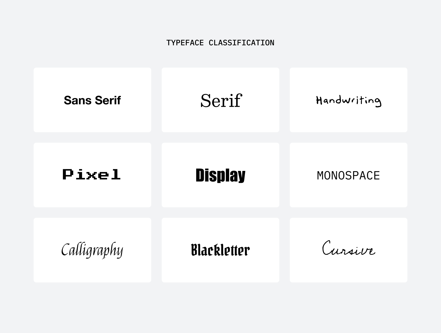
There are a few categories to be aware of when discussing type.. sans serif, serif, script, geometric, block, display, sans. Sans serif fonts is a sans font which includes serifs (pronounced tails at the end or beginning of a letter), this type of font is often regarded as being quite fancy or luxurious due to it’s establishment in old English. Sans fonts are commonly used on computer screens, paired with anti-aliasing – these fonts make for good legibility due to their simplicity and distinct letters. They can be easier to read at smaller scales than compared to sans serif fonts which include more vectors than necessary. Script fonts can be associated to hand-drawn fonts, they’re the fanciest and most complex of all the categories – being harder to produce, references of real handwriting may be used in the process. These fonts are avoided in most cases for the fact they are quite difficult to read at a glance, only being used to serve as decorative and/or outstanding content. Display fonts are used for big bold stand-alone bodies of text, they make good titles for events, fairs, etc.. being excentric and embodying as much of the relative brand as possible.
Related References: Chapman, C. (2018). Understanding the Nuances of Typeface Classification. [online] Toptal Design Blog. Available at: https://www.toptal.com/designers/typography/typeface-classification.
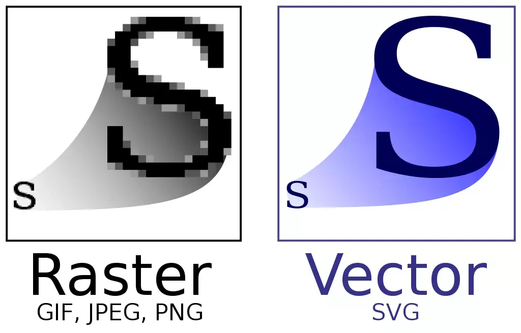
Fonts aren’t all simple, there are a few modern technical processes that are at play… vectors and anti-aliasing are 2 of the most prominent behind digital text. Just like a logo, text needs to be scalable in such a way where it’s pixels are not distorted.. therefor.. fonts are not actually made of pixels, they’re made of math! This type of storage is called a vector(s), in simple – a vector is a list of points and arcs which tells the computer what the text should look like.. these points and arcs can be changed using mathematical equations to help the computer size up or down the font. This way – logos and fonts stay crispy no matter the resolution or size they’re used.
Related Reference: Todd, D. (n.d.). What is vector art – vector art for beginners | Adobe. [online] www.adobe.com. Available at: https://www.adobe.com/creativecloud/illustration/discover/vector-art.html.
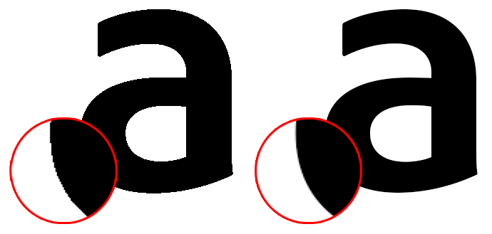
Anti-aliasing is a modern technique embedded into most GPUs (graphics processing units) nowadays, it’s a method that involves smoothing out the edges of pixels by adding softer pixels around harder pixels. Without anti-aliasing – text would be much harder to read. Anti-aliasing isn’t just used for text, it’s used across the whole output of a GPU, helping to reduce jaggies, especially across rounded elements like circles. You may notice that when your computer is in a boot state, the GPU is not very active. Therefor anti-aliasing is neglected and your computer uses an alternative geometric font to avoid jaggies until your GPU is fully working again.
Related Reference: Lenovo.com. (2021). Anti-Alising: What is Anti-Aliasings | Lenovo UK. [online] Available at: https://www.lenovo.com/gb/en/glossary/what-is-anti-aliasing/ [Accessed 29 May 2025].
Brands
Brands
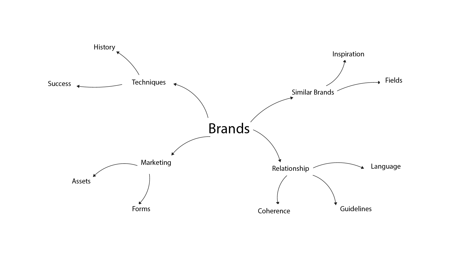
Brands use a range of methods, most of which have been previously mentioned. To keep all of their brand coherent throughout all of their platforms, products and marketing materials – brands will opt to use a brand guideline. A brand guideline is usually a multi-page PDF document created by a designer to inform other designers on how their brand should be replicated. This helps the brand retain a compounded design language that feels the same, striving to be recognisable at a glance.
A brand guideline PDF will often contain descriptions of the brand’s keywords and overall aesthetic based on colours, shapes, words, moodboards and images. Pages may be dedicated to showing how the logo should be used and placed. Other pages may also be dedicated to showing what NOT to do with certain brand elements.
Strict brands maintain integrity and familiarity with their audiences, making the brand a success in its core purpose.
Related Reference: Adobe (n.d.). Create a Brand Style Guide for Your business. [online] www.adobe.com. Available at: https://www.adobe.com/creativecloud/business/teams/resources/how-to/brand-guide.html.
Brands also tend to carry a hefty amount of assets to maintain coherence. Designers will often have to create a series of different folders for containing: fonts, colours, logo exports, shapes/vectors, photographs, CGI/renders, specific notes and projects. These files need to be securely stored and backed up to ensure no assets are corrupted or lost.
Related Reference: www.tabithaemma.com. (n.d.). How to Organise Your Brand Files and What to Include. [online] Available at: https://www.tabithaemma.com/post/organise-brand-files-include.
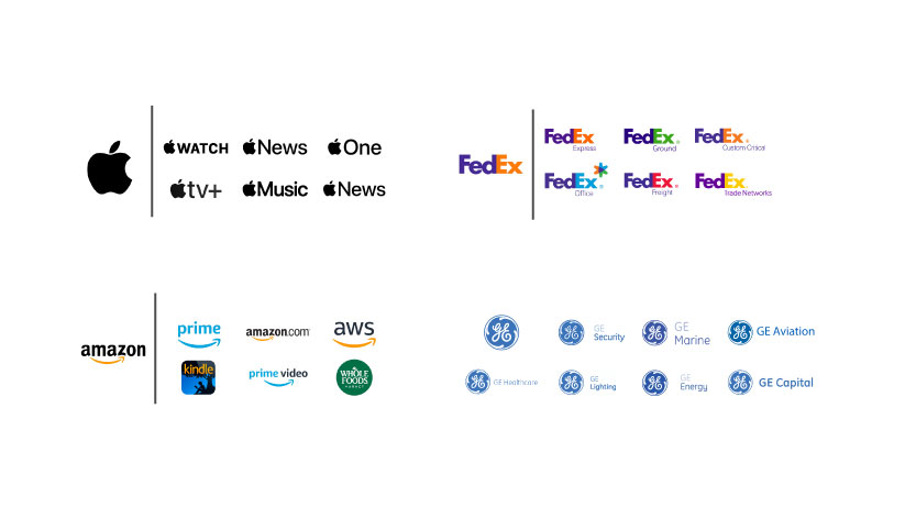
Some brands are actually split into sub-brands. Sub-brands are different brands based on a primary brand. These are often used to seperate major products or services from eachother but still provide a sense of unity through the basis of the primary brand.
Related Reference: Indeed Career Guide. (2024). What is sub-branding and why is it a useful strategy? [online] Available at: https://uk.indeed.com/career-advice/career-development/sub-branding.
They tend to use the primary logo with a minor addition to distinquish a product or they make simple colour adjustments to the primary logo. Designers have to be mindful of the changes they make from the base brand to achieve a sub-brand, as they need to consider the already existing parameters and rules of the base brand, or they risk breaking coherance.
Bibliography
- Bicaku, E. (2023). Logo Shapes: What They Mean & Why They’re Important – Looka. [online] Looka. Available at: https://looka.com/blog/logo-shapes-meanings
- Velarde, O. (2019). Color Psychology in Marketing: The Ultimate Guide. [online] Visual Learning Center by Visme. Available at: https://visme.co/blog/color-psychology-in-marketing-the-ultimate-guide
- Wonderopolis (n.d.). Why Does Black Absorb Heat? [online] wonderopolis.org. Available at: https://wonderopolis.org/wonder/why-does-black-absorb-heat.
- ux4sight.com. (n.d.). Color Associations: A Designer’s Guide to Their Significance | UX 4Sight. [online] Available at: https://ux4sight.com/blog/designers-guide-to-color-associations.
- Pixcap (2024). A Guide to Psychology of Shapes in Design. [online] Pixcap. Available at: https://pixcap.com/blog/psychology-of-shapes.
- Chapman, C. (2018). Understanding the Nuances of Typeface Classification. [online] Toptal Design Blog. Available at: https://www.toptal.com/designers/typography/typeface-classification.
- Todd, D. (n.d.). What is vector art – vector art for beginners | Adobe. [online] www.adobe.com. Available at: https://www.adobe.com/creativecloud/illustration/discover/vector-art.html.
- Lenovo.com. (2021). Anti-Alising: What is Anti-Aliasings | Lenovo UK. [online] Available at: https://www.lenovo.com/gb/en/glossary/what-is-anti-aliasing/ [Accessed 29 May 2025].
- Adobe (n.d.). Create a Brand Style Guide for Your business. [online] www.adobe.com. Available at: https://www.adobe.com/creativecloud/business/teams/resources/how-to/brand-guide.html.
- www.tabithaemma.com. (n.d.). How to Organise Your Brand Files and What to Include. [online] Available at: https://www.tabithaemma.com/post/organise-brand-files-include.
- Indeed Career Guide. (2024). What is sub-branding and why is it a useful strategy? [online] Available at: https://uk.indeed.com/career-advice/career-development/sub-branding.