Brief 1-Advertisement
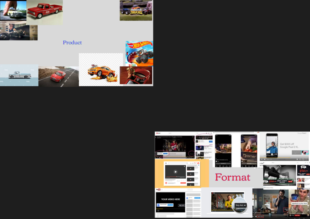
The first step to this brief is figuring out what platforms adds you’re taking inspiration from, there is a wide range with regular add posts on twitter or sponsored tweets, with the ads typically aimed towards adults as that’s the main demographic of people who use twitter. Facebook adds that function like regular posts, that again are targeted to adults, however older than twitter users since that’s the main user demographic. Tik Tok uses adds very discreetly by having them mixed in with other posts, like a lot of scrolling based social medias, however unlike the rest the ads are targeted towards Teenagers-younger adults since that’s the predominant user demographic for the app. YouTube has 3 different add types, posts mixed in with the videos people upload, videos in YouTube shorts, a lot like tik Tok and the most known kind of add, adds in videos. There are two different kinds of adds within videos, videos that play at the start, middle and end of the videos and some that are sponsored, made by the content creator for a company to advertise their product. With the separate adds they stick in your head, due to either their fast passed nature or because they continue to play repeatedly. Sponsorships are probably the more effective of the two as you see creators that you like using this product, you’ll trust this person that this thing they’re advertising is good, so you’ll be more convinced to purchase said product. With ads that’s play before, during and after videos, which for the sake of simplicity I will be referring to as “mid roll ads”, have 3 different observable formats. One is a short un-skippable ad; one is a long un-skippable ad and the third is a long ad skippable after 5 seconds. Now the ads you get will depend on the video you’re watching, YouTube has such a diverse number of ages using the platform (despite it being marketed as an 18+ application) so each video will have a very different demographic so the ads that go with those videos will differ.
1:
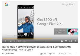
2:
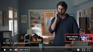
3:

Bacon, M. (1996) No Strings Attached. Virgin Books. Pinocchio the wooden marionette, and a vulture-like creature in heavy robes- a Skeksis The Dark Crystal
Above is a standard twitter advertisement, made to blend in with the normal twitter posts, except in the bottom right it has a promoted tag to let people know it’s an ad. It usually has a GIF/Video playing showcasing what’s being advertised. The ad itself showcases how this phone can, as they stated, “unfold your world” showing all the different situations you can use the phone in as well as lightly showcasing it’s feature, but more in a practical sense than showing a render preforming actions. This way makes it feel more natural and enticing towards consumers as it could be seen as more relatable or allow consumers to see themselves in those situations using that phone.
Above is an ad from youtube, now this isn’t one I’ve spoken about with it just being a regular video instead of a mid-roll, however they both serve the sam function. Ads on youtube are just youtube videos trying to sell something and i think youtube ads are one of the best mediums as you have a lot more freedom with the production and editing of the ad. The ad its self starts with a women leaving a normal building, presumably her house, and walking down a normal street. This first shot is supposed to show reality. As she walks off the street the background becomes littered with different pieces of art and images but not looking too fanciful. as she continues to walk onto another street the background becomes more fanciful, robots, large sheep and oddly placed statues can be observed.the next shot features her in a fully immersed fanciful background, with it being mostly drawings that are visible.Hot air balloons and flamingos can be seen immediately and while those two things are real, they’re not typically seen in a cityscape which is exactly what the background seems to be emulating. More fanciful things come into shot, like rainbow leaves. Then the background essentially becomes a reverse of what it was before with it being. jungle instead of a city. Animals made up of half photos and half drawings can be seen as well as enlarged flowers and a UFO at one point, which takes her into the next set being a desert with cartoon lighthouses, futuristic cities, statues the same size as skyscrapers, astronauts of similar proportion and a rocket blasting off. Further back a desert looking planet can be seen, most likely Mars. That scene was the pinnacle of the fantasy theme of this advert, which is then dissolved as it’s shown that everything fanciful shown in the ad was in-fact all on a screen in a sound stage with the screen changing to show the shutterstock logo and the several uses for shutterstock, which ties into he demographics that this ad was targeted towards. One visible is editors, the entire ad could be seen as being mainly targeted towards video editors as it’s showing how shutterstock elements can be used in video editing, as it states that the entire ad was used using shutterstock resources.
I believe the best kind of add to replicate would be the longer un-skipable add, with a length of 10-15 seconds meaning it won’t be dragged out but won’t be too restrictive as a 5 second ad. Using the YouTube ad as my medium will allow me to be more creative with creating the ad, unlike something like an Instagram or twitter ad, while that would be easier it won’t be as fun or as challenging, something I want to do, challenge myself. For filming I think the best thing to do would be to use a green screen, probably one supplied by the college rather than my own purely for quality. I think using a green screen would allow me to be more adventurous with my ad when it comes to editing it and gives me more opportunity to further enhance my skills to a more professional level.I’m wanting to use a piece of music I found in an advert that is heavily inspiring my own, Racing hearts by Mattie Maguire. The inspiration for my ad is for a plushie rather than a toy car, however I believe the basis for the ad is usable for the product being a more comedic take on advertising so a relatively boring product is more memorable.
The video above is my inspiration for how i want to do my ad, mainly the use of green screen, the editing and presentation of vocals, all being very comedic. The ad originates from “Suction Cup man 4: Business or pleasure” at the end of the video and is advertising a plush toy of the suction cup man. For the actual ad I’m going to construct it using a collection of different sock shots, that I’m going to film and choose which suits the part of the ad best.
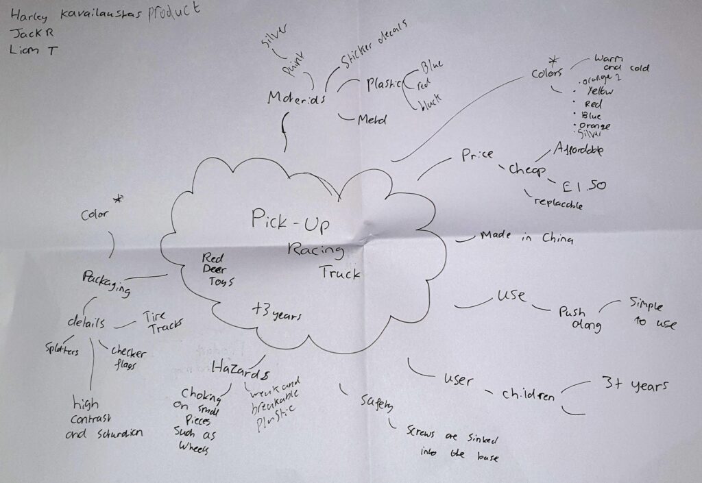
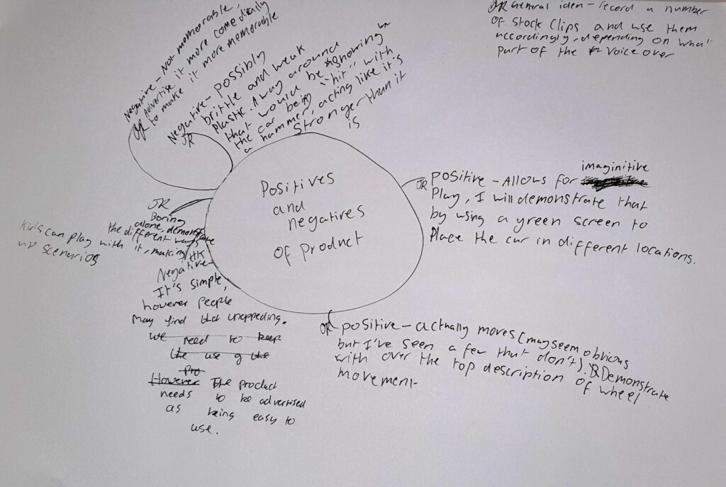
My actual Advertisement
I was given some peer feedback, one said What was good about the presentation? The voice acting was really amazing it made me laugh at first but I really ENJOYED it. What do you think could be improved? There was bare minimum that needed to be improved How would you rate the quality of the advert? I would rate it like a movie trailer because it was top range to be honest. The feedback from this person was prominently positive and while it’s not helpful on things I need to improve it proves that I accomplished with what I wanted to do with this ad which was have it be entertaining and comedic.
Another said, What was good about the presentation? The music was spot on and mildly energetic & happy. What do you think could be improved? Some scenes could’ve been edited better included the keying and resolution of some assets. How would you rate the quality of the advert? 7/10.
To start this project I first had to do research into the different primary platforms that have ads and which platform is best to draw inspiration from. Despite doing research I already had a plan on what platform I wanted to emulate, that being YouTube given I have experience making content for the platform with my own channel and watching a lot of ads. I had to collect different examples of ads, despite having a few ideas present already it was still useful to look at other ad types and see if I could use different platforms to replicate, however I still stayed with YouTube.
Since I had YouTube set in as the platform I was going to work on I started to plan what my video would be like and what it would include. From the beginning I knew I wanted to take a comedic approach to the ad to try to make it stand out and have it be enjoyable to make and for people to watch, I can say I accomplished one of those things. During the process of brainstorming and thinking of how my ad would be there was one piece of music I had going around in my head,Racing hearts by Mattie Maguire however at the time I had no clue of the title or artists, but I knew where I heard the music before a video called Suction Cup man 4: Business or Pleasure, Specifically at the end of the video where a plush toy of the previously mentioned suction cup man was being advertised, so I rewatched the ad and it sunk in. This was what I wanted to do, the ad I was watching was exactly what I was aiming for so it would be my inspiration. Using this ad as a sort of template