
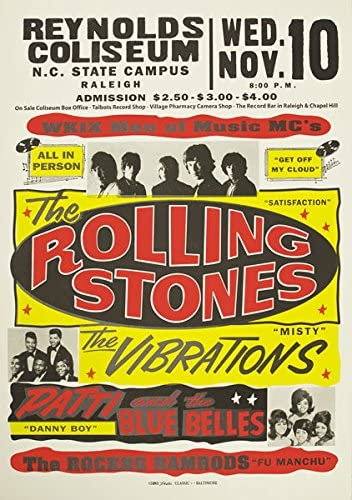
This The Rolling Stones poster is good because of how clear it is. The colours stand out making the text easier to read and understand, also make it easy to take in the information at a quick glance. I also like how its quite retro and looks older. It also clearly says where, when and the price of the concert meaning theres no confusion.
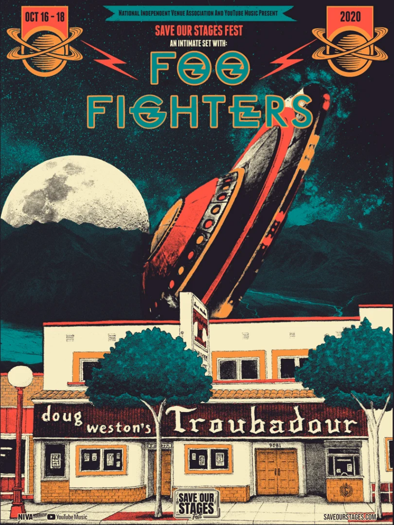
I like this Foo Fighters poster because of how creative and artistic it is, I like how it kind of looks like it’s from an old comic. It also clearly says the date and the festival at where they are playing, I however don’t like that it doesn’t say where the festival is located and would mean you would have to do further research as to where it was, especially if you aren’t an extreme fan of the band.
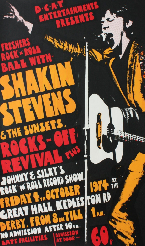
This poster is really good because it has all the information you need in one place. I like the placement and colours of the text, i especially like how the text is slightly slanted. The text is nice however I find it a bit hard to read, but apart from that it explains all the bands that are playing, when and where and also how much it costs.
This Glastonbury poster is good because the bright colours against the black background really makes all the acts stand out. It says all the big acts that will be playing and says when and where it takes place. I like its simplicity.
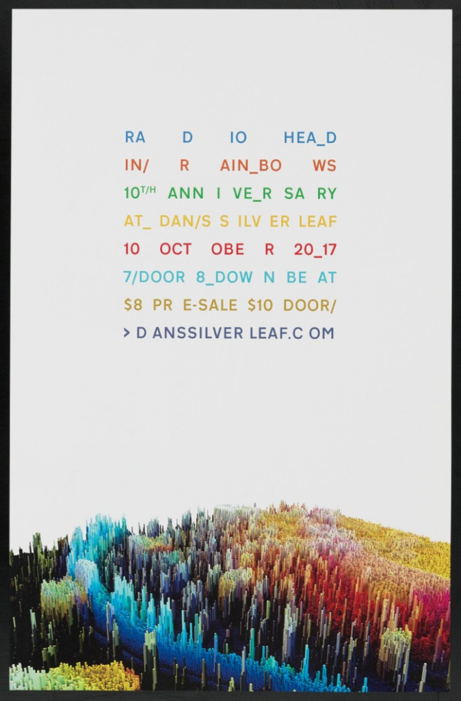
I really like the simplicity but also the colours they use one this Radiohead poster. Obviously the colours represent the album In Rainbows and also the design of it. I also like the fact that it has a boarder and it does clearly say where and when and the price of the gig which means people won’t get confused about the information.