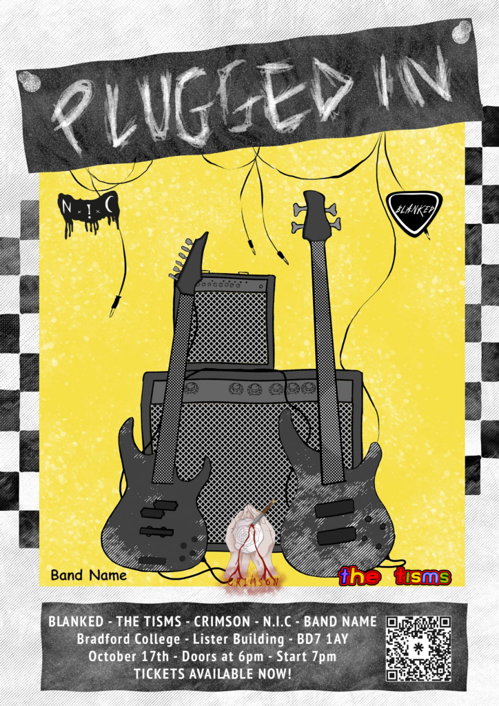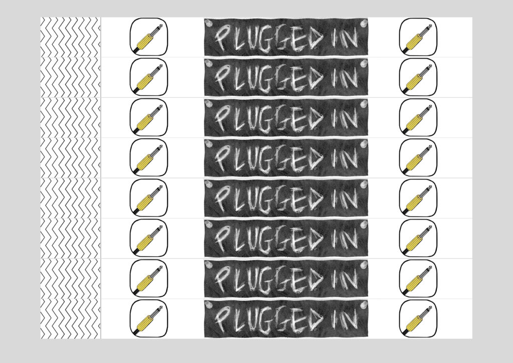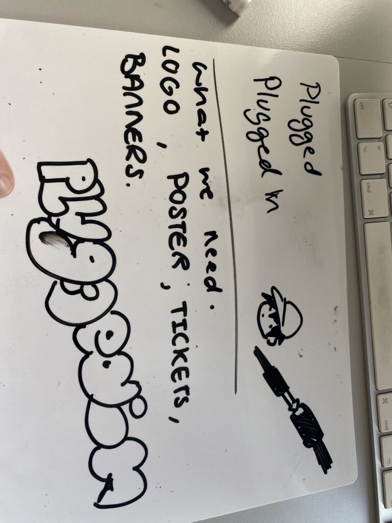
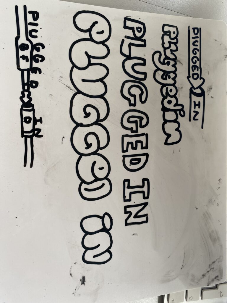
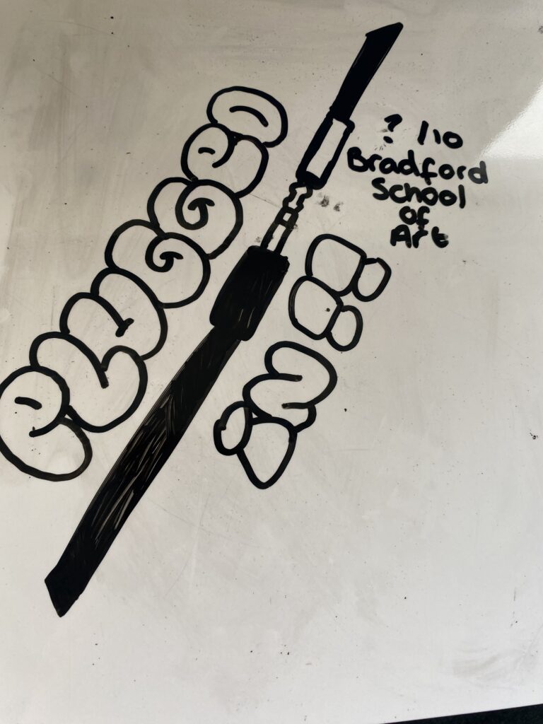
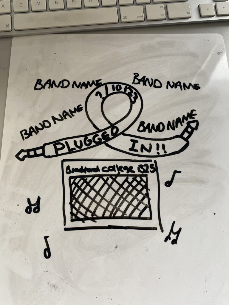
For the name of the event we decided on Plugged In as it represents a cable being plugged in. Here are a few examples of logo ideas and poster ideas that i came up with. I like the idea of the cable being used and i also liked the bubble writing that I tried doing. For the actual poster and logo design we will use photoshop to make it a lot neater rather than a messy whiteboard.
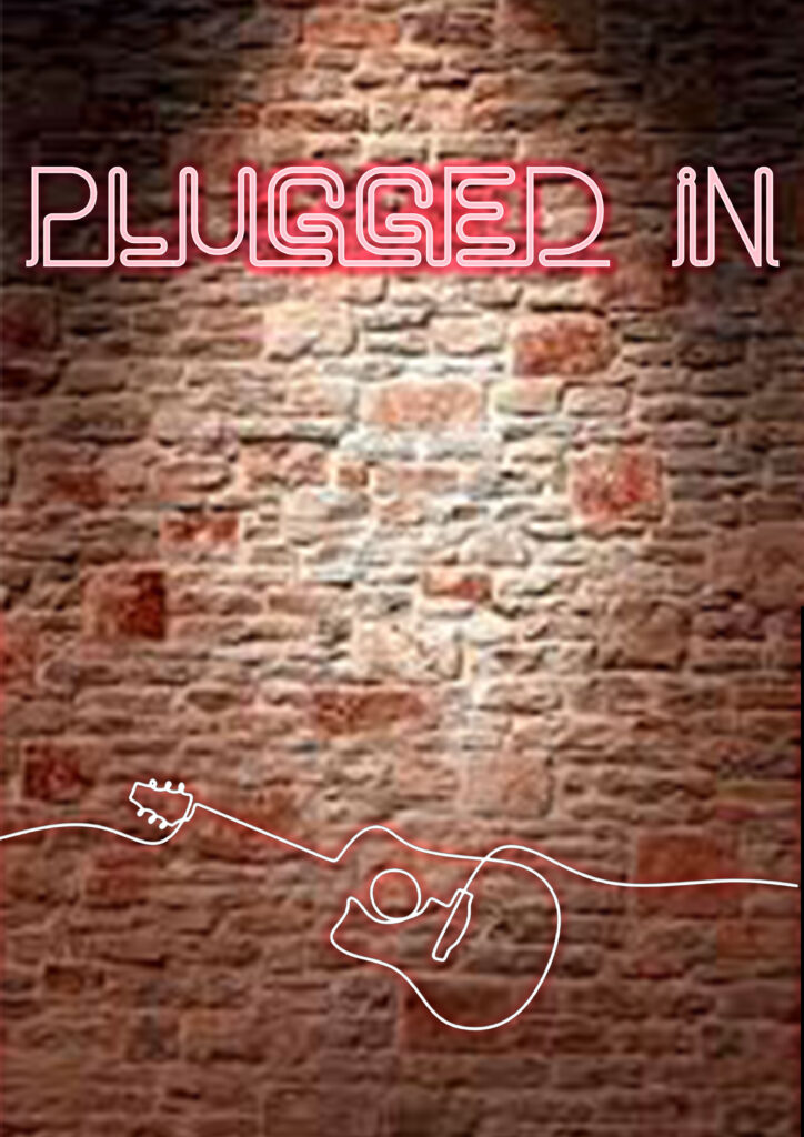
Me and Ethan worked together to come up with this potential poster. It’s not finished but our idea was to have it look like a neon light on the wall, which has kind of happened. I think it could be lot better but the isn’t enough time to make it incredible.
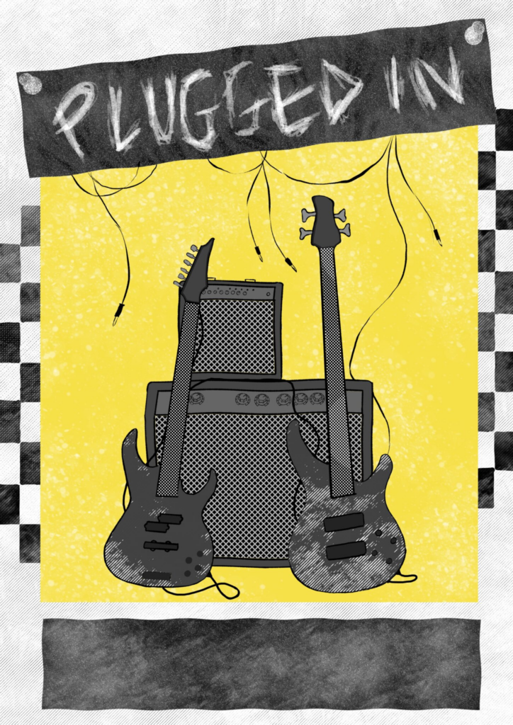
I like Kaitlyn’s idea for a poster however I think it could have been drawn better and maybe used actual photos of guitars and amps instead of drawn versions. I also don’t really like the could scheme of it.
