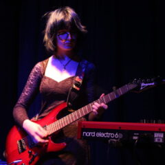
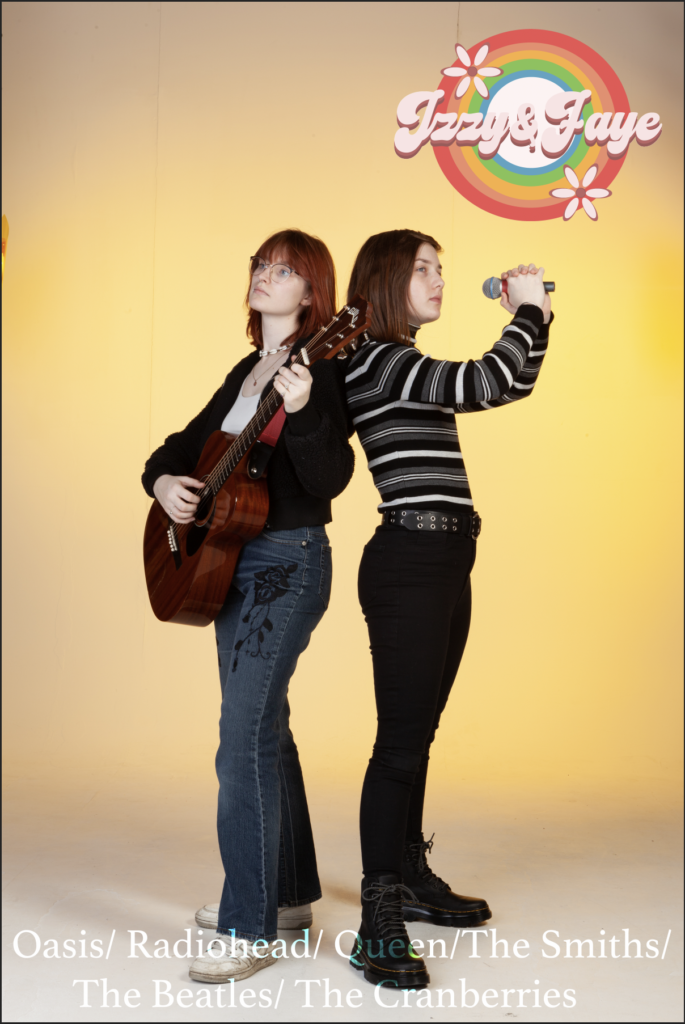
I took our best photo from the photoshoot we did and put in into photoshop, making it fit the canvas. I then imported in our logo and decided it looked best in the top right corner. After that I put a few of the bands we cover (the most popular ones) and then went through the filter effects where it makes the text blend in a bit better and then pressed the saturation one which gave it a cool effect that made the text noticeable but not too in your face. I had it in mind that I would put dates and venues in the top right corner when we eventually get a gig.
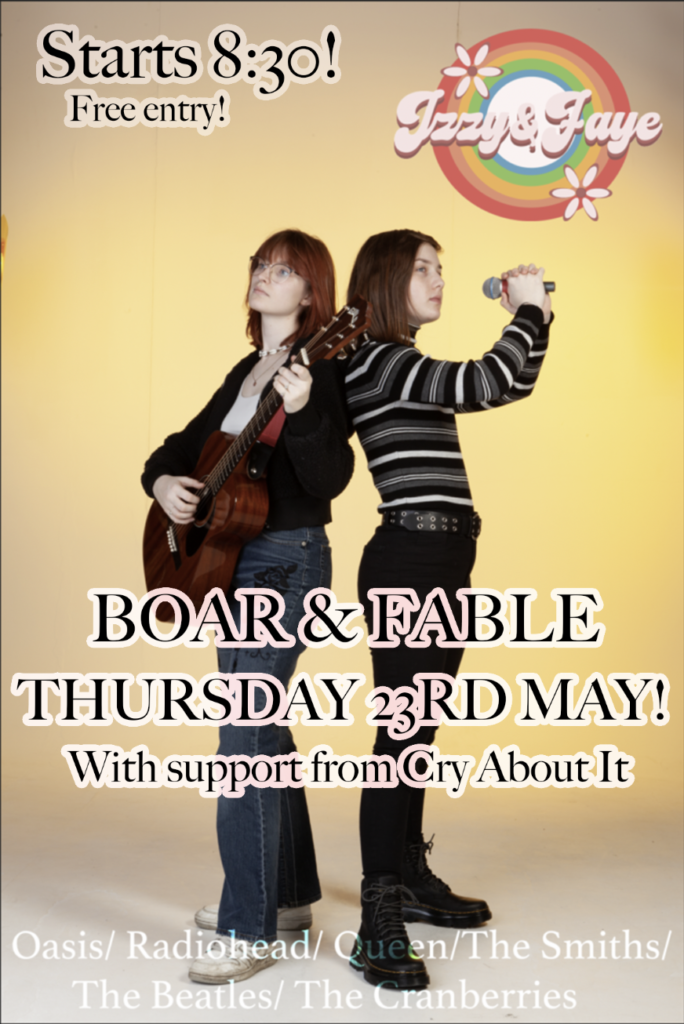
About 5 hours after making the initial poster we got a confirmed gig and so I started working on finalising the poster. I opened up the file and started typing out all the important information people need to know (dates, venues, opening acts, and times). At first I put all the information in the top left corner but i thought it looked too cramped and didn’t really draw any attention in. I decided to move the venue, date and support act into the middle of the poster and worked out how to get a glow effect around it and then edited it so it looked cool and still brought attention in. I really like how the text and font turned out and I think people will definitely get drawn in by the placement and effect of it. I then sent a photo of the logo to Luke (my dads cousin who works in the industry) and he said I should include the time and that its free entry so I added that to the top left corner and I think it really finishes the poster off.