Ideas/Inspiration:
For my logo I have a vivid picture in my head on what I want it to look like. I’m looking to go for a hippie type of style and colours. This means bubble writing and orange/ yellow colours.
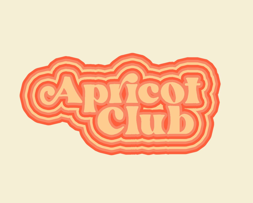
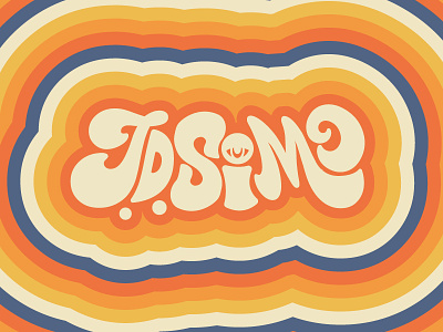
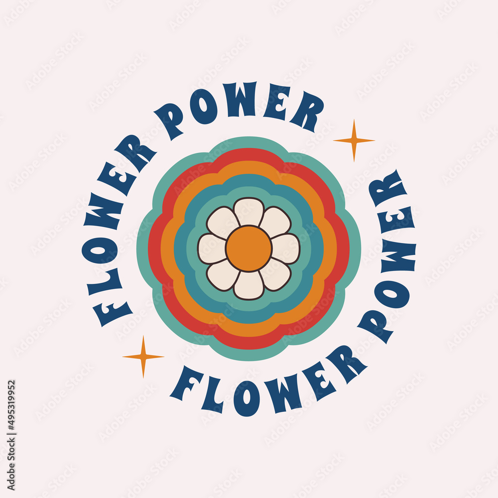

This is the type of vibe I want for my logo, very hippie and bright colours. I like it because it really suits an acoustic set performance and since we will be performing over he summer it gives summery vibes.
Making the logo:
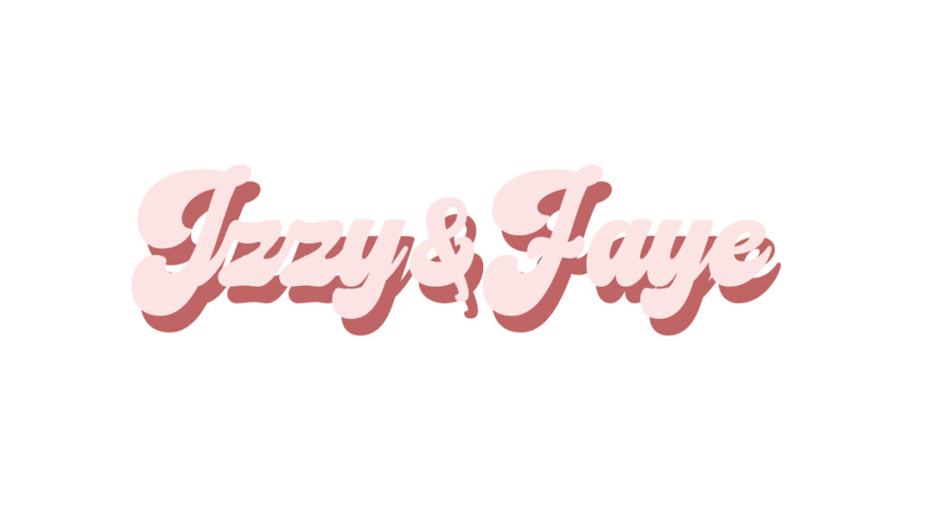
I found a font on the website DaFont where I went into the catagory of vintage and found this font and really liked the look of it. I downloaded the font and typed in “Izzy & Faye” onto photoshop and used the font. I then copied that layer and chose a pinky colour and a darker pinky colour to make it look like a shadow I really liked how this looked.
I then decided I needed another layer of shadowing so I copied the text again and found an even darker pink shade to go under it and changed the position of the shadow as it was showing a lot of the white background in places I didn’t want the white background showing (in the middle of the E and A). I liked this design but still felt like it needed something else.
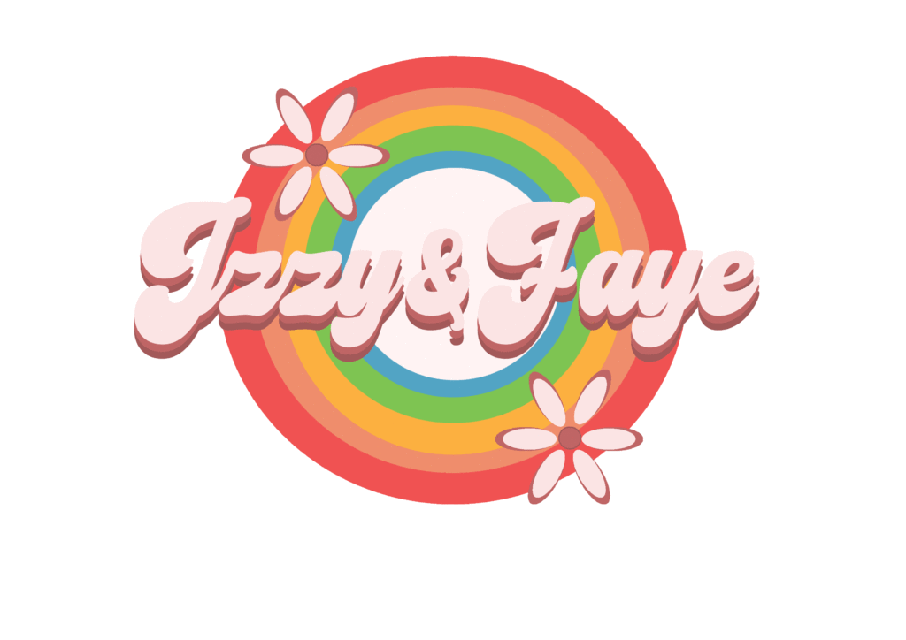
As you can tell I really stuck to the inspiration and themes that I had originally liked. I added the flowers by going into Adobe Illustrator and creating lots of circles to make a flower shape. I then took the flower design to photoshop and used the paint bucket tool to make them the same colour as the font. I then copied that layer and put it under the first layer, making the second layer slightly bigger and making the colours slightly darker which gives it the cool outline effect. I then thought i’d mess around in illustrator to see if i could make a rainbow, originally I was planning to only do half a rainbow but after creating a bunch of circles smaller than the last and then colouring them to make them rainbow, I quite liked the full circle effect. I dropped that into photoshop and then placed it underneath all the other layers. At first the colours were very bright to I used the paint bucket tool again and made the colours of the rainbow a lot less harsh on the eyes and I really like the final outcome. I think the rainbow in the middle really draws peoples eyes in and I think its a really effective logo.
