
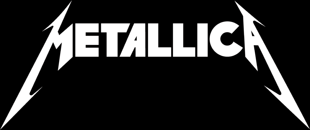
The Metallica band logo is effective because it gives off the same vibes as their songs (heavy metal). I think that M and the A being zig-zag like helps frame the word and makes it an infamous look. Because of this it is a well recognisable logo.
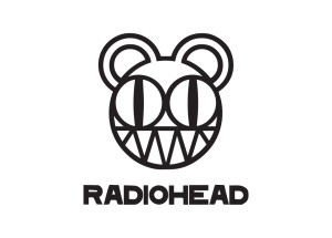
The Radiohead logo is well designed as it has the infamous “face/bear” which has been known to been tattooed on fans. This proves that it is a good logo as people want it permanently on their body.
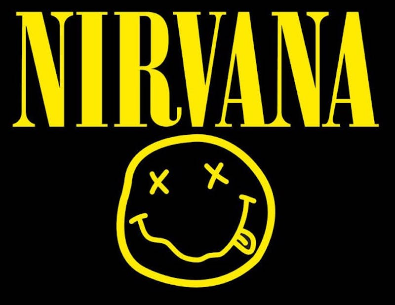
The Nirvana band logo is effective because it is bright and known worldwide even if you didn’t know the band. The name itself is simple but with the use of the face it makes is become extremely well known, which is exactly what you want in a band logo.
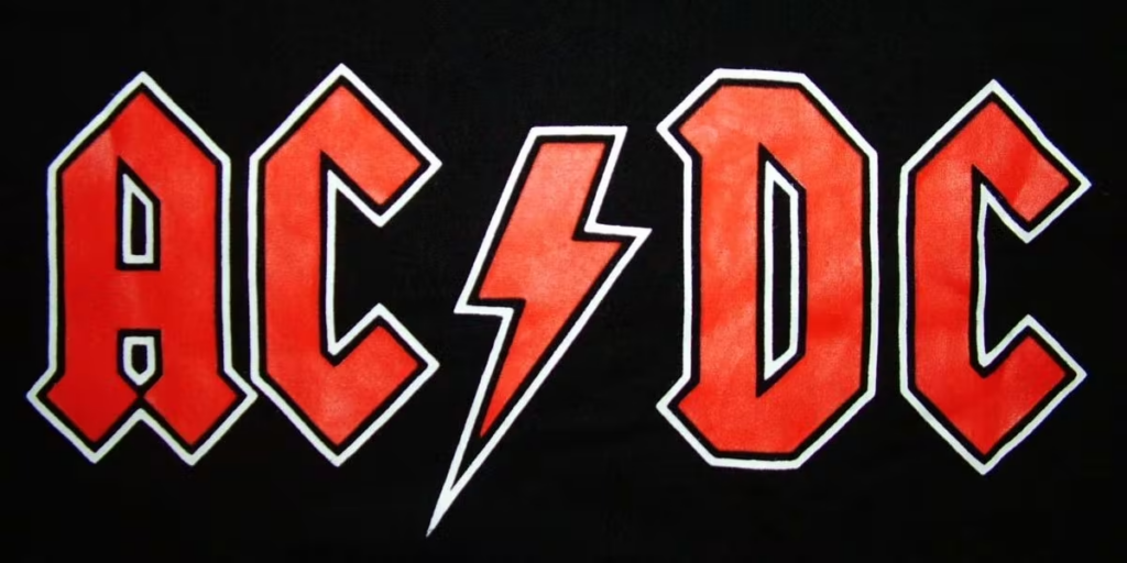
The ACDC band logo is well designed because of its font and colour. With the use of the lighting bolt splitting up the AC from the DC. This was unique and well thought of at the time when the band was new.
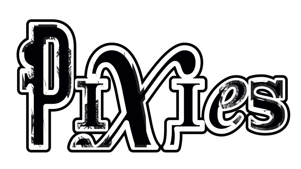
The Pixies design is much more intricate than the other designs and is slightly more detailed than the others. Th big X stands out from the rest, also using the X as the dot on the I. Compared to the other band logo’s, you don’t necessarily image the Pixies logo when you think of them. Where as with the other bands when you think of them, you can in-vision their band logo. That doesn’t mean that the pixies logo doesn’t work, it is still a very efficient logo.
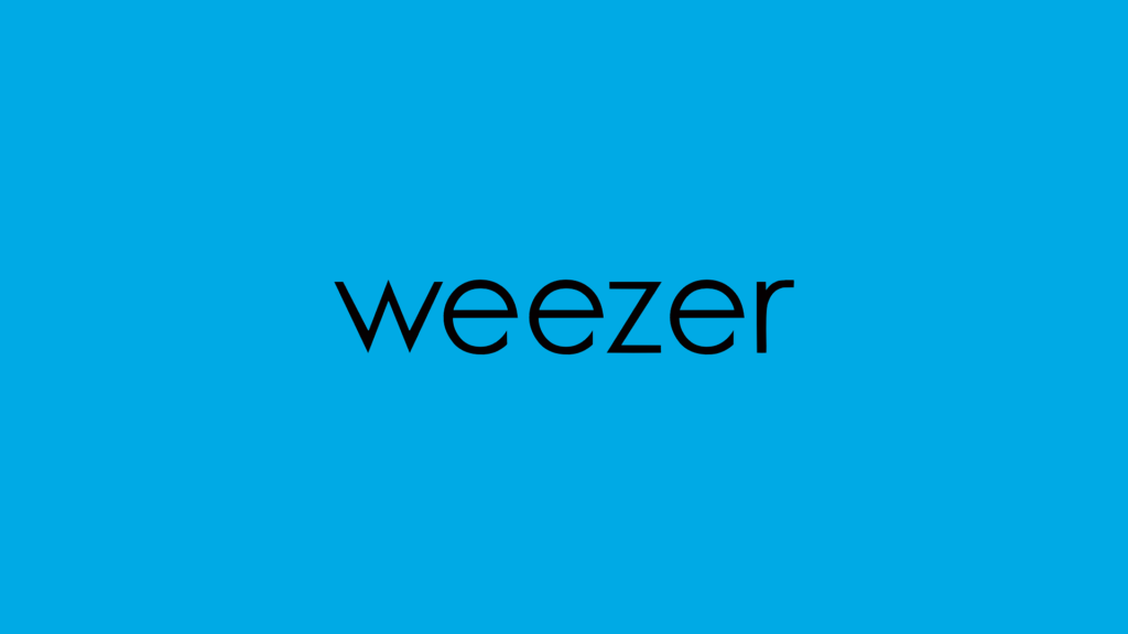
The Weezer logo is obviously different to the other logos. It is extremely simple, having a plain blue background with the word Weezer sat in the middle. The blue background, that is sometimes known as “Weezer blue” to some fans makes it a famous logo. In this case, simple is better.
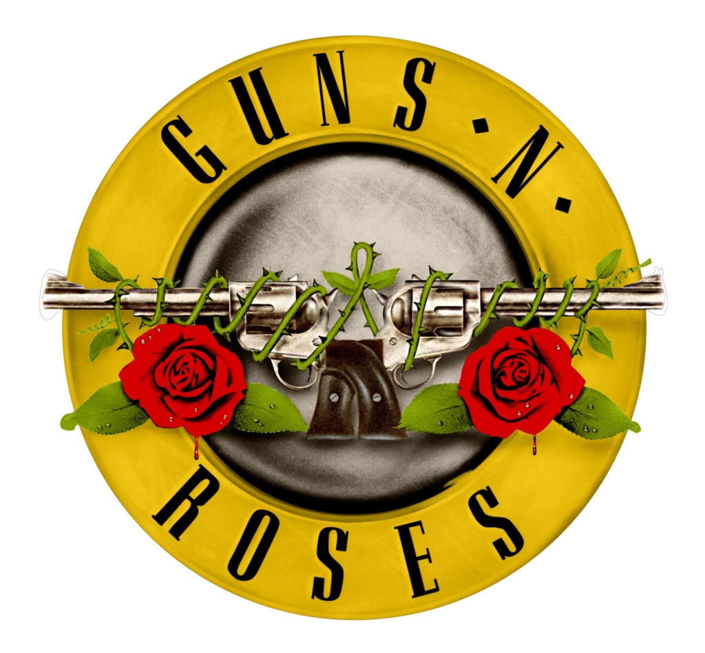
The Guns N Roses logo is good as it is much more artistic. With the use of the circle border and the name ‘Guns N roses’ in the border it makes it stand out. The guns tangled up in roses also makes the logo work well as it is a play on their name. This makes this logo well designed as people will recognize it even if they don’t know the band.
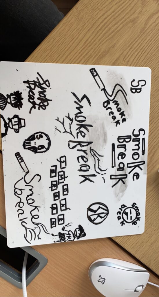

These are my input in band logo ideas. i sketched the face and the name on a whiteboard and my graphics teacher made it into an actual logo. i like this design as it is original and unique but unfortunately not the design we went for.
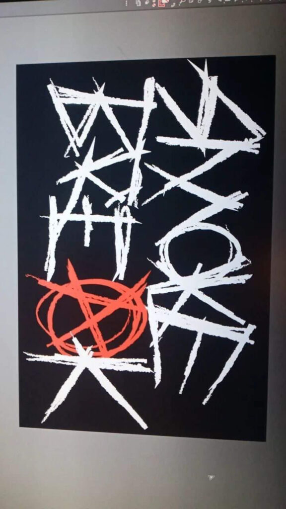
This is the logo we chose, designed by Ollie (guitarist). I personally did not like this design specifically because it is slightly messy and has taken heavy inspiration from a different band. In any other case it would be a nice logo, however because our setlist is very much indie/rock the logo doesn’t fit the vibe. But as a group we did a vote and this logo was the winner, making it our band logo.