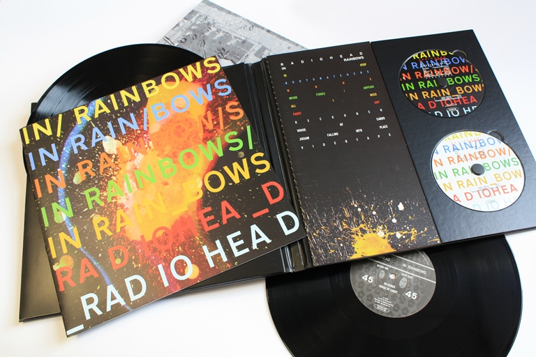
I like the Radiohead in rainbows album sleeve because of its simplistic design that works so well. I like how it’s a bit weird in a sense and that really fits with the music that Radiohead make.

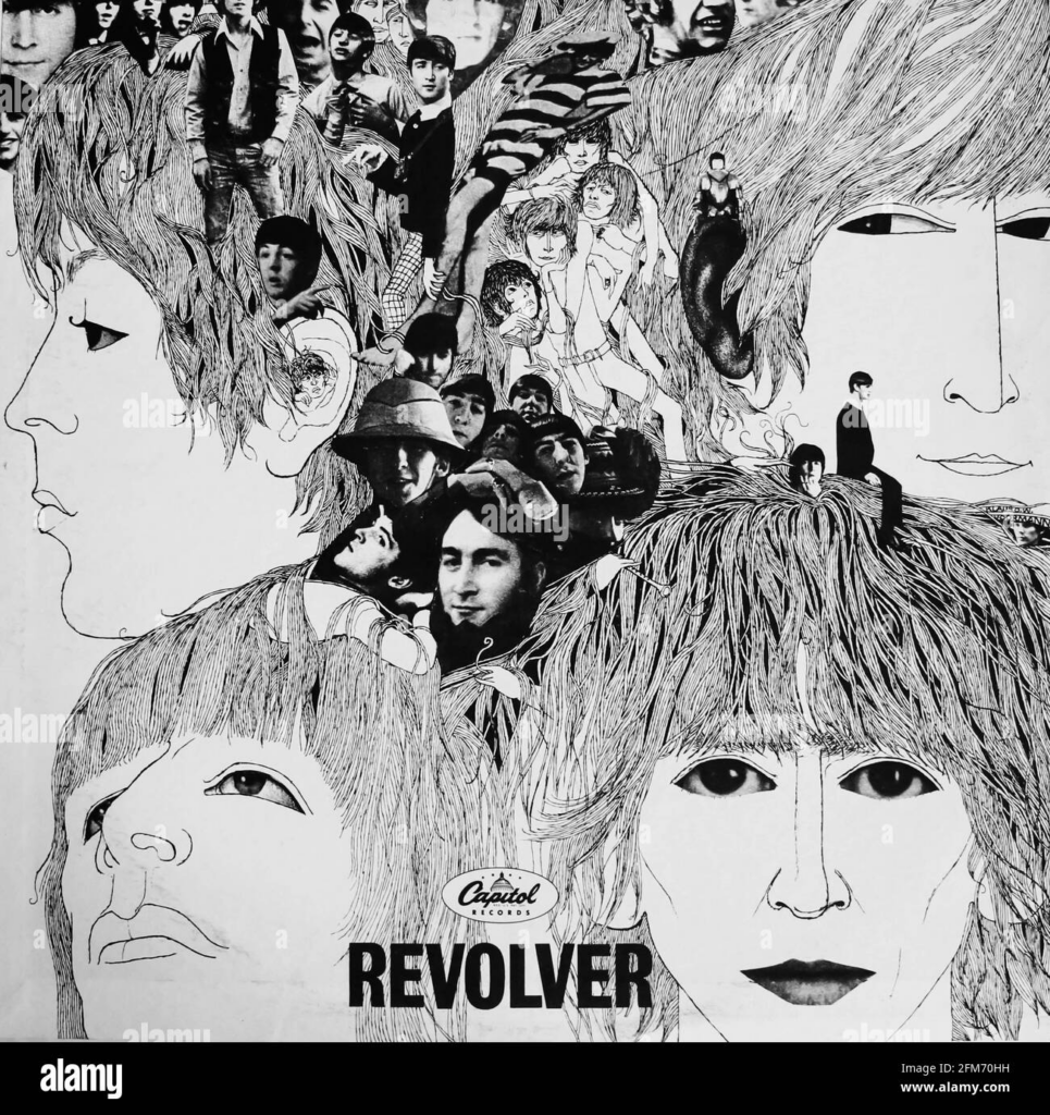
I like this album cover because of the lack of colour. I like how some parts are drawn and other parts are real, it gives it a crazy feel which catches people eye.

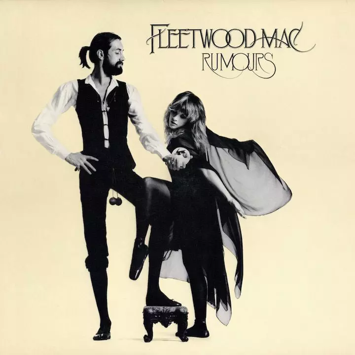
I like this album cover because it is simple with an artistic element from the modelling. I like that the clothes are adventurous and different and really like the positioning of the people and think the black and white contrasts with the cream colour for the background.

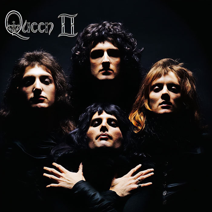
I like the Queen album cover because it is dramatic and powerful. The contrast using the spotlight making it so that their faces are the only thing you can see makes it really powerful in a way just like their music.
