As soon as the idea for my final project was finalised, I was hit with an idea for my single cover. This idea consisted of myself laying down on a blank canvas, surrounded by the instruments I’ll be playing in my performance. It is a simple idea that could be argued as a little cliché, however I do like it! I feel that the composition of the image would look well balanced, with a clear message relating to myself as the artist and the ways in which this composition came to life.


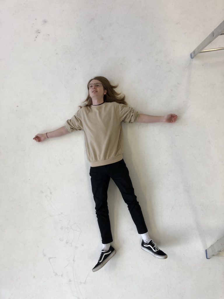
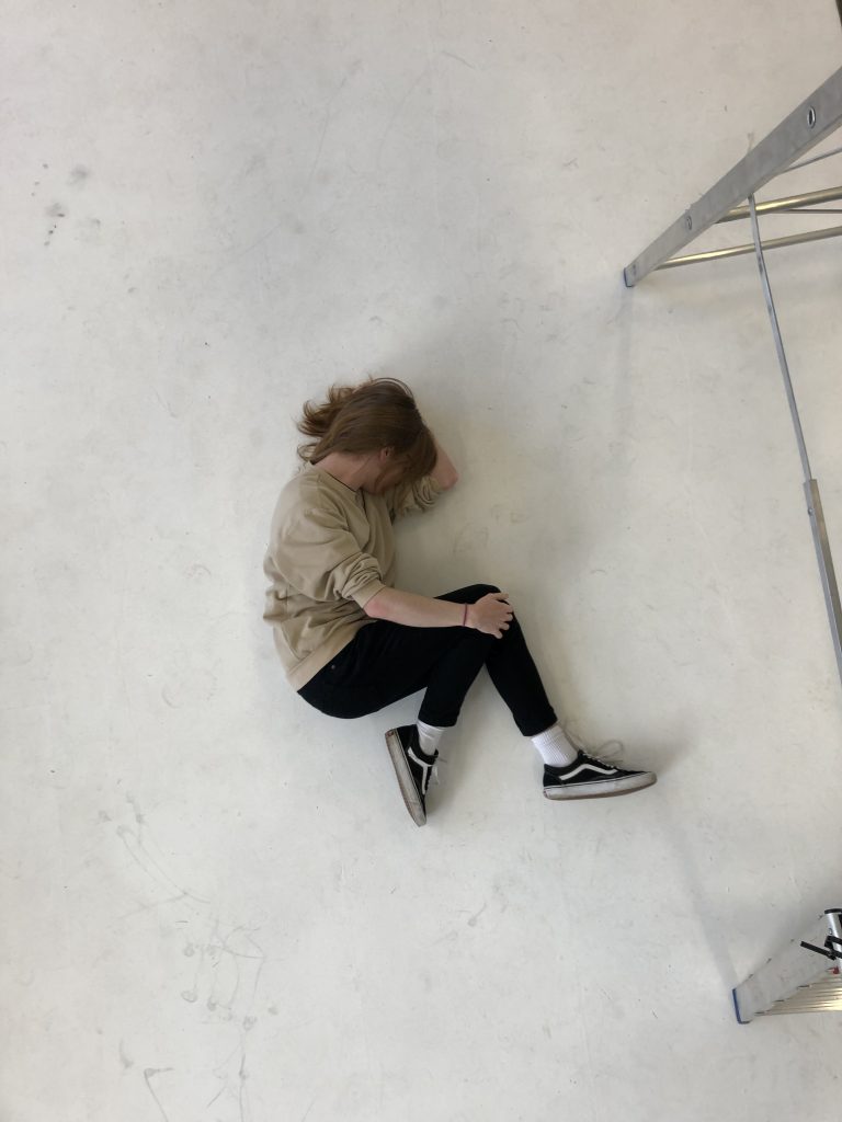
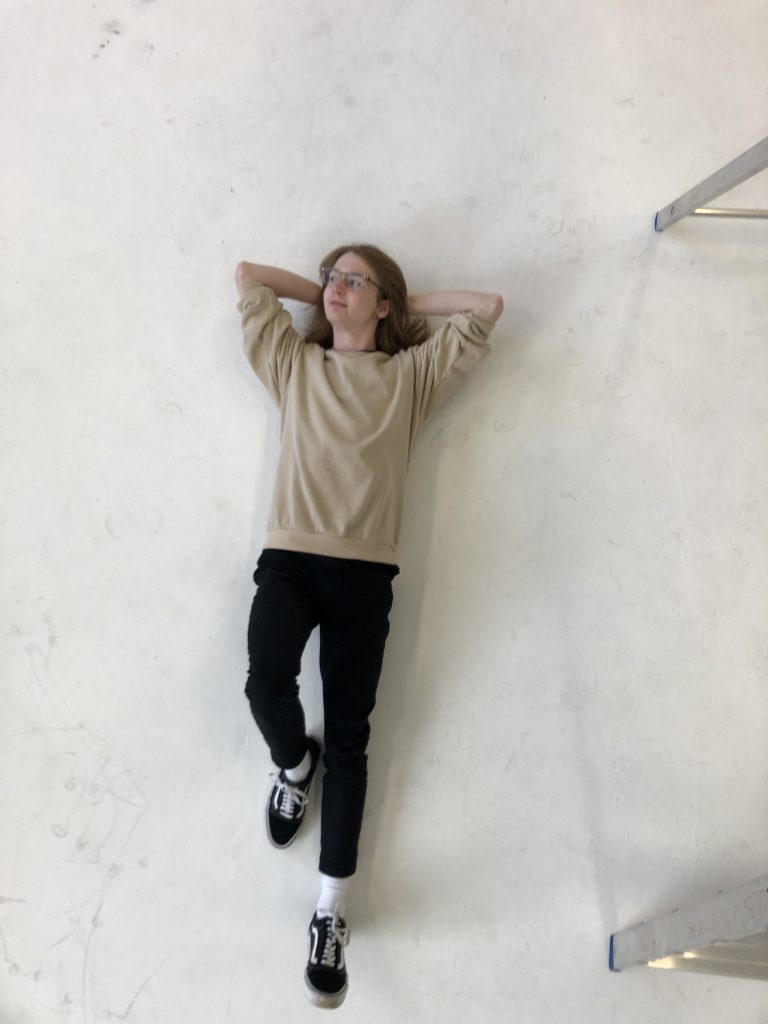
Visiting the studio to take these reference shots was rather impromptu and so I didn’t really have any idea of what poses I wanted. I just knew I wanted myself to be laid down and so that’s what I did! I then went for whatever my impulses told me to do. I started with this starfish kind of pose which could maybe work if my hair wasn’t as wild as it was in the shot, tucking it underneath myself could offer a cleaner look – however I still don’t really like it, it looks lazy to me. The next pose was this foetal position which could play into the idea of “recalibrate” and the themes of new beginnings. I prefer this to the first pose by a large margin, as it feels much more thoughtful and gives me greater room around myself to place the instruments. Lastly, I went with a very simple, relaxed position. I quite like the look of this, it isn’t anything special by any means but it just looks really easygoing and feels quite complimentary to my eyes. It offers no deeper meaning, unlike the previous shot, but I feel that such depth isn’t required with this one. My one issue with it is that it may not work very well compositionally, I take up a large vertical space down the centre which leaves minimal room above and below for instruments to be placed, possibly leading to my image to look like three lines, as opposed to myself being encircled by musical paraphernalia.
Overall, I can see myself using the second and the third poses in future. The first one makes me feel nothing, while the other two speak to me. It feels somewhat like a copout to say that I prefer these images without giving real reason as to why they speak to me but they simply do, and I would argue that decisions like this can be based on feeling and instinct, and that’s what is happening here. Of course, as these are references, they are without studio lighting, studio cameras, and everything else studio quality, but once I have all that to help me I think the shots could come out looking excellent.
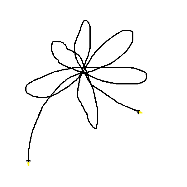
After taking these reference shots I was given another idea which I may or may not choose to use for my cover art: an audio jack lead displayed on a canvas in the shape of a flower. You will have to excuse the lack in artistic quality here, I quickly sketched this in Microsoft Paint using a mouse.

There is a charm in the simplicity of this idea. Taking a mundane piece of audio equipment and positioning it to look like a beautiful piece of nature – I really like it. As delightful as I find this, I don’t believe it would be the best representative for my project. It would look lovely but it holds no meaning in relation to the themes and ideas I’m putting forward, nor does it tell the viewer anything about myself as an artist and how the piece was constructed. The flower, for that reason, is out, as much as it pains me to say.
Weeks have passed since the original photos were taken and I am yet to have clearer, updated versions ready to use for promotional work. Whilst I have a clear idea of what I would like and how to potentially go about realising my vision, it hasn’t happened. This is due to being unable to co-ordinate with the technician for a multitude of reasons, either they haven’t been in on days where I would be able to shoot or they were simply too busy at a given time. Whilst frustrating, I can’t be mad, these things happen when collaborating with someone and if it’s out of your control, don’t worry, only worry about the things you can actually control. I still have faith that I will get chance to work with the technician to bring my ideas to life, however if I was desperate I could go to the photography studio one Friday morning with Paul and we could shoot it all ourselves. This wouldn’t achieve the quality I am aiming for, but it will get the job done as a last resort.
Another update and another change in plans: I have decided against releasing my song as a single. This means I now have no real need to shoot my cover art. I explain this decision further at the end of my page discussing DSPs.