A bad album cover doesn’t make a bad album, but a great album cover can make a good album even better. It is the first visual aspect that audiences see, it helps them identify with the music and gives them information about the artist/music without even hearing a single note. Sometimes an interesting cover is all it takes for a listener to dive in and try out the album.
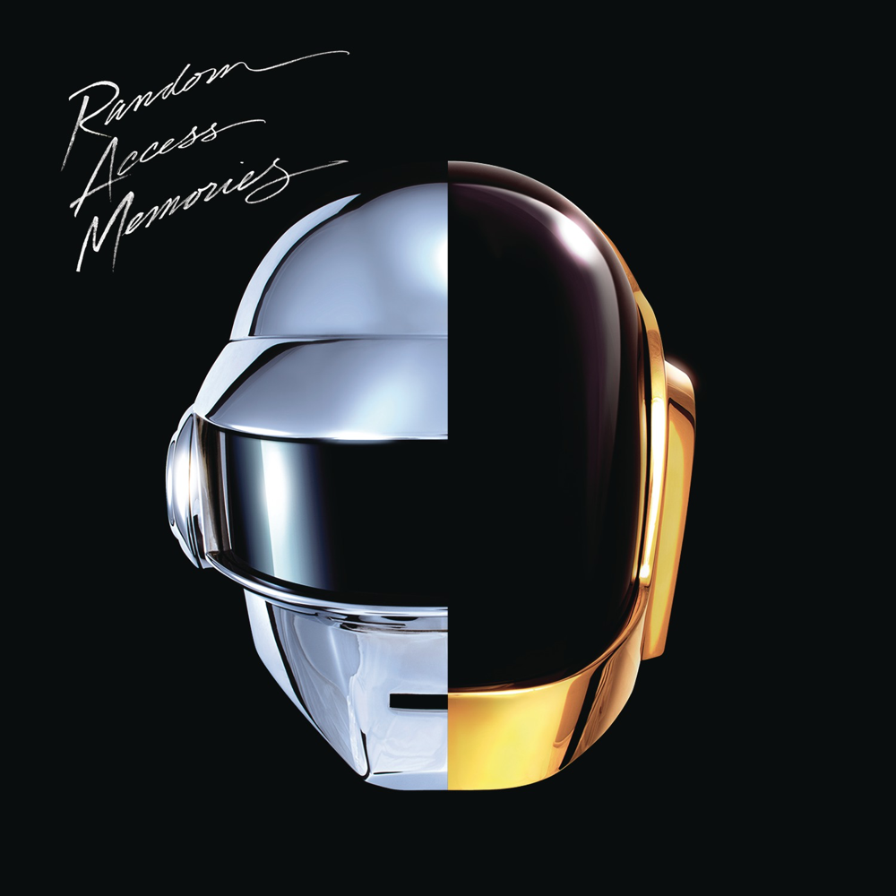
Daft Punk’s final album was the first and only of theirs to not feature the duo’s wordmark as the sole feature of the cover. Instead it consists of half of each member’s helmets side by side, as a symbol of unity between the two artists behind the masks. It is clean, well finished, and the same can be said about the actual music itself.
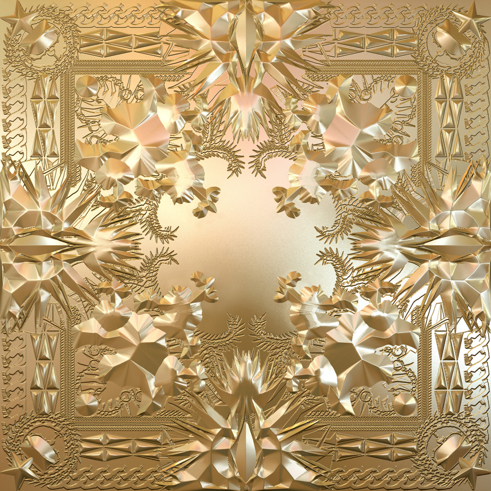
Jay-Z and Kanye’s collaborative project was the epitome of A-list, luxury rap, and the decadent gold cover art was crafted by Italian designer Ricardo Tisci who was selected for the job by the project’s art director, Virgil Abloh, both of whom are/were members of the luxury fashion world – part of the millionaire’s playground that the two rappers wax lyrical about over the course of the album. Everything about this project screams money.
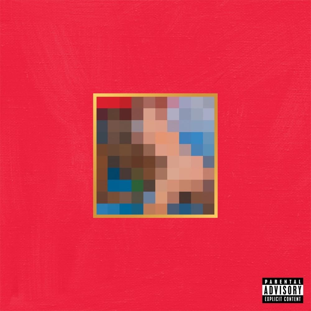
Kanye West’s magnum opus “My Beautiful Dark Twisted Fantasy” was an exercise is how to deal in multiple covers. Again, Virgil Abloh acted as art director for the album and selected artist George Condo to paint several covers, including the main one people think of – the censored cover. The cover (seen below) represented the album perfectly and West actually wanted his cover to be provocative enough to be banned, he got his wish.
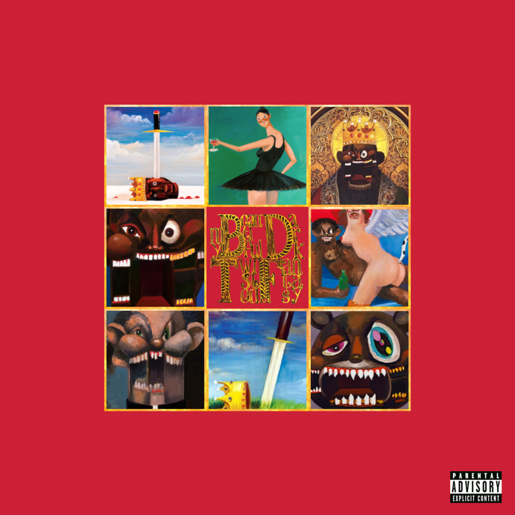
Condo created most covers seen here, ranging from the surrealist portraits of Kanye West to the aforementioned censored cover to the ballerina painting, which was also used as the single cover for “Runaway”, the epic of the album with a music video heavily featuring ballerinas.
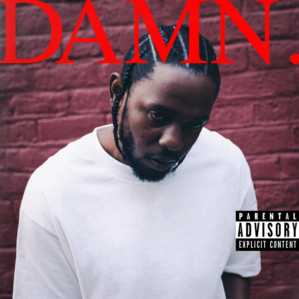
Kendrick Lamar’s Pulitzer Prize-winning album “DAMN.” is rather simple in nature as it consists of a somewhat unsettling picture of Lamar with the album title emblazoned at the top. The defining feature of the cover is the title; it’s bold, it’s impactful, and it follows a trend that can be seen in various forms of media, most notably TIME Magazine covers where the “M” in “TIME” is placed above the subject’s head, reminiscent of devil horns. The placing of the “M” on Lamar’s head is most definitely intentional.
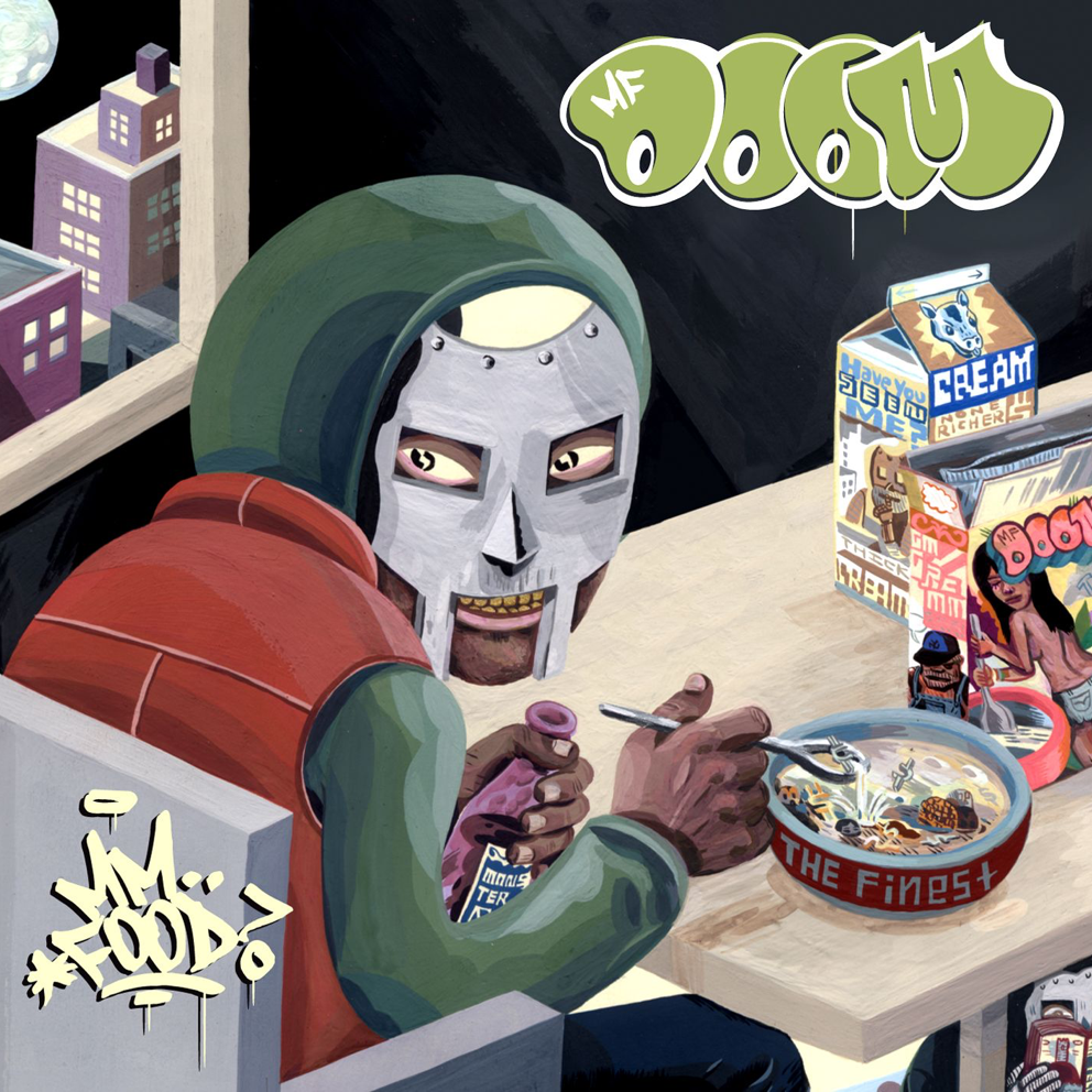
MF DOOM’s seminal work was MM..FOOD, and the cover for it included many references to DOOM himself and his previous album. In the top right and bottom left you see Dumile’s logo and the album title, respectively, in graffiti type, inspired by his history as a graffiti artist in New York. It features a cartoonish MF DOOM eating cereal (with cent symbols as pieces of cereal), his name on the box of cereal, a song title from his debut album on the bowl (“The Finest”) and a small image of DOOM on the carton of milk. This cover speaks to his history as an artist and I have yet to see another cover use this particular art style.
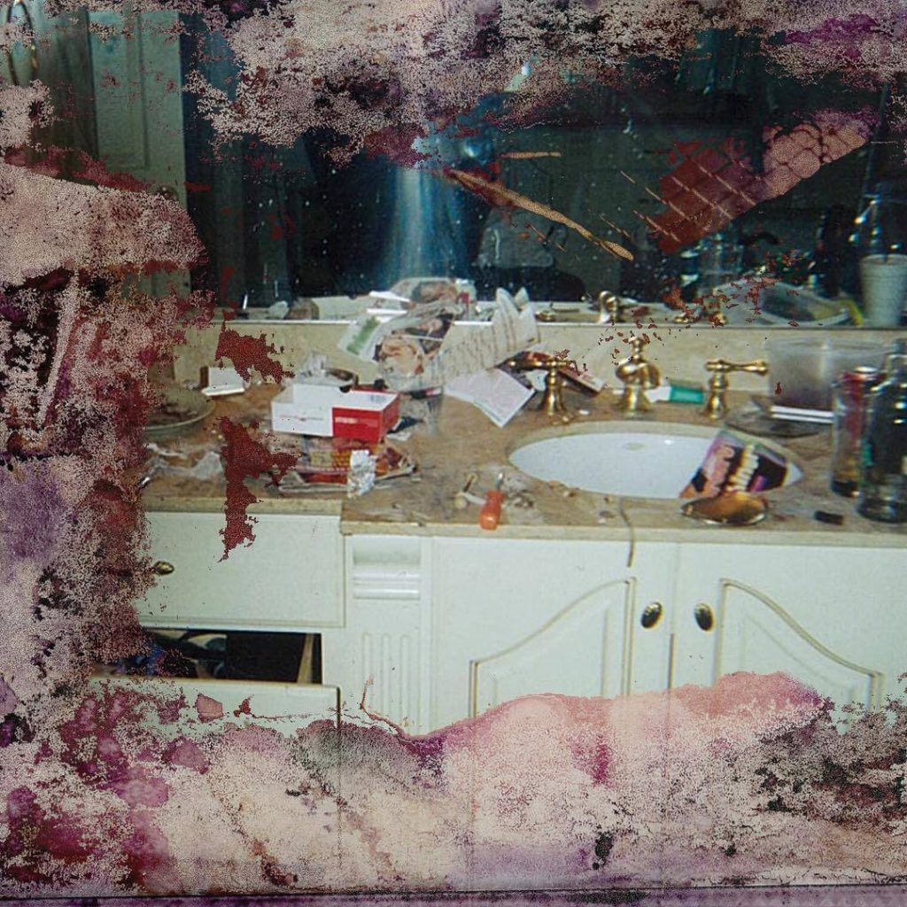
One of the most controversial album covers in recent memory was that of Pusha T’s 2018 album, “DAYTONA”. The executive producer of the album, Kanye West, bought the selected this image of Whitney Houston’s paraphernalia-filled bathroom. Pusha is an icon of cocaine rap, with his past as a big time drug dealer informing his present lyrics, the image of Houston’s bathroom is what happens to the people he would sell to and how it affects them, thus representing who Pusha was.
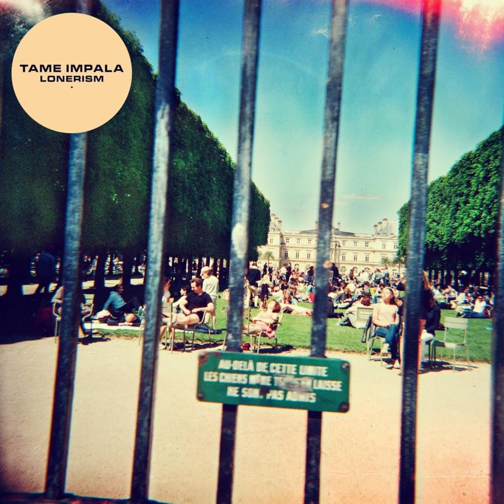
The central idea for this cover was the concept of loneliness and social exclusion – rather fitting for an album titled “Lonerism”. This was Tame Impala’s second studio album and perfectly encapsulates the themes which run throughout the project, and the feelings which Kevin Parker (sole band member) had been experiencing at that point in his life. He was the one who took the picture on a toy camera outside Jardin du Luxembourg in Paris, and he was the one responsible for the red splotch in the top right corner as he incorrectly wound the film. Leif Podhajsky, who has worked previously with Parker, was selected to edit the artwork for release.
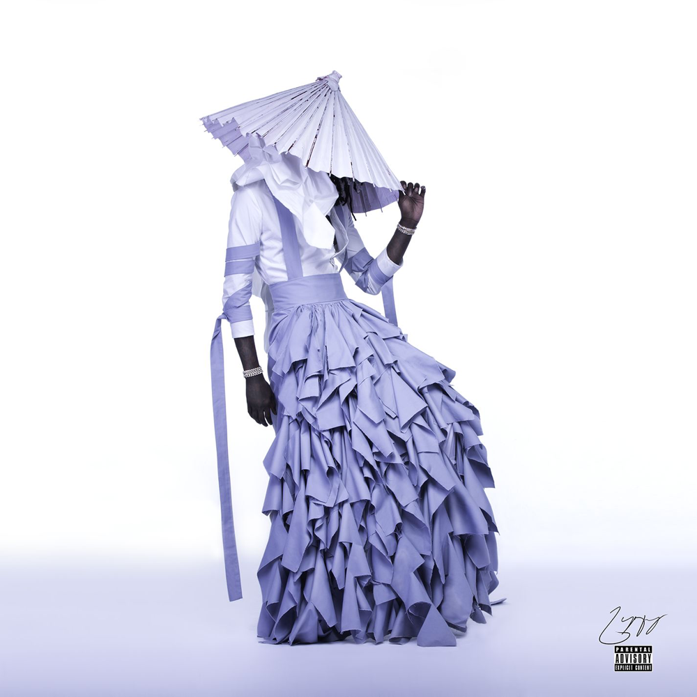
Young Thug is a pioneer of the rap game and is always pushing the boundaries – his 2016 mixtape “Jeffery” was no different. He boldly wore an androgynous dress designed by Alessandro Trincone, an Italian designer famed for his gender-challenging collections. Within the traditionally masculine hip-hop sphere, there was some pushback, be that in the form of memes or overt homophobia, brought about by the idea of a man wearing a dress. Visually, the cover is just striking, heavy use of white and lavender with a beautiful flowing dress taking centre stage.