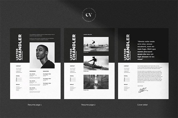
Black and white is a timeless colour combination and, while ink-intensive, is an easy way to build a cohesive appearance to a CV. It is simple, effective, and efficient.
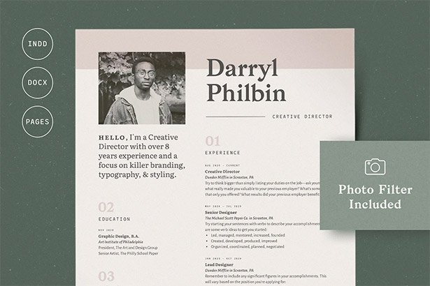
Minimalism has been a mainstay of popular culture over recent years and I think this style works very well on a CV, it leaves all unnecessary details and distracting graphics out so the reader can focus on the important stuff.
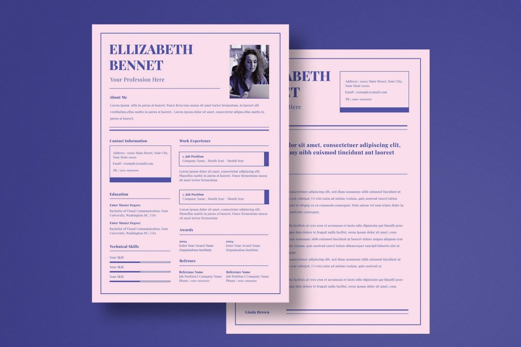
As a huge fan of shades of pinks and purples, this really caught my eye and I think I would definitely look to use similar colours in my own design. I associate myself more with lavender however so that’s what I would use, these colours could be nice accents.
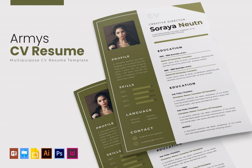
What I really appreciate about this example is the two-column method of separating the information; the key details are in the colour blocked column underneath the image, and then further information is beyond that, breaking apart all necessary information in a very tidy manner.
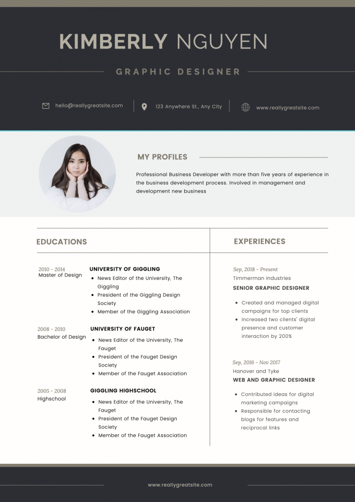
This rather minimalist, modern CV just appears really professional to me. White is a go-to background colour but the black and muted gold add a level of luxury almost to it, it adds a lot.
Above is the CV which I have had for a few years now, and it is somewhat simplistic but I feel it gets the job done effectively. Each subheading is highlighted to add some interest to the page and break up the pieces of text.
This is my altered version edited using Adobe Illustrator. It now uses blue lozenges as subheadings instead of the red text, as red text is a bit too aggressive for something such as a CV. The blue is more appealing to the eye and looks kinder, the lozenges look more professional than simply changing the text colour. It is now a PDF so that whoever receives this cannot edit it on my behalf.