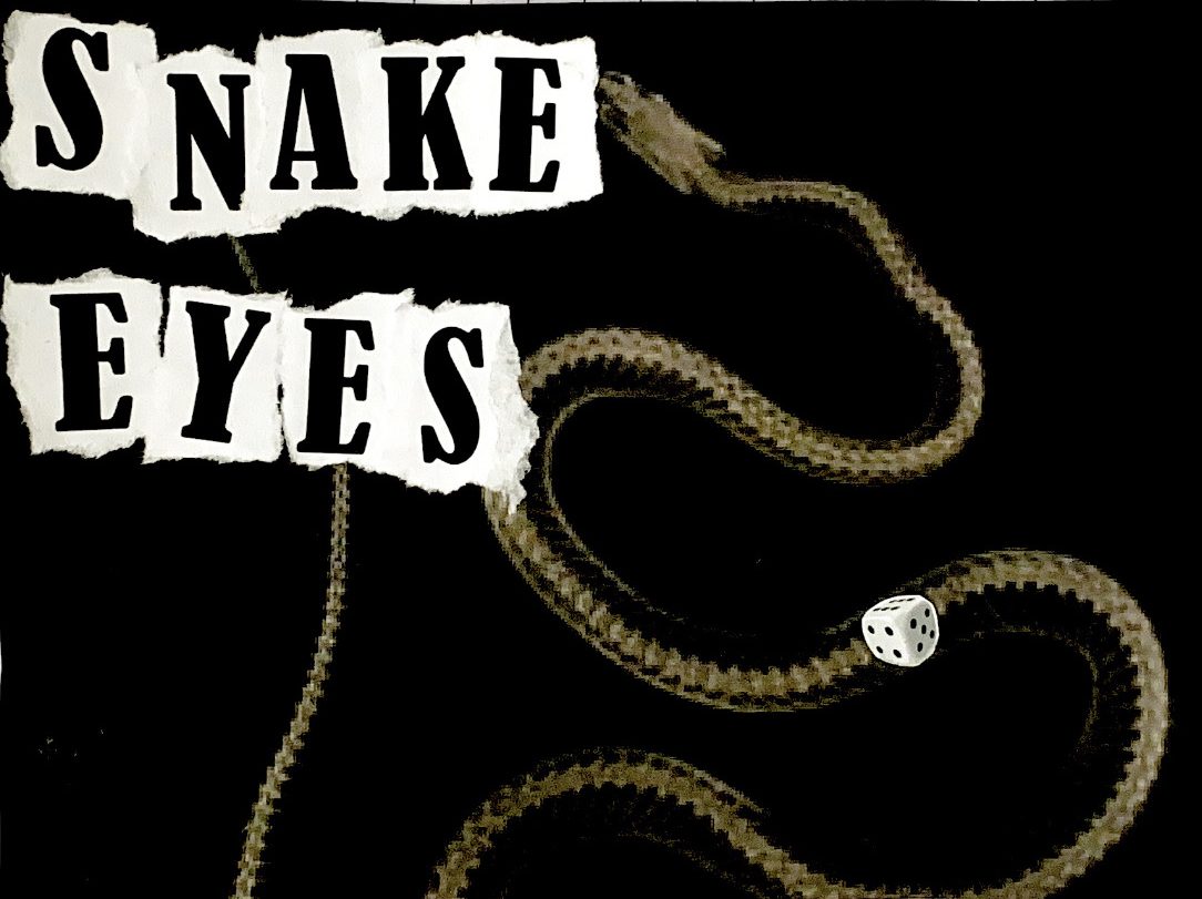
In this graphics project, we have been tasked with creating our own sleeve/cover art for the single we are collaboratively creating. Our working title is “Snake Eyes” as the initial song was inspired by our observations of a die, and we just think it is a memorable enough name to start with and work from.

One of our first ideas was heavily centred around the snake theme, involving an x-ray of a snake which has swallowed a die, or maybe even two dice that landed on snake eyes, although that errs on leaning too heavily on the snake imagery. When the main metaphor of the composition revolves around a die, I feel like it makes more sense to centre the die than the snake.
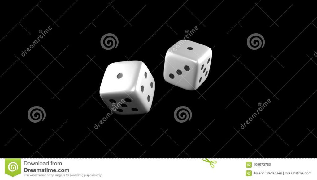
An idea I had was the image of two dice suspended over a black backdrop, snake eyes facing the camera. This could be achieved through either fishing wire suspending the dice over the backdrop and editing out the wire, or creating a more rigid structure with the dice so the angle of them is exactly right, and then superimposing that over a black background. Something reminiscent of the below image is what I imagined originally. Just picture these with the colours inverted.
