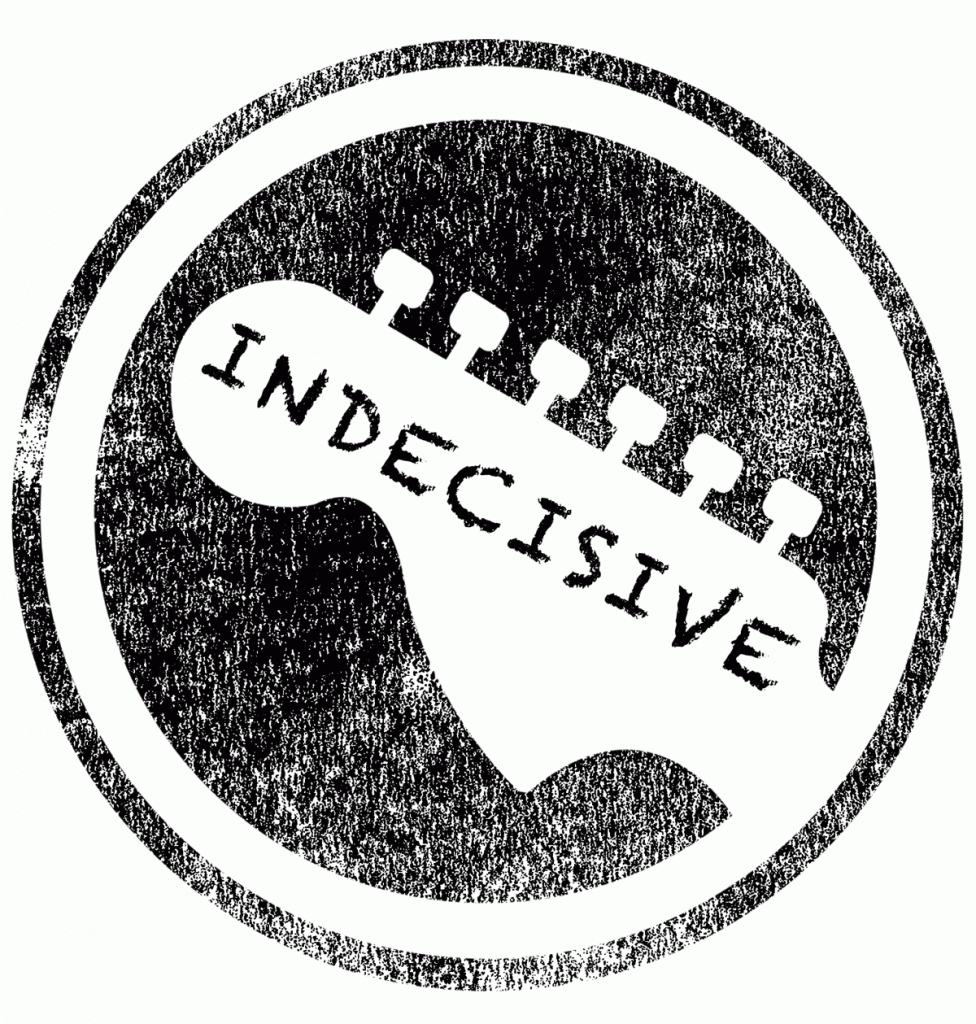
Obviously, every band needs something to identify itself with and, in most cases, that means a logo. We wanted our name to be included within the logo as well as something clearly musical just to hit home that we are a band, in case there was any doubt.

Here is the first image we worked with, a simple black and white image of the head of a guitar within a circle. We then adapted it to include some distressing and the band name, “Indecisive”, stylised here in all caps.

We then chose a different font as we felt like the handwritten font looked somewhat childish, in the sense that it looks like it could’ve been written on for us by a child.

We landed on this bolder, more in-your-face font for a larger impact and a bit more clarity when viewed from afar or in a smaller image size.