| Project Action Plan and Timetable | |||
Week | Date Week Beginning | Activity / What you are intending to do – including independent study | Resources / What you will need to do it – including access to workshops |
| 1 | 13th march | Design a few ideas and a shot list for my project | Pen paper |
| 2 | 20th march | Finish the designs and Ask which two designs they like the best on Thursday Start designing on software on friday | Pen paper illustrator and photoshop |
| 3 | 27th march | Design the two logos and start filming parts of the club for a promotional shoot | Camera (phone camera) illustrator photoshop |
| 4 | 3rd April | Finish the logos final design and get the community to decide which they like better. Film some more on Saturdays when there is a live band on | Photoshop camera illustrator |
| 5 | 10th April | Edit the promotional shoot using after effects and premiere pro | Premiere pro |
| 6 | 17th April | Polish it off and export it show it to the owner and ask if she would like to post it on face book along with the new logo. | Premiere pro photoshop illustrator |
| 7 | 24th April | Post it and receive feedback from the online community. Start the overall evaluation. | Word, Facebook |
| 8 | 1st may | Evaluating my main project highlighting the problems I encountered and what I accomplished | Word |
| 9 | 8th may | Check over evaluation see if I missed anything double check digital space and see if there is anything | Word |
| 10 | 15th may | Carry on improving my evaluation | word |
| 11 | 22nd may | Final checks on everything | mac |


<object class="wp-block-file__embed" data="https://digitalspace.bradfordcollege.ac.uk/10655818/wp-content/uploads/sites/417/2023/05/bucket-lady.pdf" type="application/pdf" style="width:100%;height:560px" aria-label="
bucket-ladyDownload
bucket-ladyDownload
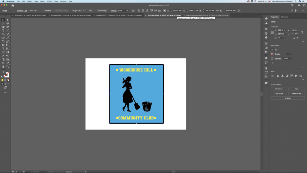
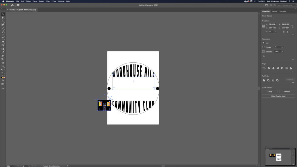
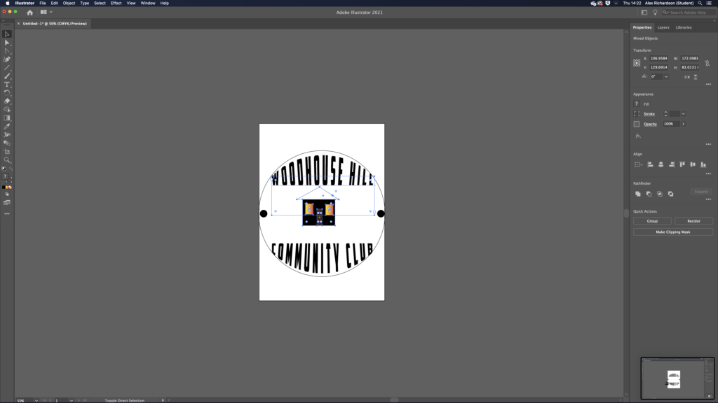
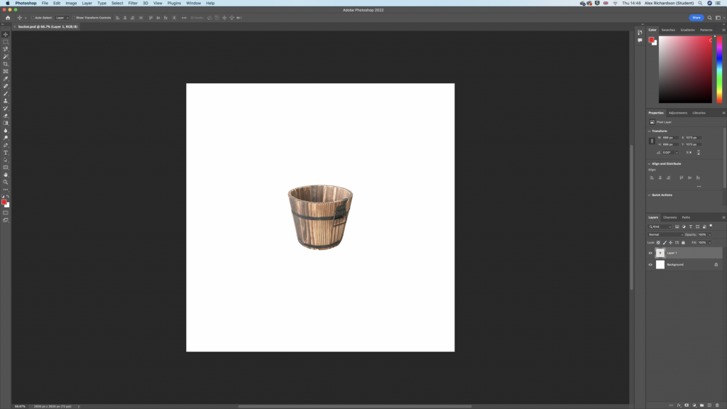
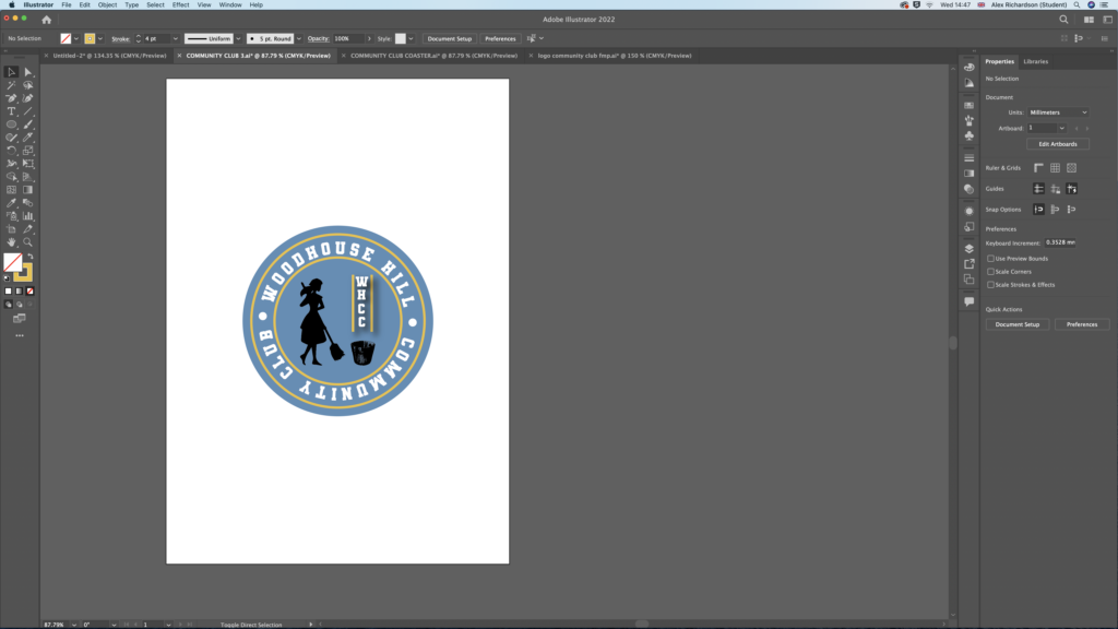
above is a bucket and lady this was because of the old clubs name the Peggy tub which is a woman cleaning out of a tub. i did this so people would be able to recognize the new club when they knew it as the old name and not the new one .


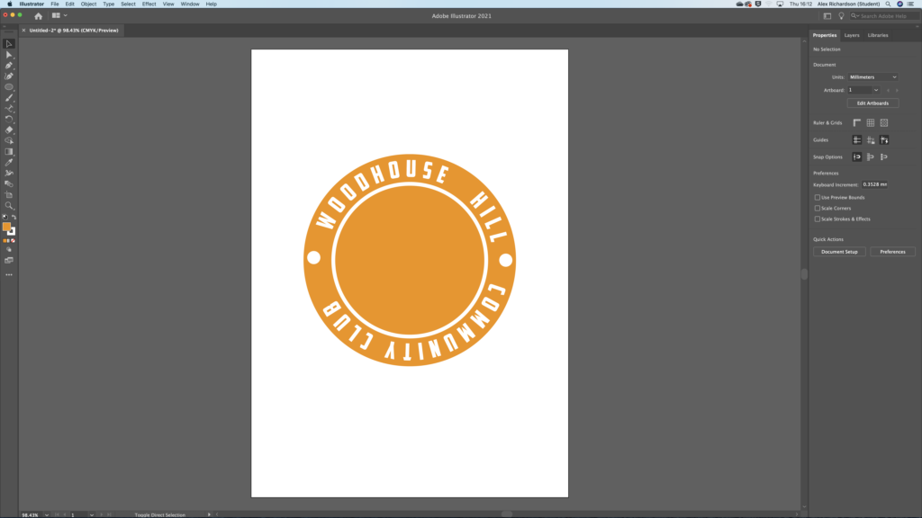


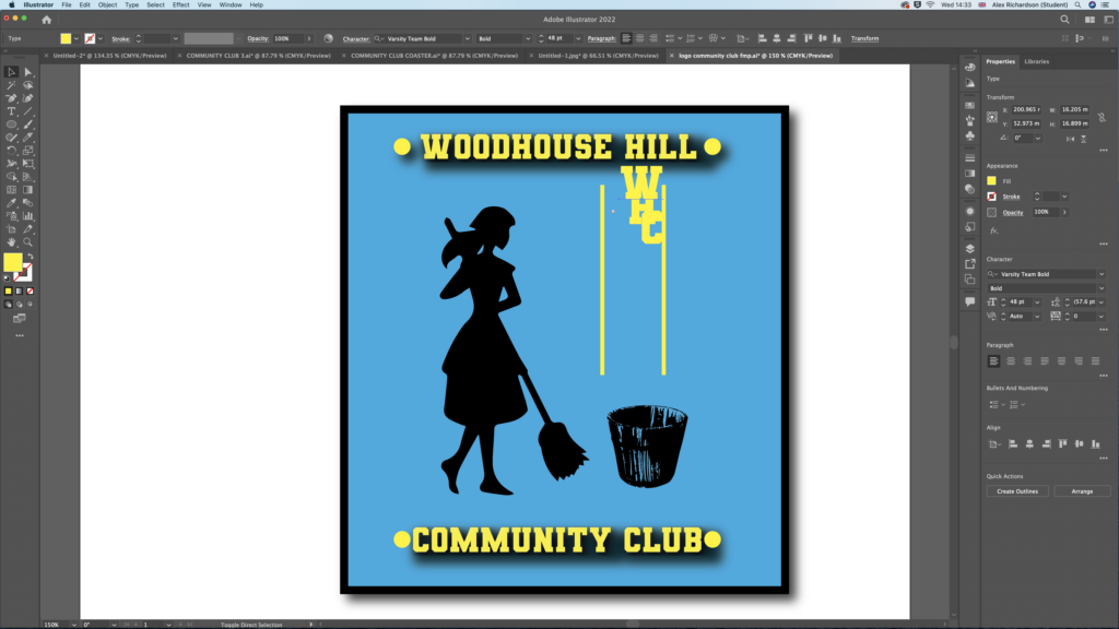
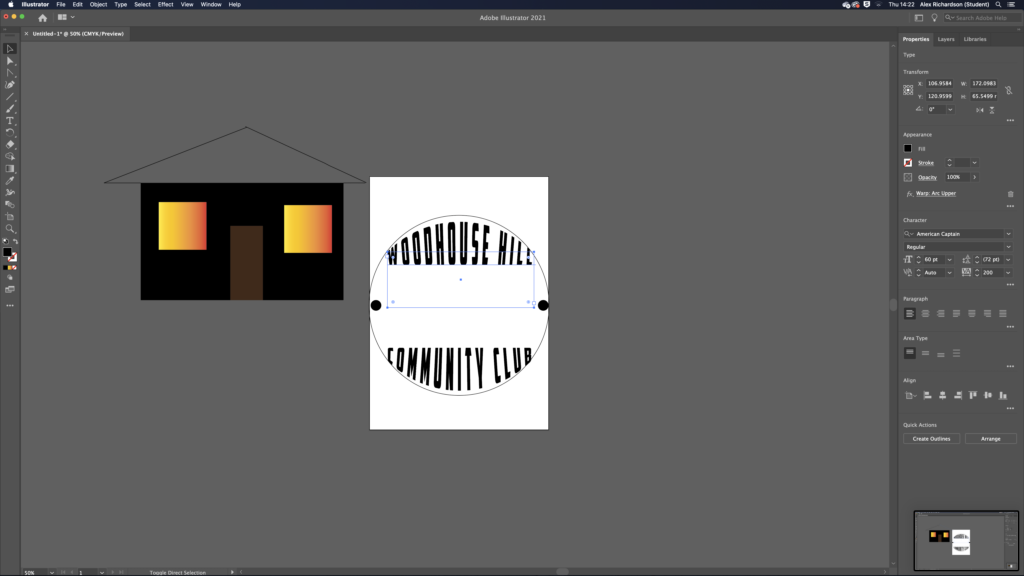
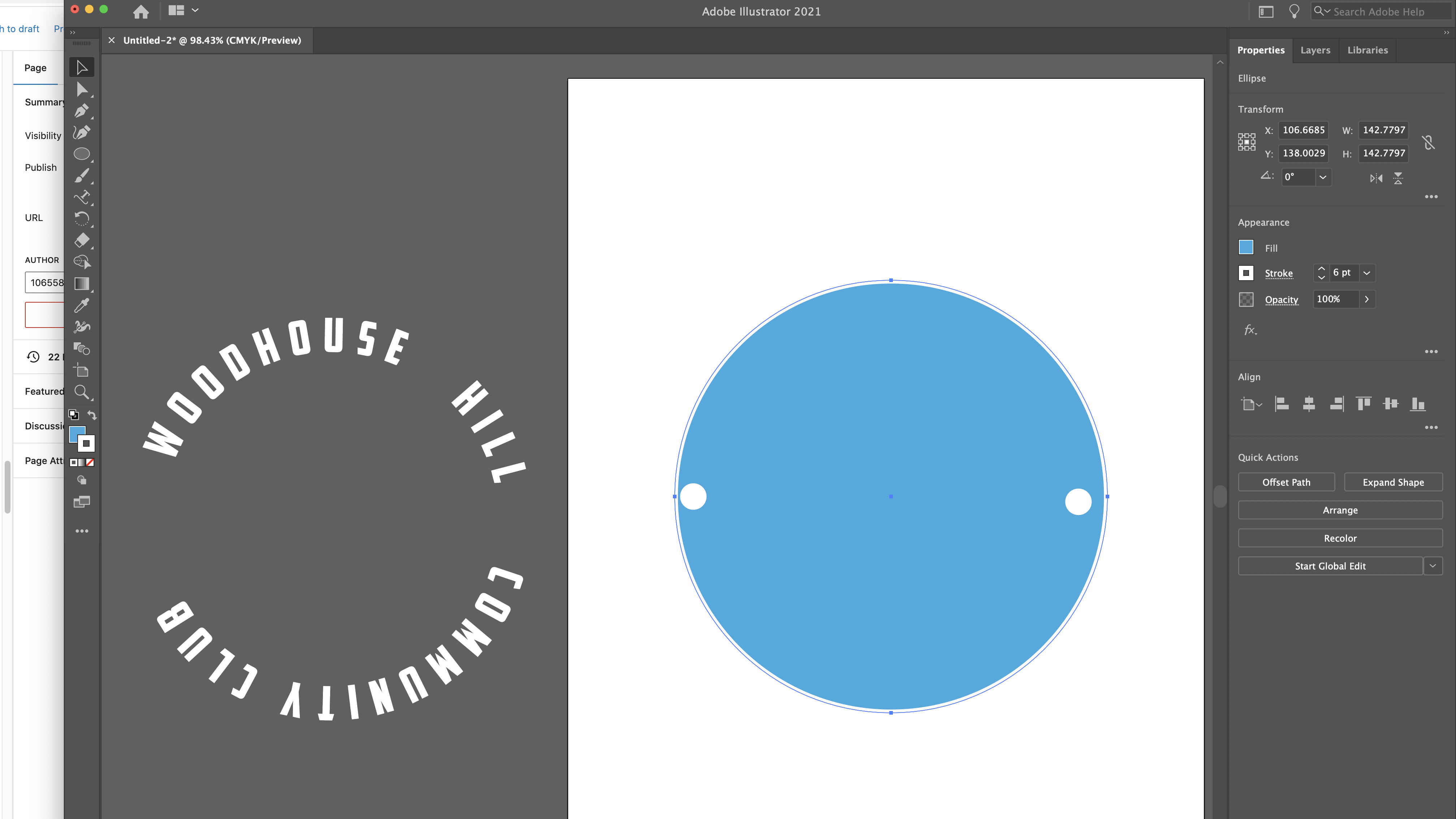
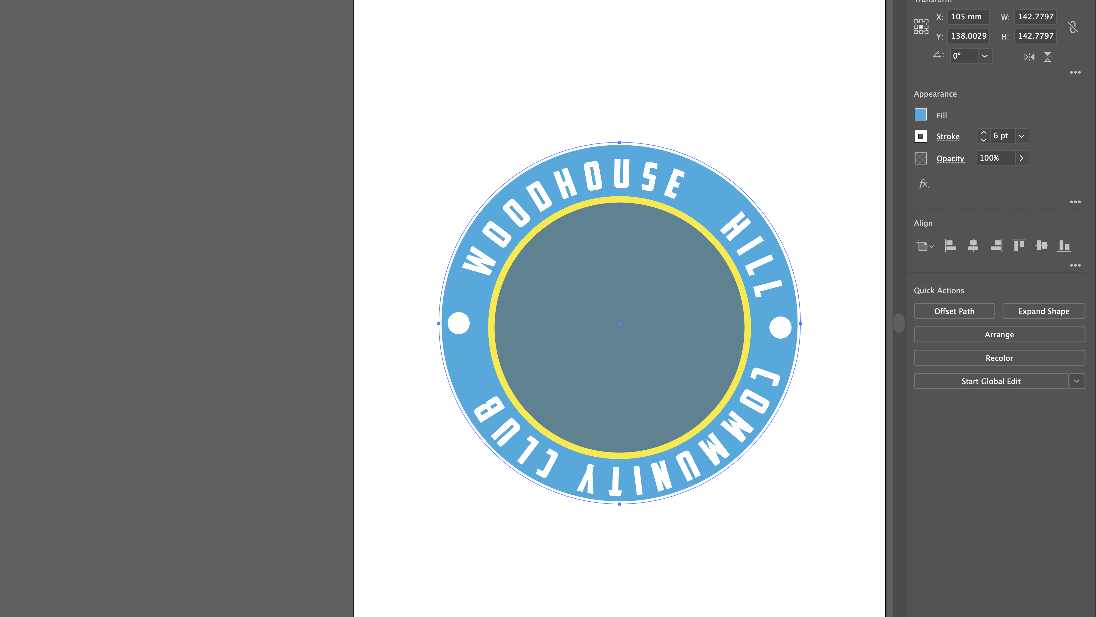
above is the process on how i started the sign and logo before improving it as you can see i went for a rectangular shape with a blue background and a yellow coloured lettering with a black border.