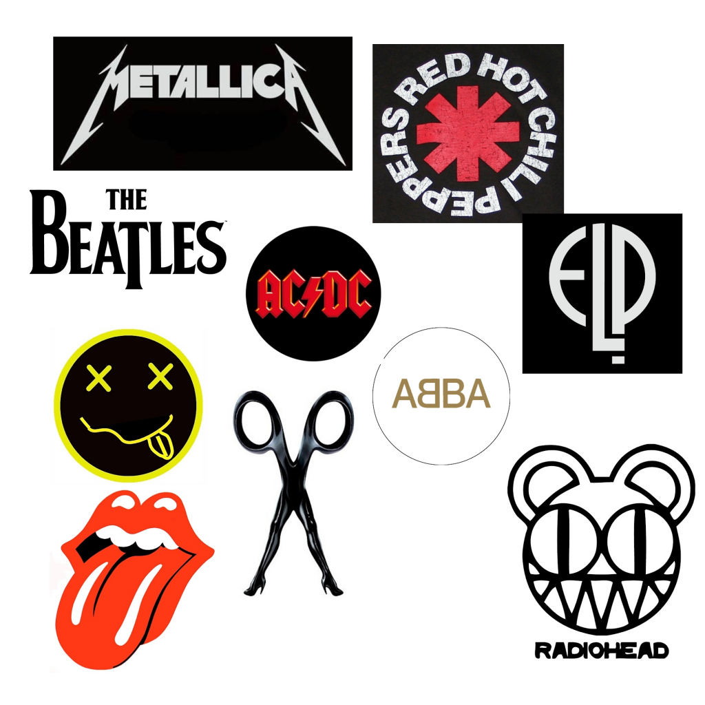
Going from top to bottom, first we have Metallica. The reason this Logo works so well is that is has a grungy, rocky theme to it which matches the music that metallica makes. It’s a very presentable and memorable logo, as evident by the influence of the art style into the newer generation.
Second we have the Red Hot Chilli Peppers. The reason this logo works so well is that the logo itself both includes the band name, and gives a direct reference and connotation towards the name. This is done by the red almost warning sign, which links towards the idea of the red “HOT” chilli peppers.
Third we have the beatles, iconicly. This logo is the perfect example of simplicity together in a logo, while showing the bands image as a whole. The beatles doesn’t make heavy metal, head-banging music, they make more smooth songs, and this is portrayed by the logo in the font choice and colour scheme.
Fourth we have AC-DC, the reason this logo is well made and designed is because it stands out from the rest of the logos with the contrasting colours of red and black being so prominently used in the logo along with the bands name. This logo is very professionally made and very marketable, which is another reason for the big success of the band.
Next we have Abba, this is a very simple logo, with a very simple almost “rich” colour scheme, this is evident by the gold and the white colours that are being used, with gold having clear connotations to wealth and success, something the band is well known for.
6th on the list is Emerson, Lake & Palmer. This logo is very simple and brings in the idea of combining letters together to create unique shapes and creative outlets. The contrasting white and black colour allows the letters to stand out, each representing a member of the band. This was a conscious choice and may reflect how every other band doesn’t give have each member recognised as a whole person, rather as the band.
7th on the list we have nirvana. This logo by far goes for the more “trippy” aesthetic, which is what nirvana seems to portray and achieve with their music. This is an example of a logo that doesnt actually include the band’s name, which can be seen as a positive and a negative. A negative for it is that somebody that has never heard of nirvana will not know this is their logo.
8th on the list we have the rolling stones. A reason this logo is good is the colour choice, bright reds and whites stand out behind backgrounds or amongst other logos that have been made, and even ones that are shown on this list.
9th we have Scissor Sisters. The reason this logo stands out is how creative the logo is, using the template of a pair of scissors and then transitions into a pair of legs in high heels, indicating sisters. This is a very smart nod to the bands name and tye-ing it all together so that its memorable.
Last we have radiohead. This stands out against other logos as it is actually a face and something that you can easily remember, simple but not too simple. The colour scheme is very basic with black and white.