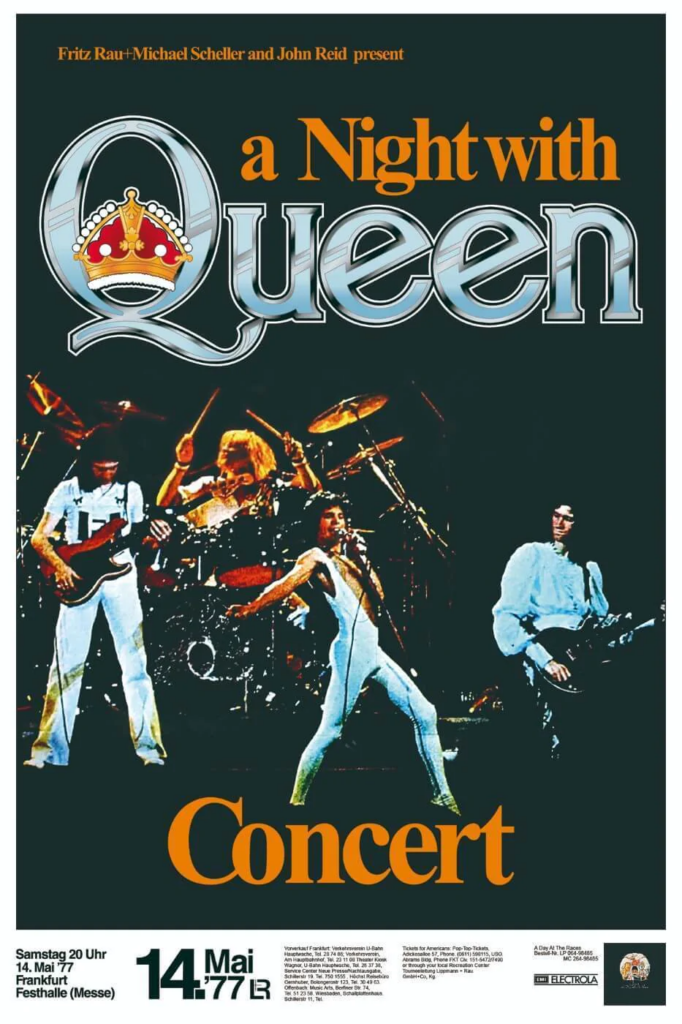
I picked this gig poster as it is a very simple yet very powerful in its design many people would turn their heads around if they saw thus poster on a wall. The picture of the band mates is perfect as some people may not know the band name but know what the band mates look like which can sell the band and ticket simply because of a smart decision of having a picture of the band. And it is also very smart to place Freddie Mercury in the middle of the poster as people would immediately recognise him.
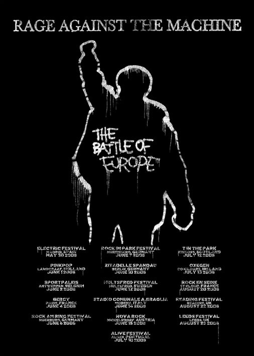
I picked this poster gig as I first of all am a huge fan of the band and this poster is done very well. Extremely simple and straight to the point people walking past this poster can look at all of the dates and know where the band is touring. they can also take a picture of the dates and show it to their friends who may live in one of the areas that the band is performing. the colours aren’t bright but if you print this poster big enough it wouldn’t have a problem with getting attention the bands popularity is huge so all they need to do to get attraction is to put their band name at the top of the poster just like they did here.
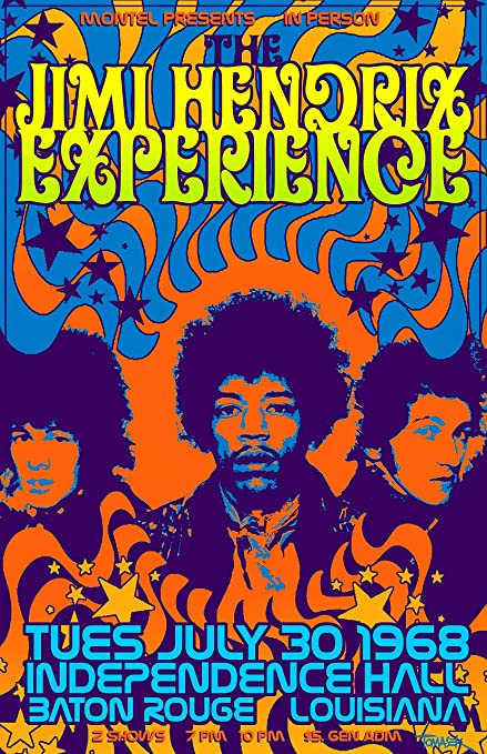
I picked this poster as it is very colourful and bright it will stand out anywhere you put it because of the bright colours they are so bright and intense people will be able to see it from across a street or they may see it on a road as they are passing by. The dates of the gig are also written in a very large size with a unique bright blue font. This type of poster has the ability to attract every type of demographic from little children to teenagers to adults. very simple but smart poster.
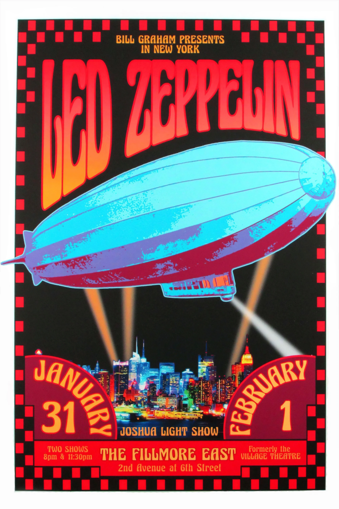
I feel the same with this poster it is very bright and the design of the poster is amazing extremely eye catching and easy to spot and stand out this poster reminds me of the Jimi Hendrix poster but this one would attract even more attention than the Jimi Hendrix because of the amazing art work of the huge zeppelin and city right behind it. The dates of the gig are right in your face with bright colours.
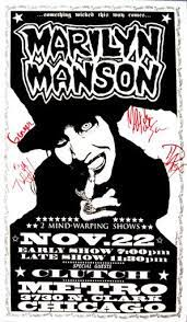
I picked this one because of its uniqueness it is black and white so it is not eye catching but the picture for the poster it would easily catch many peoples attention even if it does not have bright colours because it almost looks like it is a poster for a carnival or a circus but as they inspect the poster closer they realise it is a artist gig. This may get many people interested in getting themselves a ticket and seeing what this artist is about as it just look so interesting.
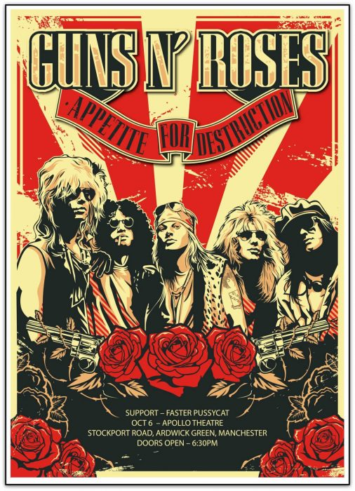
I picked his poster because of the amazing artwork and colour pallet it easily stands out and would catch peoples attention. all of the band mates are on the poser so even if people don’t read the title of the poster as passing by they will recognise the band mates and catch their attention.