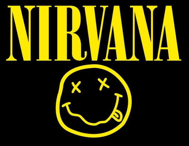
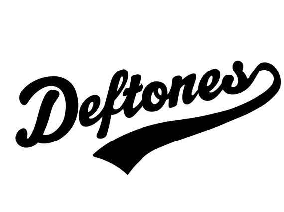
I chose all of these logos as almost of these logos are from classic rock bands and they all have things in common they are very basic and not complicated easy to remember and recognisable. I would say the best logos from these 10 is probably nirvana and Black Sabbath since its basically their band name in a large unique font which anyone can recognise instantly.
They all have good colour pallets and are very visually attractive which is what I am going to try and achieve whilst creating my logo for our band. I want to make it simple and eye catching. I also like how some of he bands have their own stamp for their band for example Nirvana has a smiling face and ACDC has an electric bolt I will also try to create something like that for our band.
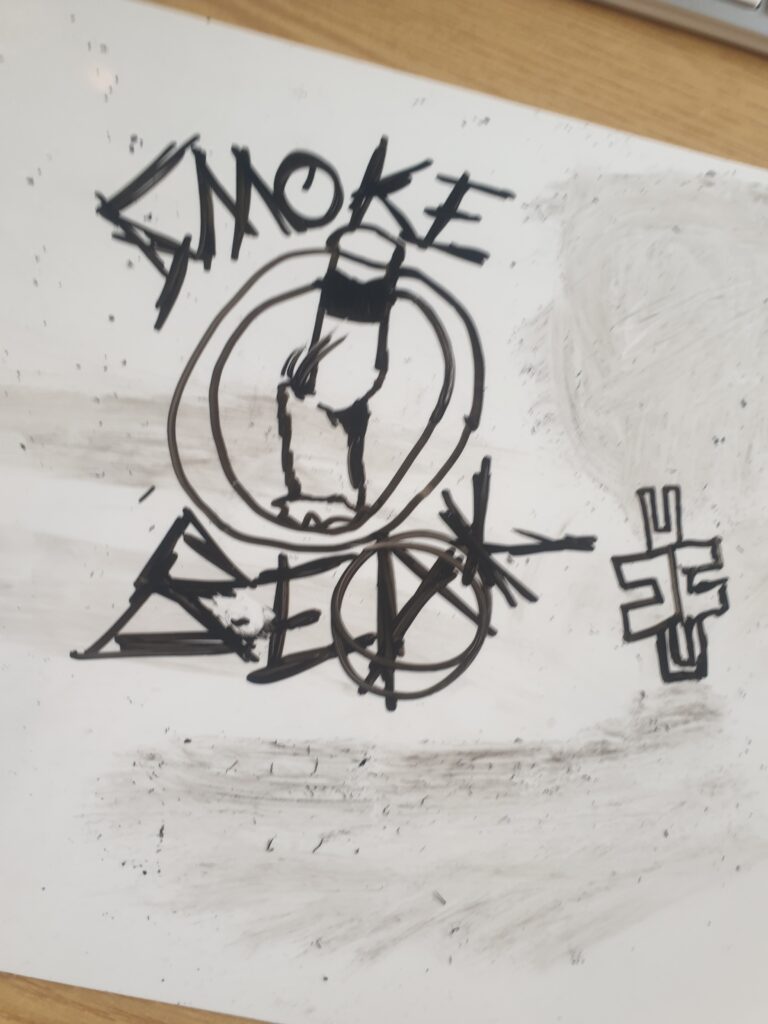
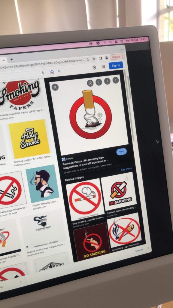
these are one of our first ideas we copied a image on google and added our band name with our own font we thought of putting our band name around the cigarette in black and white with the same font as in the drawing on the whiteboard all in black and white but we make the letter A red.
We later scrapped the idea of a cigarette in the middle and decided to just have a text.
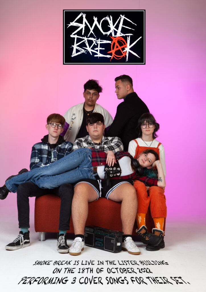
This is our promotional poster, I made the promotional poster with my graphics teacher I took some inspiration from star wars. The text looks like it is on the ground, I stole it from the star wars series.
I wanted the promotional poster to look eye-catching but very simple as well and so that’s what I did I placed the band logo at the top in the middle and a small text of the date of the performance and location at the bottom. simple but very eye-catching.
I took the of the text from a website (Dafont.com) since our band logo looks liked it is drawn scribbled with a pencil I wanted our promotional poster font to look similar so I went on the website and searched for a font that looks like its written with a scruffy pencil which I did.
The font of the text at the bottom and the logo at the top look very similar to each other and looks perfect in my opinion.
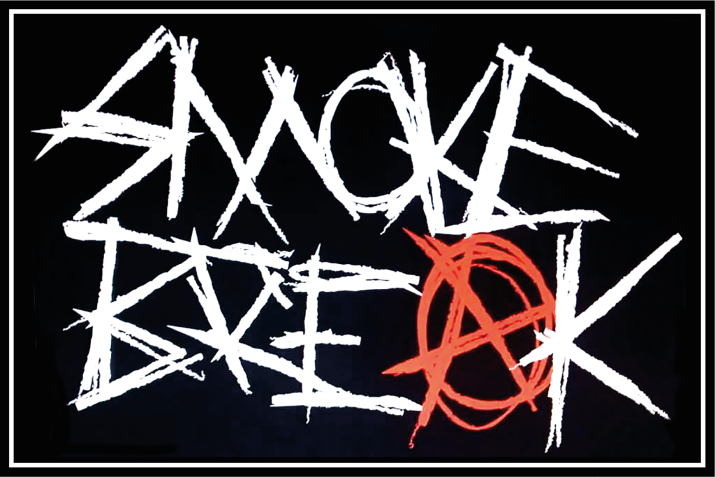
This is our band logo the guitarist of our band made it (Oliver wright) he first showed us this logo idea when he drew it on a whiteboard as shown in the pictures above but we didn’t like the cigarette in the middle so we told him to redraw it on a computer or a drawing tablet if he had one with just the text.
He then the same day sent us this we all loved it but I didn’t like how the “A” on the logo was white I told him it would be cooler if he changed the colour of the “A” to red and so he did he changed the color of it and the band loved it we all agreed to make this our band logo.
I do not know where Oliver took his inspiration from when he made this logo but he did tell me he took some ideas of off other punk rock and grind core bands so I am guessing his idea for this logo mainly came from that.