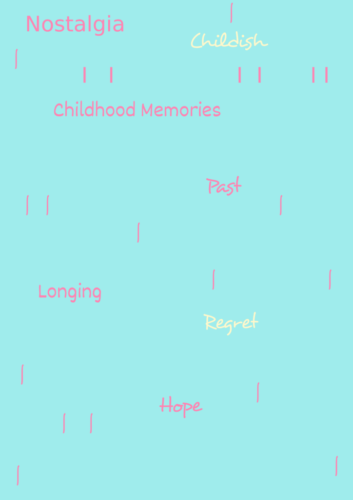
For this workshop, we practiced using typography using Photoshop. We used the text in Photoshop to experiment with fonts and colours. To make this fit my theme better, I wrote down words that relate to my theme such as:
- Longing
- Past
- Regret
- Hope
Here is my attempt at typography.

For this, I wanted to mainly use the colours baby blue and baby pink, since they fit the theme of nostalgia since those are the colours you’re most likely to give to a child or represent childish things. I tried to add lines to look like sprinkles in the background, which I’m not sure if I like or not. It also reminds me of rain, which reminds me of the times that I would stare at the rain on my window and see which raindrop would reach the bottom of the window first with my brother.
Regret and childish are yellow since those are negative instead of positive or neutral. I picked those fonts because they were the most childish ones, with them being more messy and round, like how children write things down.
I might try this out again later in the project, but with a better design since I know what I’m doing now.