For this workshop, I decided to experiment by making different repeating patterns using Photoshop.
Here’s my first attempt with making a repeated pattern on Photoshop. For this, I used the shape tool. I wanted to start off with a more simplified design, then move onto a more complicated design once I was more confident. So, I used different coloured shapes for the first one. For the colours, I decided to use different shades of pink. I think the colours I picked go well together, however the square is a bit too bright so if I had to change anything about this I would make it a bit lighter to match the other shapes.

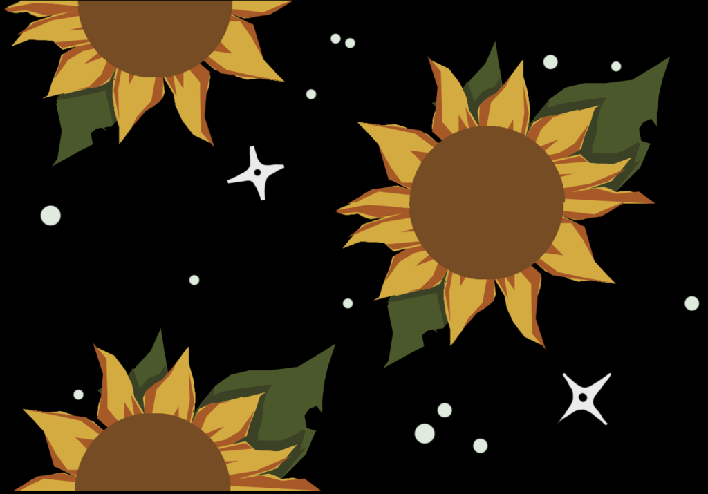
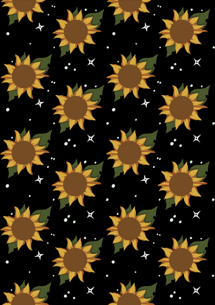
For my second try, I decided to try a more complicated pattern, so I made a sunflower pattern. I first designed the whole sunflower that you can see in the tile below that I made for this.. I then cut it in half and stuck one half at the top and one at the bottom, so that it looks like a whole flower once I put multiple tiles together. To fill in the empty space behind the flowers, I decided to add stars since the black background reminded me of space. I think adding the stars makes this piece much better. The sunflower at the top doesn’t match the flower at the bottom perfectly but its a small enough difference that its not too noticeable. If I did this again I would move it slightly or edit it so it fits perfectly like the whole sunflower.
Here’s another repeated pattern that I did. For this one, I wanted to make it similar to my main inspiration for this activity.
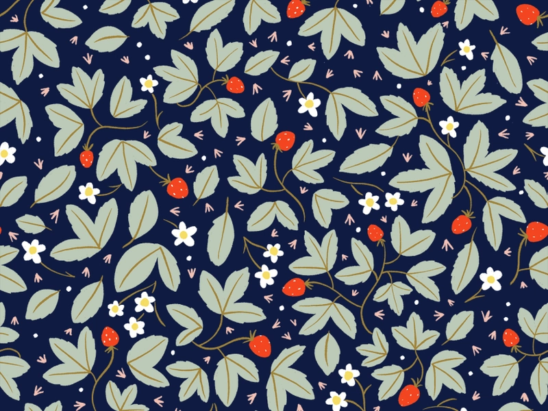
My main inspiration for this workshop was this piece by Kaela Stewart. While this isn’t exactly a repeated pattern, it looks like it is and I like how it looks. Especially the use of colour in this piece. The red strawberries are a great pop of colour. To me, when I first look at this piece, those are what my eyes are drawn to. The leaves surrounding them are less saturated, which helps them stand out,
So here’s my repeated pattern inspired by this piece:
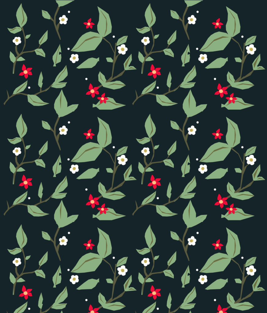
Here’s the tile I designed for this piece:
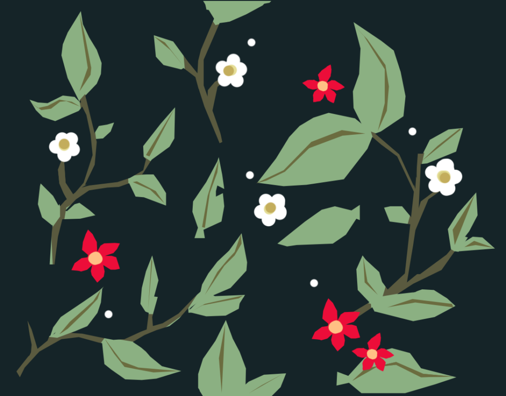
Personally, I really like how this turned out. The red flowers give it the pop of colour that I loved in the artists work that inspired this piece. My only complaint based on this piece is that the background looks empty in some spots. So, if I was to change anything about this piece, I would add more things to the background, like spots, small leaves or even petals.