Christie Williams is an Australian illustrator and surface pattern designer. She is known for her colorful pattern art that uses flowers and birds. On her website, she says that she specializes in “drawing colorful Australian flowers, tropical plants, birds and nature-inspired designs”. While she does a lot of work surrounding plants and flowers, she also uses shapes in her work as shown by some of the cards she’s designed. Her work is often used for fabrics, textiles, greeting cards, and stationery for brands worldwide. Here are a few examples from the list of brands she has listed on her website:
Hallmark
Peteralexander
Minted
Moonpig
Target
Pebble & Poppet
Scrubsy
Here’s a few examples of her work that i like:
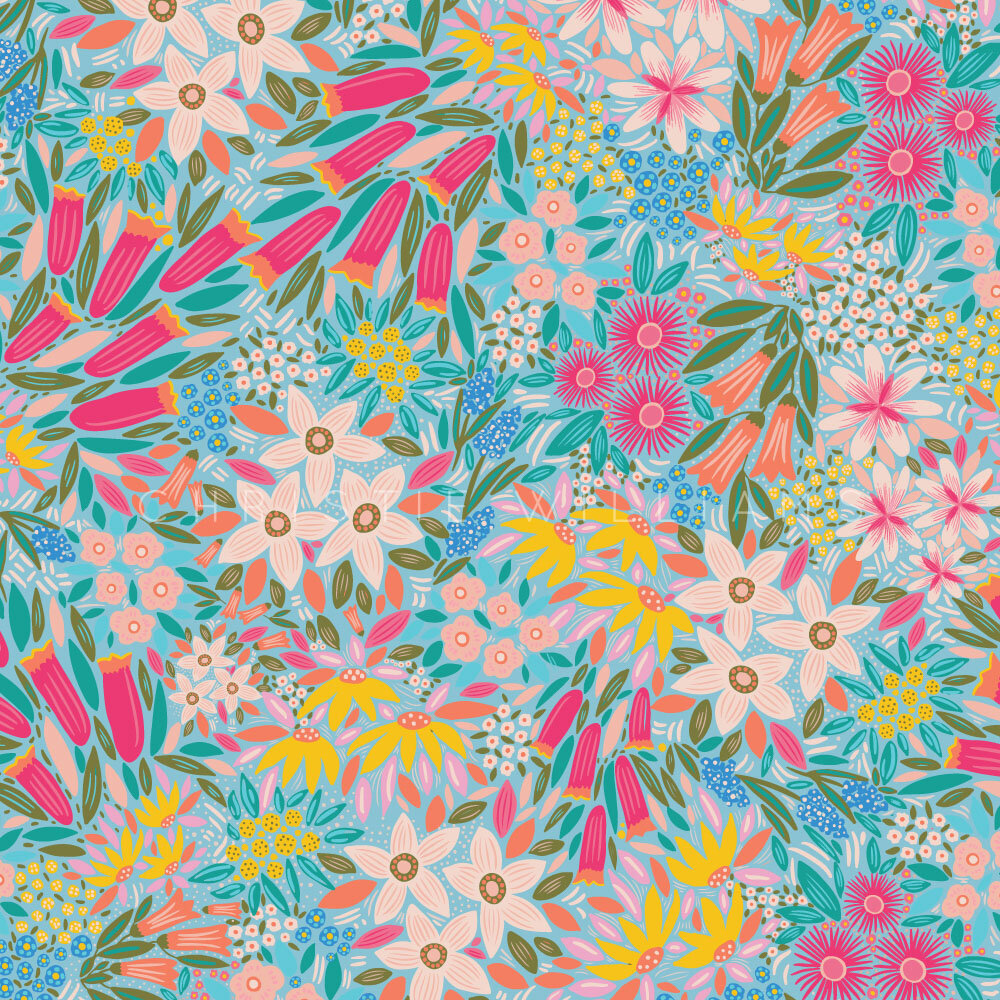
What I like about this one is the contrast between the background and the flowers, since the background is bright blue while the flowers are shades of pink and yellow.
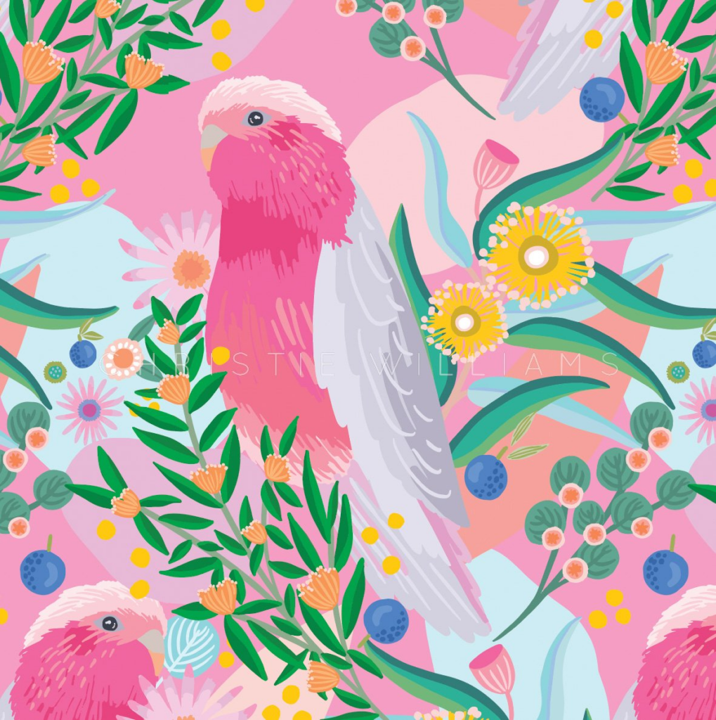
What I like about this one is the way the bird looks detailed despite the simplistic style she has.
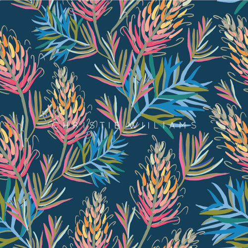
I love the way the dark background makes the leaves stand out more, and because of this it’s more likely to catch our attention.
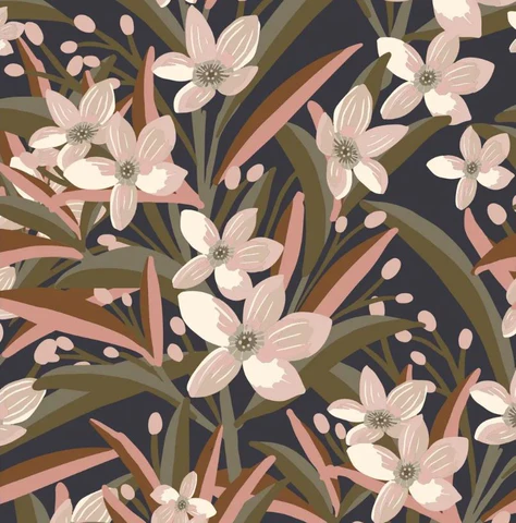
I love the colour pallet she chose here. The colours she chose contrast each over well since she used light pink for the flowers and a darker green for the leaves.
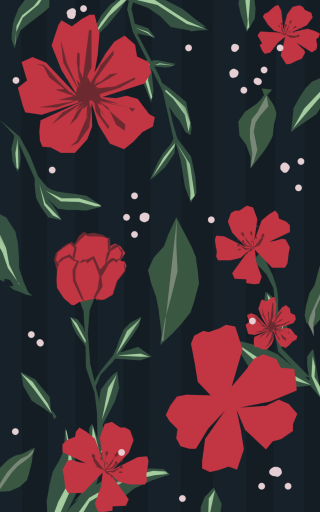
This work of hers is probably my favourite from what I’ve seen of her pieces. I love how the flowers stand out against the darker background. It helps bring the focal point to the flowers above it. I also like how she used a variety of types of flowers in this instead of drawing the same flower. The use of shapes reminds me of abstract art slightly which looks good. You can tell that they’re flowers but they’re made up of ovals and other round shapes. When I make a transcription based on her work, I think this piece is going to be my main inspiration.
When making my transcription, I want to keep in mind the main features of her work which are:
Flowers
Leaves
Contrasting colours
Not much empty space
Here’s one of the transcriptions I made for this artist. While I like how this turned out, I don’t think it ended up looking like the artist’s work. So, because of this, I think I’m going to try again. For the next one, I think I’ll keep the darker background cause I like how it helps the flowers stand out since it brings the eyes to them. I think I’ll add more flowers and more leaves to the background to make it busier like Williams’s work.