Kazimir Malevich is a Russian artist who’s artwork heavily influenced abstract art during the 20th century. While his preferred medium is painting, he worked with many different art styles, deciding that he preferred impressionism, symbolism and fauvism. He developed his cubism style when he went to visit Paris in 1912.
His piece called Black Square(1915), which was a black square on white was the most shocking abstract painting known to have been created so far and was described as “an uncrossable line between old art and new art”
Here are a few pieces that he made throughout the years.

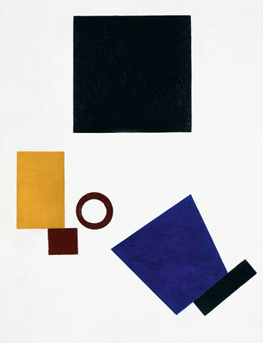
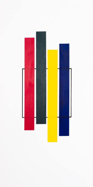
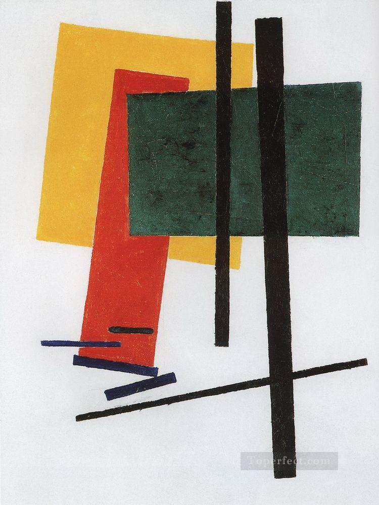
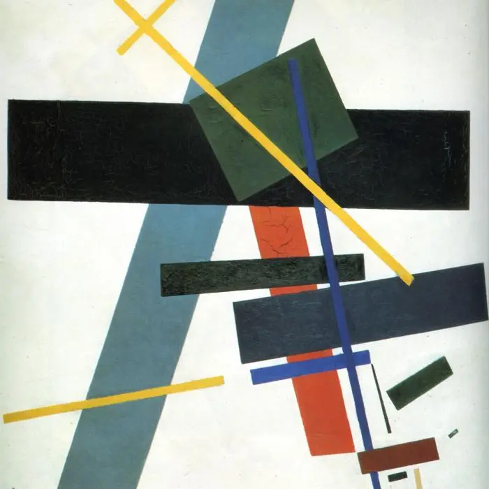
Out of all of his pieces, these 2 are my favourites.

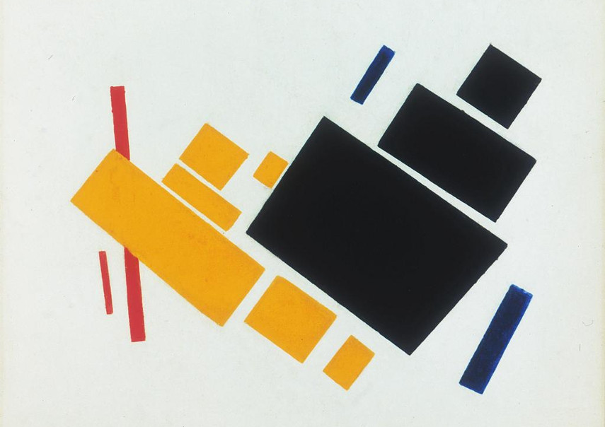
This is because I love the way the yellow shapes stand out against the other ones. Since the other shapes are darker, except for the red in the 2nd picture, they make the yellow stand out, making it the main focal point for the pictures. I like the way that the shapes are scattered about in the first one as if they were placed randomly on the sheet. They’re much neater in the picture in the 2nd but still look like they’re scattered around since the space between the shapes is different for each shape. It looks like they were placed neatly but also placed randomly at the same time.
For my transcription, I’m going to use photoshop to create my piece. I’ll use the shape tool photoshop offers so the shapes look neater.
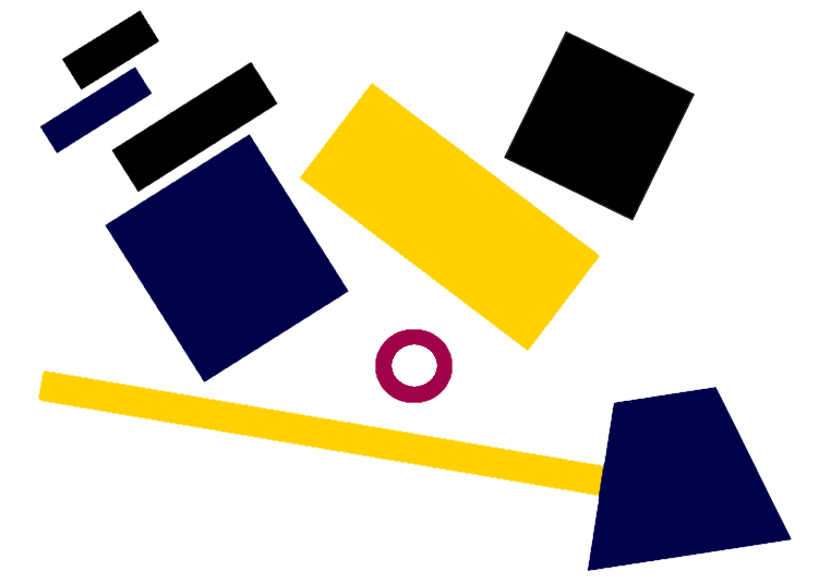
When designing this transcription, I kept in mind the way the shapes were placed in his work. In his work, the shapes never overlap. They touch each over sometimes but never go under or over another shape. The placement of the top left shapes was inspired by the placement of his images that I mentioned earlier. I put the yellow shapes in the centre, since I wanted that to be the focal point for the piece. I surrounded the yellow shapes with blue and black shapes to help with that. Since they’re darker, they help the yellow stand out. The red circle also stands out, bringing attention to the centre.
I like how it turned out. My favourite part of it is the shapes in the top left corner since I like the placement of them. If I had to do this again though, I would add some more shapes since I didn’t add too many.